Preview image. Unlock full-res
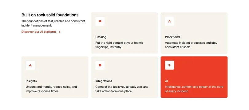
Light feature grid where an intro cell sits in the corner of a two-row card layout of beige feature tiles, with one tile flipped to solid red as the emphasis.
Summary
A light features block laid out as a two-row, three-column card grid where the top-left cell holds the intro copy instead of a tile, and one bottom tile is flipped to solid red to single out the AI capability.
Visual description
On white, the top-left cell is text only: a bold sans heading "Built on rock-solid foundations", a two-line description, and a red "Discover our AI platform" text link with an arrow. The remaining five cells are rounded cards: the top row has two beige tiles (Catalog, Workflows), and the bottom row has Insights and Integrations in beige plus AI as a solid red card with white text. Each card carries a small rounded white icon chip at the top, then a bold title and a one or two line description. Spacing is generous and uniform, and the only color break is the single red tile.
Key takeaway
Using the grid's corner cell as the section intro so the heading lives inside the same rhythm as the cards, no separate header band needed. Flipping exactly one tile to a saturated brand color is a cheap, strong way to point at the feature you most want clicked.
Reuse notes
A clean, reusable pattern for listing four to six product pillars when one deserves extra weight. The empty-corner-intro trick wants a roughly even card count to balance. Works on light backgrounds; keep icons in a single consistent style so the lone red card, not the icons, carries the emphasis.