Preview image. Unlock full-res
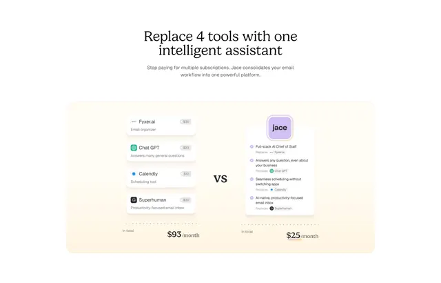
A warm, contained "vs" panel that stacks four priced competitor tool cards against a single brand card, totaling the swap as $93 versus $25 per month.
Summary
A bundle-versus-one cost argument: a serif headline over a single contained cream panel that stacks four priced tool cards on the left against one brand card on the right, summed as $93 versus $25 per month.
Visual description
Light background, centered serif headline ("Replace 4 tools with one intelligent assistant") and a two-line subhead. A single large rounded cream panel holds the comparison. On the left, four small white tool cards each show an app name, a price pill ($30, $23, $10, $30), and a one-line role (email organizer, answers general questions, scheduling tool, productivity inbox). A bold "vs" sits in the gutter. On the right, one elevated brand card lists four capabilities, each annotated "Replaces" with the matching competitor chip. Footer math: "In total $93/month" versus "In total $25/month".
Key takeaway
Quantifying consolidation: name the exact tools you replace, show their real prices, and total both sides so the savings land as a single number. Wrapping the whole comparison in one warm contained panel keeps it feeling like a tidy receipt rather than a busy table.
Reuse notes
Strong when your pitch is "replace this stack." Naming competitors with prices is persuasive but needs to stay current and defensible. Keep the replaced list to about four so both stacks balance. The cream panel and serif give a soft, premium tone; swap for higher contrast if the brand is more technical.
More comparison sections
See all











More like this


Keep what you find
A free account saves references to boards and can send you a weekly email of picks based on what you save.
To see every result, go Pro.