Preview image. Unlock full-res
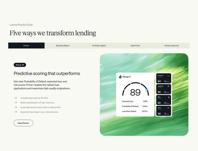
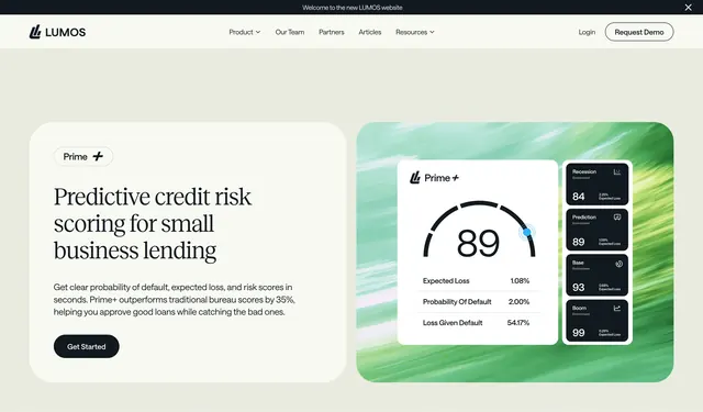
Tabbed product suite section with Prime+ active tab, benefit bullets left, and green abstract UI scorecard illustration right.
Summary
Five-way product suite feature with horizontal tabs, Prime+ copy and bullet benefits on the left, and a painted green background framing a Prime+ score dashboard mockup on the right.
Visual description
Cream background. Small Lumos Product Suite label and large serif heading Five ways we transform lending. Five horizontal tabs: Prime+ active in dark charcoal with white text; Business Report, Portfolio Insights, Data Portal, and Advisory Services inactive in light beige. Left column: Predictive scoring that outperforms subhead, body copy on probability of default, four arrow-bullet benefits, and outlined View Prime+ button. Right: rounded container with green horizontal brushstroke texture holding a white Prime+ card with gauge showing 89, Expected Loss, Probability Of Default, and Loss Given Default rows, plus a vertical stack of dark scenario cards for Recession, Prediction, Base, and Boom with scores and expected loss percentages.
Key takeaway
Product tabs above a split copy-and-UI layout let one screenshot carry the whole suite story. Painted green frame makes fintech UI feel branded rather than generic.
Reuse notes
Multi-product fintech and analytics pages. Tabbed pattern needs distinct visuals per tab; gauge card is the hero asset here.
More feature detail sections
See all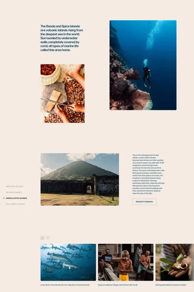

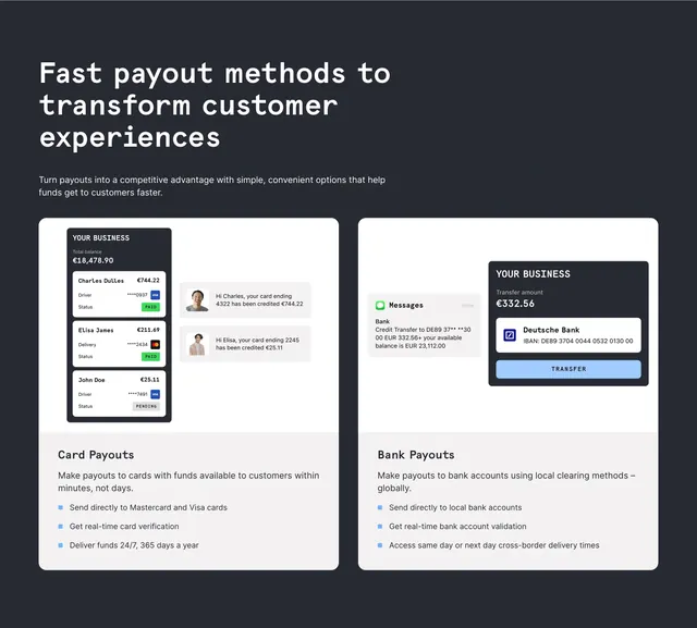
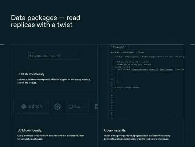





More like this



Keep what you find
A free account saves references to boards and can send you a weekly email of picks based on what you save.
To see every result, go Pro.