Preview image. Unlock full-res
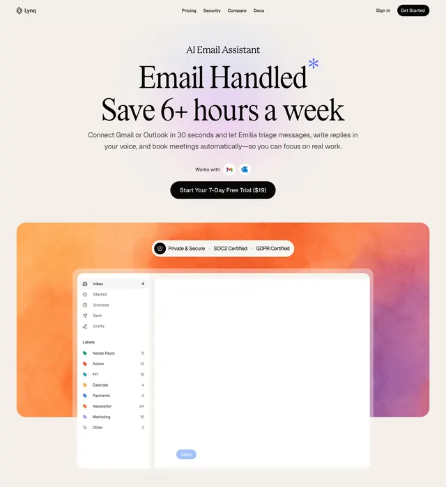
Two alternating feature blocks pairing email-client mockups inside watercolor gradient frames with serif headlines and bolded benefit copy.
Summary
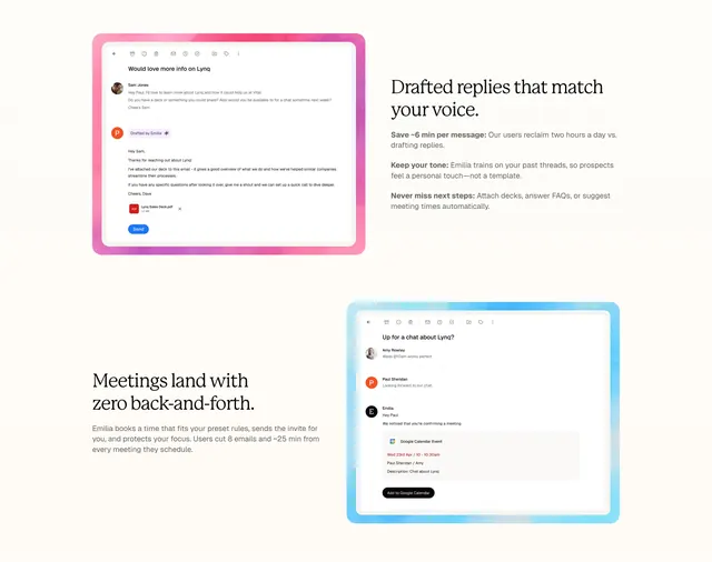
A two-row feature section where each row alternates a soft watercolor-framed email-client screenshot against a column of serif headline plus bolded benefit copy. The defining move is the painterly gradient frame wrapping each product shot.
Visual description
Cream background. The top block places a pink watercolor-bordered email mockup on the left (showing an AI-drafted reply with a Send button and PDF attachment) and, on the right, a two-line serif headline "Drafted replies that match your voice." followed by three short paragraphs, each opening with a bold lead-in phrase. The lower block mirrors this: a serif headline "Meetings land with zero back-and-forth." with muted body copy sits on the left, and a blue watercolor-framed email thread mockup (with an embedded Google Calendar event card and a black "Add to Google Calendar" button) sits on the right. Type pairs a large editorial serif for headings with a small grey sans for body.
Key takeaway
The watercolor gradient frame turning a flat UI screenshot into something warm and crafted. The alternating image side keeps a two-feature stack from feeling repetitive, and the bold lead-in phrase on each paragraph lets a skimmer read only the first few words per point.
Reuse notes
Good for a productivity or AI assistant product that needs to show real product UI but wants a softer, less corporate feel. The painterly frames carry a lot of the personality, so pair with otherwise restrained type. Works on light backgrounds; the pastel frames would lose contrast on dark.