Preview image. Unlock full-res
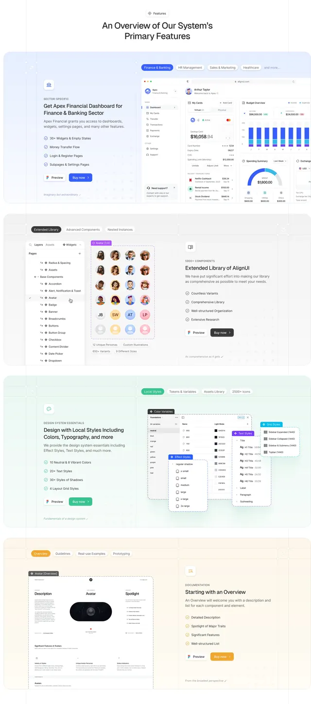
Long light-mode features section with four pastel-tinted blocks, each alternating copy and a detailed Figma-style product mockup with checkmark bullets and dual CTAs.
Summary
A vertically stacked overview of four primary AlignUI features, each in its own soft pastel band with sector label, headline, checkmark feature list, Preview and Buy now buttons, and a large UI mockup on the opposite side.
Visual description
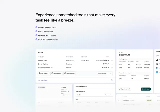
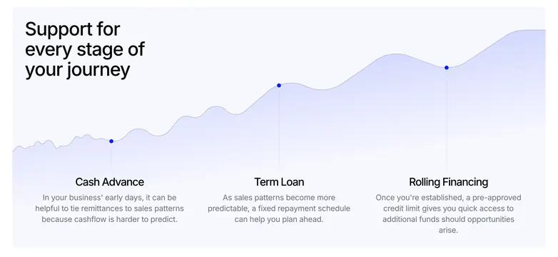
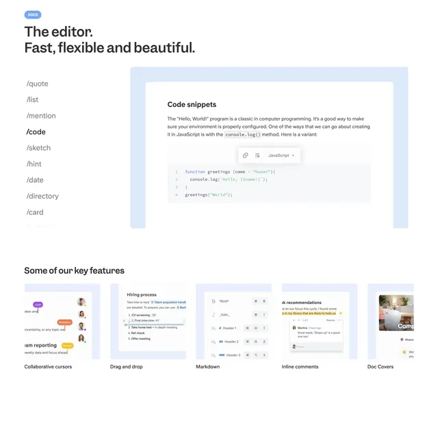
Tall section titled "An Overview of Our System's Primary Features" with four horizontal blocks on distinct pastel backgrounds: light blue, light grey, light green, and light orange. Each block follows an alternating Z-pattern. Text side includes a small line icon, an uppercase sector label (for example "SECTOR-SPECIFIC"), a bold headline, a short paragraph, a bulleted list with checkmark icons, and two buttons: white "Preview" and a color-matched filled "Buy now". Graphic side shows detailed mockups: a finance dashboard with cards, charts, and sector tabs labeled Finance & Banking; a Figma-style layers panel beside a grid of avatar photos with stats like "950+ Variants"; floating panels for color variables, shadow effect styles, and text styles; and a documentation page layout for an Avatar component with description and spotlight sections.
Key takeaway
Pastel banding separates four dense feature stories without hard dividers, while the alternating text/mockup rhythm keeps a long scroll scannable. Matching each block's CTA color to its tint ties action to the feature theme.
Reuse notes
Ideal for design system or UI kit landings that need to show breadth (dashboards, libraries, styles, docs) in one section. Requires high-quality mockups for each block; weak visuals will flatten the impact. Long vertical capture suits desktop; mobile should stack mockup below copy in every block.