Preview image. Unlock full-res
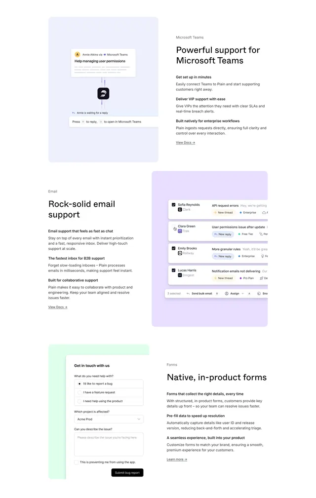
Light stacked section with three alternating split rows for Microsoft Teams, Email, and in-product Forms, each with tinted UI mockup and bullet features.
Summary
A long product section documenting three support channels in alternating split layouts: Teams notification UI, email inbox bulk actions, and a native bug-report form, each with label, headline, three bullets, and docs link.
Visual description
White page with three large feature bands stacked vertically, alternating image side. First band: light blue rounded panel left with Teams message from Annie Atkins about user permissions, keyboard hints Press R to reply and O to open in Teams; right text block labeled Microsoft Teams, headline Powerful support for Microsoft Teams, three bold-lead paragraphs about setup, VIP SLAs, and enterprise ingestion, View Docs link. Second band: left copy labeled Email with Rock-solid email support headline and three bullets on speed, millisecond inbox, and collaboration; right light purple panel with inbox rows (Sofia Reynolds, Clara Green, Emily Brooks, Lucas Harris) showing tier tags and floating 3 selected toolbar with Send bulk email, Assign, Snooze. Third band: light green panel left with white Get in touch form (help type radios, project dropdown, issue textarea, blocking checkbox, Submit bug report black button); right copy labeled Forms with Native, in-product forms headline, three bullets on structured details, pre-fill, and branded experience, Learn more link.
Key takeaway
Alternating split rows keep a long integrations page readable while reusing one template. Pastel rounded panels color-code channels without brand-clashing logos dominating. Three bold-lead bullets plus docs link per channel gives skimmers hooks and gives implementers an exit ramp.
Reuse notes
Ideal for multi-channel support products detailing each surface on one scroll. Needs realistic UI for each channel and distinct pastel tints that stay accessible with black text. Section is tall; anchor nav or sticky subnav helps on live sites.
More feature detail sections
See all

More like this

Keep what you find
A free account saves references to boards and can send you a weekly email of picks based on what you save.
To see every result, go Pro.