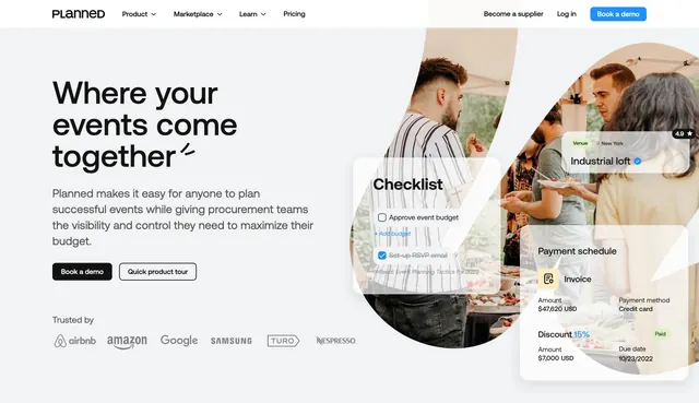
Preview image. Unlock full-res
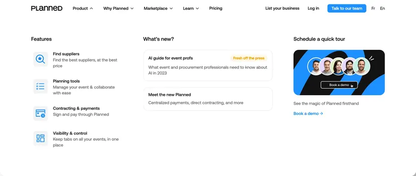
Light navbar with an expanded Product mega-menu split into features, news cards, and a demo CTA panel with team avatars.
Summary
Planned's navigation bar shown with the Product dropdown open as a three-column mega-menu mixing feature links, news cards, and a demo booking promo.
Visual description
White background. Top bar: PLANNED wordmark left; links Product (active, chevron up), Why Planned, Marketplace, Learn, Pricing; right side List your business, Log in, blue Talk to our team button, and Fr/En language toggle. Expanded mega-menu in three columns. Left "Features": four rows with light blue icon squares and titles Find suppliers, Planning tools, Contracting & payments, Visibility & control, each with one-line descriptions. Middle "What's new?": two bordered cards, one tagged "Fresh off the press" for an AI guide, another for centralized payments. Right "Schedule a quick tour": dark card with overlapping circular team headshots, Book a demo button with cursor hover, and caption with arrow link below.
Key takeaway
Three-column mega-menu balances wayfinding, freshness, and conversion without feeling like a sitemap. Icon-plus-description rows scan faster than plain links. Dedicated demo column with faces outperforms a text-only CTA.
Reuse notes
Reference for B2B SaaS nav with multiple product pillars. Mega-menu width needs desktop; collapse to accordion on mobile. Keep news cards to two items max so the panel stays scannable.