Preview image. Unlock full-res
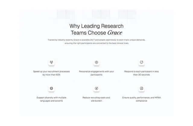
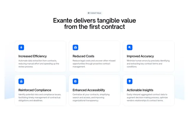
Light features section with a centered badge and headline above a three-column, two-row grid of bordered cards, each led by a rounded blue icon tile.
Summary
A tidy light feature grid: a centered Instant Value pill and headline sit above six bordered cards in three columns by two rows, each opening with a rounded-square blue icon tile.
Visual description
At the top, a small grey pill badge reads "Instant Value" above a centered two-line black headline ("Exante delivers tangible value from the first contract"). Below, six equal cards are arranged in a 3-by-2 grid on a white background, each with a soft rounded border and a faint left-edge gradient. Every card leads with a filled blue rounded-square icon tile (lightning, dollar bag, magnifier, lock, layers, lightbulb), then a bold black title (Increased Efficiency, Reduced Costs, Improved Accuracy, Reinforced Compliance, Enhanced Accessibility, Actionable Insights) and three lines of grey body copy. Spacing between cards is even and generous.
Key takeaway
The single saturated-blue icon tile on each otherwise neutral card gives the grid one consistent accent and a clear scan anchor per item. A 3-by-2 layout is the cleanest way to present exactly six benefits without crowding.
Reuse notes
Reliable default benefits grid for a B2B SaaS page. Works best with exactly six parallel value points and short, scannable copy. Light and restrained; the icon system must be visually consistent or the grid loses its rhythm.