Preview image. Unlock full-res
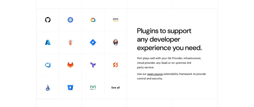
Light split section with a four-column grid of vendor logos on the left and an oversized headline plus copy on the right.
Summary
A clean integrations section that anchors a four-column grid of colorful vendor logos on the left against a large copy block on the right.
Visual description
White background with faint grid guides. The left half is a four-by-four grid of full-color vendor logos in airy cells (GitHub, Kubernetes, Google Cloud, AWS, Azure, an octopus mark, Jira, Jenkins, Azure DevOps, GitLab, Terraform, and others), with a bold "See all" sitting in the last cell. The right half holds a three-line oversized black headline "Plugins to support any developer experience you need.", then two short muted paragraphs explaining that Port works with Git providers, infrastructure, cloud, and any SaaS or on-premise service, with "open source" underlined as an inline link.
Key takeaway
Letting full-color logos carry the left half while the headline and copy stay strictly monochrome on the right, so the brand marks pop without the rest of the section competing, plus the "See all" tucked into the final grid cell instead of a separate button.
Reuse notes
Ideal for a platform or developer tool that lists many well-known integrations. The four-column logo grid scales cleanly and reads as ecosystem proof. Keep logos full-color and everything else neutral. Pairs with the rest of Port's light, corporate page sections.
More integrations sections
See all











More like this



Keep what you find
A free account saves references to boards and can send you a weekly email of picks based on what you save.
To see every result, go Pro.