Preview image. Unlock full-res
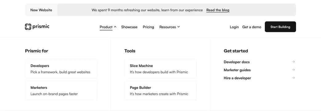
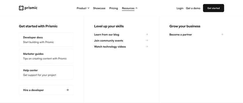
Three-column Resources mega menu under the navbar with bordered get-started cards and arrowed skill and business links.
summary
Expanded Resources dropdown with three columns for onboarding docs, skill-building links, and a partner growth CTA.
Visual description
White navbar with Prismic logo, Product, Showcase, Pricing, Resources (active, underlined with up-caret), Login, Get a demo, and black Get started button. Dropdown divides into three columns separated by thin vertical rules: "Get started with Prismic" with bordered cards for Developer docs, Marketer guides, Help center, and Hire a developer; "Level up your skills" with arrowed links for blog, community events, and technology videos; "Grow your business" with a single "Become a partner" arrow link.
Key takeaway
Resources nav organized by user intent (start, learn, grow) rather than content type. Mixing bordered cards for primary docs with simple arrow links keeps hierarchy clear without overwhelming the panel.
Reuse notes
Pair with a main nav that already handles Product separately. Bordered cards need concise sublines; empty subtext makes the menu feel sparse. Works on light backgrounds only in this capture.