Preview image. Unlock full-res
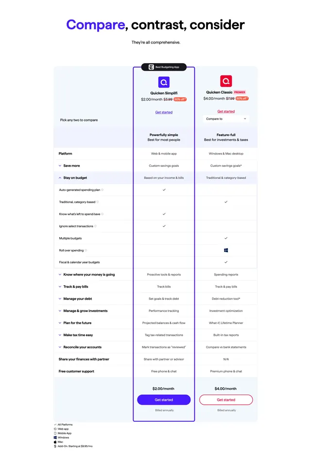
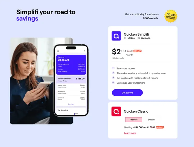
A three-column pricing comparison table with product headers, expandable feature rows, and sticky-style CTAs for two Quicken tiers.
Summary
A full product comparison grid pitting Quicken Simplifi against Classic Premier, with tier headers, strikethrough pricing, and accordion-grouped feature rows ending in column CTAs.
Visual description
Centered headline "Compare, contrast, consider" over a three-column table on white and pale blue row bands. The middle column (Simplifi) wears a thick purple border and a black "Best Budgeting App" badge; the right column (Classic Premier) uses red accents. Each product header shows a Q logo, monthly price with 50% off strikethrough, tagline, and text link. Rows group features under expandable categories like "Stay on budget" with checkmarks, dashes, and platform icons (web, mobile, Windows, Mac). A legend at the bottom explains icon meanings. Purple and red "Get started" buttons repeat at the table footer with "Billed annually" notes.
Key takeaway
Framing one tier as the recommended choice with a bordered column and badge while keeping the table scannable. Expandable row groups let a dense feature matrix breathe without leaving the page.
Reuse notes
Strong pattern for SaaS or subscription products with two clear personas. Needs honest feature parity and icon legend discipline. The purple highlight column works best when one tier is genuinely the default recommendation.
More pricing table sections
See all

More like this
Keep what you find
A free account saves references to boards and can send you a weekly email of picks based on what you save.
To see every result, go Pro.