Preview image. Unlock full-res
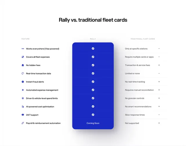
A three-column feature comparison where Rally sits in a raised blue card column with checkmarks against gray traditional-card limitations.
Summary
A competitor comparison table titled "Rally vs. traditional fleet cards" with ten feature rows and a full-height blue Rally column visually winning every row.
Visual description
White background, centered bold black headline. Three-column table: left "FEATURE" lists rows with blue icons and labels (Visa acceptance, all fleet expenses, no hidden fees, real-time data, fraud alerts, automated expense management, spend limits, AI cost optimization, 24/7 support, payroll automation). Center "RALLY" column is a rounded blue card spanning all rows with white checkmarks; bottom row reads "Coming Soon" in white. Right "TRADITIONAL FLEET CARDS" column shows gray dash or x icons with limitation copy ("Only at specific stations", "Transaction & service fees", etc.). Thin gray row dividers throughout.
Key takeaway
Making the winning product column a physical card that spans the full table height, so the eye never leaves your brand color. Pairing icon-led feature names with short negative phrases on the competitor side keeps scanning fast.
Reuse notes
Classic B2B "us vs. them" pattern for category disruption stories. Be careful with claim accuracy; the elevated column implies dominance on every row. "Coming Soon" row adds honesty for unfinished features.
More comparison sections
See all











More like this

Keep what you find
A free account saves references to boards and can send you a weekly email of picks based on what you save.
To see every result, go Pro.