Preview image. Unlock full-res
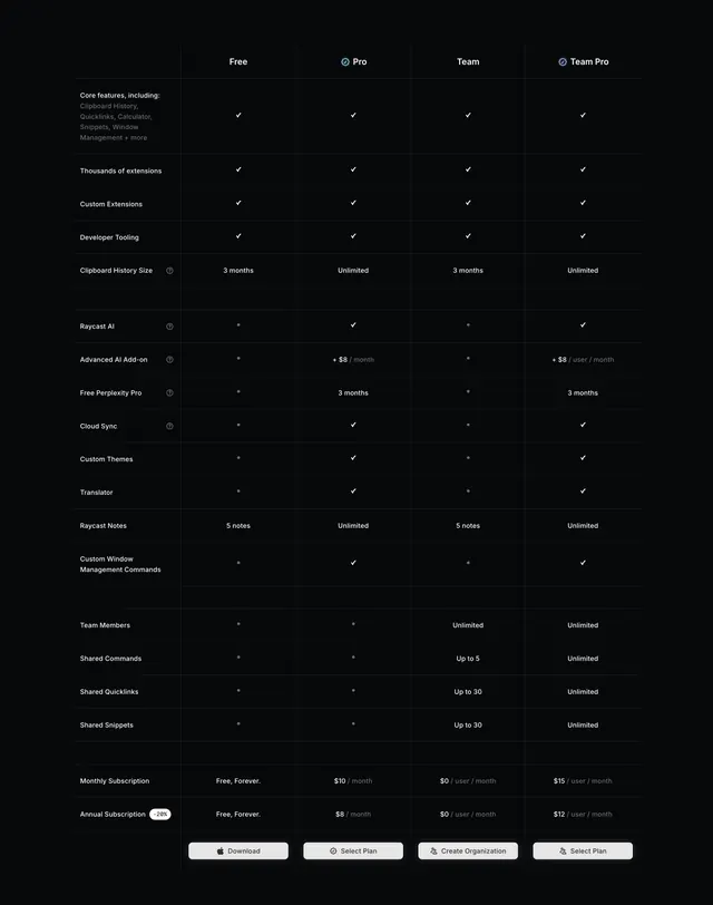
Dense dark feature-comparison matrix with one labels column and four plan columns, resolving to checkmarks, values, and per-row CTAs at the foot.
Summary
A dense dark feature-comparison table with one labels column and four plan columns (Free, Pro, Team, Team Pro), where rows resolve to checkmarks, text values, or blank, and each plan column ends in its own CTA button. The full line-by-line matrix is the point.
Visual description
On near-black, a header row names four plans with small verified glyphs beside Pro and Team Pro. The left column lists grouped feature rows (Core features, Thousands of extensions, Custom Extensions, Developer Tooling, Clipboard History Size, Raycast AI, Advanced AI Add-on, Free Perplexity Pro, Cloud Sync, Custom Themes, Translator, Raycast Notes, Custom Window Management Commands, Team Members, Shared Commands, Shared Quicklinks, Shared Snippets), several with a tooltip icon, with subtle gaps separating feature groups. Cells resolve to small white checkmarks, faint dots/blanks for unavailable, or text values (3 months / Unlimited; 5 notes / Unlimited; Up to 5 / Up to 30 / Unlimited). Near the bottom, two rows give Monthly Subscription and Annual Subscription prices per plan (with a "-20%" badge on the annual row), and the table closes with a per-column CTA row (Download, Select Plan, Create Organization, Select Plan). Hairline row separators run the full width.
Key takeaway
Closing every plan column with its own CTA button at the foot of the matrix so a buyer can act from the exact column they were comparing. Folding monthly and annual prices into their own labeled rows inside the same table keeps all commercial detail in one place. Subtle gaps between feature groups segment a long list without adding headers or heavy rules.
Reuse notes
The deep-detail companion to a card-based pricing block, for technical buyers who read everything. Four columns plus this many rows is information-dense; it suits desktop and power users and needs careful handling on mobile. Hairline separators and checkmarks rely on a dark, high-contrast theme to stay legible, and the footer CTA row only helps if each button is reachable without scrolling back up.
More pricing table sections
See all

More like this


Keep what you find
A free account saves references to boards and can send you a weekly email of picks based on what you save.
To see every result, go Pro.