Preview image. Unlock full-res
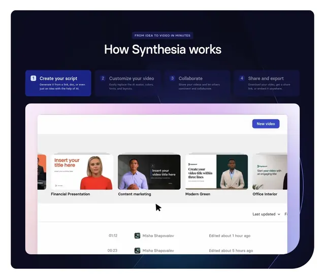
Dark four-step "how it works" section with tabbed step cards above a large product UI screenshot.
Summary
A dark, centered "how it works" section that breaks the flow into four numbered, tabbed step cards, then anchors the section with a single large product screenshot. The defining move is using selectable step tabs as the chapter index for the demo below.
Visual description
Deep navy-to-black background inside a rounded, contained panel. A small violet pill badge reads "FROM IDEA TO VIDEO IN MINUTES" above an oversized white headline "How Synthesia works". Below sit four step cards in a single row, each with a numbered square chip and a short title plus one line of muted copy; step 1 ("Create your script") is highlighted with a solid blue fill while the other three stay dark and recessed. Faint connector lines run down from the cards toward a large tilted product UI screenshot in a browser frame, which shows a video template gallery with a "New video" button, headshot thumbnails, and an edited-files list. A soft pink-to-violet glow rims the top of the screenshot.
Key takeaway
Numbered step cards that double as tabs, with the active step in a saturated fill and the rest dark, so one row communicates both the process and the current chapter. The single contained product screenshot doing all the proof work below the steps keeps the section from feeling like a generic three-up.
Reuse notes
Good for a product that has a clear linear workflow (script, edit, collaborate, export) and a screenshot worth showing. The active-tab fill implies the cards are interactive, so pair it with a real tab interaction or it reads as a static stylistic choice. Works best on dark and needs a high-quality UI capture to carry the lower half.
More process sections
See all



More like this



Keep what you find
A free account saves references to boards and can send you a weekly email of picks based on what you save.
To see every result, go Pro.