Preview image. Unlock full-res
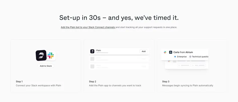
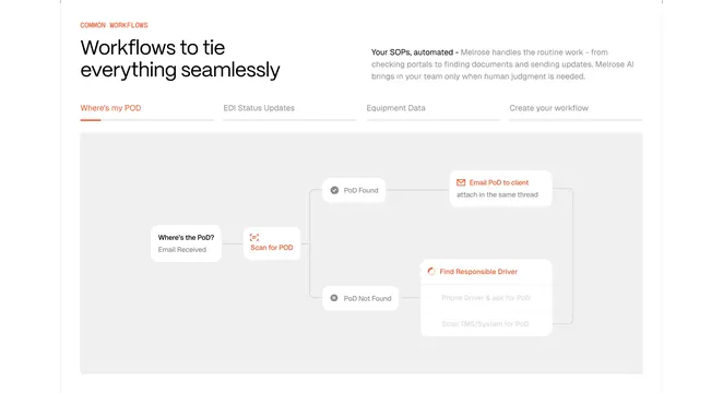
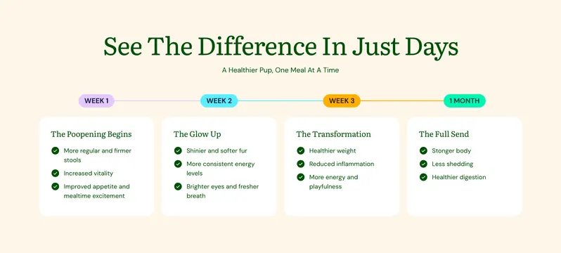
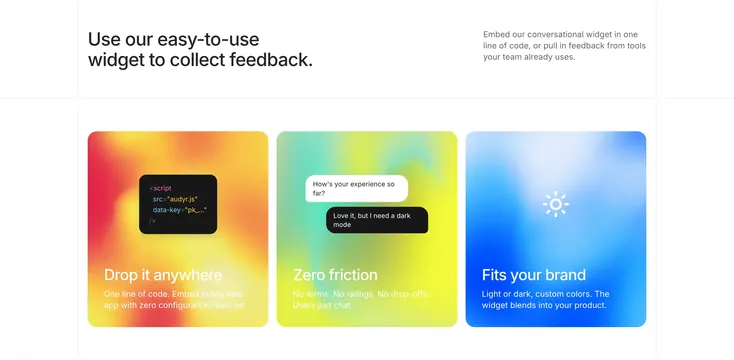
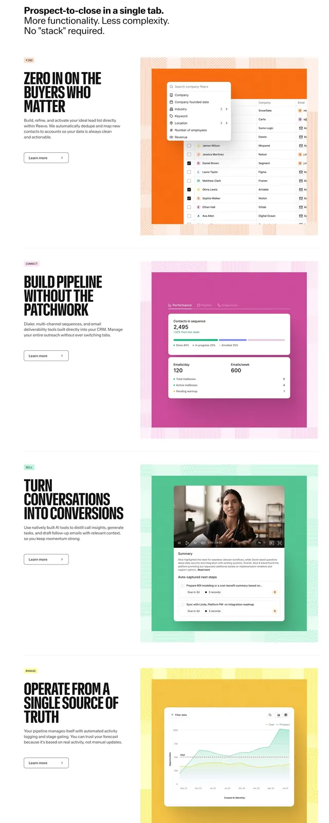
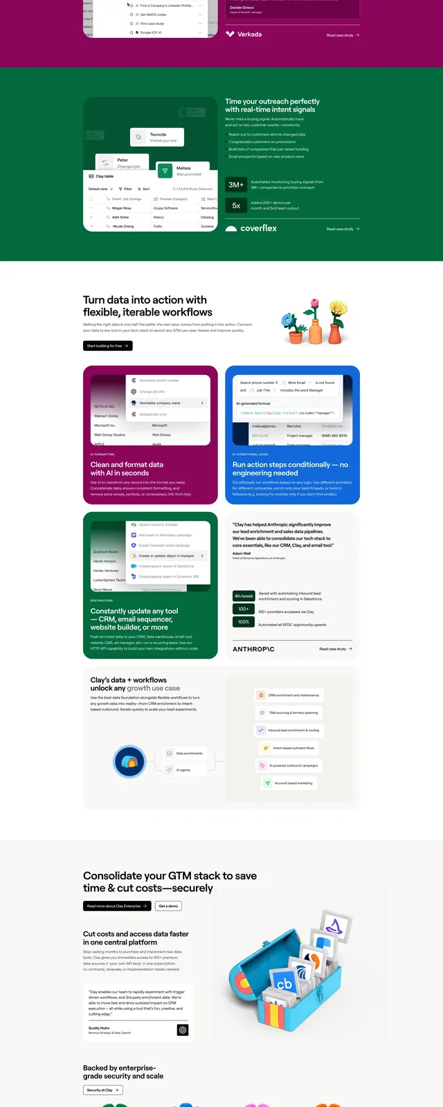
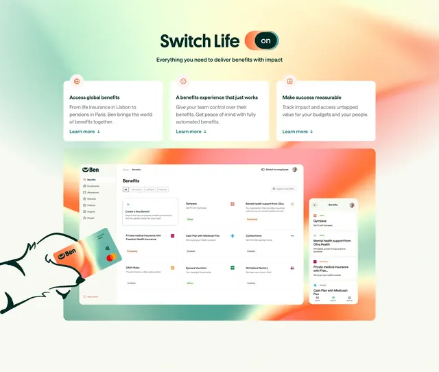
Light how-it-works carousel of tall vivid-gradient step cards, each layering product UI snippets over a different colored wash.
Summary
A horizontally scrolling four-step process where each tall card sits on its own saturated gradient and floats real product UI fragments over it.
Visual description
A grey "End To End Outbound Automation" pill eyebrow tops a centered two-line black headline. Below runs a row of tall portrait cards, one per step: Step 1 "Arrival" on an amber-orange wash with stacked browser windows, Step 2 "Identification" on teal with floating contact/notification cards, Step 3 "Research" on green with website-visit notifications and source chips, and a Step 4 "Craft message" card on purple peeking in from the right edge. Each card carries a small step label top-left and a white title plus one line of copy bottom-left. A circular black arrow button overlaps the right edge, and the clipped fourth card signals more slides.
Key takeaway
Giving every step its own bold gradient backdrop turns a process row into a colorful, memorable sequence. Floating actual UI snippets (browser tabs, contact cards, visit notifications) over the gradient shows the product working at each stage without flat screenshots.
Reuse notes
Best when a process has four or more steps and you want it to feel lively rather than clinical. The peeking next card plus the arrow makes the carousel discoverable. Works on light backgrounds where the saturated cards can pop; keep titles short since copy space is limited.