Preview image. Unlock full-res
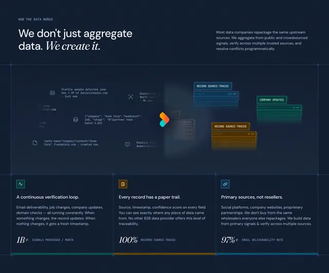
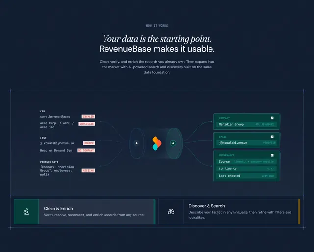
Dark how-it-works section with a horizontal messy-to-clean data pipeline diagram, error labels, and dual feature tabs below.
Summary
Dark how-it-works section with a horizontal messy-to-clean data pipeline diagram, error labels, and dual feature tabs below.
Visual description
Dark navy canvas framed by thin blueprint lines and corner crosshairs. HOW IT WORKS eyebrow above a split headline: Your data is the starting point. in serif italic and RevenueBase makes it usable. in sans-serif, with supporting copy about cleaning, verifying, and enriching existing records. Center stage is a left-to-right flow: three messy input stacks labeled CRM, LIST, and PARTNER DATA show red error pills (INVALID, DUPLICATE, BOUNCE, NO COMPANY, MISSING); teal connector lines feed a cylindrical processor with a colorful ribbon logo; outputs on the right are three green-tinted cards for COMPANY, EMAIL, and PROVENANCE with verified IDs and confidence metadata. Below, two wide tab panels sit side by side: active Clean & Enrich with broom icon on teal background, and inactive Discover & Search with binoculars icon and a gold accent edge.
Key takeaway
Showing literal bad records on the left and structured output cards on the right makes abstract enrichment tangible. Red error chips and green result cards create instant before/after contrast without a paragraph of explanation. Dual tabs below extend the story into a second product mode without leaving the section.
Reuse notes
Strong for data quality, ETL, or enrichment products where prospects need to see the transformation. Keep input examples realistic and label errors clearly. The horizontal pipeline needs width; stacked mobile layouts should preserve input-to-output reading order.