Preview image. Unlock full-res
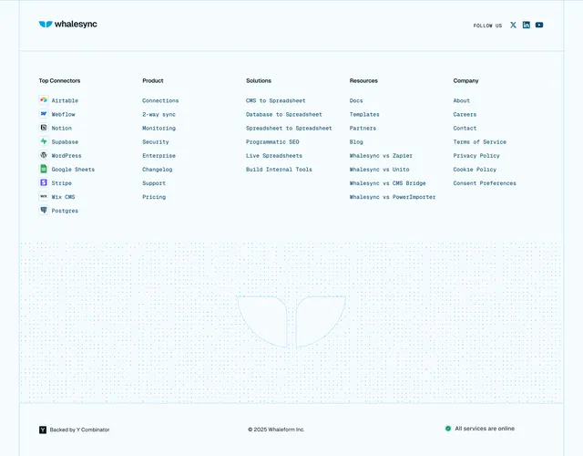
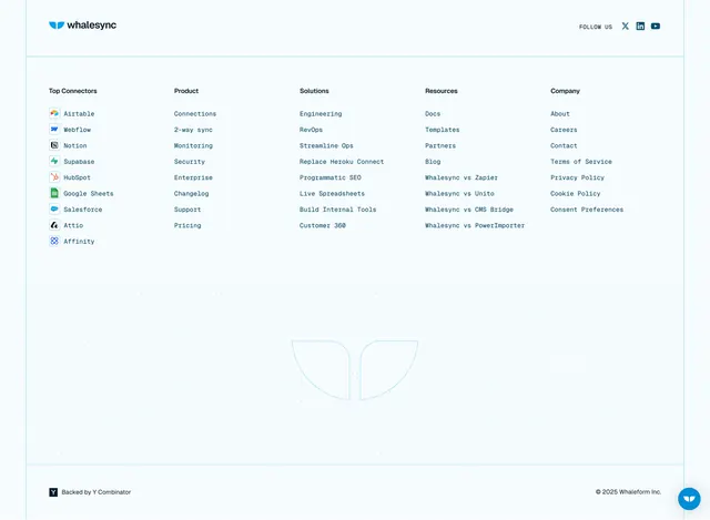
Light, airy footer with a five-column monospace-labeled link directory and a large faint outline of the whale brand mark watermarked across the lower area.
Summary
A clean white footer with a tidy five-column link directory up top and a huge faint outline of the brand whale mark watermarked behind the lower half. The defining move is the oversized outline logo used as quiet background texture rather than a solid graphic.
Visual description
White background. A top bar holds the whalesync wordmark at left and a "FOLLOW US" label with X, LinkedIn, and YouTube icons at right, above a thin rule. Below, five labeled columns of monospace-style links: Top Connectors (Airtable, Webflow, Notion, Supabase, HubSpot, Google Sheets, Salesforce, Attio, Affinity, each with a small color app icon), Product, Solutions, Resources (including several "Whalesync vs" comparison links), and Company. Centered in the lower whitespace is a large, very pale outline of the two-lobed whale-tail brand mark, used as a watermark. A bottom bar carries a small "Backed by Y Combinator" badge at left and the copyright at right; a round chat button floats in the corner.
Key takeaway
Dropping an oversized, low-opacity outline of the brand mark into the footer's empty lower area so the negative space carries identity without weight. Pairing small color app icons with monospace connector names makes an integrations-led link column instantly scannable.
Reuse notes
Good for integration or data tools with a strong, simple logo and many connector and comparison pages to list. The watermark needs ample whitespace and very low contrast so it never competes with the links. The YC badge is a nice trust cue for early-stage products.