Preview image. Unlock full-res
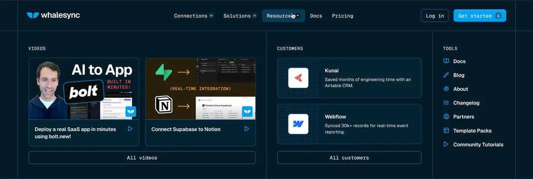
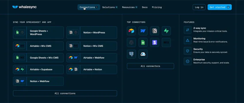
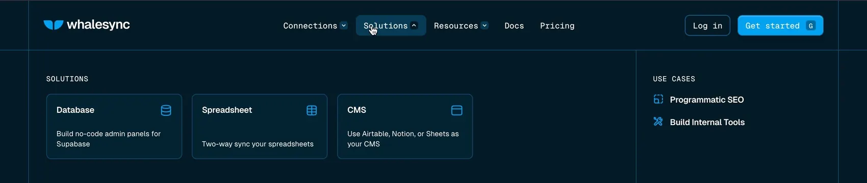
Two-column Solutions dropdown with product cards on the left and compact use-case links on the right.
Summary
Two-column Solutions dropdown with product cards on the left and compact use-case links on the right.
Visual description
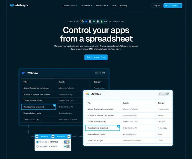
Dark navy navbar with Whalesync logo, Solutions tab active in a rounded pill with chevron, and standard Log in and Get started actions. Dropdown splits into SOLUTIONS with three bordered cards (Database, Spreadsheet, CMS) each showing a blue icon, bold title, and one-line description, and USE CASES with two icon-led links for Programmatic SEO and Build Internal Tools. Thin vertical divider between columns, all-caps spaced section headers, white text on deep navy.
Key takeaway
Card-based product categories plus a lighter use-case list in one panel lets users self-segment by product or job-to-be-done. Active nav pill with chevron makes the open state obvious without heavy animation.
Reuse notes
Ideal for multi-product SaaS with a small number of clear solution buckets. Cards need concise one-line descriptions to stay scannable. Requires dark theme and dropdown width for the two-column layout.