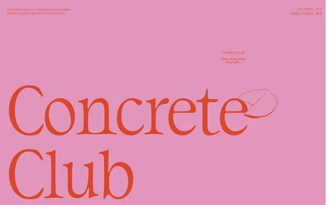
Preview image. Unlock full-res
Gallery Wall Typography
Color palette
Brand accent, prominent headings, interactive states – a vibrant statement against muted backgrounds.
Ephemeral background element; suggests a soft, temporary stage.
Primary text, borders, accents on light backgrounds.
Dark mode background, contrast element against lighter text.
Hero background, general background surfaces.
General background, text on dark surfaces.
Typography
- Weights
- 400
- Sizes
- 14px, 16px, 300px
- Line height
- 1.14, 1.19
- Letter spacing
- -0.03
- Fallback
- Georgia Pro
Display headings and primary content; its unique serifs and tight letter spacing at large sizes give the brand its distinct voice.
- Weights
- 400
- Sizes
- 26px, 48px, 112px
- Line height
- 1.15
- Fallback
- Helvetica Neue
Navigation, subtle branding elements, and large-scale, airy headlines; provides a modern counterpoint to the more classic serif.
- Weights
- 400
- Sizes
- 12px
- Line height
- 1.17
- Fallback
- Inter
Body text and small informational snippets; its neutral presence supports the more expressive display fonts.
Spacing & shape
Components
Styled as a `button` with `backgroundColor: rgba(0, 0, 0, 0)`, `color: rgb(0, 0, 0)`, `borderTopColor: rgb(0, 0, 0)`, `borderRadius: 0px`, `padding: 0px`. Uses HelveticaNeue-Light 26px for subtle presence.
TRJN DaVinci 300px, weight 400, lineHeight 1.14, letterSpacing -0.03em. Commands attention with massive scale.
TRJN DaVinci 48px, weight 400, lineHeight 1.14, letterSpacing -0.03em. Maintains the brand's serif voice at a more manageable size.
Neue Montreal 12px, weight 400, lineHeight 1.17. Provides unobtrusive body copy.
Guidelines
- Prioritize TRJN DaVinci for all headlines and brand-critical text, ensuring its unique character defines the typography.
- Use Tangerine Flash (#d9462b) sparingly as a high-impact accent, primarily for interactive elements or key brand statements.
- Maintain raw, unpadded button styles with `padding: 0px` and `borderRadius: 0px` for a minimalist, boundary-pushing feel.
- Employ Frost Canvas (#f5f6f5) or Gallery White (#ffffff) as dominant background surfaces to provide a crisp, gallery-like setting for content.
- Utilize large spacing values like `230px` for `sectionGap` to break content and create significant visual breathing room between major sections.
- Avoid using generic button styles or heavy paddings; interaction cues are minimal and baked into the content itself.
- Do not introduce additional border radii; the design relies on sharp edges (`0px`) for its distinctive aesthetic.
- Refrain from adding elevation or shadows to components; the system relies on stark color contrast and inherent typography for hierarchy.
- Do not introduce additional font families or weights beyond the defined HelveticaNeue-Light, TRJN DaVinci, and Neue Montreal.
- Avoid over-saturating the layout with Tangerine Flash (#d9462b); its impact comes from its scarcity.
About this system
ShowHide
This design system evokes a raw, almost deconstructed gallery experience, where content is paramount and design elements serve as subtle frames. The stark contrast between graphic Tangerine Flash and deep neutrals, combined with the unexpected juxtaposition of a classic serif with a minimalist sans-serif, creates a tension that is both playful and sophisticated. The heavy reliance on large, almost architectural typography and minimal component styling puts the focus entirely on the message and visual art direction, creating a distinctive aesthetic that feels both rebellious and highly curated.
The page model is full-bleed, using the entire viewport width, with content often centered but without a strict max-width container, allowing for vast negative space. The hero sections are typically monoscape, dominated by large, centered typography or a single graphic element against a solid color background. Sections often create a distinct rhythm by alternating between light (Frost Canvas) and dark (Onyx Canvas) backgrounds. Content arrangement is typically centered or uses a simple, stark block layout, with abundant `sectionGap` (230px) creating significant vertical separation. The navigation is a minimalist top-right cluster of text links, appearing as 'ghost' elements. The overall density is very spacious, emphasizing individual elements rather than dense information.
The visual language is characterized by sparse, line-art or sketch-style illustrations that are organic and slightly whimsical, appearing mostly in white on dark backgrounds or as outlines. They function as decorative accents or subtle contextual hints rather than central content. Photography is absent, replaced by abstract, graphic elements such as colored backgrounds (e.g., Rose Bloom) or playful, deconstructed textual compositions. The imagery is highly stylized, never realistic, and always serves to complement the strong typographic statements, often with a raw, unfinished quality. Icons, if present, align with the line-art aesthetic.
Reminiscent of AIGA Journal, Certain graphic design portfolios, Independent art galleries, Early 2000s experimental web design.
# Concrete Club Studio — Style Reference
> Gallery Wall Typography

**Theme:** mixed

**Site:** https://concreteclub.studio

This design system evokes a raw, almost deconstructed gallery experience, where content is paramount and design elements serve as subtle frames. The stark contrast between graphic Tangerine Flash and deep neutrals, combined with the unexpected juxtaposition of a classic serif with a minimalist sans-serif, creates a tension that is both playful and sophisticated. The heavy reliance on large, almost architectural typography and minimal component styling puts the focus entirely on the message and visual art direction, creating a distinctive aesthetic that feels both rebellious and highly curated.

## Tokens — Colors

| Name | Value | Token | Role |
|------|------|------|------|
| Tangerine Flash | `#d9462b` | `--color-tangerine-flash` | Brand accent, prominent headings, interactive states – a vibrant statement against muted backgrounds. |
| Rose Bloom | `#e296bb` | `--color-rose-bloom` | Ephemeral background element; suggests a soft, temporary stage. |
| Midnight Ink | `#000000` | `--color-midnight-ink` | Primary text, borders, accents on light backgrounds. |
| Onyx Canvas | `#212121` | `--color-onyx-canvas` | Dark mode background, contrast element against lighter text. |
| Frost Canvas | `#f5f6f5` | `--color-frost-canvas` | Hero background, general background surfaces. |
| Gallery White | `#ffffff` | `--color-gallery-white` | General background, text on dark surfaces. |

## Tokens — Typography

### TRJN DaVinci
- **Substitute:** Georgia Pro
- **Weights:** 400
- **Sizes:** 14px, 16px, 300px
- **Line height:** 1.14, 1.19
- **Letter spacing:** -0.03
- **Role:** Display headings and primary content; its unique serifs and tight letter spacing at large sizes give the brand its distinct voice.

### HelveticaNeue-Light
- **Substitute:** Helvetica Neue
- **Weights:** 400
- **Sizes:** 26px, 48px, 112px
- **Line height:** 1.15
- **Role:** Navigation, subtle branding elements, and large-scale, airy headlines; provides a modern counterpoint to the more classic serif.

### Neue Montreal
- **Substitute:** Inter
- **Weights:** 400
- **Sizes:** 12px
- **Line height:** 1.17
- **Role:** Body text and small informational snippets; its neutral presence supports the more expressive display fonts.

## Tokens — Type Scale

| Role | Size | Line height | Letter spacing |
|------|------|------|------|
| caption | 12px | 1.17 | — |
| body | 14px | 1.19 | -0.42px |
| body-lg | 16px | 1.19 | -0.48px |
| subheading | 26px | 1.15 | — |
| heading | 48px | 1.15 | — |
| heading-lg | 112px | 1.15 | — |
| display | 300px | 1.14 | -9px |

## Tokens — Spacing

- **Card padding:** 30px

## Tokens — Radius

- **elements:** 0px

## Layout

The page model is full-bleed, using the entire viewport width, with content often centered but without a strict max-width container, allowing for vast negative space. The hero sections are typically monoscape, dominated by large, centered typography or a single graphic element against a solid color background. Sections often create a distinct rhythm by alternating between light (Frost Canvas) and dark (Onyx Canvas) backgrounds. Content arrangement is typically centered or uses a simple, stark block layout, with abundant `sectionGap` (230px) creating significant vertical separation. The navigation is a minimalist top-right cluster of text links, appearing as 'ghost' elements. The overall density is very spacious, emphasizing individual elements rather than dense information.

## Imagery

The visual language is characterized by sparse, line-art or sketch-style illustrations that are organic and slightly whimsical, appearing mostly in white on dark backgrounds or as outlines. They function as decorative accents or subtle contextual hints rather than central content. Photography is absent, replaced by abstract, graphic elements such as colored backgrounds (e.g., Rose Bloom) or playful, deconstructed textual compositions. The imagery is highly stylized, never realistic, and always serves to complement the strong typographic statements, often with a raw, unfinished quality. Icons, if present, align with the line-art aesthetic.

## Components

### Hero Display Text Block

### Dark Story Section Block

### Ghost Navigation Header

### Ghost Navigation Link
*Primary navigation elements*

Styled as a `button` with `backgroundColor: rgba(0, 0, 0, 0)`, `color: rgb(0, 0, 0)`, `borderTopColor: rgb(0, 0, 0)`, `borderRadius: 0px`, `padding: 0px`. Uses HelveticaNeue-Light 26px for subtle presence.

### Hero Display Text
*Main page headline*

TRJN DaVinci 300px, weight 400, lineHeight 1.14, letterSpacing -0.03em. Commands attention with massive scale.

### Section Heading
*Secondary section titles*

TRJN DaVinci 48px, weight 400, lineHeight 1.14, letterSpacing -0.03em. Maintains the brand's serif voice at a more manageable size.

### Informational Text Block
*Contextual details and metadata*

Neue Montreal 12px, weight 400, lineHeight 1.17. Provides unobtrusive body copy.

## Guidelines

### Do

- Prioritize TRJN DaVinci for all headlines and brand-critical text, ensuring its unique character defines the typography.
- Use Tangerine Flash (#d9462b) sparingly as a high-impact accent, primarily for interactive elements or key brand statements.
- Maintain raw, unpadded button styles with `padding: 0px` and `borderRadius: 0px` for a minimalist, boundary-pushing feel.
- Employ Frost Canvas (#f5f6f5) or Gallery White (#ffffff) as dominant background surfaces to provide a crisp, gallery-like setting for content.
- Utilize large spacing values like `230px` for `sectionGap` to break content and create significant visual breathing room between major sections.

### Don't

- Avoid using generic button styles or heavy paddings; interaction cues are minimal and baked into the content itself.
- Do not introduce additional border radii; the design relies on sharp edges (`0px`) for its distinctive aesthetic.
- Refrain from adding elevation or shadows to components; the system relies on stark color contrast and inherent typography for hierarchy.
- Do not introduce additional font families or weights beyond the defined HelveticaNeue-Light, TRJN DaVinci, and Neue Montreal.
- Avoid over-saturating the layout with Tangerine Flash (#d9462b); its impact comes from its scarcity.

## Agent Prompt Guide

### Quick Color Reference
- **Text (Midnight Ink):** `#000000`
- **Background (Frost Canvas):** `#f5f6f5`
- **Accent (Tangerine Flash):** `#d9462b`
- **Dark Background (Onyx Canvas):** `#212121`
- **Ephemeral Accent (Rose Bloom):** `#e296bb`

### Example Component Prompts
1. **Create a Hero Section:** Set background to Rose Bloom (`#e296bb`). Place 'Concrete' in TRJN DaVinci 300px, weight 400, `#d9462b` color, lineHeight 1.14, letterSpacing -0.03em, centered vertically and horizontally. Add a subtle line-art illustration element to its right.
2. **Design a Navigation Block:** Position at top right. Include three text links: 'Studio', 'Contact', 'Blog'. Each link uses HelveticaNeue-Light 26px, weight 400, `#000000` color, `padding: 0px`, `borderRadius: 0px`. Separate links by a small gap (elementGap).
3. **Generate a Dark Text Section:** Set background to Onyx Canvas (`#212121`). Include a main heading 'Concrete Club' using TRJN DaVinci 48px, weight 400, `#ffffff` color, letterSpacing -0.03em. Below it, add a short descriptive paragraph 'The Concrete Club is a collaboration based creative freelance collective founded by Gaétan Pautler.' using Neue Montreal 12px, weight 400, `#ffffff` color, lineHeight 1.17.
4. **Create a Body Text Paragraph:** Use Gallery White (`#ffffff`) as background. The text should be 'Concrete club Paris, Worldwide' using Neue Montreal 12px, weight 400, `color: #000000`, lineHeight 1.17. Ensure ample `sectionGap` (230px) above and below.
More like this






Keep what you find
A free account saves references to boards and can send you a weekly email of picks based on what you save.
To see every result, go Pro.