Preview image. Unlock full-res
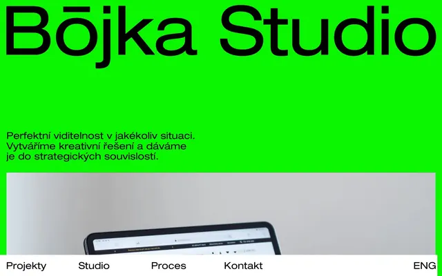
Neon Green Canvas, Bold Black Type
Color palette
Primary page background, hero section accent — establishes the brand's bold and energetic presence
Highlight text, decorative accents — a flash of warm color that draws attention without diluting the primary green/black dynamic
Primary text, headings, navigation links, card backgrounds — provides strong contrast against the Neon Green and white
Secondary text, subtle borders, supporting elements — a slightly softer black for visual relief while maintaining high contrast
Secondary page backgrounds, navigation backgrounds, occasional card backgrounds — stark contrast to Ink Black, provides breathing room
Typography
- Weights
- 400
- Sizes
- 22px, 44px, 157px
- Line height
- 1, 1.09, 2.73
- Letter spacing
- -0.0080em at 157px, 0.0090em at 22px
- Fallback
- Archivo Black
All headings and prominent display text. The singular heavy weight and tight tracking create a strong, unyielding presence.
- Weights
- 400
- Sizes
- 16px
- Line height
- 1
- Letter spacing
- normal
- Fallback
- Inter
Body copy and standard informational text. A system sans-serif for legibility in smaller contexts where custom_15364 would be too heavy.
- Weights
- 400
- Sizes
- 18px
- Line height
- 1.44
- Letter spacing
- normal
- Fallback
- Inter
Secondary body text and detailed descriptions. Provides a slightly larger size and more generous line height than -apple-system for content blocks.
Spacing & shape
Components
Features 'custom_15364' font, 157px size, weight 400, Ink Black text on a Neon Green background. Letter spacing is a tight -0.008em.
Uses 'custom_15364' font, 22px size, weight 400, Ink Black text on a Canvas White background. Letter spacing is 0.009em.
Features an Ink Black background with a 68px border-radius. Padding is 0px internally.
Features a Canvas White background with a 0px border-radius. Padding is 0px internally.
Uses 'Roboto' font, 18px size, weight 400. Text color is Dark Charcoal, with normal letter spacing and a line height of 1.44.
Guidelines
- Prioritize high contrast: Ink Black on Neon Green or Canvas White for all primary content.
- Use 'custom_15364' weight 400 for all headlines and prominent text to maintain visual impact and brand voice.
- Maintain a border-radius of 68px for large interactive elements and cards to reinforce the brand's soft, approachable edge.
- Employ Neon Green (#0af500) as a full-bleed background for key sections or the entire page to command attention.
- Keep internal component padding at 0px where possible to allow content to fill its container and maximize visual density.
- Ensure navigation links use Canvas White backgrounds with Ink Black text, differentiating them from the main content sections.
- Do not introduce subtle accent colors; stick to the core palette of Neon Green, Ink Black, Dark Charcoal, Canvas White, and Sunset Orange.
- Avoid using multiple font weights within a single text block of 'custom_15364'; it is designed for a singular, bold impact.
- Do not introduce square-edged cards or elements; border radii are intentionally large for softness.
- Avoid gradients or complex shadows; the design relies on flat, high-contrast color blocks.
- Do not use Sunset Orange (#ff4600) as a primary background or action color; it's an accent for highlights only.
- Refrain from altering the prescribed letter-spacing for 'custom_15364'; it's integral to its distinct visual impact.
About this system
ShowHide
Bōjka Studio uses a high-contrast, energetic visual language: a blindingly bright neon green dominates as the primary canvas, providing an unmissable backdrop. This vividness is grounded by uncompromisingly black, blocky typography that commands attention. Essential UI elements and navigation are stripped back to stark black and white, allowing the potent color-type dynamic to define the brand. The overall impression is direct, confident, and visually distinct.
The layout is primarily full-bleed, especially for the hero section which uses a vibrant Neon Green background spanning the entire viewport. Content is arranged in prominent, often centered blocks of text and headings, with a clear vertical rhythm. Below the hero, sections transition to a split layout where imagery appears in a contained block. Navigation is present as a minimalist, horizontally aligned list at the bottom of the viewport, staying consistent with the highly contrasted and direct visual approach.
The site's visual language for imagery is based on tightly cropped, high-resolution product photography featuring digital devices. These images are contained and serve an explanatory or showcase role rather than decorative. They appear without complex masks or overlays, maintaining sharp rectangular edges. There is a notable absence of illustrations, abstract graphics, or lifestyle photography, placing emphasis squarely on clean product presentation.
Reminiscent of Huge Inc., Anagram Studio, BASIC/DEPT®, Sagmeister & Walsh.
# Bōjka Studio — Style Reference
> Neon Green Canvas, Bold Black Type

**Theme:** light

**Site:** https://bojka.studio

Bōjka Studio uses a high-contrast, energetic visual language: a blindingly bright neon green dominates as the primary canvas, providing an unmissable backdrop. This vividness is grounded by uncompromisingly black, blocky typography that commands attention. Essential UI elements and navigation are stripped back to stark black and white, allowing the potent color-type dynamic to define the brand. The overall impression is direct, confident, and visually distinct.

## Tokens — Colors

| Name | Value | Token | Role |
|------|------|------|------|
| Neon Green | `#0af500` | `--color-neon-green` | Primary page background, hero section accent — establishes the brand's bold and energetic presence |
| Sunset Orange | `#ff4600` | `--color-sunset-orange` | Highlight text, decorative accents — a flash of warm color that draws attention without diluting the primary green/black dynamic |
| Ink Black | `#000000` | `--color-ink-black` | Primary text, headings, navigation links, card backgrounds — provides strong contrast against the Neon Green and white |
| Dark Charcoal | `#282828` | `--color-dark-charcoal` | Secondary text, subtle borders, supporting elements — a slightly softer black for visual relief while maintaining high contrast |
| Canvas White | `#ffffff` | `--color-canvas-white` | Secondary page backgrounds, navigation backgrounds, occasional card backgrounds — stark contrast to Ink Black, provides breathing room |

## Tokens — Typography

### custom_15364
- **Substitute:** Archivo Black
- **Weights:** 400
- **Sizes:** 22px, 44px, 157px
- **Line height:** 1, 1.09, 2.73
- **Letter spacing:** -0.0080em at 157px, 0.0090em at 22px
- **Role:** All headings and prominent display text. The singular heavy weight and tight tracking create a strong, unyielding presence.

### -apple-system
- **Substitute:** Inter
- **Weights:** 400
- **Sizes:** 16px
- **Line height:** 1
- **Letter spacing:** normal
- **Role:** Body copy and standard informational text. A system sans-serif for legibility in smaller contexts where custom_15364 would be too heavy.

### Roboto
- **Substitute:** Inter
- **Weights:** 400
- **Sizes:** 18px
- **Line height:** 1.44
- **Letter spacing:** normal
- **Role:** Secondary body text and detailed descriptions. Provides a slightly larger size and more generous line height than -apple-system for content blocks.

## Tokens — Type Scale

| Role | Size | Line height | Letter spacing |
|------|------|------|------|
| body-sm | 16px | 1 | — |
| body | 18px | 1.44 | — |
| subheading | 22px | 2.73 | 0.2px |
| heading | 44px | 1.09 | — |
| display | 157px | 1 | -12.5px |

## Tokens — Spacing

- **Card padding:** 0px
- **Element gap:** 16px

## Tokens — Radius

- **Default:** 20px
- **Buttons:** 68px
- **Cards:** 68px

## Layout

The layout is primarily full-bleed, especially for the hero section which uses a vibrant Neon Green background spanning the entire viewport. Content is arranged in prominent, often centered blocks of text and headings, with a clear vertical rhythm. Below the hero, sections transition to a split layout where imagery appears in a contained block. Navigation is present as a minimalist, horizontally aligned list at the bottom of the viewport, staying consistent with the highly contrasted and direct visual approach.

## Imagery

The site's visual language for imagery is based on tightly cropped, high-resolution product photography featuring digital devices. These images are contained and serve an explanatory or showcase role rather than decorative. They appear without complex masks or overlays, maintaining sharp rectangular edges. There is a notable absence of illustrations, abstract graphics, or lifestyle photography, placing emphasis squarely on clean product presentation.

## Components

### Hero Headline Block
*Primary attention-grabber on the landing page.*

Features 'custom_15364' font, 157px size, weight 400, Ink Black text on a Neon Green background. Letter spacing is a tight -0.008em.

### Navigation Link
*Interactive navigation elements in footers and headers.*

Uses 'custom_15364' font, 22px size, weight 400, Ink Black text on a Canvas White background. Letter spacing is 0.009em.

### Dark Card
*Container for content sections, often displaying project previews.*

Features an Ink Black background with a 68px border-radius. Padding is 0px internally.

### White Card
*Alternative content container, offering visual break.*

Features a Canvas White background with a 0px border-radius. Padding is 0px internally.

### Body Text Block
*Standard textual content for descriptions and paragraphs.*

Uses 'Roboto' font, 18px size, weight 400. Text color is Dark Charcoal, with normal letter spacing and a line height of 1.44.

## Guidelines

### Do

- Prioritize high contrast: Ink Black on Neon Green or Canvas White for all primary content.
- Use 'custom_15364' weight 400 for all headlines and prominent text to maintain visual impact and brand voice.
- Maintain a border-radius of 68px for large interactive elements and cards to reinforce the brand's soft, approachable edge.
- Employ Neon Green (#0af500) as a full-bleed background for key sections or the entire page to command attention.
- Keep internal component padding at 0px where possible to allow content to fill its container and maximize visual density.
- Ensure navigation links use Canvas White backgrounds with Ink Black text, differentiating them from the main content sections.

### Don't

- Do not introduce subtle accent colors; stick to the core palette of Neon Green, Ink Black, Dark Charcoal, Canvas White, and Sunset Orange.
- Avoid using multiple font weights within a single text block of 'custom_15364'; it is designed for a singular, bold impact.
- Do not introduce square-edged cards or elements; border radii are intentionally large for softness.
- Avoid gradients or complex shadows; the design relies on flat, high-contrast color blocks.
- Do not use Sunset Orange (#ff4600) as a primary background or action color; it's an accent for highlights only.
- Refrain from altering the prescribed letter-spacing for 'custom_15364'; it's integral to its distinct visual impact.

## Agent Prompt Guide

### Quick Color Reference
text: #000000
background: #0af500
border: #282828
accent: #ff4600
primary action: no distinct CTA color

### 3-5 Example Component Prompts
1. Create a hero section with a full-bleed Neon Green background (#0af500). Center a 'custom_15364' headline at 157px, weight 400, Ink Black text (#000000), letter-spacing -0.008em. Below it, add a section of 'Roboto' text at 18px, weight 400, Dark Charcoal (#282828), line height 1.44.
2. Design a navigation bar anchored to the bottom of the screen. Use a Canvas White background (#ffffff). Place navigation links using 'custom_15364' font, 22px size, weight 400, Ink Black text (#000000), letter-spacing 0.009em. Include 'Kontakt' and 'ENG' as example links.
3. Compose a content card with an Ink Black background (#000000) and a 68px border-radius. Populate it with 'custom_15364' heading text at 44px, weight 400, Canvas White text (#ffffff). Overall padding for the card should be 0px.
4. Create a highlighted text section. Use 'custom_15364' font, 44px size, weight 400, with Sunset Orange text (#ff4600) on an Ink Black background (#000000).
More like this






Keep what you find
A free account saves references to boards and can send you a weekly email of picks based on what you save.
To see every result, go Pro.