Preview image. Unlock full-res
Warm ivory software studio.
Color palette
Outlined action button borders and link text — a vibrant orange indicating interactive elements without a solid fill.
supporting accents, small interactive text snippets — a vivid green for positive or noteworthy cues, often within code examples.
Accent for specific interactive states or icons, often found in button backgrounds for 'Build' actions.
Specific button backgrounds/borders like 'View PR' — a moderate green for distinct, yet secondary actions.
Page backgrounds, card backgrounds, neutral button backgrounds — provides a soft, warm foundation.
Primary text, strong borders, navigation text — grounds the lighter surfaces with significant contrast.
Secondary text, subtle borders, icon fills — a mid-tone gray for less prominent information or structural lines.
Deepest text variant — for maximum contrast on headlines or critical information.
Hover states on neutral buttons, subtle card backgrounds — visually lighter than Canvas Parchment, indicating elevation.
Subtle card backgrounds on nested elements, faint border color — a light neutral for separation with low visual weight.
Typography
- Weights
- 400
- Sizes
- 13px, 14px, 16px, 22px, 26px, 36px, 72px
- Line height
- 1, 1.1, 1.2, 1.25, 1.3, 1.43, 1.5
- Letter spacing
- -0.45, -0.35, -0.19, -0.08, 0.08, 0.18
- Fallback
- system-ui
Primary UI text for headlines, navigation items, and larger body copy. The custom font with precise letter-spacing and stylistic alternates ("ss09", "ss08", "tnum") creates a technically sophisticated, almost code-like feel.
- Weights
- 400, 500
- Sizes
- 12px, 13px
- Line height
- 1.21, 1.43, 1.5, 1.63, 1.67
- Fallback
- monospace
Code snippets, input text, and small descriptive body copy. The monospaced nature reinforces the developer tool identity.
- Weights
- 400, 600
- Sizes
- 10px, 12px, 14px, 16px
- Line height
- 1.1, 1.27, 1.33, 1.5
- Letter spacing
- 0.06
- Fallback
- sans-serif
Secondary and utility text across various components like buttons, links, and small informational sections. Its geometric sans-serif quality adds versatility.
- Weights
- 400, 500
- Sizes
- 16px
- Line height
- 1, 1.5
EB Garamond — detected in extracted data but not described by AI
- Weights
- 400
- Sizes
- 16px
- Line height
- 1.5
-apple-system — detected in extracted data but not described by AI
Spacing & shape
Elevation
Components
Solid Inkwell (#26251e) background, Canvas Parchment (#f7f7f4) text, 4px border-radius, with 17.5px padding on all sides. Used for primary calls to action.
Transparent background, Inkwell (#26251e) text, 4px border-radius, with 2px vertical and 6px horizontal padding. Typically used for less prominent actions or text buttons within interfaces.
Transparent background, Onyx Outline (#f54e00) text and 1px border, 4px border-radius, often with 17.5px padding. Signals an important interaction without being a solid fill.
Pebble Gray (#e6e5e0) background, 10px border-radius, with a multi-layered shadow: rgba(0, 0, 0, 0.14) 0px 28px 70px 0px, rgba(0, 0, 0, 0.1) 0px 14px 32px 0px, oklab(0.263084 -0.00230259 0.0124794 / 0.1) 0px 0px 0px 1px. No explicit padding mentioned in variants, implies content defines padding.
Canvas Parchment (#f7f7f4) background, 4px border-radius, no shadow. Padding 0px vertical and 7.5px horizontal. Used for subtle content grouping without strong visual separation.
Transparent background, Muted Stone (#7a7974) border, Inkwell (#26251e) text, 0px border-radius, 8px horizontal and 6-8px vertical padding. Designed for content editing.
Transparent background with Muted Stone (#7a7974) border and text, 0px border-radius. Padding 0px on all sides, implies icon dictates clickable area not visual padding.
Pebble Gray (#e6e5e0) background, 4px border-radius, no shadow on the card itself, but the text beneath may have a shadow. Used to display partner logos or small brand mentions.
Guidelines
- Use CursorGothic for all headings and primary UI text, applying precise letter-spacing values (e.g., -0.45px at 72px, -0.08px at 22px).
- Elevate content with the multi-layered shadow token: rgba(0, 0, 0, 0.14) 0px 28px 70px 0px, rgba(0, 0, 0, 0.1) 0px 14px 32px 0px, oklab(0.263084 -0.00230259 0.0124794 / 0.1) 0px 0px 0px 1px.
- Apply Canvas Parchment (#f7f7f4) as the primary background for all major page sections and UI elements.
- Reserve Onyx Outline (#f54e00) exclusively for outlined interactive elements or prominent link text to signal primary action.
- Use 4px border-radius for most general rounded elements like cards and buttons, with 8px radius for more visually distinct components.
- Maintain a compact information density with an 8px element gap between related UI elements.
- Ensure input fields use a transparent background with Muted Stone (#7a7974) for borders, prioritizing readability of the input over strong visual containment.
- Do not use solid background colors for primary call-to-action buttons; prefer bordered actions with Onyx Outline (#f54e00).
- Avoid arbitrary shadow values; adhere strictly to the defined multi-layered shadow for all elevated cards and elements.
- Never use purely achromatic grays for primary text or borders; always use Inkwell (#26251e) or Muted Stone (#7a7974).
- Do not introduce new font families or weights beyond CursorGothic (400), Lato (400, 600), and berkeleyMono (400, 500).
- Do not use the vivid accent color Onyx Outline (#f54e00) as a background fill for any component.
- Avoid large, uncontained background images; all visuals should appear within component bounds or as subtle, textural overlays.
- Do not vary letter-spacing for standard body text or inputs; only apply the specified letter-spacing values for CursorGothic headlines.
About this system
ShowHide
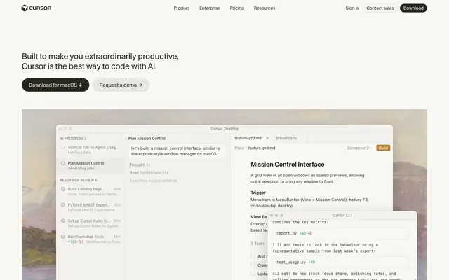
Cursor's design language evokes a functional, precise studio environment, blending the tactile feel of physical tools with the clean, digital interface of modern software. A foundation of warm, off-white backgrounds (#f7f7f4) and subtle, multi-layered shadows create a sense of depth and hierarchy, mimicking stacked, floating interface elements. Typography is highly refined, utilizing custom mono and gothic fonts with precise letter-spacing and stylistic alternates that convey technical sophistication.
The page adheres to a max-width of 1300px, creating a contained, spacious feel. The hero section is a split layout, featuring a prominent headline next to a contextual product screenshot, providing an immediate understanding of the tool. Content sections alternate between visually distinct blocks, often with a large left-aligned text column paired with right-aligned product imagery or stacked UI elements. A central element on the page is the responsive display of product screenshots, often overlapping, giving the impression of a live, multi-tasking interface on the screen. The overall rhythm is unhurried, with generous vertical spacing between sections, avoiding a dense, information-heavy presentation. Navigation is a simple top bar with distinct links and a primary download button.
The visual language for imagery is driven by product screenshots and UI examples, emphasizing the tool's functionality. These are typically contained within card-like structures, often floating with subtle shadows, and sometimes overlapping to create a dynamic, multi-windowed feel. The product screenshots themselves feature a dark UI with distinct syntax highlighting, contrasting with the light surrounding page, effectively showcasing the software environment. There is minimal photography; the focus is on UI and code. Icons are simple, monochrome, using Muted Stone (#7a7974) for fills, suggesting utility over embellishment. Density is balanced, with imagery illustrating explanations rather than dominating sections.
Reminiscent of Linear, Stripe, OpenAI, Figma.
# Cursor — Style Reference
> Warm ivory software studio.

**Theme:** light

**Site:** https://cursor.com

Cursor's design language evokes a functional, precise studio environment, blending the tactile feel of physical tools with the clean, digital interface of modern software. A foundation of warm, off-white backgrounds (#f7f7f4) and subtle, multi-layered shadows create a sense of depth and hierarchy, mimicking stacked, floating interface elements. Typography is highly refined, utilizing custom mono and gothic fonts with precise letter-spacing and stylistic alternates that convey technical sophistication.

## Tokens — Colors

| Name | Value | Token | Role |
|------|------|------|------|
| Onyx Outline | `#f54e00` | `--color-onyx-outline` | Outlined action button borders and link text — a vibrant orange indicating interactive elements without a solid fill. |
| Chartreuse Alert | `#4ade80` | `--color-chartreuse-alert` | supporting accents, small interactive text snippets — a vivid green for positive or noteworthy cues, often within code examples. |
| Goldenrod Accent | `#c08532` | `--color-goldenrod-accent` | Accent for specific interactive states or icons, often found in button backgrounds for 'Build' actions. |
| Forest Green Action | `#34785c` | `--color-forest-green-action` | Specific button backgrounds/borders like 'View PR' — a moderate green for distinct, yet secondary actions. |
| Canvas Parchment | `#f7f7f4` | `--color-canvas-parchment` | Page backgrounds, card backgrounds, neutral button backgrounds — provides a soft, warm foundation. |
| Inkwell | `#262510` | `--color-inkwell` | Primary text, strong borders, navigation text — grounds the lighter surfaces with significant contrast. |
| Muted Stone | `#7a7974` | `--color-muted-stone` | Secondary text, subtle borders, icon fills — a mid-tone gray for less prominent information or structural lines. |
| Deep Shadow | `#141414` | `--color-deep-shadow` | Deepest text variant — for maximum contrast on headlines or critical information. |
| Pebble Gray | `#e6e5e0` | `--color-pebble-gray` | Hover states on neutral buttons, subtle card backgrounds — visually lighter than Canvas Parchment, indicating elevation. |
| Highlight Beige | `#cdcdc9` | `--color-highlight-beige` | Subtle card backgrounds on nested elements, faint border color — a light neutral for separation with low visual weight. |

## Tokens — Typography

### CursorGothic
- **Substitute:** system-ui
- **Weights:** 400
- **Sizes:** 13px, 14px, 16px, 22px, 26px, 36px, 72px
- **Line height:** 1, 1.1, 1.2, 1.25, 1.3, 1.43, 1.5
- **Letter spacing:** -0.45, -0.35, -0.19, -0.08, 0.08, 0.18
- **Role:** Primary UI text for headlines, navigation items, and larger body copy. The custom font with precise letter-spacing and stylistic alternates ("ss09", "ss08", "tnum") creates a technically sophisticated, almost code-like feel.

### berkeleyMono
- **Substitute:** monospace
- **Weights:** 400, 500
- **Sizes:** 12px, 13px
- **Line height:** 1.21, 1.43, 1.5, 1.63, 1.67
- **Role:** Code snippets, input text, and small descriptive body copy. The monospaced nature reinforces the developer tool identity.

### Lato
- **Substitute:** sans-serif
- **Weights:** 400, 600
- **Sizes:** 10px, 12px, 14px, 16px
- **Line height:** 1.1, 1.27, 1.33, 1.5
- **Letter spacing:** 0.06
- **Role:** Secondary and utility text across various components like buttons, links, and small informational sections. Its geometric sans-serif quality adds versatility.

### EB Garamond
- **Weights:** 400, 500
- **Sizes:** 16px
- **Line height:** 1, 1.5
- **Role:** EB Garamond — detected in extracted data but not described by AI

### -apple-system
- **Weights:** 400
- **Sizes:** 16px
- **Line height:** 1.5
- **Role:** -apple-system — detected in extracted data but not described by AI

## Tokens — Type Scale

Perfect Fifth (1.5) from 10px base.

| Role | Size | Line height | Letter spacing |
|------|------|------|------|
| caption | 10px | 1.1 | 0.06em |
| body-lg | 14px | 1.43 | 0.08em |
| heading-sm | 22px | 1.25 | -0.08em |
| heading | 26px | 1.2 | -0.35px |
| heading-lg | 36px | 1.1 | -0.45px |
| display | 72px | 1 | -2.16px |

## Tokens — Spacing

- **Max width:** 1300px
- **Section gap:** 43px
- **Card padding:** 12px
- **Element gap:** 8px

## Tokens — Radius

- **General:** 4px
- **Buttons:** 4px
- **Cards:** 4px
- **prominent:** 8px

## Tokens — Elevation

- **Elevated Content Card:** `rgba(0, 0, 0, 0.14) 0px 28px 70px 0px, rgba(0, 0, 0, 0.1) 0px 14px 32px 0px, oklab(0.263084 -0.00230259 0.0124794 / 0.1) 0px 0px 0px 1px`

## Layout

The page adheres to a max-width of 1300px, creating a contained, spacious feel. The hero section is a split layout, featuring a prominent headline next to a contextual product screenshot, providing an immediate understanding of the tool. Content sections alternate between visually distinct blocks, often with a large left-aligned text column paired with right-aligned product imagery or stacked UI elements. A central element on the page is the responsive display of product screenshots, often overlapping, giving the impression of a live, multi-tasking interface on the screen. The overall rhythm is unhurried, with generous vertical spacing between sections, avoiding a dense, information-heavy presentation. Navigation is a simple top bar with distinct links and a primary download button.

## Imagery

The visual language for imagery is driven by product screenshots and UI examples, emphasizing the tool's functionality. These are typically contained within card-like structures, often floating with subtle shadows, and sometimes overlapping to create a dynamic, multi-windowed feel. The product screenshots themselves feature a dark UI with distinct syntax highlighting, contrasting with the light surrounding page, effectively showcasing the software environment. There is minimal photography; the focus is on UI and code. Icons are simple, monochrome, using Muted Stone (#7a7974) for fills, suggesting utility over embellishment. Density is balanced, with imagery illustrating explanations rather than dominating sections.

## Components

### CTA Button Group

### Trusted By — Brand Grid

### Cursor Agent Activity Card

### Primary Filled Button
*Interactive element*

Solid Inkwell (#26251e) background, Canvas Parchment (#f7f7f4) text, 4px border-radius, with 17.5px padding on all sides. Used for primary calls to action.

### Ghost Action Button
*Interactive element*

Transparent background, Inkwell (#26251e) text, 4px border-radius, with 2px vertical and 6px horizontal padding. Typically used for less prominent actions or text buttons within interfaces.

### Outlined Accent Button
*Interactive element*

Transparent background, Onyx Outline (#f54e00) text and 1px border, 4px border-radius, often with 17.5px padding. Signals an important interaction without being a solid fill.

### Elevated Content Card
*Content container*

Pebble Gray (#e6e5e0) background, 10px border-radius, with a multi-layered shadow: rgba(0, 0, 0, 0.14) 0px 28px 70px 0px, rgba(0, 0, 0, 0.1) 0px 14px 32px 0px, oklab(0.263084 -0.00230259 0.0124794 / 0.1) 0px 0px 0px 1px. No explicit padding mentioned in variants, implies content defines padding.

### Flat Background Card
*Content container*

Canvas Parchment (#f7f7f4) background, 4px border-radius, no shadow. Padding 0px vertical and 7.5px horizontal. Used for subtle content grouping without strong visual separation.

### Text Input Field
*Form element*

Transparent background, Muted Stone (#7a7974) border, Inkwell (#26251e) text, 0px border-radius, 8px horizontal and 6-8px vertical padding. Designed for content editing.

### Icon Button
*Interactive element*

Transparent background with Muted Stone (#7a7974) border and text, 0px border-radius. Padding 0px on all sides, implies icon dictates clickable area not visual padding.

### Branding Card
*Informational display*

Pebble Gray (#e6e5e0) background, 4px border-radius, no shadow on the card itself, but the text beneath may have a shadow. Used to display partner logos or small brand mentions.

## Guidelines

### Do

- Use CursorGothic for all headings and primary UI text, applying precise letter-spacing values (e.g., -0.45px at 72px, -0.08px at 22px).
- Elevate content with the multi-layered shadow token: rgba(0, 0, 0, 0.14) 0px 28px 70px 0px, rgba(0, 0, 0, 0.1) 0px 14px 32px 0px, oklab(0.263084 -0.00230259 0.0124794 / 0.1) 0px 0px 0px 1px.
- Apply Canvas Parchment (#f7f7f4) as the primary background for all major page sections and UI elements.
- Reserve Onyx Outline (#f54e00) exclusively for outlined interactive elements or prominent link text to signal primary action.
- Use 4px border-radius for most general rounded elements like cards and buttons, with 8px radius for more visually distinct components.
- Maintain a compact information density with an 8px element gap between related UI elements.
- Ensure input fields use a transparent background with Muted Stone (#7a7974) for borders, prioritizing readability of the input over strong visual containment.

### Don't

- Do not use solid background colors for primary call-to-action buttons; prefer bordered actions with Onyx Outline (#f54e00).
- Avoid arbitrary shadow values; adhere strictly to the defined multi-layered shadow for all elevated cards and elements.
- Never use purely achromatic grays for primary text or borders; always use Inkwell (#26251e) or Muted Stone (#7a7974).
- Do not introduce new font families or weights beyond CursorGothic (400), Lato (400, 600), and berkeleyMono (400, 500).
- Do not use the vivid accent color Onyx Outline (#f54e00) as a background fill for any component.
- Avoid large, uncontained background images; all visuals should appear within component bounds or as subtle, textural overlays.
- Do not vary letter-spacing for standard body text or inputs; only apply the specified letter-spacing values for CursorGothic headlines.
More like this





Keep what you find
A free account saves references to boards and can send you a weekly email of picks based on what you save.
To see every result, go Pro.