Preview image. Unlock full-res
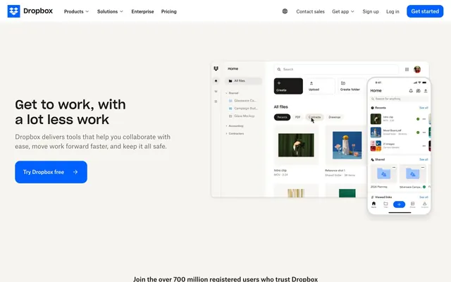
Pristine Digital Workspace. A highly organized, clean desktop environment where every element has its place and purpose.
Color palette
Primary Call-to-Action buttons, active navigation states, and interactive link elements — for consistent user guidance.
Decorative accents or emphasis in specific UI contexts, often for highlighting information or badges.
Primary heading and body text, button text on light backgrounds, strong accents.
Default page backgrounds, primary surface for content areas like hero sections.
Secondary background color for subtle content separation, cards, and modal backdrops.
Main body text, navigation links, and button text on light-colored buttons — provides high contrast.
Secondary body text, descriptive labels, and subtle UI elements like borders or inactive icons.
Subtle surface elevation for cards or distinct content blocks, offering a soft visual break from the canvas.
Light border color for subtle separation of UI elements and form fields.
Background for specific sections or elements requiring a dark, immersive feel, often in subtle gradients.
Typography
- Weights
- 500
- Sizes
- 18px, 26px, 40px
- Line height
- 1.2, 1.3
- Letter spacing
- normal
- Fallback
- Montserrat
Main headings and significant display text. Weight 500 maintains a robust yet approachable presence.
- Weights
- 400
- Sizes
- 32px
- Line height
- 1.2
- Letter spacing
- normal
- Fallback
- Montserrat
Prominent subheadings, slightly lighter than main headings to create hierarchy and readability.
- Weights
- 400, 500, 700
- Sizes
- 12px, 14px, 16px, 20px
- Line height
- 1.2, 1.43, 1.5, 1.57
- Letter spacing
- normal
- Fallback
- Inter
Used for body text, navigation items, links, and various UI elements, providing clear, functional readability across different scales.
- Weights
- 400
- Sizes
- 16px
- Line height
- 1.2
- Letter spacing
- normal
- Fallback
- serif
System fallback for specific content or to provide a contrasting, traditional serif voice on occasion.
- Weights
- 400
- Sizes
- 13px
- Line height
- 1.2
- Letter spacing
- normal
- Fallback
- sans-serif
System fallback for minor labels or tooltips when default sans-serif is required.
Spacing & shape
Components
Filled with Royal Blue (#0061fe) and Cloud White (#f7f5f2) text. Features 16px border-radius and generous padding (24px horizontal, 24px vertical) for a prominent, friendly presence.
Transparent background (rgba(0, 0, 0, 0)) with Deep Graphite (#1e1919) text. No explicit border-radius (0px), offering a sharp, integrated feel in navigation contexts. Padding is 12px horizontal, 16px vertical.
Transparent background (rgba(0, 0, 0, 0)) with Cloud White (#f7f5f2) text. No explicit border-radius (0px) and no padding, designed for inline text links that maintain hover effect.
Subtle Almond Dust (#eee9e2) background with no shadows. Features a 0px border-radius, maintaining a sharp, clean edge for distinct content differentiation. Zero internal padding is specified from component variant data, implying content controls its own internal spacing.
Transparent background, no border-radius. Padding is 114.5px left and right, implying a container with substantial inline cushioning for its text content.
Deep Graphite (#1e1919) text on transparent background, no radius. The 16px padding on text-based links creates ample clickable area, often accompanied by an arrow icon.
Guidelines
- Prioritize Royal Blue (#0061fe) for all primary call-to-action buttons, ensuring consistent visual hierarchy.
- Use Deep Graphite (#1e1919) for all primary body text and main navigation links against light backgrounds.
- Establish clear content separation using Off-White Canvas (#f7f5f2) for backgrounds and Almond Dust (#eee9e2) for elevated card surfaces.
- Apply 16px border-radius to all interactive buttons for a soft, approachable feel, unless explicitly overridden by component design.
- Maintain a sense of generous whitespace; ensure a minimum of 48px vertical spacing between major sections.
- Utilize Sharp Grotesk (Montserrat substitute) for all headlines to convey a clear, robust brand voice.
- For multi-column layouts, ensure column gaps are set to at least 24px to prevent visual crowding.
- Avoid using highly saturated accent colors for text unless they are interactive links in Royal Blue.
- Do not introduce strong shadows; the design relies on subtle background color shifts for depth.
- Refrain from using overly decorative fonts; stick to Atlas Grotesk Web (Inter substitute) for all body copy and UI elements.
- Do not use border-radius values less than 8px, as the system prefers slightly rounded corners for most interaction points.
- Avoid overly dense information blocks; use generous paragraph line-heights (e.g., 1.5 for 16px text) and element spacing.
- Do not use stark black (#000000) for regular body text; reserve it for distinct headings or strong accents only.
- Do not use full-width layouts; constrain all content within a maximum width of 1150px.
About this system
ShowHide
Dropbox's visual style is that of a confident, established tech product: a pristine, spacious digital workspace with pops of vibrant interaction. Dominant bright surfaces and substantial, clear typography create an atmosphere of straightforward efficiency and trustworthiness. The strategic use of a vivid royal blue for primary calls to action, contrasted with deep graphite text and subtle, almost invisible backgrounds, maintains a focused and uncluttered user experience.
The visual language for imagery is a mix of product screenshots (often within high-fidelity mockups of devices), abstract conceptual illustrations, and tightly cropped, professional photography. Photography tends to be lifestyle-oriented but focused on work environments, with natural light and a slightly desaturated, clean aesthetic. Illustrations are minimalistic, often using geometric shapes and a limited palette of brand colors. Icons are outlined (often using Graphite Black or Muted Grey), with a consistent stroke weight, and monochrome. Imagery serves both to explain product features (screenshots) and to provide aspirational context (photography of people working), maintaining a balance between functional and atmospheric content. Images are typically contained within cards or sections, not often full-bleed.
Reminiscent of Airtable, Webflow, Notion, Google Workspace.
# Dropbox.com — Style Reference
> Pristine Digital Workspace. A highly organized, clean desktop environment where every element has its place and purpose.

**Theme:** light

**Site:** https://dropbox.com

Dropbox's visual style is that of a confident, established tech product: a pristine, spacious digital workspace with pops of vibrant interaction. Dominant bright surfaces and substantial, clear typography create an atmosphere of straightforward efficiency and trustworthiness. The strategic use of a vivid royal blue for primary calls to action, contrasted with deep graphite text and subtle, almost invisible backgrounds, maintains a focused and uncluttered user experience.

## Tokens — Colors

| Name | Value | Token | Role |
|------|------|------|------|
| Royal Blue | `#0061fe` | `--color-royal-blue` | Primary Call-to-Action buttons, active navigation states, and interactive link elements — for consistent user guidance. |
| Blush Pink | `#cd2f7b` | `--color-blush-pink` | Decorative accents or emphasis in specific UI contexts, often for highlighting information or badges. |
| Graphite Black | `#000000` | `--color-graphite-black` | Primary heading and body text, button text on light backgrounds, strong accents. |
| Cloud White | `#ffffff` | `--color-cloud-white` | Default page backgrounds, primary surface for content areas like hero sections. |
| Off-White Canvas | `#f7f5f2` | `--color-off-white-canvas` | Secondary background color for subtle content separation, cards, and modal backdrops. |
| Deep Graphite | `#1e1919` | `--color-deep-graphite` | Main body text, navigation links, and button text on light-colored buttons — provides high contrast. |
| Muted Grey | `#716b61` | `--color-muted-grey` | Secondary body text, descriptive labels, and subtle UI elements like borders or inactive icons. |
| Almond Dust | `#eee9e2` | `--color-almond-dust` | Subtle surface elevation for cards or distinct content blocks, offering a soft visual break from the canvas. |
| Ash Border | `#c6c4c3` | `--color-ash-border` | Light border color for subtle separation of UI elements and form fields. |
| Dark Overlay Gradient | `#292c31` | `--color-dark-overlay-gradient` | Background for specific sections or elements requiring a dark, immersive feel, often in subtle gradients. |

## Tokens — Typography

### Sharp Grotesk
- **Substitute:** Montserrat
- **Weights:** 500
- **Sizes:** 18px, 26px, 40px
- **Line height:** 1.2, 1.3
- **Letter spacing:** normal
- **Role:** Main headings and significant display text. Weight 500 maintains a robust yet approachable presence.

### Sharp Grotesk 23
- **Substitute:** Montserrat
- **Weights:** 400
- **Sizes:** 32px
- **Line height:** 1.2
- **Letter spacing:** normal
- **Role:** Prominent subheadings, slightly lighter than main headings to create hierarchy and readability.

### Atlas Grotesk Web
- **Substitute:** Inter
- **Weights:** 400, 500, 700
- **Sizes:** 12px, 14px, 16px, 20px
- **Line height:** 1.2, 1.43, 1.5, 1.57
- **Letter spacing:** normal
- **Role:** Used for body text, navigation items, links, and various UI elements, providing clear, functional readability across different scales.

### Times
- **Substitute:** serif
- **Weights:** 400
- **Sizes:** 16px
- **Line height:** 1.2
- **Letter spacing:** normal
- **Role:** System fallback for specific content or to provide a contrasting, traditional serif voice on occasion.

### Arial
- **Substitute:** sans-serif
- **Weights:** 400
- **Sizes:** 13px
- **Line height:** 1.2
- **Letter spacing:** normal
- **Role:** System fallback for minor labels or tooltips when default sans-serif is required.

## Tokens — Type Scale

Minor Third (1.2) from 14px base.

| Role | Size | Line height | Letter spacing |
|------|------|------|------|
| caption | 12px | 1.2 | — |
| body | 14px | 1.43 | — |
| body-lg | 16px | 1.5 | — |
| subheading | 18px | 1.2 | — |
| heading-sm | 20px | 1.2 | — |
| heading | 26px | 1.3 | — |
| heading-lg | 32px | 1.2 | — |
| display | 40px | 1.2 | — |

## Tokens — Spacing

- **Max width:** 1150px
- **Section gap:** 48px
- **Card padding:** 12px
- **Element gap:** 12px

## Tokens — Radius

- **Default:** 8px
- **Buttons:** 16px
- **large:** 20px
- **links:** 16px
- **navigation:** 12px

## Imagery

The visual language for imagery is a mix of product screenshots (often within high-fidelity mockups of devices), abstract conceptual illustrations, and tightly cropped, professional photography. Photography tends to be lifestyle-oriented but focused on work environments, with natural light and a slightly desaturated, clean aesthetic. Illustrations are minimalistic, often using geometric shapes and a limited palette of brand colors. Icons are outlined (often using Graphite Black or Muted Grey), with a consistent stroke weight, and monochrome. Imagery serves both to explain product features (screenshots) and to provide aspirational context (photography of people working), maintaining a balance between functional and atmospheric content. Images are typically contained within cards or sections, not often full-bleed.

## Components

### Primary CTA Button
*Calls to action, 'Get started' type buttons*

Filled with Royal Blue (#0061fe) and Cloud White (#f7f5f2) text. Features 16px border-radius and generous padding (24px horizontal, 24px vertical) for a prominent, friendly presence.

### Navigation Link Button
*Top navigation items, secondary actions*

Transparent background (rgba(0, 0, 0, 0)) with Deep Graphite (#1e1919) text. No explicit border-radius (0px), offering a sharp, integrated feel in navigation contexts. Padding is 12px horizontal, 16px vertical.

### Dark Navigation Link Button
*Navigation items for dark mode or contrasting sections*

Transparent background (rgba(0, 0, 0, 0)) with Cloud White (#f7f5f2) text. No explicit border-radius (0px) and no padding, designed for inline text links that maintain hover effect.

### Informational Card
*Feature blocks, content organization*

Subtle Almond Dust (#eee9e2) background with no shadows. Features a 0px border-radius, maintaining a sharp, clean edge for distinct content differentiation. Zero internal padding is specified from component variant data, implying content controls its own internal spacing.

### Lightweight Text Link Card
*Content container for simple text lists or outlines*

Transparent background, no border-radius. Padding is 114.5px left and right, implying a container with substantial inline cushioning for its text content.

### Text Link with Arrow
*'Learn more' or 'Read article' links*

Deep Graphite (#1e1919) text on transparent background, no radius. The 16px padding on text-based links creates ample clickable area, often accompanied by an arrow icon.

## Guidelines

### Do

- Prioritize Royal Blue (#0061fe) for all primary call-to-action buttons, ensuring consistent visual hierarchy.
- Use Deep Graphite (#1e1919) for all primary body text and main navigation links against light backgrounds.
- Establish clear content separation using Off-White Canvas (#f7f5f2) for backgrounds and Almond Dust (#eee9e2) for elevated card surfaces.
- Apply 16px border-radius to all interactive buttons for a soft, approachable feel, unless explicitly overridden by component design.
- Maintain a sense of generous whitespace; ensure a minimum of 48px vertical spacing between major sections.
- Utilize Sharp Grotesk (Montserrat substitute) for all headlines to convey a clear, robust brand voice.
- For multi-column layouts, ensure column gaps are set to at least 24px to prevent visual crowding.

### Don't

- Avoid using highly saturated accent colors for text unless they are interactive links in Royal Blue.
- Do not introduce strong shadows; the design relies on subtle background color shifts for depth.
- Refrain from using overly decorative fonts; stick to Atlas Grotesk Web (Inter substitute) for all body copy and UI elements.
- Do not use border-radius values less than 8px, as the system prefers slightly rounded corners for most interaction points.
- Avoid overly dense information blocks; use generous paragraph line-heights (e.g., 1.5 for 16px text) and element spacing.
- Do not use stark black (#000000) for regular body text; reserve it for distinct headings or strong accents only.
- Do not use full-width layouts; constrain all content within a maximum width of 1150px.

## Agent Prompt Guide

Quick Color Reference: Text (#1e1919), Background (#ffffff), Primary CTA (#0061fe), Secondary Surface (#f7f5f2), Border (#c6c4c3).

1. Create a Hero Section: Cloud White (#ffffff) background. Headline 'Get to work, with a lot less work' at 40px Sharp Grotesk 500, Graphite Black (#000000). Body text 'Dropbox delivers tools...' at 16px Atlas Grotesk Web 400, Deep Graphite (#1e1919). Primary CTA Button 'Try Dropbox free' (Royal Blue #0061fe, Cloud White #f7f5f2 text, 16px radius, 24px padding), next to the text content.
2. Design a Feature Card: Almond Dust (#eee9e2) background, 0px border-radius. Title 'Technology' at 20px Atlas Grotesk Web 500, Deep Graphite (#1e1919). Body text at 14px Atlas Grotesk Web 400, Muted Grey (#716b61). Include a 'Learn more' Text Link with Arrow (Deep Graphite #1e1919 text, 16px padding).
3. Build a Navigation Bar: Cloud White (#ffffff) background. 'Dropbox' logo on the left. Navigation Link Buttons (transparent, Deep Graphite #1e1919 text, 12px horizontal, 16px vertical padding, 0px radius) for 'Products', 'Solutions', 'Enterprise', 'Pricing'. On the far right, a Royal Blue (#0061fe) Primary CTA Button for 'Get started'.

## Layout

The page primarily uses a max-width, centered containment model (approx. 1150px) for most content sections, ensuring readability across various screen sizes. The hero section often features a split layout with prominent text on the left and product screenshots or illustrations on the right. Content sections generally follow a consistent vertical rhythm with 48px section gaps. Many sections utilize a 2-column or 3-column grid for features and cards. The page frequently alternates between Cloud White (#ffffff) and Off-White Canvas (#f7f5f2) background bands to create visual rhythm and delineate distinct content blocks. The navigation is a sticky top bar, maintaining brand presence throughout scrolling.
More like this








Keep what you find
A free account saves references to boards and can send you a weekly email of picks based on what you save.
To see every result, go Pro.