Preview image. Unlock full-res
Architectural Blueprint on White
Color palette
Violet outline accent for tags, dividers, and focused UI edges. Do not promote it to the primary CTA color
Page backgrounds, card surfaces, ghost button text (hero), navigation background
Primary text across titles, body, and major UI elements, high-contrast borders
Secondary text, muted headings, subtle borders, navigation text for inactive states
Subtle background for alternating sections or elevated surfaces
Background for subtle, interactive elements and secondary buttons
Typography
- Weights
- 400, 500, 700
- Sizes
- 14px, 16px, 20px, 24px, 32px, 48px, 64px, 80px, 112px
- Line height
- 1, 1.3
- Letter spacing
- -0.03
- Fallback
- Inter
The primary typeface for all text content, from headings to body text and UI labels. Its broad range of weights and tight letter-spacing (-0.03em across all sizes) are key to its compact, authoritative feel, especially for larger headlines. Weight 700 is reserved for dominant messaging, while 400 and 500 maintain legibility in body and UI contexts.
Spacing & shape
Components
backgroundColor: rgba(0,0,0,0), color: #ffffff, border: none, padding: 12px 12px, border-radius: 0px. Used in dark hero sections.
backgroundColor: #ececec, color: #000000, border: none, border-radius: 1440px, padding: varies (minimal, often 0px in observed data but typically 12px vertical/24px horizontal for text). This is a 'pill' shape.
backgroundColor: #1e37a0, color: #ffffff, border: none, border-radius: 8px (inferred from general UI radius, not button-specific), padding: 12px 24px (example sizes).
backgroundColor: rgba(0,0,0,0) or #ffffff (depending on section), border: none (implied by shadow=none), border-radius: 0px. Internal padding is elementGap/cardPadding of 16px.
color: #000000 (active) or #6a6a6a (inactive), padding: 12px vertical, 24px horizontal, border-radius: 8px (for dropdowns/active states). Font: Lunar 16px, weight 400.
Guidelines
- Prioritize a white (#ffffff) or light ash (#f1efe9) background for main content areas.
- Use Midnight Ink (#000000) for all primary body text and significant headings.
- Apply Command Violet (#1e37a0) exclusively for primary interactive elements, brand accents, and decorative borders on textual elements.
- Maintain tight letter-spacing (-0.03em) across all Lunar typography to ensure a compact and serious tone.
- Implement the large 1440px border-radius for 'pill' shaped buttons and a consistent 8px radius for container-like elements such as links and potentially filled buttons.
- Ensure generous vertical spacing between sections, adhering to a 48px section gap, allowing content to breathe.
- Use Storm Gray (#6a6a6a) for all secondary, supporting text and subtle UI borders.
- Avoid using highly saturated colors other than Command Violet (#1e37a0) in the primary UI.
- Do not introduce heavy shadows or gradients, as the system relies on flat surfaces and high contrast.
- Do not deviate from the strict letter-spacing values; even slight changes will undermine the typographic identity.
- Avoid using multiple border styles or thicknesses, sticking to minimal or no borders for most elements except for specific accents.
- Do not use small, playful, or highly decorative typography; maintain the serious and professional character of Lunar.
- Avoid dense UIs; prioritize clear information hierarchy with ample negative space.
- Do not apply a border-radius of 0px to interactive surface-level buttons or links except for specific 'ghost' button variants.
About this system
ShowHide
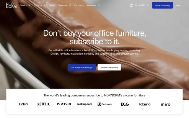
Nornorm presents a stark, almost architectural aesthetic: clean white surfaces and deep, commanding dark typography with a single, highly saturated violet acting as a functional highlight for interactive elements and brand accents. The design emphasizes content clarity and a sense of gravity, achieved through generous negative space and a reserved use of color. Component styles are minimal, often borderless or using subtle outlines, allowing the strong typographic voice and the violet accent to direct focus.
The page generally follows a max-width contained model, ensuring content is centered and readable, although the hero section appears full-bleed. The hero pattern consists of a large, commanding centered headline overlaid on a rich, textural image, accompanied by ghost and subtle gray buttons. Section rhythm is primarily defined by alternating subtle background colors (white and light ash) and consistent vertical spacing (48px section gap), creating distinct content blocks. Content arrangement frequently uses 2-column or 4-column grids for feature lists and imagery, with a strong preference for centered text stacks for main headings and descriptive paragraphs. A sticky header provides persistent navigation.
The visual language predominantly features high-key, product-focused photography and abstract 3D renders with a monochromatic or desaturated color palette, often featuring clean lines and precise arrangements. Photography focuses on office environments and furniture, presented in a minimalist, often uncropped or full-bleed manner. Illustrations appear as flat, geometric, and monochromatic representations of concepts, primarily used for explanatory purposes within content cards. Icons are subtle, leveraging the primary text color, typically outlined. Imagery serves to showcase products and explain concepts, maintaining a clean and professional aesthetic with a medium density, allowing UI elements and text to dominate.
Reminiscent of Figma, Linear, Stripe, Vercel.
# Nornorm — Style Reference
> Architectural Blueprint on White

**Theme:** light

**Site:** https://nornorm.com

Nornorm presents a stark, almost architectural aesthetic: clean white surfaces and deep, commanding dark typography with a single, highly saturated violet acting as a functional highlight for interactive elements and brand accents. The design emphasizes content clarity and a sense of gravity, achieved through generous negative space and a reserved use of color. Component styles are minimal, often borderless or using subtle outlines, allowing the strong typographic voice and the violet accent to direct focus.

## Tokens — Colors

| Name | Value | Token | Role |
|------|------|------|------|
| Command Violet | `#1e37a0` | `--color-command-violet` | Violet outline accent for tags, dividers, and focused UI edges. Do not promote it to the primary CTA color |
| Canvas White | `#ffffff` | `--color-canvas-white` | Page backgrounds, card surfaces, ghost button text (hero), navigation background |
| Midnight Ink | `#000000` | `--color-midnight-ink` | Primary text across titles, body, and major UI elements, high-contrast borders |
| Storm Gray | `#6a6a6a` | `--color-storm-gray` | Secondary text, muted headings, subtle borders, navigation text for inactive states |
| Light Ash | `#f1efe9` | `--color-light-ash` | Subtle background for alternating sections or elevated surfaces |
| Frost | `#ececec` | `--color-frost` | Background for subtle, interactive elements and secondary buttons |

## Tokens — Typography

### Lunar
- **Substitute:** Inter
- **Weights:** 400, 500, 700
- **Sizes:** 14px, 16px, 20px, 24px, 32px, 48px, 64px, 80px, 112px
- **Line height:** 1, 1.3
- **Letter spacing:** -0.03
- **Role:** The primary typeface for all text content, from headings to body text and UI labels. Its broad range of weights and tight letter-spacing (-0.03em across all sizes) are key to its compact, authoritative feel, especially for larger headlines. Weight 700 is reserved for dominant messaging, while 400 and 500 maintain legibility in body and UI contexts.

## Tokens — Type Scale

| Role | Size | Line height | Letter spacing |
|------|------|------|------|
| caption | 14px | 1.3 | -0.03em |
| body | 16px | 1.3 | -0.03em |
| subheading | 20px | 1.3 | -0.03em |
| heading-sm | 24px | 1.3 | -0.03em |
| heading | 32px | 1.3 | -0.03em |
| heading-lg | 48px | 1 | -0.03em |
| display | 64px | 1 | -0.03em |

## Tokens — Spacing

- **Section gap:** 48px
- **Card padding:** 16px
- **Element gap:** 16px

## Tokens — Radius

- **Buttons:** 1440px
- **links:** 8px
- **navigation:** 8px
- **others:** 8px

## Layout

The page generally follows a max-width contained model, ensuring content is centered and readable, although the hero section appears full-bleed. The hero pattern consists of a large, commanding centered headline overlaid on a rich, textural image, accompanied by ghost and subtle gray buttons. Section rhythm is primarily defined by alternating subtle background colors (white and light ash) and consistent vertical spacing (48px section gap), creating distinct content blocks. Content arrangement frequently uses 2-column or 4-column grids for feature lists and imagery, with a strong preference for centered text stacks for main headings and descriptive paragraphs. A sticky header provides persistent navigation.

## Imagery

The visual language predominantly features high-key, product-focused photography and abstract 3D renders with a monochromatic or desaturated color palette, often featuring clean lines and precise arrangements. Photography focuses on office environments and furniture, presented in a minimalist, often uncropped or full-bleed manner. Illustrations appear as flat, geometric, and monochromatic representations of concepts, primarily used for explanatory purposes within content cards. Icons are subtle, leveraging the primary text color, typically outlined. Imagery serves to showcase products and explain concepts, maintaining a clean and professional aesthetic with a medium density, allowing UI elements and text to dominate.

## Components

### Ghost Navigation Button
*Primary navigation links and interactive textual buttons that blend into the background.*

backgroundColor: rgba(0,0,0,0), color: #ffffff, border: none, padding: 12px 12px, border-radius: 0px. Used in dark hero sections.

### Subtle Gray Button
*Secondary action buttons with a soft visual emphasis.*

backgroundColor: #ececec, color: #000000, border: none, border-radius: 1440px, padding: varies (minimal, often 0px in observed data but typically 12px vertical/24px horizontal for text). This is a 'pill' shape.

### Command Violet Filled Button
*Primary call-to-action buttons, indicating strongest interactive focus.*

backgroundColor: #1e37a0, color: #ffffff, border: none, border-radius: 8px (inferred from general UI radius, not button-specific), padding: 12px 24px (example sizes).

### Feature Card
*Informational cards presenting key selling points or content blocks.*

backgroundColor: rgba(0,0,0,0) or #ffffff (depending on section), border: none (implied by shadow=none), border-radius: 0px. Internal padding is elementGap/cardPadding of 16px.

### Header Navigation Item
*Top-level navigation links.*

color: #000000 (active) or #6a6a6a (inactive), padding: 12px vertical, 24px horizontal, border-radius: 8px (for dropdowns/active states). Font: Lunar 16px, weight 400.

## Guidelines

### Do

- Prioritize a white (#ffffff) or light ash (#f1efe9) background for main content areas.
- Use Midnight Ink (#000000) for all primary body text and significant headings.
- Apply Command Violet (#1e37a0) exclusively for primary interactive elements, brand accents, and decorative borders on textual elements.
- Maintain tight letter-spacing (-0.03em) across all Lunar typography to ensure a compact and serious tone.
- Implement the large 1440px border-radius for 'pill' shaped buttons and a consistent 8px radius for container-like elements such as links and potentially filled buttons.
- Ensure generous vertical spacing between sections, adhering to a 48px section gap, allowing content to breathe.
- Use Storm Gray (#6a6a6a) for all secondary, supporting text and subtle UI borders.

### Don't

- Avoid using highly saturated colors other than Command Violet (#1e37a0) in the primary UI.
- Do not introduce heavy shadows or gradients, as the system relies on flat surfaces and high contrast.
- Do not deviate from the strict letter-spacing values; even slight changes will undermine the typographic identity.
- Avoid using multiple border styles or thicknesses, sticking to minimal or no borders for most elements except for specific accents.
- Do not use small, playful, or highly decorative typography; maintain the serious and professional character of Lunar.
- Avoid dense UIs; prioritize clear information hierarchy with ample negative space.
- Do not apply a border-radius of 0px to interactive surface-level buttons or links except for specific 'ghost' button variants.

## Agent Prompt Guide

Quick Color Reference:
text: #000000
background: #ffffff
border: #000000
accent: #1e37a0
primary action: no distinct CTA color

Example Component Prompts:
1. Create a Hero Section with a main headline. Use Lunar, weight 700, 64px, line-height 1.0, letter-spacing -0.03em, color #000000. Include a 'Get a free office design' button: background #1e37a0, text #ffffff, border: none, border-radius 8px, padding 12px 24px. Next to it, an 'Explore the service' button: background #ececec, text #000000, border: none, border-radius 1440px, padding 12px 24px.
2. Design a 'Why Subscribe' feature card. Use background #ffffff, border-radius 0px. Headline: Lunar, weight 500, 24px, line-height 1.3, letter-spacing -0.03em, color #000000. Body text: Lunar, weight 400, 16px, line-height 1.3, letter-spacing -0.03em, color #6a6a6a. Ensure 16px padding inside the card.
3. Create a top navigation bar. Background #ffffff. Brand logo text: Lunar, weight 700, 24px, line-height 1.3, letter-spacing -0.03em, color #000000. Navigation links: Lunar, weight 400, 16px, line-height 1.3, letter-spacing -0.03em. Inactive text color #6a6a6a, active text color #000000 with an optional 1.5px border-bottom in #1e37a0. Global (EN) button: background #ececec, text #000000, border-radius 1440px, padding 12px 24px. Book a meeting button: background #1e37a0, text #ffffff, border-radius 8px, padding 12px 24px.
More like this









Keep what you find
A free account saves references to boards and can send you a weekly email of picks based on what you save.
To see every result, go Pro.