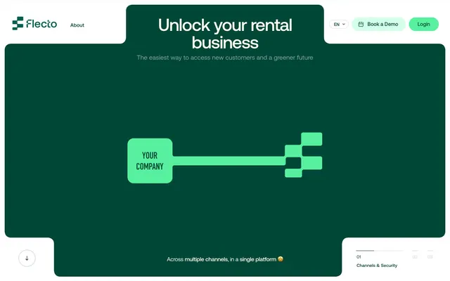
Preview image. Unlock full-res
Rounded emerald portal
Color palette
Teal accent for outlined action borders, linked labels, and lightweight interactive emphasis. Do not promote it to the primary CTA color
Vivid accent color for primary buttons, active states, highlighted cards, and decorative icons. Creates a strong visual focal point against the Emerald Canvas
Lighter accent for ghost button borders, subtle highlights, and background washes. Provides a softer interaction point than Mint Accent
Decorative accent color, used for specific data points or icon strokes to provide a punch of distinct hue
Secondary background for header, select cards, and areas requiring visual separation. Provides a bright contrast to the main canvas
Primary text color for dark backgrounds, dark footer elements, and some borders
Secondary text color, muted icon details, and borders for inactive list items
Subtle background for specific cards, offering a warmer neutral alternative to Paper White
Icon fills and very subtle borders on white backgrounds
Primary page canvas and white card surfaces. Do not promote it to the primary CTA color
Default text on light backgrounds and borders for some neutral ghost buttons
Delicate borders and subtle background tints, often seen around elements on light surfaces
Muted text or placeholder text in light contexts
Subtle background or border color in content areas
Typography
- Weights
- 400
- Sizes
- 8px, 9px, 10px, 11px, 12px, 13px, 14px, 15px, 16px, 17px, 18px, 19px, 20px, 24px, 26px, 28px, 32px, 33px, 36px, 56px, 60px, 64px, 66px, 74px
- Line height
- 1, 1.1, 1.14, 1.15, 1.2, 1.22, 1.23, 1.29, 1.3, 1.38, 1.4, 1.44, 1.46, 1.5, 1.6, 1.67, 1.86, 1.92, 1.94, 2.03, 2.09, 2.12, 2.79, 2.88
- Letter spacing
- -0.0430em at 74px, -0.0300em at 66px, -0.0200em at 56px, 0.0100em at 12px
- Fallback
- Inter
Primary display and body font, used for most headings, prominent text, and UI elements. The `tnum` feature ensures uniform numbers, while the varied letter-spacing provides a distinct, modern texture to headlines and smaller text alike.
- Weights
- 400
- Sizes
- 12px, 16px
- Line height
- 1.4, 1.87
- Letter spacing
- normal
- Fallback
- Inter
Secondary body font for supporting text, navigation items, and descriptive content. Maintains legibility at smaller sizes with standard letter-spacing.
- Weights
- 400
- Sizes
- 16px
- Line height
- 1.2
Arial — detected in extracted data but not described by AI
Spacing & shape
Elevation
Components
Background: Mint Accent (#56f09f), Text: Off Black (#032019), Padding: 12px horizontal, 0px vertical (implied by content height). Border radius: 10px. Uses Aeonik font, weight 400.
Background: transparent (rgba(0,0,0,0)), Text: Dark Wolf (#222222), Border: 1px solid Dark Wolf (#222222), Padding: 0px vertical, 12px-24px horizontal. Border radius: 0px. Uses Aeonik font at 16px.
Background: transparent (rgba(0,0,0,0)), Text: Emerald Canvas (#004737), Border: 1px solid Emerald Canvas (#004737), Padding: 0px. Border radius: 0px. Uses Aeonik font.
Background: transparent (rgba(0,0,0,0)), Text: Soft Mint (#d4ffe8), Border: 1px solid Soft Mint (#d4ffe8), Padding: 0px. Border radius: 0px. Uses Aeonik font.
Background: transparent (rgba(0,0,0,0)), Text: Dark Wolf (#222222), Border: 1px solid Dark Wolf (#222222), Border radius: 100% (full pill shape).
Background: Pure White (#ffffff), Border radius: 10px 0px 0px 10px, Shadow: rgba(0, 0, 0, 0.04) 0px 3px 2px 0px, Padding: 20px vertical, 0px horizontal.
Background: Mint Accent (#56f09f), Border radius: 19.2px, no shadow, no explicit padding (assumed content-driven).
Background: Emerald Canvas (#004737), Border radius: 14.4px, no shadow, no explicit padding (assumed content-driven).
Background: transparent (rgba(0,0,0,0)), Border radius: 0px, no shadow, Padding: 28.8px.
Guidelines
- Prioritize Emerald Canvas (#004737) as the dominant background color for full-bleed sections to establish brand identity.
- Use Mint Accent (#56f09f) exclusively for primary calls to action, active indicators, and key highlights to maintain its impact.
- Apply a default border-radius of 19px for most card-like elements and content containers for a consistently soft appearance.
- Use the Aeonik font with varied letter-spacing as outlined in the typography section for all headings and prominent text.
- Ensure interactive components primarily use rounded shapes, with specific radii like 10px for buttons and 40px for larger section containers.
- Design for a 'compact' density, using 10px as the default element gap to group related items closely.
- Prefer outlined buttons using brand colors (Emerald Canvas or Soft Mint) over filled neutral buttons for secondary actions or links.
- Avoid using multiple vivid accent colors; restrict strong chromatic accents to Mint Accent (#56f09f).
- Do not break the established rounding pattern; avoid sharp corners for interactive elements or cards unless explicitly part of a decorative shape.
- Do not use generic system fonts for headings; always use Aeonik for brand consistency and its distinct letter-spacing.
- Avoid excessive use of shadows; stick to the rgba(0, 0, 0, 0.04) 0px 3px 2px 0px for discrete card elevation only.
- Do not introduce large, open whitespace between elements; maintain the 'compact' density for optimal information display.
- Avoid using Cream Card (#faf2d5) as a primary background; reserve it for specific card surfaces to provide subtle variation.
- Do not use Emerald Canvas (#004737) for body text on light backgrounds; use Dark Wolf (#222222) instead for readability.
About this system
ShowHide
Flecto employs a high-contrast dark green canvas accented by a vibrant, energetic lighter green for key interactive elements. Rounded corners are ubiquitous, creating a soft, approachable aesthetic for sections and components. Typography is crisp and modern, featuring custom sans-serif fonts with subtle letter-spacing variations to enhance legibility and visual rhythm. The overall impression is one of structured friendliness, with clear visual hierarchy driven by color and shape rather than complex elevation.
The page primarily uses a contained layout with a maximum width of 174px for content blocks, centered within the browser. The hero section features a full-bleed Emerald Canvas (#004737) background with a large, centered headline and a graphic. Sections often alternate between full-bleed brand color (Emerald Canvas) and a contained Paper White (#fffbec) or Pure White (#ffffff) background. Vertical section rhythm is consistent, with clear visual breaks between blocks. Content is often arranged in visually distinct blocks that occasionally feature rounded cutouts and overlays. Navigation is a simple top bar with a sticky header and minimal links.
This site features abstract, geometric visual elements, particularly a key-like graphic constructed from pixelated blocks. There are no photographs or complex illustrations. Icons are outlined, mono-color, and minimal, matching the clean UI aesthetic. Visual space is dominated by UI elements and typography, with graphics serving primarily as decorative atmosphere and brand representation rather than explanatory content. Image density is low.
Reminiscent of Keyhole, Paddle, Pitch.
# Flecto — Style Reference
> Rounded emerald portal

**Theme:** light

**Site:** https://flecto.io

Flecto employs a high-contrast dark green canvas accented by a vibrant, energetic lighter green for key interactive elements. Rounded corners are ubiquitous, creating a soft, approachable aesthetic for sections and components. Typography is crisp and modern, featuring custom sans-serif fonts with subtle letter-spacing variations to enhance legibility and visual rhythm. The overall impression is one of structured friendliness, with clear visual hierarchy driven by color and shape rather than complex elevation.

## Tokens — Colors

| Name | Value | Token | Role |
|------|------|------|------|
| Emerald Canvas | `#004737` | `--color-emerald-canvas` | Teal accent for outlined action borders, linked labels, and lightweight interactive emphasis. Do not promote it to the primary CTA color |
| Mint Accent | `#56f09f` | `--color-mint-accent` | Vivid accent color for primary buttons, active states, highlighted cards, and decorative icons. Creates a strong visual focal point against the Emerald Canvas |
| Soft Mint | `#d4ffe8` | `--color-soft-mint` | Lighter accent for ghost button borders, subtle highlights, and background washes. Provides a softer interaction point than Mint Accent |
| Deep Violet | `#8f37ff` | `--color-deep-violet` | Decorative accent color, used for specific data points or icon strokes to provide a punch of distinct hue |
| Paper White | `#fffbec` | `--color-paper-white` | Secondary background for header, select cards, and areas requiring visual separation. Provides a bright contrast to the main canvas |
| Off Black | `#032019` | `--color-off-black` | Primary text color for dark backgrounds, dark footer elements, and some borders |
| Muted Sage | `#99b5af` | `--color-muted-sage` | Secondary text color, muted icon details, and borders for inactive list items |
| Cream Card | `#faf2d5` | `--color-cream-card` | Subtle background for specific cards, offering a warmer neutral alternative to Paper White |
| True Black | `#000000` | `--color-true-black` | Icon fills and very subtle borders on white backgrounds |
| Pure White | `#ffffff` | `--color-pure-white` | Primary page canvas and white card surfaces. Do not promote it to the primary CTA color |
| Dark Wolf | `#222222` | `--color-dark-wolf` | Default text on light backgrounds and borders for some neutral ghost buttons |
| Grey Shadow | `#ccdad7` | `--color-grey-shadow` | Delicate borders and subtle background tints, often seen around elements on light surfaces |
| Stone Grey | `#939393` | `--color-stone-grey` | Muted text or placeholder text in light contexts |
| Light Moss | `#afc5c0` | `--color-light-moss` | Subtle background or border color in content areas |

## Tokens — Typography

### Aeonik
- **Substitute:** Inter
- **Weights:** 400
- **Sizes:** 8px, 9px, 10px, 11px, 12px, 13px, 14px, 15px, 16px, 17px, 18px, 19px, 20px, 24px, 26px, 28px, 32px, 33px, 36px, 56px, 60px, 64px, 66px, 74px
- **Line height:** 1, 1.1, 1.14, 1.15, 1.2, 1.22, 1.23, 1.29, 1.3, 1.38, 1.4, 1.44, 1.46, 1.5, 1.6, 1.67, 1.86, 1.92, 1.94, 2.03, 2.09, 2.12, 2.79, 2.88
- **Letter spacing:** -0.0430em at 74px, -0.0300em at 66px, -0.0200em at 56px, 0.0100em at 12px
- **Role:** Primary display and body font, used for most headings, prominent text, and UI elements. The `tnum` feature ensures uniform numbers, while the varied letter-spacing provides a distinct, modern texture to headlines and smaller text alike.

### roobert-regular
- **Substitute:** Inter
- **Weights:** 400
- **Sizes:** 12px, 16px
- **Line height:** 1.4, 1.87
- **Letter spacing:** normal
- **Role:** Secondary body font for supporting text, navigation items, and descriptive content. Maintains legibility at smaller sizes with standard letter-spacing.

### Arial
- **Weights:** 400
- **Sizes:** 16px
- **Line height:** 1.2
- **Role:** Arial — detected in extracted data but not described by AI

## Tokens — Type Scale

Perfect Fifth (1.5) from 16px base.

| Role | Size | Line height | Letter spacing |
|------|------|------|------|
| body | 16px | 1.4 | — |
| subheading | 24px | 1.2 | — |
| heading | 36px | 1.14 | — |
| heading-lg | 56px | 1 | -0.2px |
| display | 74px | 1 | -0.43px |

## Tokens — Spacing

- **Max width:** 174px
- **Section gap:** 40px
- **Card padding:** 12px
- **Element gap:** 10px

## Tokens — Radius

- **Default:** 19px
- **Buttons:** 10px
- **iconButtons:** 100%
- **pill:** 60px
- **sections:** 40px
- **smallWidgets:** 5.76px

## Tokens — Elevation

- **Basic Card:** `rgba(0, 0, 0, 0.04) 0px 3px 2px 0px`

## Layout

The page primarily uses a contained layout with a maximum width of 174px for content blocks, centered within the browser. The hero section features a full-bleed Emerald Canvas (#004737) background with a large, centered headline and a graphic. Sections often alternate between full-bleed brand color (Emerald Canvas) and a contained Paper White (#fffbec) or Pure White (#ffffff) background. Vertical section rhythm is consistent, with clear visual breaks between blocks. Content is often arranged in visually distinct blocks that occasionally feature rounded cutouts and overlays. Navigation is a simple top bar with a sticky header and minimal links.

## Imagery

This site features abstract, geometric visual elements, particularly a key-like graphic constructed from pixelated blocks. There are no photographs or complex illustrations. Icons are outlined, mono-color, and minimal, matching the clean UI aesthetic. Visual space is dominated by UI elements and typography, with graphics serving primarily as decorative atmosphere and brand representation rather than explanatory content. Image density is low.

## Components

### Primary Filled Button
*Call to action button for primary actions*

Background: Mint Accent (#56f09f), Text: Off Black (#032019), Padding: 12px horizontal, 0px vertical (implied by content height). Border radius: 10px. Uses Aeonik font, weight 400.

### Ghost Button
*Secondary action or navigation link*

Background: transparent (rgba(0,0,0,0)), Text: Dark Wolf (#222222), Border: 1px solid Dark Wolf (#222222), Padding: 0px vertical, 12px-24px horizontal. Border radius: 0px. Uses Aeonik font at 16px.

### Outlined Button (Emerald)
*Call to action with brand emphasis, but not filled.*

Background: transparent (rgba(0,0,0,0)), Text: Emerald Canvas (#004737), Border: 1px solid Emerald Canvas (#004737), Padding: 0px. Border radius: 0px. Uses Aeonik font.

### Outlined Button (Soft Mint)
*Call to action with subtle brand emphasis, typically on dark backgrounds.*

Background: transparent (rgba(0,0,0,0)), Text: Soft Mint (#d4ffe8), Border: 1px solid Soft Mint (#d4ffe8), Padding: 0px. Border radius: 0px. Uses Aeonik font.

### Pill Button (Text)
*Small, rounded control or category tag.*

Background: transparent (rgba(0,0,0,0)), Text: Dark Wolf (#222222), Border: 1px solid Dark Wolf (#222222), Border radius: 100% (full pill shape).

### Basic Card
*Content container on Paper White backgrounds.*

Background: Pure White (#ffffff), Border radius: 10px 0px 0px 10px, Shadow: rgba(0, 0, 0, 0.04) 0px 3px 2px 0px, Padding: 20px vertical, 0px horizontal.

### Highlight Card (Mint)
*Prominent information card or feature highlight.*

Background: Mint Accent (#56f09f), Border radius: 19.2px, no shadow, no explicit padding (assumed content-driven).

### Dark Card (Emerald)
*Content card on light backgrounds, creating strong contrast.*

Background: Emerald Canvas (#004737), Border radius: 14.4px, no shadow, no explicit padding (assumed content-driven).

### Plain Card
*Simple content grouping without visual emphasis.*

Background: transparent (rgba(0,0,0,0)), Border radius: 0px, no shadow, Padding: 28.8px.

## Guidelines

### Do

- Prioritize Emerald Canvas (#004737) as the dominant background color for full-bleed sections to establish brand identity.
- Use Mint Accent (#56f09f) exclusively for primary calls to action, active indicators, and key highlights to maintain its impact.
- Apply a default border-radius of 19px for most card-like elements and content containers for a consistently soft appearance.
- Use the Aeonik font with varied letter-spacing as outlined in the typography section for all headings and prominent text.
- Ensure interactive components primarily use rounded shapes, with specific radii like 10px for buttons and 40px for larger section containers.
- Design for a 'compact' density, using 10px as the default element gap to group related items closely.
- Prefer outlined buttons using brand colors (Emerald Canvas or Soft Mint) over filled neutral buttons for secondary actions or links.

### Don't

- Avoid using multiple vivid accent colors; restrict strong chromatic accents to Mint Accent (#56f09f).
- Do not break the established rounding pattern; avoid sharp corners for interactive elements or cards unless explicitly part of a decorative shape.
- Do not use generic system fonts for headings; always use Aeonik for brand consistency and its distinct letter-spacing.
- Avoid excessive use of shadows; stick to the rgba(0, 0, 0, 0.04) 0px 3px 2px 0px for discrete card elevation only.
- Do not introduce large, open whitespace between elements; maintain the 'compact' density for optimal information display.
- Avoid using Cream Card (#faf2d5) as a primary background; reserve it for specific card surfaces to provide subtle variation.
- Do not use Emerald Canvas (#004737) for body text on light backgrounds; use Dark Wolf (#222222) instead for readability.

## Agent Prompt Guide

Quick Color Reference:
text: #032019
background: #004737
border: #004737
accent: #56f09f
primary action: #004737 (outlined action border)

Example Component Prompts:
1. Create an Outlined Primary Action: Transparent background, #004737 border and text, 9999px radius, compact pill padding. Use it for the main CTA instead of a filled button.
2. Create a Hero Section with Emerald Canvas background: Headline 'Unlock your Potential' in Aeonik, 74px, weight 400, White (#ffffff), letter-spacing -0.43px. Sub-headline 'Your future is now' in Aeonik, 24px, weight 400, Soft Mint (#d4ffe8).
3. Create a Basic Card on Paper White background: Text 'Card Title' in Aeonik, 36px, weight 400, Dark Wolf (#222222). Body text 'Card description here' in roobert-regular, 16px, weight 400, Dark Wolf (#222222). Background Pure White (#ffffff), border-radius 10px 0px 0px 10px, box-shadow rgba(0, 0, 0, 0.04) 0px 3px 2px 0px.
4. Create an Outlined Button (Soft Mint): Background rgba(0,0,0,0), text Soft Mint (#d4ffe8), border 1px solid Soft Mint (#d4ffe8), border-radius 0px. Text 'Learn More' using Aeonik font, weight 400.
More like this









Keep what you find
A free account saves references to boards and can send you a weekly email of picks based on what you save.
To see every result, go Pro.