Preview image. Unlock full-res
Crisp AI Canvas
Color palette
Primary action backgrounds, active states, and decorative accents
Hero text and prominent graphical elements — conveys digital energy
Primary page and card backgrounds
Darker, rich card backgrounds typically for content sections
Background for rich content blocks and section cards
Background for rich content blocks and section cards, slightly darker than Shadow Green
Subtle background for ghost button fills and secondary elements
Hairline borders and divider lines
Primary text, headings, and icon fill
Tertiary text, subtle link backgrounds
Outline for ghost buttons, soft borders for interactive elements
Background for specific content cards or sections, a cool gray
Typography
- Weights
- 400, 500, 700
- Sizes
- 9px, 12px, 15px, 16px, 18px, 24px, 30px
- Line height
- 1, 1.2, 1.4, 1.5
- Letter spacing
- -0.01
- Fallback
- Inter
Primary text across body, buttons, and system elements. Its neutral forms ensure legibility and a consistent functional tone.
- Weights
- 100, 300
- Sizes
- 72px, 80px, 120px
- Line height
- 0.95, 1
- Letter spacing
- -0.017
- Fallback
- Playfair Display
Display headlines and hero text. The extremely light weights (100, 300) combined with generous sizes create an airy, sophisticated, and slightly understated grandeur for bold statements, contrasting with conventional heavy headings.
Spacing & shape
Elevation
Components
Background transparent, text 'Text Black' (#000000), no border, no radius. Padding: 1.5px vertical, 0px horizontal.
Background 'Mint Accent' (#a3fda7), text 'Text Black' (#000000), border 'Mint Accent' (#a3fda7). Radius: 200px. Padding: 0px vertical, 18.8px horizontal.
Background 'Stone Beige' (#e9e7e2), text 'Text Black' (#000000), border 'Stone Beige' (#e9e7e2). Radius: 1.67772e+07px (effectively full pill). Padding: 7.2px vertical, 10.2px horizontal.
Background 'Canvas White' (#ffffff), radius 24px. Shadow: 'rgba(0, 0, 0, 0.09) 0px 0px 28px 0px'. Padding: 20px all sides.
Background 'Graphite Inset' (#2d3637), radius 24px. No shadow. No padding (content handles internal spacing).
Background 'Deep Forest BG' (#083a26), radius 24px. No shadow. No padding (content handles internal spacing).
Background transparent, text 'Canvas White' (#ffffff) or 'Text Black' (#000000). Border 1px solid 'Outline Gray' (#cccccc). Radius: 100px. Padding: 12px vertical, 18.8px horizontal.
Guidelines
- Use 'Canvas White' (#ffffff) as the primary background for most sections.
- Apply 'Text Black' (#000000) for all primary body text and headings.
- Emphasize primary calls-to-action with the 'Pill Accent Button' featuring 'Mint Accent' (#a3fda7) background.
- Use 'secondaryFont' at weight 100 or 300 for all large display headlines to maintain a refined, light aesthetic.
- Apply a 24px border-radius to all card components (Card with Shadow, Dark Content Card, Accent Gradient Card).
- Maintain generous vertical spacing between major sections, utilizing the 'sectionGap' of 30px.
- Utilize the 'Agentic Gradient' only for hero text or distinct graphical elements, never for backgrounds or small UI details.
- Avoid heavy shadows; use 'rgba(0, 0, 0, 0.09) 0px 0px 28px 0px' only for intentionally elevated cards.
- Do not use highly saturated colors for general UI elements; reserve 'Mint Accent' (#a3fda7) for primary actions and highlights.
- Never use bold (weight 700) from 'secondaryFont' for headlines; its characteristic is its lightness.
- Do not add additional decorative borders or heavy backgrounds to input fields, they should remain minimal and pill-shaped.
- Avoid tightly packed content; ensure a minimum 'elementGap' of 8px between discrete UI elements.
- Do not use generic square buttons; all distinct interactive buttons should leverage the 200px (full pill) or 1.67772e+07px (rounded pill) radius.
About this system
ShowHide
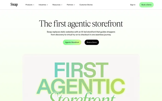
Swap's design system evokes an 'AI as a service' aesthetic with a bright, spacious, and slightly austere canvas adorned with precise, geometric forms. Typography is a key differentiator: elegant, thin headings juxtapose with a workhorse sans-serif for body text, creating a contrast of sophistication and clarity. A prominent, vibrant green gradient is used sparingly as a functional accent, making interactive elements feel 'charged'. Surfaces are predominantly clean white, occasionally featuring subtle shadows for a light sense of elevation or rich, deep-toned section cards. Components are generally compact and direct, prioritizing information delivery over heavy ornamentation.
This system primarily uses product-focused design, with custom graphics being a prominent feature. There's a strong lean towards abstract, gradient-filled typography for hero sections and illustrative elements, embodying the 'Agentic Gradient'. Where present, imagery appears to be either logo displays (customer stories) or product screenshots integrated seamlessly into the UI. Icons are minimal, typically 'Text Black' (#000000), and outlined rather than filled, maintaining the lightweight feel. The density is moderate, with ample negative space around key textual and interactive elements, allowing the custom graphics and bold typography to dominate focal points.
Reminiscent of Rive, Framer, Supabase, Vercel.
# Swap — Style Reference
> Crisp AI Canvas

**Theme:** light

**Site:** https://www.swap-commerce.com

Swap's design system evokes an 'AI as a service' aesthetic with a bright, spacious, and slightly austere canvas adorned with precise, geometric forms. Typography is a key differentiator: elegant, thin headings juxtapose with a workhorse sans-serif for body text, creating a contrast of sophistication and clarity. A prominent, vibrant green gradient is used sparingly as a functional accent, making interactive elements feel 'charged'. Surfaces are predominantly clean white, occasionally featuring subtle shadows for a light sense of elevation or rich, deep-toned section cards. Components are generally compact and direct, prioritizing information delivery over heavy ornamentation.

## Tokens — Colors

| Name | Value | Token | Role |
|------|------|------|------|
| Mint Accent | `#a3fda7` | `--color-mint-accent` | Primary action backgrounds, active states, and decorative accents |
| Agentic Gradient | `#82ff87` | `--color-agentic-gradient` | Hero text and prominent graphical elements — conveys digital energy |
| Canvas White | `#ffffff` | `--color-canvas-white` | Primary page and card backgrounds |
| Graphite Inset | `#2d3637` | `--color-graphite-inset` | Darker, rich card backgrounds typically for content sections |
| Shadow Green BG | `#0d5b3b` | `--color-shadow-green-bg` | Background for rich content blocks and section cards |
| Deep Forest BG | `#083a26` | `--color-deep-forest-bg` | Background for rich content blocks and section cards, slightly darker than Shadow Green |
| Stone Beige | `#e9e7e2` | `--color-stone-beige` | Subtle background for ghost button fills and secondary elements |
| Outline Gray | `#cccccc` | `--color-outline-gray` | Hairline borders and divider lines |
| Text Black | `#000000` | `--color-text-black` | Primary text, headings, and icon fill |
| Muted Ash | `#999999` | `--color-muted-ash` | Tertiary text, subtle link backgrounds |
| Subtle Sage | `#9cb0a8` | `--color-subtle-sage` | Outline for ghost buttons, soft borders for interactive elements |
| Subtle Gray Card | `#838676` | `--color-subtle-gray-card` | Background for specific content cards or sections, a cool gray |

## Tokens — Typography

### mainFont
- **Substitute:** Inter
- **Weights:** 400, 500, 700
- **Sizes:** 9px, 12px, 15px, 16px, 18px, 24px, 30px
- **Line height:** 1, 1.2, 1.4, 1.5
- **Letter spacing:** -0.01
- **Role:** Primary text across body, buttons, and system elements. Its neutral forms ensure legibility and a consistent functional tone.

### secondaryFont
- **Substitute:** Playfair Display
- **Weights:** 100, 300
- **Sizes:** 72px, 80px, 120px
- **Line height:** 0.95, 1
- **Letter spacing:** -0.017
- **Role:** Display headlines and hero text. The extremely light weights (100, 300) combined with generous sizes create an airy, sophisticated, and slightly understated grandeur for bold statements, contrasting with conventional heavy headings.

## Tokens — Type Scale

Perfect Fifth (1.5) from 15px base.

| Role | Size | Line height | Letter spacing |
|------|------|------|------|
| body | 15px | 1.4 | — |
| subheading | 18px | 1.5 | — |
| heading | 24px | 1.4 | — |
| heading-lg | 30px | 1.2 | — |
| display | 72px | 0.95 | -1.22px |

## Tokens — Spacing

- **Section gap:** 30px
- **Card padding:** 20px
- **Element gap:** 8px

## Tokens — Radius

- **General:** 10px
- **Buttons:** 200px
- **Inputs:** 100px
- **Cards:** 24px

## Tokens — Elevation

- **Card with Shadow:** `rgba(0, 0, 0, 0.09) 0px 0px 28px 0px`

## Imagery

This system primarily uses product-focused design, with custom graphics being a prominent feature. There's a strong lean towards abstract, gradient-filled typography for hero sections and illustrative elements, embodying the 'Agentic Gradient'. Where present, imagery appears to be either logo displays (customer stories) or product screenshots integrated seamlessly into the UI. Icons are minimal, typically 'Text Black' (#000000), and outlined rather than filled, maintaining the lightweight feel. The density is moderate, with ample negative space around key textual and interactive elements, allowing the custom graphics and bold typography to dominate focal points.

## Components

### Ghost Text Button
*Navigation links and secondary actions*

Background transparent, text 'Text Black' (#000000), no border, no radius. Padding: 1.5px vertical, 0px horizontal.

### Pill Accent Button
*Primary call-to-actions*

Background 'Mint Accent' (#a3fda7), text 'Text Black' (#000000), border 'Mint Accent' (#a3fda7). Radius: 200px. Padding: 0px vertical, 18.8px horizontal.

### Pill Ghost Button
*Secondary and descriptive actions*

Background 'Stone Beige' (#e9e7e2), text 'Text Black' (#000000), border 'Stone Beige' (#e9e7e2). Radius: 1.67772e+07px (effectively full pill). Padding: 7.2px vertical, 10.2px horizontal.

### Card with Shadow
*Content containers with subtle elevation*

Background 'Canvas White' (#ffffff), radius 24px. Shadow: 'rgba(0, 0, 0, 0.09) 0px 0px 28px 0px'. Padding: 20px all sides.

### Dark Content Card
*Prominent content blocks, often for feature showcases*

Background 'Graphite Inset' (#2d3637), radius 24px. No shadow. No padding (content handles internal spacing).

### Accent Gradient Card
*Prominent content blocks, usually for features or special offers*

Background 'Deep Forest BG' (#083a26), radius 24px. No shadow. No padding (content handles internal spacing).

### Minimal Input Field
*Form inputs*

Background transparent, text 'Canvas White' (#ffffff) or 'Text Black' (#000000). Border 1px solid 'Outline Gray' (#cccccc). Radius: 100px. Padding: 12px vertical, 18.8px horizontal.

## Guidelines

### Do

- Use 'Canvas White' (#ffffff) as the primary background for most sections.
- Apply 'Text Black' (#000000) for all primary body text and headings.
- Emphasize primary calls-to-action with the 'Pill Accent Button' featuring 'Mint Accent' (#a3fda7) background.
- Use 'secondaryFont' at weight 100 or 300 for all large display headlines to maintain a refined, light aesthetic.
- Apply a 24px border-radius to all card components (Card with Shadow, Dark Content Card, Accent Gradient Card).
- Maintain generous vertical spacing between major sections, utilizing the 'sectionGap' of 30px.
- Utilize the 'Agentic Gradient' only for hero text or distinct graphical elements, never for backgrounds or small UI details.

### Don't

- Avoid heavy shadows; use 'rgba(0, 0, 0, 0.09) 0px 0px 28px 0px' only for intentionally elevated cards.
- Do not use highly saturated colors for general UI elements; reserve 'Mint Accent' (#a3fda7) for primary actions and highlights.
- Never use bold (weight 700) from 'secondaryFont' for headlines; its characteristic is its lightness.
- Do not add additional decorative borders or heavy backgrounds to input fields, they should remain minimal and pill-shaped.
- Avoid tightly packed content; ensure a minimum 'elementGap' of 8px between discrete UI elements.
- Do not use generic square buttons; all distinct interactive buttons should leverage the 200px (full pill) or 1.67772e+07px (rounded pill) radius.

## Agent Prompt Guide

### Quick Color Reference
text: #000000
background: #ffffff
border: #cccccc
accent: #82ff87 (Agentic Gradient, use for headlines/graphics)
primary action: #a3fda7 (filled action)

### 3-5 Example Component Prompts
1. Create a hero section: 'Canvas White' (#ffffff) background. Centered headline 'The first agentic storefront' using 'secondaryFont' weight 300, size 120px, 'Agentic Gradient' fill, line-height 0.95, letter-spacing -1.22px. Below it, a centered subtext 'Swap replaces static websites...' using 'mainFont' weight 400, size 18px, 'Text Black' (#000000), line-height 1.5. Two buttons below, left: 'Pill Accent Button' ('Mint Accent', #a3fda7, 'Text Black' text, 200px radius); right: 'Dark Filled Button' ('Text Black', '#ffffff' text, 200px radius).
2. Design a feature card: 'Card with Shadow' background ('Canvas White', #ffffff, 24px radius, shadow 'rgba(0, 0, 0, 0.09) 0px 0px 28px 0px'). Use 'mainFont' weight 700, size 24px, 'Text Black' (#000000) for the feature title. Body text 'mainFont' weight 400, size 16px, 'Text Black' (#000000). Padding throughout is 20px.
3. Create a Primary Action Button: #a3fda7 background, #000000 text, 9999px radius, compact pill padding. Use this filled treatment for the main CTA.
More like this









Keep what you find
A free account saves references to boards and can send you a weekly email of picks based on what you save.
To see every result, go Pro.