Preview image. Unlock full-res
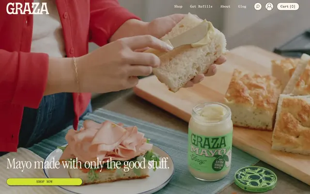
Artisanal provisions on a sunny countertop. The distinct 'GT Alpina Typewriter' font paired with the classic 'ITC Garamond Condensed' creates a blend of retro-modern warmth against a palette of creamy whites and food-inspired greens and yellows.
Color palette
Primary call-to-action buttons, active states, highlights — a vibrant, natural yellow that injects energy and directs attention, reminiscent of citrus.
Secondary accent color, background for playful sections — a lighter, softer green that complements the Zest Yellow and Grove Green, adding freshness.
Tertiary accent, often used for background blocks — a warm, sunny yellow for more emphatic accent sections, used sparingly for impact.
Page backgrounds, card surfaces, primary text color on dark accents — foundational creamy base that feels warmer than pure white.
Secondary background, subtle dividers — a slightly deeper, warmer neutral that adds depth without stark contrast, like aged paper.
Subtle shading in backgrounds, decorative elements — a warm, faint brown used for subtle visual texture or background variations (from --oke-shadingColor).
Typography
- Weights
- 400
- Sizes
- 46px, 48px, 72px, 102px, 120px
- Line height
- 0.9, 1, 1.6
- Letter spacing
- -0.031, -0.03, -0.021
- Fallback
- Garamond (or similar humanist serif with condensed variant)
Display and Large Headlines — the signature custom serif font, creating a classic, artisanal, and slightly retro feel. The tight letter-spacing at larger sizes makes it feel intentional and sophisticated.
- Weights
- 400, 500, 700
- Sizes
- 12px, 16px, 18px, 20px
- Line height
- 1, 1.2, 1.25, 1.5
- Fallback
- Roboto Mono, Space Mono (for a strong typewriter feel)
Body copy, navigation, small headings, buttons — a custom monospaced-style typeface that contrasts with the Garamond-like headlines, adding a modern, structured, and slightly technical feel to the primary content.
- Weights
- 400
- Sizes
- 13px
- Line height
- 1
- Fallback
- Inter, Montserrat (or similar geometric sans-serif)
Badges and labels — a highly legible, compact sans-serif used for small, functional text elements that require clear, direct communication.
Spacing & shape
Components
Background Zest Yellow (#d1e030), text Grove Green (#3c422e), 10px corner radius, padding varies but typically uses 20px horizontal for small buttons, 35px or 24px vertical. Text uses GT Alpina Typewriter, 16px, weight 400.
Transparent background, text Grove Green (#3c422e), border Grove Green (#3c422e), no explicit padding. Used for subtle actions where visual weight should be low. Text uses GT Alpina Typewriter.
Transparent background, text Buttermilk (#fff4ec), border Buttermilk (#fff4ec). Used for subtle actions on darker backgrounds. Text uses GT Alpina Typewriter.
Transparent background, text Grove Green (#3c422e), 9999px radius (pill shape), 32px horizontal padding. Font Apercu 13px, weight 400. Used for categorical labels.
Transparent background, text Grove Green (#3c422e), border Grove Green (#3c422e), 10px 0px 0px 10px radius (left segment). Used for navigation within a small group of options.
Transparent background, text Grove Green (#3c422e), border Grove Green (#3c422e), 0px 10px 10px 0px radius (right segment). Used for navigation within a small group of options.
Transparent background, text Grove Green (#3c422e), border Grove Green (#3c422e), 8px radius, 16px padding on all sides. Text uses GT Alpina Typewriter, 16px, weight 400.
Guidelines
- Prioritize ITC Garamond Condensed for all display-level headings (72px, 102px, 120px) to establish artisanal brand voice with letter-spacing tuned to -0.03em.
- Use Grove Green (#3c422e) as the primary text and interactive color against Buttermilk (#fff4ec) or Farmhouse Gray (#f6e6d9) backgrounds for AAA contrast.
- Apply a 20px border-radius to large visual content blocks like product images for a softer, organic feel.
- Utilize Zest Yellow (#d1e030) exclusively for primary CTA backgrounds to draw immediate attention, paired with Grove Green (#3c422e) text.
- Maintain generous vertical spacing with multiples of 24px and 35px between sections, like 35px (common for paddingTop/Bottom) or 24px (marginBottom/marginTop) for comfortable readability.
- Ensure all buttons and input fields have at least an 8px border-radius for a consistent soft touch, with specific components like badges using 9999px for a full pill shape.
- Use GT Alpina Typewriter for all body copy, navigation, and supplementary text elements to provide a structured, modern counterpoint to the display headings at a comfortable 16px, weight 400.
- Avoid using pure black or stark white. Rely on Grove Green (#3c422e) for dark text and Buttermilk (#fff4ec) for light backgrounds to maintain warmth.
- Do not use generic sans-serif fonts for display headings; ITC Garamond Condensed is critical for brand identity.
- Refrain from sharp 0px corners on interactive elements; a minimum of 8px radius is expected across buttons and inputs.
- Do not use Zest Yellow (#d1e030) for small text or secondary accents; its high saturation is reserved for primary calls to action.
- Avoid excessive use of shadows or gradients; the design relies on flat colors, subtle radius, and strong typography for depth.
- Do not break the visual rhythm of alternating background colors (Buttermilk, Farmhouse Gray, Avocado Cream) within major sections.
- Avoid dense packing of information; maintain the spacious page model allowing plenty of breathing room between elements and sections.
About this system
ShowHide
This system evokes a playful yet sophisticated artisanal brand, like gourmet pantry provisions. The visual character is defined by a curated tension between rustic craft and modern typography, achieving an approachable elegance. Creamy off-white backgrounds alternate with vibrant, food-inspired hues, creating a warm, inviting canvas. Subtle rounded corners lend a gentle, organic touch to elements, while a custom serif font for prominent headings adds a distinctive, handcrafted feel.
The page maintains a maximum width of 1440px, centered, with generous surrounding white space providing an open, airy feel. The hero section often features full-bleed photography with overlaid text, setting an immediate lifestyle tone. Sections generally alternate between creamy white (Buttermilk) and soft-colored (Farmhouse Gray, Sunbeam Yellow, Avocado Cream) backgrounds, creating a clear visual rhythm. Content often uses a two-column layout with imagery on one side and text on the other, frequently reversing layout for variety. Text is often center-aligned or left-aligned within its column. The arrangement is spacious, allowing individual product features or ideas to breathe. Navigation is a sticky top bar, minimal and clear, aligning with the spacious and uncluttered aesthetic.
Imagery is primarily high-quality, brightly lit product photography and food lifestyle shots. Products are often shown tightly cropped on textured backgrounds or in use, emphasizing functionality and deliciousness. Photography is full-bleed or contained in soft-edged (e.g., 20px radius) containers, often overlapping with text or bold color blocks. Illustrations, when present (e.g., on packaging), are flat, brand-colored, and slightly whimsical. Icons are minimal, outlined, and monochromatic (Grove Green). The overall role is to showcase the product's appealing nature and inspire culinary use, balancing product focus with atmospheric context.
Reminiscent of Brightland, Oatly, Fly By Jing, Haus.
# GRAZA — Style Reference
> Artisanal provisions on a sunny countertop. The distinct 'GT Alpina Typewriter' font paired with the classic 'ITC Garamond Condensed' creates a blend of retro-modern warmth against a palette of creamy whites and food-inspired greens and yellows.

**Theme:** light

**Site:** https://graza.co

This system evokes a playful yet sophisticated artisanal brand, like gourmet pantry provisions. The visual character is defined by a curated tension between rustic craft and modern typography, achieving an approachable elegance. Creamy off-white backgrounds alternate with vibrant, food-inspired hues, creating a warm, inviting canvas. Subtle rounded corners lend a gentle, organic touch to elements, while a custom serif font for prominent headings adds a distinctive, handcrafted feel.

## Tokens — Colors

| Name | Value | Token | Role |
|------|------|------|------|
| Zest Yellow | `#d1e030` | `--color-zest-yellow` | Primary call-to-action buttons, active states, highlights — a vibrant, natural yellow that injects energy and directs attention, reminiscent of citrus. |
| Avocado Cream | `#9eef80` | `--color-avocado-cream` | Secondary accent color, background for playful sections — a lighter, softer green that complements the Zest Yellow and Grove Green, adding freshness. |
| Sunbeam Yellow | `#fbd535` | `--color-sunbeam-yellow` | Tertiary accent, often used for background blocks — a warm, sunny yellow for more emphatic accent sections, used sparingly for impact. |
| Buttermilk | `#fff4ec` | `--color-buttermilk` | Page backgrounds, card surfaces, primary text color on dark accents — foundational creamy base that feels warmer than pure white. |
| Farmhouse Gray | `#f6e6d9` | `--color-farmhouse-gray` | Secondary background, subtle dividers — a slightly deeper, warmer neutral that adds depth without stark contrast, like aged paper. |
| Harvest Ochre | `#e8d6c8` | `--color-harvest-ochre` | Subtle shading in backgrounds, decorative elements — a warm, faint brown used for subtle visual texture or background variations (from --oke-shadingColor). |

## Tokens — Typography

### ITC Garamond Condensed
- **Substitute:** Garamond (or similar humanist serif with condensed variant)
- **Weights:** 400
- **Sizes:** 46px, 48px, 72px, 102px, 120px
- **Line height:** 0.9, 1, 1.6
- **Letter spacing:** -0.031, -0.03, -0.021
- **Role:** Display and Large Headlines — the signature custom serif font, creating a classic, artisanal, and slightly retro feel. The tight letter-spacing at larger sizes makes it feel intentional and sophisticated.

### GT Alpina Typewriter
- **Substitute:** Roboto Mono, Space Mono (for a strong typewriter feel)
- **Weights:** 400, 500, 700
- **Sizes:** 12px, 16px, 18px, 20px
- **Line height:** 1, 1.2, 1.25, 1.5
- **Role:** Body copy, navigation, small headings, buttons — a custom monospaced-style typeface that contrasts with the Garamond-like headlines, adding a modern, structured, and slightly technical feel to the primary content.

### Apercu
- **Substitute:** Inter, Montserrat (or similar geometric sans-serif)
- **Weights:** 400
- **Sizes:** 13px
- **Line height:** 1
- **Role:** Badges and labels — a highly legible, compact sans-serif used for small, functional text elements that require clear, direct communication.

## Tokens — Spacing

- **Max width:** 1440px

## Tokens — Radius

- **Default:** 10px
- **Buttons:** 10px
- **Inputs:** 8px
- **Images:** 20px
- **badges:** 9999px

## Layout

The page maintains a maximum width of 1440px, centered, with generous surrounding white space providing an open, airy feel. The hero section often features full-bleed photography with overlaid text, setting an immediate lifestyle tone. Sections generally alternate between creamy white (Buttermilk) and soft-colored (Farmhouse Gray, Sunbeam Yellow, Avocado Cream) backgrounds, creating a clear visual rhythm. Content often uses a two-column layout with imagery on one side and text on the other, frequently reversing layout for variety. Text is often center-aligned or left-aligned within its column. The arrangement is spacious, allowing individual product features or ideas to breathe. Navigation is a sticky top bar, minimal and clear, aligning with the spacious and uncluttered aesthetic.

## Imagery

Imagery is primarily high-quality, brightly lit product photography and food lifestyle shots. Products are often shown tightly cropped on textured backgrounds or in use, emphasizing functionality and deliciousness. Photography is full-bleed or contained in soft-edged (e.g., 20px radius) containers, often overlapping with text or bold color blocks. Illustrations, when present (e.g., on packaging), are flat, brand-colored, and slightly whimsical. Icons are minimal, outlined, and monochromatic (Grove Green). The overall role is to showcase the product's appealing nature and inspire culinary use, balancing product focus with atmospheric context.

## Components

### Primary CTA Button Group

### Product Feature Card — Back in Stock

### Recipe Section Card

### Primary Call-to-Action Button
*Interactive element*

Background Zest Yellow (#d1e030), text Grove Green (#3c422e), 10px corner radius, padding varies but typically uses 20px horizontal for small buttons, 35px or 24px vertical. Text uses GT Alpina Typewriter, 16px, weight 400.

### Ghost Button (Primary)
*Interactive element*

Transparent background, text Grove Green (#3c422e), border Grove Green (#3c422e), no explicit padding. Used for subtle actions where visual weight should be low. Text uses GT Alpina Typewriter.

### Ghost Button (Contrast)
*Interactive element*

Transparent background, text Buttermilk (#fff4ec), border Buttermilk (#fff4ec). Used for subtle actions on darker backgrounds. Text uses GT Alpina Typewriter.

### Pill Badge
*Informational label*

Transparent background, text Grove Green (#3c422e), 9999px radius (pill shape), 32px horizontal padding. Font Apercu 13px, weight 400. Used for categorical labels.

### Segmented Button Left
*Interactive group*

Transparent background, text Grove Green (#3c422e), border Grove Green (#3c422e), 10px 0px 0px 10px radius (left segment). Used for navigation within a small group of options.

### Segmented Button Right
*Interactive group*

Transparent background, text Grove Green (#3c422e), border Grove Green (#3c422e), 0px 10px 10px 0px radius (right segment). Used for navigation within a small group of options.

### Text Input Field
*Form element*

Transparent background, text Grove Green (#3c422e), border Grove Green (#3c422e), 8px radius, 16px padding on all sides. Text uses GT Alpina Typewriter, 16px, weight 400.

## Guidelines

### Do

- Prioritize ITC Garamond Condensed for all display-level headings (72px, 102px, 120px) to establish artisanal brand voice with letter-spacing tuned to -0.03em.
- Use Grove Green (#3c422e) as the primary text and interactive color against Buttermilk (#fff4ec) or Farmhouse Gray (#f6e6d9) backgrounds for AAA contrast.
- Apply a 20px border-radius to large visual content blocks like product images for a softer, organic feel.
- Utilize Zest Yellow (#d1e030) exclusively for primary CTA backgrounds to draw immediate attention, paired with Grove Green (#3c422e) text.
- Maintain generous vertical spacing with multiples of 24px and 35px between sections, like 35px (common for paddingTop/Bottom) or 24px (marginBottom/marginTop) for comfortable readability.
- Ensure all buttons and input fields have at least an 8px border-radius for a consistent soft touch, with specific components like badges using 9999px for a full pill shape.
- Use GT Alpina Typewriter for all body copy, navigation, and supplementary text elements to provide a structured, modern counterpoint to the display headings at a comfortable 16px, weight 400.

### Don't

- Avoid using pure black or stark white. Rely on Grove Green (#3c422e) for dark text and Buttermilk (#fff4ec) for light backgrounds to maintain warmth.
- Do not use generic sans-serif fonts for display headings; ITC Garamond Condensed is critical for brand identity.
- Refrain from sharp 0px corners on interactive elements; a minimum of 8px radius is expected across buttons and inputs.
- Do not use Zest Yellow (#d1e030) for small text or secondary accents; its high saturation is reserved for primary calls to action.
- Avoid excessive use of shadows or gradients; the design relies on flat colors, subtle radius, and strong typography for depth.
- Do not break the visual rhythm of alternating background colors (Buttermilk, Farmhouse Gray, Avocado Cream) within major sections.
- Avoid dense packing of information; maintain the spacious page model allowing plenty of breathing room between elements and sections.

## Agent Prompt Guide

### Quick Color Reference
- Text: #3c422 (Grove Green)
- Background: #fff4ec (Buttermilk)
- CTA: #d1e030 (Zest Yellow)
- Border: #3c422 (Grove Green)
- Accent (Background): #9eef80 (Avocado Cream)

### 3-5 Example Component Prompts
1. Create a hero section: Full-width photographic background. Overlay a headline sized 120px, weight 400, ITC Garamond Condensed, color #fff4ec, letter-spacing -0.031em. Below it, a button with background #d1e030, text #3c422, 10px radius, 35px horizontal padding, 16px vertical padding, font GT Alpina Typewriter 16px weight 400.
2. Design a product feature card: Background #fff4ec, 20px border-radius. Vertically stack a 20px radius product image. Below image, a headline at 46px, weight 400, ITC Garamond Condensed, color #3c422, letter-spacing -0.021em, line-height 1.0. Next, body copy at 16px, weight 400, GT Alpina Typewriter, color #3c422, line-height 1.5. Add a Ghost Button (Primary style).
3. Generate a testimonial block: Background #f6e6d9. Centered text at 20px, GT Alpina Typewriter, weight 400, color #3c422, line-height 1.25. Add a small avatar image, 20px radius, 8px bottom margin. Below the testimonial, use a Pill Badge with text 'Reviewer Name' at 13px, Apercu, color #3c422, background transparent, 9999px radius, 32px horizontal padding, 8px bottom margin.
4. Build an input field: Background transparent, border #3c422, 8px radius, 16px padding. Placeholder and input text #3c422, font GT Alpina Typewriter 16px weight 400.
More like this




Keep what you find
A free account saves references to boards and can send you a weekly email of picks based on what you save.
To see every result, go Pro.