Preview image. Unlock full-res
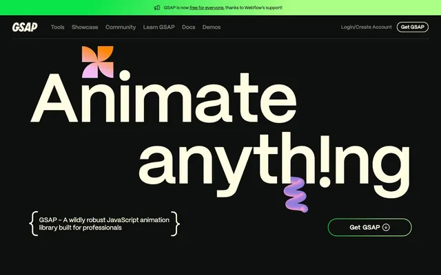
Midnight kinetic canvas
Color palette
Decorative accents, text highlights, graphic elements, section dividers
Decorative accents, text highlights, graphic elements
Green outline accent for tags, dividers, and focused UI edges; Used for hero banners and vibrant background fills, signifying energy and dynamism
Decorative accents, text highlights, graphic elements
Decorative accents, text highlights, graphic elements
Decorative accents, text highlights, graphic elements
Page background, primary surface color, neutral text on bright surfaces
Primary text, outlined button borders, key interactive elements, secondary surface color for contrast
Muted text, secondary navigation items, subtle borders, inactive icons
Delineators and subtle borders on Frosted Canvas surfaces
Typography
- Weights
- 400, 600
- Sizes
- 14px, 16px, 17px, 18px, 19px, 20px, 21px, 23px, 24px, 32px, 33px, 34px, 40px, 44px, 66px, 76px, 89px, 101px, 224px
- Line height
- 1, 1.05, 1.15, 1.2, 1.38, 1.4
- Letter spacing
- -4.48, -2.02, -1.78, -1.52, -1.32, -0.88, -0.8, -0.68, -0.66, -0.64, -0.24, -0.23, -0.21, -0.2, -0.19, -0.18, -0.17, -0.16, -0.14
- Fallback
- system-ui, sans-serif
All text roles: headings, body copy, navigation, buttons. Its geometric sans-serif shapes and precise tracking define the brand's sharp, technical yet playful voice, especially at large display sizes with significant negative tracking.
Spacing & shape
Components
Text in Frosted Canvas (#fffce1), with a Frosted Canvas border (#fffce1) of 1px, and a 100px border-radius, giving it a pill shape. Padding is 15px vertical, 24px horizontal. No background fill.
Text in Faded Steel (#7c7c6f), with no border or background. Padding is 16px vertical, 0px horizontal. Typically used for internal navigation or less prominent actions.
Frosted Canvas (#fffce1) icon, with no border or background, and a 50% border-radius for a circular shape. Zero padding, used mainly for functional icons rather than text labels.
Text in Frosted Canvas (#fffce1), no background, no border, uses 100px border radius for its hit area. Padding 15px vertically, 24px horizontally.
Background is Absolute Zero (#0e100f). Features an 8px border-radius, with varying accent border colors like Neon Pink or Fiery Orange, and a 2px stroke. Internal padding of 16px.
Guidelines
- Use Absolute Zero (#0e100f) as the default background for all pages and primary content sections.
- Prioritize Frosted Canvas (#fffce1) for all primary text and interactive elements to ensure high contrast on dark backgrounds.
- Apply Mori font with variable letter-spacing, using the tighter tracking values for larger display text (e.g., -0.0200em for 224px display text) and standard tracking for body copy.
- Employ the 100px border-radius for all primary buttons and navigation items to maintain a distinct pill-shaped interactive element.
- Integrate brand accent colors (Neon Pink, Fiery Orange, Shocking Green, Digital Violet, Aqua Glow, Mint Burst) in graphical elements, animated components, and section highlights using 2px borders.
- Maintain a comfortable density with element gaps typically at 16px, and card padding at 16px for content blocks.
- Outline interactive elements like buttons and input fields rather than filling them, using Frosted Canvas (#fffce1) for borders to keep the primary background clean.
- Avoid using solid background fills for primary action buttons; instead, opt for outlined styles with Frosted Canvas borders.
- Do not introduce new color palettes; stick to the defined brand accents and neutral scale.
- Never use generic square or rounded-square buttons; all primary interactive elements should leverage the 100px border-radius for the signature pill shape.
- Resist adding unnecessary elevation or shadows; the design relies on flat surfaces and vibrant color outlines for visual interest.
- Do not deviate from the Mori font or introduce other font families; all textual content must use Mori to maintain brand consistency.
- Avoid overly bright or light background sections; the design system is anchored in a dark theme where brighter elements serve as accents.
- Do not use generic gray text for headlines or section titles; they should always be Frosted Canvas (#fffce1) or a specific brand accent color for emphasis.
About this system
ShowHide
GSAP uses a dynamic 'dark playground' aesthetic, where a deep black canvas provides a dramatic stage for vibrant, evolving highlight colors and bold, unconventional typography. The system emphasizes clear content hierarchy through stark contrast, with interactive elements outlined in subtle, near-white tones rather than filled. The overall impression is one of sophisticated, high-performance tooling for creative animation.
Reminiscent of Framer, Lumen5, spline.design, Webflow.
# Gsap — Style Reference
> Midnight kinetic canvas

**Theme:** dark

**Site:** https://gsap.com

GSAP uses a dynamic 'dark playground' aesthetic, where a deep black canvas provides a dramatic stage for vibrant, evolving highlight colors and bold, unconventional typography. The system emphasizes clear content hierarchy through stark contrast, with interactive elements outlined in subtle, near-white tones rather than filled. The overall impression is one of sophisticated, high-performance tooling for creative animation.

## Tokens — Colors

| Name | Value | Token | Role |
|------|------|------|------|
| Neon Pink | `#fec5fb` | `--color-neon-pink` | Decorative accents, text highlights, graphic elements, section dividers |
| Fiery Orange | `#ff8709` | `--color-fiery-orange` | Decorative accents, text highlights, graphic elements |
| Shocking Green | `#0ae448` | `--color-shocking-green` | Green outline accent for tags, dividers, and focused UI edges; Used for hero banners and vibrant background fills, signifying energy and dynamism |
| Digital Violet | `#9d95ff` | `--color-digital-violet` | Decorative accents, text highlights, graphic elements |
| Aqua Glow | `#00bae2` | `--color-aqua-glow` | Decorative accents, text highlights, graphic elements |
| Mint Burst | `#abff84` | `--color-mint-burst` | Decorative accents, text highlights, graphic elements |
| Absolute Zero | `#0e100f` | `--color-absolute-zero` | Page background, primary surface color, neutral text on bright surfaces |
| Frosted Canvas | `#fffce1` | `--color-frosted-canvas` | Primary text, outlined button borders, key interactive elements, secondary surface color for contrast |
| Faded Steel | `#7c7c6f` | `--color-faded-steel` | Muted text, secondary navigation items, subtle borders, inactive icons |
| Deep Graphite | `#42433d` | `--color-deep-graphite` | Delineators and subtle borders on Frosted Canvas surfaces |

## Tokens — Typography

### Mori
- **Substitute:** system-ui, sans-serif
- **Weights:** 400, 600
- **Sizes:** 14px, 16px, 17px, 18px, 19px, 20px, 21px, 23px, 24px, 32px, 33px, 34px, 40px, 44px, 66px, 76px, 89px, 101px, 224px
- **Line height:** 1, 1.05, 1.15, 1.2, 1.38, 1.4
- **Letter spacing:** -4.48, -2.02, -1.78, -1.52, -1.32, -0.88, -0.8, -0.68, -0.66, -0.64, -0.24, -0.23, -0.21, -0.2, -0.19, -0.18, -0.17, -0.16, -0.14
- **Role:** All text roles: headings, body copy, navigation, buttons. Its geometric sans-serif shapes and precise tracking define the brand's sharp, technical yet playful voice, especially at large display sizes with significant negative tracking.

## Tokens — Type Scale

Perfect Fifth (1.5) from 18px base.

| Role | Size | Line height | Letter spacing |
|------|------|------|------|
| caption | 14px | 1.4 | -0.14px |
| body-sm | 16px | 1.4 | -0.16px |
| body | 18px | 1.4 | -0.18px |
| subheading | 24px | 1.38 | -0.24px |
| heading-sm | 32px | 1.2 | -0.64px |
| heading | 44px | 1.15 | -0.88px |
| heading-lg | 66px | 1.05 | -1.32px |
| display | 224px | 0.9 | -4.48px |

## Tokens — Spacing

- **Section gap:** 34px
- **Card padding:** 16px
- **Element gap:** 16px

## Tokens — Radius

- **Default:** 8px
- **Buttons:** 100px
- **dividers:** 1px
- **tags:** 100px

## Components

### Pill Ghost Button
*Primary action button*

Text in Frosted Canvas (#fffce1), with a Frosted Canvas border (#fffce1) of 1px, and a 100px border-radius, giving it a pill shape. Padding is 15px vertical, 24px horizontal. No background fill.

### Text Only Button
*Secondary action or navigation link*

Text in Faded Steel (#7c7c6f), with no border or background. Padding is 16px vertical, 0px horizontal. Typically used for internal navigation or less prominent actions.

### Icon Only Button
*Tertiary action or purely decorative icon button*

Frosted Canvas (#fffce1) icon, with no border or background, and a 50% border-radius for a circular shape. Zero padding, used mainly for functional icons rather than text labels.

### Internal Link Nav Item
*Navigation links*

Text in Frosted Canvas (#fffce1), no background, no border, uses 100px border radius for its hit area. Padding 15px vertically, 24px horizontally.

### Branded Section Card
*Container for product features or content sections*

Background is Absolute Zero (#0e100f). Features an 8px border-radius, with varying accent border colors like Neon Pink or Fiery Orange, and a 2px stroke. Internal padding of 16px.

## Guidelines

### Do

- Use Absolute Zero (#0e100f) as the default background for all pages and primary content sections.
- Prioritize Frosted Canvas (#fffce1) for all primary text and interactive elements to ensure high contrast on dark backgrounds.
- Apply Mori font with variable letter-spacing, using the tighter tracking values for larger display text (e.g., -0.0200em for 224px display text) and standard tracking for body copy.
- Employ the 100px border-radius for all primary buttons and navigation items to maintain a distinct pill-shaped interactive element.
- Integrate brand accent colors (Neon Pink, Fiery Orange, Shocking Green, Digital Violet, Aqua Glow, Mint Burst) in graphical elements, animated components, and section highlights using 2px borders.
- Maintain a comfortable density with element gaps typically at 16px, and card padding at 16px for content blocks.
- Outline interactive elements like buttons and input fields rather than filling them, using Frosted Canvas (#fffce1) for borders to keep the primary background clean.

### Don't

- Avoid using solid background fills for primary action buttons; instead, opt for outlined styles with Frosted Canvas borders.
- Do not introduce new color palettes; stick to the defined brand accents and neutral scale.
- Never use generic square or rounded-square buttons; all primary interactive elements should leverage the 100px border-radius for the signature pill shape.
- Resist adding unnecessary elevation or shadows; the design relies on flat surfaces and vibrant color outlines for visual interest.
- Do not deviate from the Mori font or introduce other font families; all textual content must use Mori to maintain brand consistency.
- Avoid overly bright or light background sections; the design system is anchored in a dark theme where brighter elements serve as accents.
- Do not use generic gray text for headlines or section titles; they should always be Frosted Canvas (#fffce1) or a specific brand accent color for emphasis.

## Agent Prompt Guide

Quick Color Reference:
text: #fffce1
background: #0e100f
border: #7c7c6f
accent: #0ae448
primary action: no distinct CTA color

3-5 Example Component Prompts:
1. Create a hero section: Absolute Zero (#0e100f) background. Headline 'Animate Anything' at 224px Mori 600, Frosted Canvas (#fffce1), letter-spacing -4.48px. Beneath, add a Pill Ghost Button 'Get GSAP' with Frosted Canvas (#fffce1) text, 1px Frosted Canvas (#fffce1) border, 100px border-radius, 15px vertical padding, 24px horizontal padding.
2. Design a feature card: Absolute Zero (#0e100f) background, 8px border-radius. Use Neon Pink (#fec5fb) as a 2px border accent. Subheading 'Scroll' at 32px Mori 600, Frosted Canvas (#fffce1), letter-spacing -0.64px. Body text 'Turn scrolling into silky-smooth storytelling.' at 18px Mori 400, Frosted Canvas (#fffce1). Add a Text Only Button 'Explore Scroll' with Faded Steel (#7c7c6f) text.
3. Create a header navigation: Absolute Zero (#0e100f) background. Left logo 'GSAP' in Frosted Canvas (#fffce1). Main navigation links 'Tools', 'Showcase', 'Community', 'Learn GSAP', 'Docs', 'Demos' as Text Only Buttons with Faded Steel (#7c7c6f) text. Right-aligned Pill Ghost Button 'Get GSAP' with Frosted Canvas (#fffce1) text, 1px Frosted Canvas (#fffce1) border, 100px border-radius, 15px vertical padding, 24px horizontal padding.
More like this







Keep what you find
A free account saves references to boards and can send you a weekly email of picks based on what you save.
To see every result, go Pro.