Preview image. Unlock full-res
Midnight command center, subtly glowing
Color palette
Link text, outlined button borders, and interactive icon accents. It's a key brand identifier for interactive elements
Primary action button background. Signals positive action or confirmation
Decorative card borders and subtle illustrative accents, creating a sense of digital magic
Highlight text or decorative elements, particularly within code or feature descriptions
Solid background for specific active elements or content blocks, providing a stronger visual presence
Illustrative element — background highlight for abstract graphics
Illustrative element — focused glow emanating from central points in graphics
Illustrative element — upward-sweeping light beams in abstract backgrounds
Illustrative element — beginning of a deep blue gradient for background effects
Primary page background, base for most dark surfaces
Elevated surfaces, code blocks, modal backgrounds, and deeply shadowed areas
Secondary background for sections, code editor areas, and subtle surface differentiation
Borders between sections, divider lines, and very soft visual separation
Faint background for inactive states or subtle borders, hinting at elevation
Primary text, prominent icons, and active navigation elements. Also used as a white background for some translucent elements
Secondary text, subheadings, and muted UI elements that require slightly less prominence than primary text
Placeholder text, secondary icons, and less prominent text labels
Subtle helper text, less important details, and desaturated captions
Typography
- Weights
- 400, 425, 440, 460, 480, 500, 600, 800
- Sizes
- 14px, 16px, 18px, 22px, 24px, 40px, 48px, 64px
- Line height
- 1, 1.08, 1.18, 1.2, 1.3, 1.4, 1.5
- Letter spacing
- -0.035, 0.01, 0.011, 0.013, 0.015
- Fallback
- Inter
Primary brand typeface for all headings, body text, UI elements, and navigation. Its wide range of weights and precise letter-spacing ensures a consistent, modern voice.
- Weights
- 400, 500, 600, 700
- Sizes
- 12px, 14px, 16px, 24px
- Line height
- 1, 1.25, 1.43, 1.5
- Letter spacing
- 0
- Fallback
- Inter
Used for smaller text, auxiliary information, and captions where Mona Sans would be too heavy. Its variable font capabilities likely allow for subtle optical adjustments.
- Weights
- 400
- Sizes
- 14px
- Line height
- 1.5
- Letter spacing
- 0.015
- Fallback
- JetBrains Mono
Monospace variant for code snippets, technical terms, and environments where code-like presentation is desired, ensuring visual consistency with the main typeface.
- Weights
- 400
- Sizes
- 14px
- Line height
- 1.5
- Letter spacing
- 0
- Fallback
- Menlo, Monaco
Fallback monospace font for code blocks and technical displays, ensuring readability across systems.
Spacing & shape
Components
Text in Ghost White (#ffffff) on a transparent background, 8px padding. No border. Used for top navigation items.
Text in Ghost White (#ffffff) on a transparent background with 8px vertical, 16px horizontal padding and a 60px border radius, creating a pill shape. Used for navigation and category tabs.
Spring Green (#08872b) background, Ghost White (#ffffff) text, 6px border radius, with 6px vertical and 28px horizontal padding. Signals the most important action on a page.
Polar Blue (#8dd6ff) text on a transparent background with a 1px Ghost White (#ffffff) border, 8px border radius, and 6px vertical, 28px horizontal padding. Provides a clear interactive target without being as dominant as the primary button.
Semi-transparent surface (rgba(255, 255, 255, 0.06)), 24px border radius only on top corners (24px 24px 0px 0px), no internal padding, no box shadow. Edges are sharp at the bottom, suggesting continuity.
Highly translucent background (rgba(255, 255, 255, 0.2)), 24px border radius, 8px internal padding on all sides, no box shadow. Appears as a frosted overlay.
Transparent background with 18px top, 12px right, 0px bottom, 18px left padding. No explicit border specified, relying on contrasting text input/label (placeholder) against the dark background. 8px border radius.
Transparent background, Ghost White (#ffffff) text, with an 8px border radius. Likely uses implicit top/bottom paddings of 8px and side as 16px to create the pill shape, similar to pill buttons.
Guidelines
- Prioritize Deep Space (#0d1117) as the canvas background for most page sections.
- Use Ghost White (#ffffff) for all primary body and heading text for maximum contrast on dark backgrounds.
- Apply Spring Green (#08872b) exclusively for primary call-to-action button backgrounds.
- Utilize Polar Blue (#8dd6ff) for all links, outlined buttons, and interactive icons.
- Apply a 6px border radius for most interactive elements like buttons and inputs, but use 60px for pill-shaped elements.
- Ensure cards use a larger 24px border radius, often with only top corners rounded for a more architectural feel.
- Maintain comfortable element spacing using multiples of 4px, especially 16px for elementGap.
- Avoid using bright, saturated colors for backgrounds; stick to the dark neutral palette.
- Do not use generic gray borders (such as #f0f6fc) on interactive elements; Polar Blue (#8dd6ff) is reserved for interaction outlining.
- Never introduce hard, sharp corners on cards or primary buttons; maintain a consistent rounded aesthetic.
- Do not use overly large or decorative drop shadows; the system favors subtle glows and translucency over heavy elevation.
- Avoid dense packing of information; allow ample `elementGap` and `sectionGap` for a comfortable user experience.
- Do not vary font families outside of Mona Sans variants and monospace fallbacks; maintain typographic consistency.
- Avoid using Mona Sans Mono or ui-monospace for non-code content; these are specifically for technical text.
About this system
ShowHide
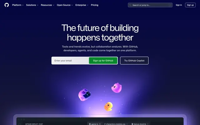
GitHub's design system evokes a dark, digital canvas – a midnight command center feel. Key elements are subtle translucency, glowing accents of blue, green, and violet, and a spacious, comfortable layout. Typography is precise and organized, contrasting bright text against deep backgrounds. Components are lightweight with rounded corners, often appearing as frosted overlays or bordered elements on a dark, unbounded canvas.
The page primarily employs a max-width contained layout, though the hero section spans full-bleed with a deep, dark gradient background. Content sections follow a vertical rhythm, often featuring alternating left/right text-and-visual arrangements or centered stacks. Card grids, typically 3-column, are used for features. The density is spacious, providing ample breathing room between information blocks. Navigation is managed via a sticky top bar, featuring Ghost Header Buttons and a pill-shaped search input.
The visual language for imagery is characterized by glowing, abstract 3D elements and vibrant, often purple or blue-hued, digital illustrations. These are frequently featured as floating objects or emanating light sources against dark backgrounds, adding a sense of futuristic technology and depth. Product screenshots are clean and integrated, showing code or UI elements with subtle, contrasting highlights. Icons are typically outlined or filled in Ghost White or subtle grays, occasionally accented with Polar Blue. The imagery serves both decorative atmosphere and to explain complex concepts, with a density that allows for significant textual information on screen.
Reminiscent of Vercel, Linear, Notion, Stripe.
# GitHub — Style Reference
> Midnight command center, subtly glowing

**Theme:** dark

**Site:** https://github.com

GitHub's design system evokes a dark, digital canvas – a midnight command center feel. Key elements are subtle translucency, glowing accents of blue, green, and violet, and a spacious, comfortable layout. Typography is precise and organized, contrasting bright text against deep backgrounds. Components are lightweight with rounded corners, often appearing as frosted overlays or bordered elements on a dark, unbounded canvas.

## Tokens — Colors

| Name | Value | Token | Role |
|------|------|------|------|
| Polar Blue | `#8dd6ff` | `--color-polar-blue` | Link text, outlined button borders, and interactive icon accents. It's a key brand identifier for interactive elements |
| Spring Green | `#08872b` | `--color-spring-green` | Primary action button background. Signals positive action or confirmation |
| Cosmic Violet | `#8c93fb` | `--color-cosmic-violet` | Decorative card borders and subtle illustrative accents, creating a sense of digital magic |
| Neon Green | `#5fed83` | `--color-neon-green` | Highlight text or decorative elements, particularly within code or feature descriptions |
| Interface Blue | `#1f6feb` | `--color-interface-blue` | Solid background for specific active elements or content blocks, providing a stronger visual presence |
| Violet Glow | `#e6b7fe` | `--color-violet-glow` | Illustrative element — background highlight for abstract graphics |
| Blue-Violet Orb | `#a7a2ff` | `--color-blue-violet-orb` | Illustrative element — focused glow emanating from central points in graphics |
| Vapor Trail Blue | `#5993d4` | `--color-vapor-trail-blue` | Illustrative element — upward-sweeping light beams in abstract backgrounds |
| Deep Gradient Start | `#000240` | `--color-deep-gradient-start` | Illustrative element — beginning of a deep blue gradient for background effects |
| Deep Space | `#0d1117` | `--color-deep-space` | Primary page background, base for most dark surfaces |
| Midnight Ink | `#000000` | `--color-midnight-ink` | Elevated surfaces, code blocks, modal backgrounds, and deeply shadowed areas |
| Code Canvas | `#151a22` | `--color-code-canvas` | Secondary background for sections, code editor areas, and subtle surface differentiation |
| Subtle Gray | `#21262d` | `--color-subtle-gray` | Borders between sections, divider lines, and very soft visual separation |
| Ash Gray | `#283041` | `--color-ash-gray` | Faint background for inactive states or subtle borders, hinting at elevation |
| Ghost White | `#ffffff` | `--color-ghost-white` | Primary text, prominent icons, and active navigation elements. Also used as a white background for some translucent elements |
| Faded Silver | `#f0f6fc` | `--color-faded-silver` | Secondary text, subheadings, and muted UI elements that require slightly less prominence than primary text |
| UI Gray | `#9198a1` | `--color-ui-gray` | Placeholder text, secondary icons, and less prominent text labels |
| Muted Text | `#7c8980` | `--color-muted-text` | Subtle helper text, less important details, and desaturated captions |

## Tokens — Typography

### Mona Sans
- **Substitute:** Inter
- **Weights:** 400, 425, 440, 460, 480, 500, 600, 800
- **Sizes:** 14px, 16px, 18px, 22px, 24px, 40px, 48px, 64px
- **Line height:** 1, 1.08, 1.18, 1.2, 1.3, 1.4, 1.5
- **Letter spacing:** -0.035, 0.01, 0.011, 0.013, 0.015
- **Role:** Primary brand typeface for all headings, body text, UI elements, and navigation. Its wide range of weights and precise letter-spacing ensures a consistent, modern voice.

### Mona Sans VF
- **Substitute:** Inter
- **Weights:** 400, 500, 600, 700
- **Sizes:** 12px, 14px, 16px, 24px
- **Line height:** 1, 1.25, 1.43, 1.5
- **Letter spacing:** 0
- **Role:** Used for smaller text, auxiliary information, and captions where Mona Sans would be too heavy. Its variable font capabilities likely allow for subtle optical adjustments.

### Mona Sans Mono
- **Substitute:** JetBrains Mono
- **Weights:** 400
- **Sizes:** 14px
- **Line height:** 1.5
- **Letter spacing:** 0.015
- **Role:** Monospace variant for code snippets, technical terms, and environments where code-like presentation is desired, ensuring visual consistency with the main typeface.

### ui-monospace
- **Substitute:** Menlo, Monaco
- **Weights:** 400
- **Sizes:** 14px
- **Line height:** 1.5
- **Letter spacing:** 0
- **Role:** Fallback monospace font for code blocks and technical displays, ensuring readability across systems.

## Tokens — Type Scale

Major Third (1.25) from 16px base.

| Role | Size | Line height | Letter spacing |
|------|------|------|------|
| caption | 12px | 1.5 | — |
| body-sm | 14px | 1.5 | 0.015em |
| body | 16px | 1.5 | 0.01em |
| subheading | 18px | 1.5 | 0.01em |
| heading-sm | 22px | 1.4 | 0.01em |
| heading | 24px | 1.4 | 0.01em |
| heading-lg | 40px | 1.2 | -0.035em |
| display | 64px | 1 | -0.035em |

## Tokens — Spacing

- **Section gap:** 24px
- **Card padding:** 8px
- **Element gap:** 16px

## Tokens — Radius

- **Default:** 6px
- **Buttons:** 6px
- **Cards:** 24px
- **input:** 8px
- **pill:** 60px

## Layout

The page primarily employs a max-width contained layout, though the hero section spans full-bleed with a deep, dark gradient background. Content sections follow a vertical rhythm, often featuring alternating left/right text-and-visual arrangements or centered stacks. Card grids, typically 3-column, are used for features. The density is spacious, providing ample breathing room between information blocks. Navigation is managed via a sticky top bar, featuring Ghost Header Buttons and a pill-shaped search input.

## Imagery

The visual language for imagery is characterized by glowing, abstract 3D elements and vibrant, often purple or blue-hued, digital illustrations. These are frequently featured as floating objects or emanating light sources against dark backgrounds, adding a sense of futuristic technology and depth. Product screenshots are clean and integrated, showing code or UI elements with subtle, contrasting highlights. Icons are typically outlined or filled in Ghost White or subtle grays, occasionally accented with Polar Blue. The imagery serves both decorative atmosphere and to explain complex concepts, with a density that allows for significant textual information on screen.

## Components

### Ghost Header Button
*Navigation, secondary actions*

Text in Ghost White (#ffffff) on a transparent background, 8px padding. No border. Used for top navigation items.

### Pill Ghost Button
*Secondary, subtle actions, category filters*

Text in Ghost White (#ffffff) on a transparent background with 8px vertical, 16px horizontal padding and a 60px border radius, creating a pill shape. Used for navigation and category tabs.

### Primary Action Button
*Main call to action*

Spring Green (#08872b) background, Ghost White (#ffffff) text, 6px border radius, with 6px vertical and 28px horizontal padding. Signals the most important action on a page.

### Outlined Accent Button
*Secondary interactive actions, often related to product features*

Polar Blue (#8dd6ff) text on a transparent background with a 1px Ghost White (#ffffff) border, 8px border radius, and 6px vertical, 28px horizontal padding. Provides a clear interactive target without being as dominant as the primary button.

### Code Block Card
*Displaying code snippets or technical content*

Semi-transparent surface (rgba(255, 255, 255, 0.06)), 24px border radius only on top corners (24px 24px 0px 0px), no internal padding, no box shadow. Edges are sharp at the bottom, suggesting continuity.

### Floating Content Card
*Elevated content blocks or interactive elements*

Highly translucent background (rgba(255, 255, 255, 0.2)), 24px border radius, 8px internal padding on all sides, no box shadow. Appears as a frosted overlay.

### Input Field
*User text input*

Transparent background with 18px top, 12px right, 0px bottom, 18px left padding. No explicit border specified, relying on contrasting text input/label (placeholder) against the dark background. 8px border radius.

### Pill Input
*Search or short text inputs*

Transparent background, Ghost White (#ffffff) text, with an 8px border radius. Likely uses implicit top/bottom paddings of 8px and side as 16px to create the pill shape, similar to pill buttons.

## Guidelines

### Do

- Prioritize Deep Space (#0d1117) as the canvas background for most page sections.
- Use Ghost White (#ffffff) for all primary body and heading text for maximum contrast on dark backgrounds.
- Apply Spring Green (#08872b) exclusively for primary call-to-action button backgrounds.
- Utilize Polar Blue (#8dd6ff) for all links, outlined buttons, and interactive icons.
- Apply a 6px border radius for most interactive elements like buttons and inputs, but use 60px for pill-shaped elements.
- Ensure cards use a larger 24px border radius, often with only top corners rounded for a more architectural feel.
- Maintain comfortable element spacing using multiples of 4px, especially 16px for elementGap.

### Don't

- Avoid using bright, saturated colors for backgrounds; stick to the dark neutral palette.
- Do not use generic gray borders (such as #f0f6fc) on interactive elements; Polar Blue (#8dd6ff) is reserved for interaction outlining.
- Never introduce hard, sharp corners on cards or primary buttons; maintain a consistent rounded aesthetic.
- Do not use overly large or decorative drop shadows; the system favors subtle glows and translucency over heavy elevation.
- Avoid dense packing of information; allow ample `elementGap` and `sectionGap` for a comfortable user experience.
- Do not vary font families outside of Mona Sans variants and monospace fallbacks; maintain typographic consistency.
- Avoid using Mona Sans Mono or ui-monospace for non-code content; these are specifically for technical text.

## Agent Prompt Guide

Quick Color Reference:
text: #ffffff
background: #0d1117
border: #21262d
accent: #8dd6ff
primary action: #08872b (filled action)

Example Component Prompts:
1. Create a Primary Action Button: #08872b background, #ffffff text, 9999px radius, compact pill padding. Use this filled treatment for the main CTA.
2. Create a feature card: Floating Content Card (rgba(255, 255, 255, 0.2) background, 24px radius, 8px padding). Title 'Accelerate your workflow' in Mona Sans, size 24px, weight 600, color Ghost White (#ffffff). Body text 'From your first line of code...' in Mona Sans, size 16px, weight 400, color Faded Silver (#f0f6fc).
3. Create a navigation link: 'Solutions' in Mona Sans, size 16px, weight 400, color Ghost White (#ffffff). Hover state text Polar Blue (#8dd6ff). Ensure 16px right margin from the next element.
More like this





Keep what you find
A free account saves references to boards and can send you a weekly email of picks based on what you save.
To see every result, go Pro.