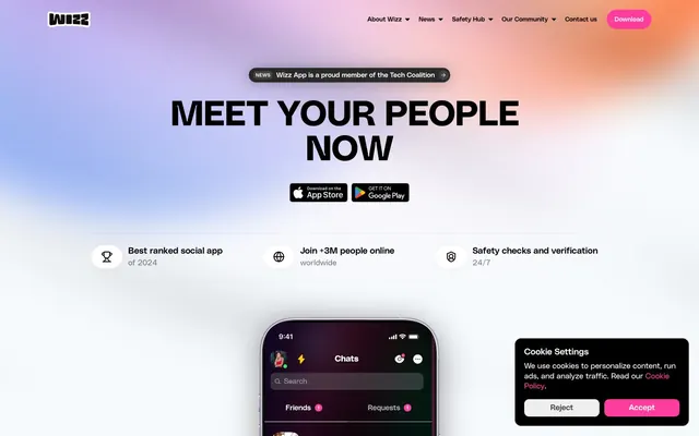
Preview image. Unlock full-res
Fuchsia-powered dark mode
Color palette
Primary action buttons, links, accents on headings, input active states – creates immediate visual focus and brand recognition
Page backgrounds, card surfaces, primary text on light backgrounds
Prominent text on dark backgrounds, active states
Muted text, hairline borders, placeholder text
Subtle dark backgrounds, input text
Secondary surface backgrounds, ghost button fills
Input background fill on light surfaces
Typography
- Weights
- 400
- Sizes
- 12px
- Line height
- 1.2
sans-serif — detected in extracted data but not described by AI
- Weights
- 400, 600, 700
- Sizes
- 10px, 13px, 14px, 16px, 18px, 86px
- Line height
- 0.85, 1, 1.1, 1.2, 1.25, 1.44, 1.5, 2
- Letter spacing
- -0.0100em at 86px, 0.0500em at 10-18px
- Fallback
- Inter
Dominant display and headline font for punchy, modern statements, also used for some body text and navigation items.
- Weights
- 400
- Sizes
- 14px, 16px, 18px
- Line height
- 1.2, 1.3, 1.4, 1.5
- Fallback
- Inter
Supplemental body and link text, offering clean readability in smaller contexts.
- Weights
- 700
- Sizes
- 72px
- Line height
- 1
- Fallback
- Inter Bold
Used for very large, impactful titles, commanding attention.
- Weights
- 300
- Sizes
- 14px
- Line height
- 1, 1.1
- Fallback
- Inter Light
Delicate, light-weight text for subtle headings, links, and buttons, conveying a sophisticated restraint.
- Weights
- 400
- Sizes
- 12px
- Line height
- 1.2
- Fallback
- System UI
Default system font for utility text, labels, and card descriptions.
Spacing & shape
Elevation
Components
Filled with Wizz Fuchsia (#ff3d9e), text in browser default blue (likely overridden to white in practice), 12px border radius, 10px vertical and 16px horizontal padding.
Background Charcoal (#292929), text in browser default blue (likely white). Has a 999px border radius (pill shape) with 4px vertical and 10px horizontal padding.
Transparent background, Steel Gray (#dadada) text color, no border or radius, zero padding.
Midnight Void (#000000) background, 14px border radius, inset border of 1px solid Steel Gray (#dadada).
Midnight Void (#000000) background, Ink Wash (#444444) text, Ink Wash (#444444) border, 10px border radius, 10px padding.
Cloud Mist (#eeeeee) background, Ink Wash (#444444) text, Ink Wash (#444444) border, 10px border radius, 10px padding.
Guidelines
- Use Midnight Void (#000000) as the primary background for all major sections unless otherwise specified.
- Apply Wizz Fuchsia (#ff3d9e) for all primary calls to action, ensuring text color contrasts sufficiently.
- Utilize 12px border radius for all inputs, buttons, and cards to maintain a consistent soft, modern feel.
- Employ PolySans Median for all headings to leverage its distinct character, varying weights as needed for hierarchy.
- Maintain a clear visual hierarchy by contrasting Ghost White (#ffffff) for primary text on dark backgrounds and Midnight Void (#000000) for text on lighter neutral sections.
- Use a 999px border radius (pill shape) for all ghost buttons and small informational tags in the header.
- Apply Steel Gray (#dadada) for subtle dividers, borders, and muted supporting text.
- Avoid generic system default colors; exclusively use colors from the defined palette.
- Do not use multiple accent colors; Wizz Fuchsia (#ff3d9e) is the sole vibrant accent for interactivity and brand highlighting.
- Do not introduce heavy shadows or gradients on elements; maintain a largely flat and sharp aesthetic with subtle elevation for key interactive components.
- Avoid using serif fonts or highly decorative typefaces; adhere strictly to the PolySans family and Inter for all textual content.
- Do not deviate from the established border radii for components; the varied but specific radii (12px, 999px, 24px) are a key part of the brand's visual identity.
- Do not use broad, full-width content sections; contain most content within a defined horizontal width for better readability and structure.
- Avoid overly bright or light backgrounds for main content areas; maintain the dark-mode aesthetic predominantly.
About this system
ShowHide
Wizz embraces a bold, high-contrast dark theme with a vibrant fuchsia accent color that creates a playful, energetic atmosphere. Typography is a central element, using distinct custom sans-serif typefaces for sharp, impactful headlines and clear body text. Surfaces are mostly dark and flat, relying on the single accent color for primary actions and highlights, with subtle elevation for key interactive elements.
The page primarily uses a full-bleed layout for background elements and a centered, contained content model for text and components, with an implicit max-width. The hero section often features a full-width gradient backdrop with a large, centered headline. Content sections alternate between visually distinct blocks, often presenting a two-column layout with text on one side and a visual (like a phone screenshot or user gallery) on the other. Vertical rhythm is established through consistent section gaps. Navigation is a sticky top bar with pill-shaped buttons and subtly styled links.
The site uses a mix of dark, immersive gradients for hero sections and UI surfaces (blending purple, orange, pink), contrasted with clean, product-focused photography featuring phone screens and diverse user profile images. Graphics are minimal, relying on simple icons (likely outlined, matching the site's generally sparse visual style). Imagery is primarily decorative atmosphere for the hero and expressive content for user representation, maintaining a high-contrast aesthetic against dark backgrounds.
Reminiscent of Discord, Figma, Linear.
# Wizz — Style Reference
> Fuchsia-powered dark mode

**Theme:** dark

**Site:** https://wizzapp.com

Wizz embraces a bold, high-contrast dark theme with a vibrant fuchsia accent color that creates a playful, energetic atmosphere. Typography is a central element, using distinct custom sans-serif typefaces for sharp, impactful headlines and clear body text. Surfaces are mostly dark and flat, relying on the single accent color for primary actions and highlights, with subtle elevation for key interactive elements.

## Tokens — Colors

| Name | Value | Token | Role |
|------|------|------|------|
| Wizz Fuchsia | `#ff3d9e` | `--color-wizz-fuchsia` | Primary action buttons, links, accents on headings, input active states – creates immediate visual focus and brand recognition |
| Midnight Void | `#000000` | `--color-midnight-void` | Page backgrounds, card surfaces, primary text on light backgrounds |
| Ghost White | `#ffffff` | `--color-ghost-white` | Prominent text on dark backgrounds, active states |
| Steel Gray | `#dadada` | `--color-steel-gray` | Muted text, hairline borders, placeholder text |
| Ink Wash | `#444444` | `--color-ink-wash` | Subtle dark backgrounds, input text |
| Charcoal | `#292929` | `--color-charcoal` | Secondary surface backgrounds, ghost button fills |
| Cloud Mist | `#eeeeee` | `--color-cloud-mist` | Input background fill on light surfaces |

## Tokens — Typography

### sans-serif
- **Weights:** 400
- **Sizes:** 12px
- **Line height:** 1.2
- **Role:** sans-serif — detected in extracted data but not described by AI

### PolySans Median
- **Substitute:** Inter
- **Weights:** 400, 600, 700
- **Sizes:** 10px, 13px, 14px, 16px, 18px, 86px
- **Line height:** 0.85, 1, 1.1, 1.2, 1.25, 1.44, 1.5, 2
- **Letter spacing:** -0.0100em at 86px, 0.0500em at 10-18px
- **Role:** Dominant display and headline font for punchy, modern statements, also used for some body text and navigation items.

### PolySans Neutral
- **Substitute:** Inter
- **Weights:** 400
- **Sizes:** 14px, 16px, 18px
- **Line height:** 1.2, 1.3, 1.4, 1.5
- **Role:** Supplemental body and link text, offering clean readability in smaller contexts.

### PolySans Bulky
- **Substitute:** Inter Bold
- **Weights:** 700
- **Sizes:** 72px
- **Line height:** 1
- **Role:** Used for very large, impactful titles, commanding attention.

### PolySans Slim
- **Substitute:** Inter Light
- **Weights:** 300
- **Sizes:** 14px
- **Line height:** 1, 1.1
- **Role:** Delicate, light-weight text for subtle headings, links, and buttons, conveying a sophisticated restraint.

### Inter
- **Substitute:** System UI
- **Weights:** 400
- **Sizes:** 12px
- **Line height:** 1.2
- **Role:** Default system font for utility text, labels, and card descriptions.

## Tokens — Type Scale

| Role | Size | Line height | Letter spacing |
|------|------|------|------|
| caption | 10px | 1.5 | 0.5px |
| body | 14px | 1.5 | — |
| heading-sm | 18px | 1.25 | — |
| heading | 72px | 1 | — |
| display | 86px | 0.85 | -1px |

## Tokens — Spacing

- **Section gap:** 80px
- **Card padding:** 16px
- **Element gap:** 10px

## Tokens — Radius

- **Buttons:** 12px
- **Inputs:** 12px
- **Cards:** 12px
- **avatars:** 24px
- **navItems:** 999px

## Tokens — Elevation

- **Dropdown/Menu:** `rgba(0, 0, 0, 0.05) 0px 1px 10px 0px`
- **Button (promoted):** `rgba(0, 0, 0, 0.3) 0px 1px 30px 0px`
- **Card (inset border):** `rgb(218, 218, 218) 0px 0px 0px 1px inset`

## Layout

The page primarily uses a full-bleed layout for background elements and a centered, contained content model for text and components, with an implicit max-width. The hero section often features a full-width gradient backdrop with a large, centered headline. Content sections alternate between visually distinct blocks, often presenting a two-column layout with text on one side and a visual (like a phone screenshot or user gallery) on the other. Vertical rhythm is established through consistent section gaps. Navigation is a sticky top bar with pill-shaped buttons and subtly styled links.

## Imagery

The site uses a mix of dark, immersive gradients for hero sections and UI surfaces (blending purple, orange, pink), contrasted with clean, product-focused photography featuring phone screens and diverse user profile images. Graphics are minimal, relying on simple icons (likely outlined, matching the site's generally sparse visual style). Imagery is primarily decorative atmosphere for the hero and expressive content for user representation, maintaining a high-contrast aesthetic against dark backgrounds.

## Components

### Primary Action Button
*The main call to action button.*

Filled with Wizz Fuchsia (#ff3d9e), text in browser default blue (likely overridden to white in practice), 12px border radius, 10px vertical and 16px horizontal padding.

### Ghost Header Button
*Used for secondary actions in the header.*

Background Charcoal (#292929), text in browser default blue (likely white). Has a 999px border radius (pill shape) with 4px vertical and 10px horizontal padding.

### Nav Link
*Standard navigation item with minimal styling.*

Transparent background, Steel Gray (#dadada) text color, no border or radius, zero padding.

### Cookie Consent Card
*Information panel for cookie settings.*

Midnight Void (#000000) background, 14px border radius, inset border of 1px solid Steel Gray (#dadada).

### Text Input (Dark)
*Standard text input field in a dark context.*

Midnight Void (#000000) background, Ink Wash (#444444) text, Ink Wash (#444444) border, 10px border radius, 10px padding.

### Text Input (Light)
*Standard text input field in a light context.*

Cloud Mist (#eeeeee) background, Ink Wash (#444444) text, Ink Wash (#444444) border, 10px border radius, 10px padding.

## Guidelines

### Do

- Use Midnight Void (#000000) as the primary background for all major sections unless otherwise specified.
- Apply Wizz Fuchsia (#ff3d9e) for all primary calls to action, ensuring text color contrasts sufficiently.
- Utilize 12px border radius for all inputs, buttons, and cards to maintain a consistent soft, modern feel.
- Employ PolySans Median for all headings to leverage its distinct character, varying weights as needed for hierarchy.
- Maintain a clear visual hierarchy by contrasting Ghost White (#ffffff) for primary text on dark backgrounds and Midnight Void (#000000) for text on lighter neutral sections.
- Use a 999px border radius (pill shape) for all ghost buttons and small informational tags in the header.
- Apply Steel Gray (#dadada) for subtle dividers, borders, and muted supporting text.

### Don't

- Avoid generic system default colors; exclusively use colors from the defined palette.
- Do not use multiple accent colors; Wizz Fuchsia (#ff3d9e) is the sole vibrant accent for interactivity and brand highlighting.
- Do not introduce heavy shadows or gradients on elements; maintain a largely flat and sharp aesthetic with subtle elevation for key interactive components.
- Avoid using serif fonts or highly decorative typefaces; adhere strictly to the PolySans family and Inter for all textual content.
- Do not deviate from the established border radii for components; the varied but specific radii (12px, 999px, 24px) are a key part of the brand's visual identity.
- Do not use broad, full-width content sections; contain most content within a defined horizontal width for better readability and structure.
- Avoid overly bright or light backgrounds for main content areas; maintain the dark-mode aesthetic predominantly.

## Agent Prompt Guide

Quick Color Reference:
text: #ffffff
background: #000000
border: #dadada
accent: #ff3d9e
primary action: #ff3d9e (filled action)

Example Component Prompts:
1. Create a Primary Action Button: Wizz Fuchsia (#ff3d9e) background, text color should contrast well (e.g. #ffffff), 12px radius, 10px vertical and 16px horizontal padding, PolySans Slim 14px weight 300 text.
2. Create a Header Ghost Button: Charcoal (#292929) background, Ghost White (#ffffff) text, 999px radius, 4px vertical and 10px horizontal padding, PolySans Median 14px weight 400 text.
3. Create a Cookie Consent Card: Midnight Void (#000000) background, 14px radius, 1px inset border of Steel Gray (#dadada), with Inter 12px weight 400 text for its content.
4. Create a prominent heading: PolySans Bulky 72px weight 700 text, Ghost White (#ffffff) color.
More like this




Keep what you find
A free account saves references to boards and can send you a weekly email of picks based on what you save.
To see every result, go Pro.