Preview image. Unlock full-res
Wilderness at dusk
Color palette
Call-to-action buttons, active states, key interactive highlights, and decorative touches — provides a jolt of vivid energy against the muted palette, drawing immediate attention.
Used for specific interactive elements or unique visual flourishes where a subtle, directional highlight is desired to draw the eye.
Alternative gradient for interactive elements, providing a slightly different shade transition.
Primary text color, link color, button text, header elements — stands out sharply against the dark background, ensuring high legibility.
Subtle borders and separators, secondary text in specific contexts like footers — adds a layer of visual separation without stark contrast.
Minor background elements or subtle details — evokes the natural, earthy tones visible in the background imagery.
Typography
- Weights
- 400
- Sizes
- 13px, 14px, 18px, 58px, 72px
- Line height
- 0.9, 1.06, 1.2, 1.25, 1.62
- Letter spacing
- -0.03em
- Fallback
- Inter
Primary headline and navigation font. Its precise, slightly condensed appearance communicates authority and technical sophistication, especially paired with the subtle letter-spacing for titles.
- Weights
- 300, 400, 700
- Sizes
- 13px, 14px, 18px, 29px, 65px
- Line height
- 1.2, 1.25, 1.28
- Fallback
- Fira Code
Used for body text, button labels, and specific elements with a functional, data-driven feel. The monospace nature lends a technical, precise, and understated tone, ensuring clarity even at smaller sizes.
Spacing & shape
Components
Transparent background, Creme Paper text (#f4f3e8), and a 0px border-radius. Padding is 0px all around, relying on text spacing for visual separation. Uses NB International Pro at 13px weight 400 with -0.03em letter spacing.
Deep Forest background (#13140e) with Creme Paper text (#f4f3e8) and a 3.6px border-radius. Padding is 0px top/bottom, 18px left/right. Uses JetBrains Mono (likely 14px or 18px), hinting at a more functional or detailed action.
Vivid Lime Accent background (#ebfc72) with Deep Forest text (#13140e). Features a 3.6px border-radius and 0px top/bottom, 18px left/right padding. Uses JetBrains Mono for the label, ensuring the action feels clear and direct.
Transparent background with Creme Paper text (#f4f3e8) and a 0px border-radius. A bottom border in Creme Paper defines the input area. Padding is 0px top/right/left, 4.5px bottom. Text uses NB International Pro.
Features NB International Pro, weight 400, in Creme Paper (#f4f3e8). Sizes include 58px and 72px, with tight line heights (0.90-1.06) and a subtle letter-spacing of -0.03em, creating an impactful yet refined presence.
Set in JetBrains Mono, likely 14px or 18px, with weights 300, 400, or 700. Employs a generous line height (1.20-1.28) for legibility against the dark background. Text color is Creme Paper (#f4f3e8).
Smaller text (likely 13px JetBrains Mono) with Creme Paper (#f4f3e8) on a Deep Forest background, sometimes accented with thin Stone Grey (#404040) borders for visual separation within the footer.
Guidelines
- Prioritize Creme Paper (#f4f3e8) on Deep Forest (#13140e) for maximum contrast and legibility.
- Use NB International Pro for all major headings and navigation elements to maintain an authoritative tone.
- Apply JetBrains Mono for body text, button labels, and any code-like snippets to emphasize precision.
- Utilize Lime Accent (#ebfc72) exclusively for primary calls-to-action or critical interactive states to command attention.
- Maintain a consistent 3.6px border-radius for all interactive buttons and input fields that require rounding.
- Employ a base spacing unit of 14px for general element gaps and 59px for vertical section spacing.
- Ensure the page content never exceeds a max-width of 810px to keep text lines readable and layout contained.
- Avoid using highly saturated colors other than Lime Accent (#ebfc72) to maintain the muted, naturalistic palette.
- Do not introduce extensive shadow effects; the design relies on stark color contrast and flat surfaces for depth.
- Refrain from using excessively large or decorative typefaces that deviate from NB International Pro or JetBrains Mono.
- Disperse rounded corners beyond buttons and specific inputs; most elements should adhere to sharp edges.
- Do not use generic system fonts; the custom typefaces are essential to the brand's visual identity.
- Avoid large blocks of text in weights lighter than 400 to ensure readability on the dark background.
- Do not create layouts that extend beyond the 810px max-width without a specific full-bleed background treatment.
About this system
ShowHide
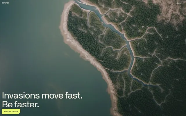
This design system evokes a sense of stark, deliberate naturalism, like an aerial view of a verdant, wild landscape at dusk. The dominant color scheme consists of a muted dark background (#13140e) contrasted with a creamy almost-white (#f4f3e8), punctuated by infrequent, vivid lime-yellow accents (#ebfc72). The use of custom fonts, NB International Pro for headlines and JetBrains Mono for body text, creates a distinctive typographic voice that is both authoritative and technical. Limited rounded corners (3.6px) appear only on interactive elements like buttons, contributing to an overall grounded aesthetic.
The page primarily utilizes a max-width contained layout, likely around 810px, centered on the screen, creating a focused reading experience. The hero section is a full-bleed visual with a dominant aerial photograph, overlaid with a large, centered headline and a distinct CTA. Subsequent sections follow a rhythm of consistent vertical spacing (approx. 59px). Content is arranged in clear, often single-column stacks with occasional text-adjacent visual elements on a dark background, establishing a very text-dominant, editorial feel. Navigation is a minimal top bar with 'INVERSA' branding on the left and a 'Menu' button on the right, unobtrusively integrated into the hero image.
The visual language is dominated by high-resolution, full-bleed aerial photography of natural landscapes (rivers, forests, geological formations). The images are treated with a slightly desaturated, moody filter that harmonizes with the dark UI, conveying a sense of scale and interconnectedness without being overly dramatic. Imagery primarily serves as a powerful atmospheric background, reinforcing the brand's connection to ecological themes. There are minimal visible icons, and those present are monochrome, typically Creme Paper (#f4f3e8) outlines against Deep Forest (#13140e), appearing precise and functional.
Reminiscent of AIGA Design, Oak, Field Notes, The New York Times.
# INVERSA — Style Reference
> Wilderness at dusk

**Theme:** dark

**Site:** https://inversa.com

This design system evokes a sense of stark, deliberate naturalism, like an aerial view of a verdant, wild landscape at dusk. The dominant color scheme consists of a muted dark background (#13140e) contrasted with a creamy almost-white (#f4f3e8), punctuated by infrequent, vivid lime-yellow accents (#ebfc72). The use of custom fonts, NB International Pro for headlines and JetBrains Mono for body text, creates a distinctive typographic voice that is both authoritative and technical. Limited rounded corners (3.6px) appear only on interactive elements like buttons, contributing to an overall grounded aesthetic.

## Tokens — Colors

| Name | Value | Token | Role |
|------|------|------|------|
| Lime Accent | `#ebfc72` | `--color-lime-accent` | Call-to-action buttons, active states, key interactive highlights, and decorative touches — provides a jolt of vivid energy against the muted palette, drawing immediate attention. |
| Lime Gradient | `#ebfc72` | `--color-lime-gradient` | Used for specific interactive elements or unique visual flourishes where a subtle, directional highlight is desired to draw the eye. |
| Inverse Lime Gradient | `#ebfc72` | `--color-inverse-lime-gradient` | Alternative gradient for interactive elements, providing a slightly different shade transition. |
| Creme Paper | `#f4f3e8` | `--color-creme-paper` | Primary text color, link color, button text, header elements — stands out sharply against the dark background, ensuring high legibility. |
| Stone Grey | `#404040` | `--color-stone-grey` | Subtle borders and separators, secondary text in specific contexts like footers — adds a layer of visual separation without stark contrast. |
| Muddy Banks | `#84837b` | `--color-muddy-banks` | Minor background elements or subtle details — evokes the natural, earthy tones visible in the background imagery. |

## Tokens — Typography

### NB International Pro
- **Substitute:** Inter
- **Weights:** 400
- **Sizes:** 13px, 14px, 18px, 58px, 72px
- **Line height:** 0.9, 1.06, 1.2, 1.25, 1.62
- **Letter spacing:** -0.03em
- **Role:** Primary headline and navigation font. Its precise, slightly condensed appearance communicates authority and technical sophistication, especially paired with the subtle letter-spacing for titles.

### JetBrains Mono
- **Substitute:** Fira Code
- **Weights:** 300, 400, 700
- **Sizes:** 13px, 14px, 18px, 29px, 65px
- **Line height:** 1.2, 1.25, 1.28
- **Role:** Used for body text, button labels, and specific elements with a functional, data-driven feel. The monospace nature lends a technical, precise, and understated tone, ensuring clarity even at smaller sizes.

## Tokens — Type Scale

Perfect Fifth (1.5) from 18px base.

| Role | Size | Line height | Letter spacing |
|------|------|------|------|
| caption | 13px | 1.62 | -0.48px |
| body | 18px | 1.2 | -0.48px |
| subheading | 29px | 1.25 | — |
| heading | 58px | 1.06 | -1.74px |
| display | 72px | 0.9 | -2.16px |

## Tokens — Spacing

- **Max width:** 810px
- **Section gap:** 59px
- **Card padding:** 18px
- **Element gap:** 14px

## Tokens — Radius

- **Buttons:** 3.6px

## Layout

The page primarily utilizes a max-width contained layout, likely around 810px, centered on the screen, creating a focused reading experience. The hero section is a full-bleed visual with a dominant aerial photograph, overlaid with a large, centered headline and a distinct CTA. Subsequent sections follow a rhythm of consistent vertical spacing (approx. 59px). Content is arranged in clear, often single-column stacks with occasional text-adjacent visual elements on a dark background, establishing a very text-dominant, editorial feel. Navigation is a minimal top bar with 'INVERSA' branding on the left and a 'Menu' button on the right, unobtrusively integrated into the hero image.

## Imagery

The visual language is dominated by high-resolution, full-bleed aerial photography of natural landscapes (rivers, forests, geological formations). The images are treated with a slightly desaturated, moody filter that harmonizes with the dark UI, conveying a sense of scale and interconnectedness without being overly dramatic. Imagery primarily serves as a powerful atmospheric background, reinforcing the brand's connection to ecological themes. There are minimal visible icons, and those present are monochrome, typically Creme Paper (#f4f3e8) outlines against Deep Forest (#13140e), appearing precise and functional.

## Components

### Lime CTA Button Group

### Stat / Metric Block

### Alert / Notification Banner

### Ghost Navigation Button
*Primary navigation interaction*

Transparent background, Creme Paper text (#f4f3e8), and a 0px border-radius. Padding is 0px all around, relying on text spacing for visual separation. Uses NB International Pro at 13px weight 400 with -0.03em letter spacing.

### Dark Solid Button
*Secondary action items*

Deep Forest background (#13140e) with Creme Paper text (#f4f3e8) and a 3.6px border-radius. Padding is 0px top/bottom, 18px left/right. Uses JetBrains Mono (likely 14px or 18px), hinting at a more functional or detailed action.

### Lime CTA Button
*Primary call-to-action*

Vivid Lime Accent background (#ebfc72) with Deep Forest text (#13140e). Features a 3.6px border-radius and 0px top/bottom, 18px left/right padding. Uses JetBrains Mono for the label, ensuring the action feels clear and direct.

### Input Field
*User data entry*

Transparent background with Creme Paper text (#f4f3e8) and a 0px border-radius. A bottom border in Creme Paper defines the input area. Padding is 0px top/right/left, 4.5px bottom. Text uses NB International Pro.

### Main Heading
*Section titles*

Features NB International Pro, weight 400, in Creme Paper (#f4f3e8). Sizes include 58px and 72px, with tight line heights (0.90-1.06) and a subtle letter-spacing of -0.03em, creating an impactful yet refined presence.

### Body Text
*Paragraph content*

Set in JetBrains Mono, likely 14px or 18px, with weights 300, 400, or 700. Employs a generous line height (1.20-1.28) for legibility against the dark background. Text color is Creme Paper (#f4f3e8).

### Copyright/Footer Text
*Legal and informational text*

Smaller text (likely 13px JetBrains Mono) with Creme Paper (#f4f3e8) on a Deep Forest background, sometimes accented with thin Stone Grey (#404040) borders for visual separation within the footer.

## Guidelines

### Do

- Prioritize Creme Paper (#f4f3e8) on Deep Forest (#13140e) for maximum contrast and legibility.
- Use NB International Pro for all major headings and navigation elements to maintain an authoritative tone.
- Apply JetBrains Mono for body text, button labels, and any code-like snippets to emphasize precision.
- Utilize Lime Accent (#ebfc72) exclusively for primary calls-to-action or critical interactive states to command attention.
- Maintain a consistent 3.6px border-radius for all interactive buttons and input fields that require rounding.
- Employ a base spacing unit of 14px for general element gaps and 59px for vertical section spacing.
- Ensure the page content never exceeds a max-width of 810px to keep text lines readable and layout contained.

### Don't

- Avoid using highly saturated colors other than Lime Accent (#ebfc72) to maintain the muted, naturalistic palette.
- Do not introduce extensive shadow effects; the design relies on stark color contrast and flat surfaces for depth.
- Refrain from using excessively large or decorative typefaces that deviate from NB International Pro or JetBrains Mono.
- Disperse rounded corners beyond buttons and specific inputs; most elements should adhere to sharp edges.
- Do not use generic system fonts; the custom typefaces are essential to the brand's visual identity.
- Avoid large blocks of text in weights lighter than 400 to ensure readability on the dark background.
- Do not create layouts that extend beyond the 810px max-width without a specific full-bleed background treatment.

## Agent Prompt Guide

### Quick Color Reference
- Text: `#f4f3e8`
- Background: `#13140e`
- CTA: `#ebfc72`
- Border: `#404040` (subtle)
- Accent: `#ebfc72`

### 3-5 Example Component Prompts
1. Create a hero section: full-bleed aerial background image. Centered headline 'Invasions move fast. Be faster.' in Creme Paper (#f4f3e8), NB International Pro, 72px, weight 400, line-height 0.9, letter-spacing -2.16px. Below, a Lime CTA Button with 'Explore Origin' text, JetBrains Mono, Deep Forest (#13140e) text, Lime Accent (#ebfc72) background, 3.6px radius, 0px top/bottom, 18px left/right padding.
2. Develop a content block: Deep Forest (#13140e) background. Inside, body text in JetBrains Mono, 18px, weight 400, line-height 1.2, in Creme Paper (#f4f3e8). Section padding is 59px top/bottom. Max content width 810px, centered.
3. Design a dark solid button: 'Inversa Leathers' text, JetBrains Mono, Creme Paper (#f4f3e8) text, Deep Forest (#13140e) background, 3.6px border-radius, 0px top/bottom, 18px left/right padding.
4. Create an input field: transparent background, Creme Paper (#f4f3e8) text, NB International Pro, 14px, with a Creme Paper (#f4f3e8) bottom border 1px thick. Padding 0px top/right/left, 4.5px bottom.
More like this









Keep what you find
A free account saves references to boards and can send you a weekly email of picks based on what you save.
To see every result, go Pro.