Preview image. Unlock full-res
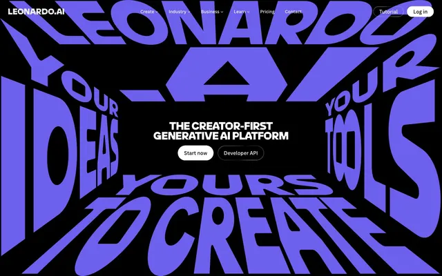
Luminous Digital Void: vibrant hues punching through deep darkness.
Color palette
Green wash for highlight backgrounds, decorative bands, and soft emphasis behind content
Violet wash for highlight backgrounds, decorative bands, and soft emphasis behind content.
Secondary accent for categorization, highlights, and occasional decorative elements. Creates visual energy
Tertiary accent, often paired with other vivid colors for visual interest or to denote specific categories. Used judiciously
A warmer red accent, similar in use to Vivid Crimson for visual variety and categorization
Primary page background, high-contrast text color on white surfaces, shadow base
Subtle borders, dividers, secondary ghost button borders, and input outlines. Provides minimal structural definition without asserting strong presence
Text on light surfaces, also appearing as link color on dark backgrounds, suggesting a subtle tonal shift from pure black; Background gradient for sections, providing a smooth transition from deep black
Primary text color against dark backgrounds, filled button backgrounds, active navigation elements
Elevated card backgrounds, differentiated from the main background without introducing significant lightness
Secondary text, descriptive elements, inactive link states. Reduces visual hierarchy
Typography
- Weights
- 400, 500, 700
- Sizes
- 10px, 12px, 14px, 16px, 18px, 19px
- Line height
- 1.1, 1.15, 1.2, 1.25, 1.33
- Letter spacing
- normal
- Fallback
- system-ui, sans-serif
Primary legible text for body content, UI labels, links, and navigation. Its consistent weight range and neutral tone support the more expressive display fonts.
- Weights
- 500, 800, 900
- Sizes
- 14px, 22px, 34px, 35px, 39px, 44px, 45px, 48px, 50px, 51px, 59px, 65px, 66px, 68px, 75px, 76px, 78px, 79px, 85px, 86px, 90px, 98px, 165px
- Line height
- 0.8, 0.85, 0.9, 0.93, 1, 1.25
- Letter spacing
- -0.0200em at large sizes, -0.0100em at smaller heading sizes
- Fallback
- Georgia, serif
Bold, condensed display typeface used for all major headings and artistic text. Its varied weights and negative letter-spacing create a distinct, authoritative, and slightly aggressive feel. The large sizes and tight tracking are a signature element.
- Weights
- 500
- Sizes
- 34px
- Line height
- 0.92
- Letter spacing
- -0.0200em
- Fallback
- serif
Specialized display face for specific, highly stylized heading elements. Its specific 34px size with tight letter spacing creates a unique, impactful visual identity for specific marketing text.
Spacing & shape
Components
Background #000000 (transparent), text #ffffff, border 1px solid #ffffff, 60px radius. Padding 6.75px vertical, 20.25px horizontal. The extensive radius creates a pill shape.
Background #ffffff, text #000000, 60px radius. Padding 6.75px vertical, 20.25px horizontal. Used for prominent calls to action.
Background transparent, text #ffffff, no border, 0px radius. No internal padding, relying on icon size for visual area.
Background transparent, text #ffffff, right-aligned, 60px radius for specific end caps. Used within a group, often with 0px padding as part of a larger component.
Background #353535, 8.4375px radius, no shadow. Padding 20.25px on all sides. Used for structured textual content.
Background uses vivid brand colors like #03e65b or #ffc533, 20.4375px radius, no shadow. Padding 16.875px on all sides. These variations bring saturated color to sections.
Background transparent, text #ffffff, 0px radius. Used for small textual indicators.
Guidelines
- Always use Midnight Void (#000000) for page backgrounds to maintain the deep, dark aesthetic.
- Utilize Pure White (#ffffff) as the primary text color on dark backgrounds for legibility and visual pop.
- Apply LeoSans for all headlines and display text, using extensive letter-spacing adjustments (e.g., -0.0200em for large sizes) to achieve its distinct, compressed look.
- Employ Ghostly Gray (#e5e5e5) for all non-interactive borders, including ghost buttons and dividers, to maintain a subtle structure against dark surfaces.
- Reserve Luminous Green (#03e65b) and Deep Violet (#6e60ee) for distinct accent roles like active states, critical highlights, and brand iconography.
- Use 60px border radius for interactive elements like buttons to achieve a strong pill-like, accessible shape.
- Implement the linear-gradient(rgb(10, 10, 10) 0%, rgba(37, 37, 37, 0.65) 100%) for contained sections that need a softer, slightly varied background from the pure black canvas.
- Avoid using multiple accent colors in close proximity; instead, let a single accent color make its statement.
- Do not introduce light gray backgrounds for content sections; maintain the dark theme by using Subtle Surface (#353535) for elevated cards.
- Refrain from using default browser link styles; ensure all links use canvaSans and either Pure White (#ffffff) or Muted Ash (#999999) with appropriate hover states.
- Do not use subtle shadows for elevation; the system relies on solid background color shifts for hierarchy.
- Never use `canvaSans` for headlines; its purpose is functional readability, not expressive display.
- Avoid generic rectangular buttons; all prominent buttons should adopt the distinct 60px pill radius.
- Do not introduce large amounts of whitespace around tightly tracked headlines; they are designed to command dense visual space.
About this system
ShowHide
Leonardo.Ai evokes a luminous digital void, where vibrant hues punch through deep darkness. Typography is bold and oversized, often warping or stacked for dramatic effect, suggesting a world of limitless creation. Interface elements are primarily ghosted or outlined, allowing the rich generative imagery and expressive text to dominate, with solid accents used sparingly for key interactions. The system maintains a high contrast, dark-mode default, relying on the interplay of black canvas, bright white text, and a focused palette of vivid, single-color accents for points of interest.
The page primarily employs a full-bleed layout, where the dark background extends to the viewport edges. The hero section is characterized by oversized, warped typographic elements laid out in 3D perspective, making a bold statement. Content sections below often feature a centered stack text block followed by image-heavy layouts – frequently a grid of cards or alternating text+visual sections. Vertical rhythm is governed by distinct section gaps, creating clear breaks. Navigation is a minimalist top bar, sticky at some breakpoints, with ghosted menu items and prominent 'Log in' and 'Tutorial' buttons.
The imagery leans heavily on highly creative, often abstract or fantastical AI-generated art, product imagery, and stylized photography. These visuals are typically contained within cards with sharp or slightly rounded corners, presented as showcases rather than integrated into the background. The treatment is direct: full-color, high-impact visuals without heavy masking or complex overlaps. Icons are generally minimalist, outlined, and monochromatic, with the occasional full-color brand icon, acting as functional elements that don't compete with the generative art.
Reminiscent of Midjourney, RunwayML, Stability AI, Framer.
# Leonardo.ai — Style Reference
> Luminous Digital Void: vibrant hues punching through deep darkness.

**Theme:** dark

**Site:** https://leonardo.ai

Leonardo.Ai evokes a luminous digital void, where vibrant hues punch through deep darkness. Typography is bold and oversized, often warping or stacked for dramatic effect, suggesting a world of limitless creation. Interface elements are primarily ghosted or outlined, allowing the rich generative imagery and expressive text to dominate, with solid accents used sparingly for key interactions. The system maintains a high contrast, dark-mode default, relying on the interplay of black canvas, bright white text, and a focused palette of vivid, single-color accents for points of interest.

## Tokens — Colors

| Name | Value | Token | Role |
|------|------|------|------|
| Luminous Green | `#03e65b` | `--color-luminous-green` | Green wash for highlight backgrounds, decorative bands, and soft emphasis behind content |
| Deep Violet | `#6e60ee` | `--color-deep-violet` | Violet wash for highlight backgrounds, decorative bands, and soft emphasis behind content. |
| Electric Yellow | `#ffc533` | `--color-electric-yellow` | Secondary accent for categorization, highlights, and occasional decorative elements. Creates visual energy |
| Vivid Crimson | `#ff3386` | `--color-vivid-crimson` | Tertiary accent, often paired with other vivid colors for visual interest or to denote specific categories. Used judiciously |
| Sunset Red | `#ff5d4b` | `--color-sunset-red` | A warmer red accent, similar in use to Vivid Crimson for visual variety and categorization |
| Midnight Void | `#000000` | `--color-midnight-void` | Primary page background, high-contrast text color on white surfaces, shadow base |
| Ghostly Gray | `#e5e5e5` | `--color-ghostly-gray` | Subtle borders, dividers, secondary ghost button borders, and input outlines. Provides minimal structural definition without asserting strong presence |
| Off-Black Text | `#0a0a0a` | `--color-off-black-text` | Text on light surfaces, also appearing as link color on dark backgrounds, suggesting a subtle tonal shift from pure black; Background gradient for sections, providing a smooth transition from deep black |
| Pure White | `#ffffff` | `--color-pure-white` | Primary text color against dark backgrounds, filled button backgrounds, active navigation elements |
| Subtle Surface | `#353535` | `--color-subtle-surface` | Elevated card backgrounds, differentiated from the main background without introducing significant lightness |
| Muted Ash | `#999999` | `--color-muted-ash` | Secondary text, descriptive elements, inactive link states. Reduces visual hierarchy |

## Tokens — Typography

### canvaSans
- **Substitute:** system-ui, sans-serif
- **Weights:** 400, 500, 700
- **Sizes:** 10px, 12px, 14px, 16px, 18px, 19px
- **Line height:** 1.1, 1.15, 1.2, 1.25, 1.33
- **Letter spacing:** normal
- **Role:** Primary legible text for body content, UI labels, links, and navigation. Its consistent weight range and neutral tone support the more expressive display fonts.

### leoSans
- **Substitute:** Georgia, serif
- **Weights:** 500, 800, 900
- **Sizes:** 14px, 22px, 34px, 35px, 39px, 44px, 45px, 48px, 50px, 51px, 59px, 65px, 66px, 68px, 75px, 76px, 78px, 79px, 85px, 86px, 90px, 98px, 165px
- **Line height:** 0.8, 0.85, 0.9, 0.93, 1, 1.25
- **Letter spacing:** -0.0200em at large sizes, -0.0100em at smaller heading sizes
- **Role:** Bold, condensed display typeface used for all major headings and artistic text. Its varied weights and negative letter-spacing create a distinct, authoritative, and slightly aggressive feel. The large sizes and tight tracking are a signature element.

### ufficioDisplay
- **Substitute:** serif
- **Weights:** 500
- **Sizes:** 34px
- **Line height:** 0.92
- **Letter spacing:** -0.0200em
- **Role:** Specialized display face for specific, highly stylized heading elements. Its specific 34px size with tight letter spacing creates a unique, impactful visual identity for specific marketing text.

## Tokens — Type Scale

Golden Ratio (1.618) from 14px base.

| Role | Size | Line height | Letter spacing |
|------|------|------|------|
| caption | 10px | 1.1 | — |
| body | 14px | 1.2 | — |
| subheading | 18px | 1.25 | — |
| heading-sm | 22px | 0.8 | -0.22px |
| heading | 39px | 0.9 | -0.78px |
| heading-lg | 59px | 0.85 | -1.18px |
| display | 165px | 0.8 | -3.3px |

## Tokens — Spacing

- **Section gap:** 34-37px
- **Card padding:** 17-20px
- **Element gap:** 7-10px

## Tokens — Radius

- **Buttons:** 60px
- **Cards:** 8.4375px
- **tags:** 270px

## Layout

The page primarily employs a full-bleed layout, where the dark background extends to the viewport edges. The hero section is characterized by oversized, warped typographic elements laid out in 3D perspective, making a bold statement. Content sections below often feature a centered stack text block followed by image-heavy layouts – frequently a grid of cards or alternating text+visual sections. Vertical rhythm is governed by distinct section gaps, creating clear breaks. Navigation is a minimalist top bar, sticky at some breakpoints, with ghosted menu items and prominent 'Log in' and 'Tutorial' buttons.

## Imagery

The imagery leans heavily on highly creative, often abstract or fantastical AI-generated art, product imagery, and stylized photography. These visuals are typically contained within cards with sharp or slightly rounded corners, presented as showcases rather than integrated into the background. The treatment is direct: full-color, high-impact visuals without heavy masking or complex overlaps. Icons are generally minimalist, outlined, and monochromatic, with the occasional full-color brand icon, acting as functional elements that don't compete with the generative art.

## Components

### Ghost Pill Button
*Secondary action button for navigation or tertiary interactions.*

Background #000000 (transparent), text #ffffff, border 1px solid #ffffff, 60px radius. Padding 6.75px vertical, 20.25px horizontal. The extensive radius creates a pill shape.

### Filled Pill Button (Light)
*Primary action button, high contrast.*

Background #ffffff, text #000000, 60px radius. Padding 6.75px vertical, 20.25px horizontal. Used for prominent calls to action.

### Icon-only Button
*Navigation or small interactive elements where size is minimal.*

Background transparent, text #ffffff, no border, 0px radius. No internal padding, relying on icon size for visual area.

### Horizontal Tab Button
*Segmented control for filtering or switching views.*

Background transparent, text #ffffff, right-aligned, 60px radius for specific end caps. Used within a group, often with 0px padding as part of a larger component.

### Basic Content Card
*Container for secondary content like descriptions or detailed information.*

Background #353535, 8.4375px radius, no shadow. Padding 20.25px on all sides. Used for structured textual content.

### Accent Product Card
*Visually distinct card for showcasing featured items or categories.*

Background uses vivid brand colors like #03e65b or #ffc533, 20.4375px radius, no shadow. Padding 16.875px on all sides. These variations bring saturated color to sections.

### Content Badge
*Label or tag for categorization.*

Background transparent, text #ffffff, 0px radius. Used for small textual indicators.

## Guidelines

### Do

- Always use Midnight Void (#000000) for page backgrounds to maintain the deep, dark aesthetic.
- Utilize Pure White (#ffffff) as the primary text color on dark backgrounds for legibility and visual pop.
- Apply LeoSans for all headlines and display text, using extensive letter-spacing adjustments (e.g., -0.0200em for large sizes) to achieve its distinct, compressed look.
- Employ Ghostly Gray (#e5e5e5) for all non-interactive borders, including ghost buttons and dividers, to maintain a subtle structure against dark surfaces.
- Reserve Luminous Green (#03e65b) and Deep Violet (#6e60ee) for distinct accent roles like active states, critical highlights, and brand iconography.
- Use 60px border radius for interactive elements like buttons to achieve a strong pill-like, accessible shape.
- Implement the linear-gradient(rgb(10, 10, 10) 0%, rgba(37, 37, 37, 0.65) 100%) for contained sections that need a softer, slightly varied background from the pure black canvas.

### Don't

- Avoid using multiple accent colors in close proximity; instead, let a single accent color make its statement.
- Do not introduce light gray backgrounds for content sections; maintain the dark theme by using Subtle Surface (#353535) for elevated cards.
- Refrain from using default browser link styles; ensure all links use canvaSans and either Pure White (#ffffff) or Muted Ash (#999999) with appropriate hover states.
- Do not use subtle shadows for elevation; the system relies on solid background color shifts for hierarchy.
- Never use `canvaSans` for headlines; its purpose is functional readability, not expressive display.
- Avoid generic rectangular buttons; all prominent buttons should adopt the distinct 60px pill radius.
- Do not introduce large amounts of whitespace around tightly tracked headlines; they are designed to command dense visual space.

## Agent Prompt Guide

Quick Color Reference:
text: #ffffff
background: #000000
border: #e5e5e5
accent: #6e60ee
primary action: #ffffff (filled action)

Example Component Prompts:
1. Create a Hero Headline: 'YOUR IDEAS YOURS TO CREATE' using `leoSans` weight 900 at 165px, color #6e60ee, letter-spacing -3.3px, on a Midnight Void (#000000) background. Ensure 0.8 line height.
2. Create a Ghost Outlined Button: 'Start now' using `canvaSans` weight 400 at 16px, text color #ffffff, background transparent, border 1px solid #ffffff, and 60px border radius. Apply 6.75px vertical and 20.25px horizontal padding.
3. Create an Accent Product Card: displaying generative art. Set background to Luminous Green (#03e65b), 20.4375px border radius, with 16.875px padding. Inside, place a 'Product Title' using `canvaSans` weight 700 at 19px, color #0a0a0a.
4. Create a Secondary Text Link: 'Learn more' using `canvaSans` weight 400 at 14px, color Muted Ash (#999999), on a Midnight Void (#000000) background.
More like this





Keep what you find
A free account saves references to boards and can send you a weekly email of picks based on what you save.
To see every result, go Pro.