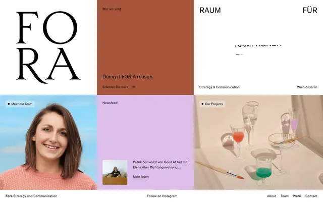
Preview image. Unlock full-res
Color-blocked gallery walls
Color palette
Prominent interactive blocks, section backgrounds, accentuating key messages with a warm, earthy tone
Subtle background for themed sections, providing a slightly darker variant of the primary brand red
Interactive content blocks, background for newsfeed sections, offering a soft, creative accent
Page backgrounds, card surfaces, typography contrast backdrop
All text elements, borders, icons, providing sharp contrast against vibrant backgrounds
Typography
- Weights
- 400
- Sizes
- 15px, 18px, 23px, 35px
- Line height
- 1.17, 1.3, 1.33, 1.53
- Letter spacing
- 0.36, 0.36, 0.46, 0.42
- Fallback
- Open Sans, Montserrat
Body text, navigation items, general content, and small headings. Its neutral stance allows the color blocks to dominate.
- Weights
- 700
- Sizes
- 15px
- Line height
- 1.33
- Letter spacing
- 0.36
- Fallback
- Open Sans, Montserrat
Used for emphasis within body copy, drawing attention to specific phrases without changing color.
Spacing & shape
Components
Full-bleed button block with background #a9553c, text #000000, 30px top padding, 25px right/bottom/left padding, 0px border radius. Used for prominent calls to action.
Full-bleed button block with background #ddbdea, text #000000, 25px uniform padding, 0px border radius. Used for secondary content highlights.
Button with transparent background, #000000 text, no padding, 0px border radius. Used for navigation and inline actions.
Button with background rgba(255, 255, 255, 0.35), text #000000, 5px uniform padding, 5px border radius. Used for small labels like 'Meet our Team'.
Small card nested within a larger content block; likely has a white background (not explicitly detected in this variant but implied by screenshot), #000000 text, with an internal padding of around 10-20px based on general element spacing.
Guidelines
- Always use Deepest Ink (#000000) for all text against Canvas White (#ffffff) or any chromatic background.
- Utilize Terracotta Bold (#a9553c) and Lavender Haze (#ddbdea) as solid, full-bleed background blocks to create distinct content zones.
- Apply 0px border radius for primary interactive content blocks to maintain a sharp, architectural feel.
- Use Theinhardt (400) for all body text at 15px with 1.33 lineHeight and 0.36px letterSpacing.
- Maintain a clear distinction between content blocks using stark color changes rather than shadows or borders.
- Employ the Subtle Tag Button style (background rgba(255, 255, 255, 0.35), 5px radius) for small, informational labels.
- Use 'Theinhardt Medium' (700 weight, 15px) for emphasizing text within paragraphs with 0.36px letterSpacing.
- Avoid using multiple border radii values; stick to 0px for main blocks and 5px for small tags/elements.
- Do not introduce gradients; the design relies on solid, flat color fields for its visual impact.
- Refrain from using shadows or excessive depth effects; the aesthetic is flat and graphic.
- Do not deviate from the specified font families and weights; the custom Theinhardt typeface is integral to the brand's voice.
- Avoid decorative icons or complex illustrations that do not contribute directly to content communication. Emphasize type and color blocks.
- Do not use highly saturated or vivid colors outside of the defined brand and accent palette for main content blocks.
- Avoid padding within primary interaction blocks that isn't either 25px or 30px as designated for visual consistency.
About this system
ShowHide
This design evokes a sense of playful architectural structure by organizing content into distinct, brightly colored blocks. The deliberate use of stark white and black typography against saturated, pastel-like backgrounds creates a high-contrast, graphic quality. Each large content area acts as a 'room' with its own color and function, where the delicate, custom serif wordmark provides an unexpected counterpoint to the bold, blocky layout and muted, modern sans-serif body text. This interplay between classical typography and contemporary, segmented color fields distinguishes the visual style.
The page primarily utilizes a full-bleed grid layout with no discernible pageMaxWidth. It's structured as a series of vertically stacked, alternating horizontal color blocks, each block serving as a distinct content section. The hero appears to be a two-column or multi-column arrangement of these blocks, featuring a large, stylized wordmark on white adjacent to a solid color block with text. Subsequent sections follow a similar pattern, creating a mosaic-like effect. Content within these blocks is often left-aligned or centered, creating a strong visual hierarchy through the block structure itself. There are instances of small elements like circular 'bullet' points (9999px radius) for emphasis. Navigation is a simple bottom bar with ghost links, consistent with the minimal aesthetic.
The site uses a mix of photography and stylized abstract visuals. Photography, when present (e.g., 'Meet our Team'), tends to be bright and clear, often with a soft-focus background or natural lighting. Other visuals appear to be artistic compositions of objects (e.g., 'Our Projects'), resembling still-life paintings with muted colors and interesting shadow play, suggesting a creative and design-oriented approach. Images are contained within their color blocks, often with raw, un-masked rectangular edges, blending seamlessly into the blocky layout. There are also small, contained product screenshots/person images embedded within text blocks, acting as visual anchors for content. The density is moderate; images are used intentionally to break up text and color fields.
Reminiscent of AIGA Design, The Brand Agency, Pentagram, Frank Body.
# FORA — Style Reference
> Color-blocked gallery walls

**Theme:** light

**Site:** https://fora-concept.com

This design evokes a sense of playful architectural structure by organizing content into distinct, brightly colored blocks. The deliberate use of stark white and black typography against saturated, pastel-like backgrounds creates a high-contrast, graphic quality. Each large content area acts as a 'room' with its own color and function, where the delicate, custom serif wordmark provides an unexpected counterpoint to the bold, blocky layout and muted, modern sans-serif body text. This interplay between classical typography and contemporary, segmented color fields distinguishes the visual style.

## Tokens — Colors

| Name | Value | Token | Role |
|------|------|------|------|
| Terracotta Bold | `#a9553c` | `--color-terracotta-bold` | Prominent interactive blocks, section backgrounds, accentuating key messages with a warm, earthy tone |
| Terracotta Muted | `#a04d35` | `--color-terracotta-muted` | Subtle background for themed sections, providing a slightly darker variant of the primary brand red |
| Lavender Haze | `#ddbdea` | `--color-lavender-haze` | Interactive content blocks, background for newsfeed sections, offering a soft, creative accent |
| Canvas White | `#ffffff` | `--color-canvas-white` | Page backgrounds, card surfaces, typography contrast backdrop |
| Deepest Ink | `#000000` | `--color-deepest-ink` | All text elements, borders, icons, providing sharp contrast against vibrant backgrounds |

## Tokens — Typography

### Theinhardt
- **Substitute:** Open Sans, Montserrat
- **Weights:** 400
- **Sizes:** 15px, 18px, 23px, 35px
- **Line height:** 1.17, 1.3, 1.33, 1.53
- **Letter spacing:** 0.36, 0.36, 0.46, 0.42
- **Role:** Body text, navigation items, general content, and small headings. Its neutral stance allows the color blocks to dominate.

### Theinhardt Medium
- **Substitute:** Open Sans, Montserrat
- **Weights:** 700
- **Sizes:** 15px
- **Line height:** 1.33
- **Letter spacing:** 0.36
- **Role:** Used for emphasis within body copy, drawing attention to specific phrases without changing color.

## Tokens — Type Scale

Perfect Fourth (1.333) from 15px base.

| Role | Size | Line height | Letter spacing |
|------|------|------|------|
| body | 15px | 1.33 | 0.36px |
| subheading | 18px | 1.53 | 0.43px |
| heading | 23px | 1.3 | 0.46px |
| display | 35px | 1.17 | 0.42px |

## Tokens — Spacing

- **Card padding:** 25px

## Tokens — Radius

- **Buttons:** 0px (primary), 5px (secondary)
- **tags:** 9999px

## Layout

The page primarily utilizes a full-bleed grid layout with no discernible pageMaxWidth. It's structured as a series of vertically stacked, alternating horizontal color blocks, each block serving as a distinct content section. The hero appears to be a two-column or multi-column arrangement of these blocks, featuring a large, stylized wordmark on white adjacent to a solid color block with text. Subsequent sections follow a similar pattern, creating a mosaic-like effect. Content within these blocks is often left-aligned or centered, creating a strong visual hierarchy through the block structure itself. There are instances of small elements like circular 'bullet' points (9999px radius) for emphasis. Navigation is a simple bottom bar with ghost links, consistent with the minimal aesthetic.

## Imagery

The site uses a mix of photography and stylized abstract visuals. Photography, when present (e.g., 'Meet our Team'), tends to be bright and clear, often with a soft-focus background or natural lighting. Other visuals appear to be artistic compositions of objects (e.g., 'Our Projects'), resembling still-life paintings with muted colors and interesting shadow play, suggesting a creative and design-oriented approach. Images are contained within their color blocks, often with raw, un-masked rectangular edges, blending seamlessly into the blocky layout. There are also small, contained product screenshots/person images embedded within text blocks, acting as visual anchors for content. The density is moderate; images are used intentionally to break up text and color fields.

## Components

### Primary Action Block

### Newsfeed Block

### Subtle Tag Button & Bottom Bar

### Primary Action Block
*Interactive content section*

Full-bleed button block with background #a9553c, text #000000, 30px top padding, 25px right/bottom/left padding, 0px border radius. Used for prominent calls to action.

### Secondary Action Block
*Interactive content section*

Full-bleed button block with background #ddbdea, text #000000, 25px uniform padding, 0px border radius. Used for secondary content highlights.

### Ghost Link Button
*Navigational link*

Button with transparent background, #000000 text, no padding, 0px border radius. Used for navigation and inline actions.

### Subtle Tag Button
*Informational tag or filter*

Button with background rgba(255, 255, 255, 0.35), text #000000, 5px uniform padding, 5px border radius. Used for small labels like 'Meet our Team'.

### Newsfeed Item Card
*Content preview*

Small card nested within a larger content block; likely has a white background (not explicitly detected in this variant but implied by screenshot), #000000 text, with an internal padding of around 10-20px based on general element spacing.

## Guidelines

### Do

- Always use Deepest Ink (#000000) for all text against Canvas White (#ffffff) or any chromatic background.
- Utilize Terracotta Bold (#a9553c) and Lavender Haze (#ddbdea) as solid, full-bleed background blocks to create distinct content zones.
- Apply 0px border radius for primary interactive content blocks to maintain a sharp, architectural feel.
- Use Theinhardt (400) for all body text at 15px with 1.33 lineHeight and 0.36px letterSpacing.
- Maintain a clear distinction between content blocks using stark color changes rather than shadows or borders.
- Employ the Subtle Tag Button style (background rgba(255, 255, 255, 0.35), 5px radius) for small, informational labels.
- Use 'Theinhardt Medium' (700 weight, 15px) for emphasizing text within paragraphs with 0.36px letterSpacing.

### Don't

- Avoid using multiple border radii values; stick to 0px for main blocks and 5px for small tags/elements.
- Do not introduce gradients; the design relies on solid, flat color fields for its visual impact.
- Refrain from using shadows or excessive depth effects; the aesthetic is flat and graphic.
- Do not deviate from the specified font families and weights; the custom Theinhardt typeface is integral to the brand's voice.
- Avoid decorative icons or complex illustrations that do not contribute directly to content communication. Emphasize type and color blocks.
- Do not use highly saturated or vivid colors outside of the defined brand and accent palette for main content blocks.
- Avoid padding within primary interaction blocks that isn't either 25px or 30px as designated for visual consistency.

## Agent Prompt Guide

### Quick Color Reference
- Text: #000000
- Background Primary: #ffffff
- Background Accent 1: #a9553c
- Background Accent 2: #ddbdea
- Button Subtle Tag: rgba(255, 255, 255, 0.35)

### 3-5 Example Component Prompts
1. Create a `Primary Action Block`: background #a9553c, text 'Doing it FOR A reason.', font Theinhardt 400 at 35px, #000000. Use 30px top padding and 25px right/bottom/left padding. Add a child 'Erfahren Sie mehr' link: ghost style #000000 text, font Theinhardt 400 at 15px.
2. Create a `Secondary Action Block`: background #ddbdea. Center align 'Newsfeed' with font Theinhardt 400 at 23px, #000000. Include a nested 'Newsfeed Item Card': small image left, text 'Patrik Sünwoldt...' right, font Theinhardt 400 at 15px, #000000.
3. Create a `Subtle Tag Button`: background rgba(255, 255, 255, 0.35), text 'Meet our Team', font Theinhardt 400 at 15px, #000000. Apply 5px uniform padding and 5px border radius. Prepend with a small black (9999px radius) circular indicator (e.g., 8px circle).
More like this







Keep what you find
A free account saves references to boards and can send you a weekly email of picks based on what you save.
To see every result, go Pro.