Preview image. Unlock full-res
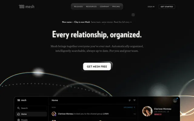
Midnight archive behind frosted glass
Color palette
Interactive elements, outlined actions, functional highlights, decorative icon accents. This color signals interactivity and focus
Orange outline accent for tags, dividers, and focused UI edges
Background gradient for hero sections and evocative visual dividers
Page background, primary surface, and deeply recessed elements
Content container backgrounds, subtle elevated surfaces, text that implies depth or inactivity
Deepest text contrast, icon fills for emphasis
Primary body text, neutral icons, subtle borders, and placeholder states
Secondary text, muted links, fine dividers
High-contrast headings, active text, button text on dark backgrounds, selected states
Tertiary text, descriptive labels, very subtle borders
Helper text, subtle content details that need to recede slightly
Typography
- Weights
- 400, 600, 700
- Sizes
- 9px, 10px, 12px, 14px, 16px, 18px, 20px
- Line height
- 1, 1.1, 1.33, 1.35, 1.38, 1.4, 1.5, 1.69, 2.25, 2.7, 3
- Letter spacing
- 0.13px at 9px to 0.33px at 20px, with specific values like 0.0560em for some contexts
- Fallback
- Inter
Primary text and UI elements. The narrow letter spacing ensures high information density even at smaller sizes in the dark UI. This font is custom, providing a unique, compact 'typewriter' feel.
- Weights
- 700, 900
- Sizes
- 48px, 64px
- Line height
- 1
- Letter spacing
- 0.67px at 48px, 0.89px at 64px
- Fallback
- Oswald
Display headlines. The condensed nature and heavy weights provide strong impact and directness, contrasting with the more restrained body text. The tight line height emphasizes the single phrase.
- Weights
- 400
- Sizes
- 22px
- Line height
- 1.55
- Letter spacing
- normal
- Fallback
- Lora
Specialized editorial headings or pull quotes. This serif font adds a touch of classic sophistication, providing a visual break from the sans-serif system to highlight key content with a more traditional voice.
- Weights
- 500, 600
- Sizes
- 10px, 14px, 15px
- Line height
- 1.14, 1.33, 2
- Letter spacing
- 1px at 10px, 1.4px at 14px, 1.5px at 15px
- Fallback
- sans-serif
Fallback and utilitarian text where system rendering is prioritized for small labels and tooltips. The wider letter-spacing at smaller sizes improves legibility.
Spacing & shape
Elevation
Components
Transparent background, 'Cloud White' text, no border, with a 6px radius. Text appears only as a label without a visible container, reducing visual clutter in the dark theme.
Background is 'Deep Night' or transparent, text is 'Cloud White', with a 'Amber Glow' border of 1px. The corners are rounded with 6px radius. This outline provides a strong interactive cue without being a solid fill, maintaining the system's lightweight feel.
Background is partially transparent (#ffffff with 70% opacity), 'Cloud White' text, with a 16px border-radius. A subtle shadow of rgba(0, 0, 0, 0.06) 0px 0px 0px 1px and rgba(0, 0, 0, 0.08) -8px 12px 22px 0px gives it a floating effect.
Transparent background, 'Silver Whisper' text, 0px border-radius. Minimal visibility, fading into the background.
Background is rgba(255, 255, 255, 0.06), 'Cloud White' text, with a 12px border-radius and 10px right padding. This badge provides a slightly more prominent visual signal than the subtle badge.
Guidelines
- Prioritize 'Deep Night' (#0f0f10) as the base background for most sections to maintain a consistent dark atmosphere.
- Use 'Silver Whisper' (#b3b3b3) for general body text and 'Cloud White' (#fefef7) for high-impact headings and active states, ensuring clear hierarchy in dark UI.
- Employ the Verlag font family for all primary text content to leverage its compact character and precise spacing.
- When an action requires emphasis, use an outlined button with 'Amber Glow' (#f2b98b) as the border color, ensuring interactive elements have a distinct, warm highlight.
- Maintain a compact information density using `elementGap` of '10px' and `cardPadding` of '24px' to organize content tightly but legibly.
- Apply `border-radius` values from the system: '16px' for cards and '6px' for buttons, to ensure consistent surface treatment.
- Utilize `Ghost Navigation Button` for all header navigation items to minimize visual distraction and keep the focus on content.
- Avoid using bright, saturated colors for large UI areas; color should primarily act as functional highlights or subtle accents, not dominant backgrounds.
- Do not introduce strong, heavy shadows or distinct background fills beyond those specified for Floating Cards; maintain a lightweight, ethereal surface treatment.
- Do not deviate from the specified Verlag and VerlagCondensed font families for headings and body text; system fonts should be reserved for specific utilitarian contexts.
- Do not use generic circular or square radii; adhere to the system's `border-radius` values of '16px' for cards, '6px' for buttons, and '12px' for badges.
- Do not use opaque white as a primary background; the system relies on deep neutrals and subtle transparencies for its dark theme.
- Avoid excessive use of 'Moonless Ink' (#000000) for body text; reserve it for high-contrast elements or specific icon fills.
- Do not introduce new type scales or line-heights; adhere to the discrete values provided to maintain typographic rhythm and density.
About this system
ShowHide
Mesh invokes a dark, intimate digital rolodex feel, where muted neutrals create a command center for relationships. The visual system combines compact, precise typography with subtle background textures and a warm, low-saturation amber accent. Components recede into the dark canvas, using fine borders and soft internal glows rather than heavy shadows or distinct background fills. The overall impression is one of restrained sophistication and digital calm.
The page layout is primarily full-bleed, extending content and atmospheric backgrounds across the viewport. The hero section is characterized by a centered headline on a deep, dark background, often subtly animated with abstract light. Content sections then shift to a mixed model: central content is constrained within a maximum width, while background elements may remain full-bleed. Vertical rhythm is established through consistent section gaps, creating distinct content blocks. Navigation is a minimalist top bar, with ghost links or an outlined button for primary actions against the dark canvas.
This system primarily uses abstract, atmospheric visuals with sparkling light effects and subtle linear patterns that evoke digital networks or constellations. Photography or detailed illustrations are absent. Icons are minimal, outlined, or filled in a mono-color style, often using 'Amber Glow' for emphasis. The imagery serves a decorative, mood-setting role rather than explanatory content, creating a sense of digital mystique and depth. Density is text-dominant, with imagery relegated to background elements.
Reminiscent of Linear, Superhuman, Amie, Arc Browser.
# Mesh — Style Reference
> Midnight archive behind frosted glass

**Theme:** dark

**Site:** https://clay.earth

Mesh invokes a dark, intimate digital rolodex feel, where muted neutrals create a command center for relationships. The visual system combines compact, precise typography with subtle background textures and a warm, low-saturation amber accent. Components recede into the dark canvas, using fine borders and soft internal glows rather than heavy shadows or distinct background fills. The overall impression is one of restrained sophistication and digital calm.

## Tokens — Colors

| Name | Value | Token | Role |
|------|------|------|------|
| Amber Glow | `#f2b98b` | `--color-amber-glow` | Interactive elements, outlined actions, functional highlights, decorative icon accents. This color signals interactivity and focus |
| Sunset Blush | `#ffaf7c` | `--color-sunset-blush` | Orange outline accent for tags, dividers, and focused UI edges |
| Golden Horizon | `#d49065` | `--color-golden-horizon` | Background gradient for hero sections and evocative visual dividers |
| Deep Night | `#0f0f10` | `--color-deep-night` | Page background, primary surface, and deeply recessed elements |
| Graphite | `#1d1d1f` | `--color-graphite` | Content container backgrounds, subtle elevated surfaces, text that implies depth or inactivity |
| Moonless Ink | `#000000` | `--color-moonless-ink` | Deepest text contrast, icon fills for emphasis |
| Silver Whisper | `#b3b3b3` | `--color-silver-whisper` | Primary body text, neutral icons, subtle borders, and placeholder states |
| Ash Gray | `#666666` | `--color-ash-gray` | Secondary text, muted links, fine dividers |
| Cloud White | `#fefef7` | `--color-cloud-white` | High-contrast headings, active text, button text on dark backgrounds, selected states |
| Warm Mist | `#868f97` | `--color-warm-mist` | Tertiary text, descriptive labels, very subtle borders |
| Pale Stone | `#86868b` | `--color-pale-stone` | Helper text, subtle content details that need to recede slightly |

## Tokens — Typography

### Verlag
- **Substitute:** Inter
- **Weights:** 400, 600, 700
- **Sizes:** 9px, 10px, 12px, 14px, 16px, 18px, 20px
- **Line height:** 1, 1.1, 1.33, 1.35, 1.38, 1.4, 1.5, 1.69, 2.25, 2.7, 3
- **Letter spacing:** 0.13px at 9px to 0.33px at 20px, with specific values like 0.0560em for some contexts
- **Role:** Primary text and UI elements. The narrow letter spacing ensures high information density even at smaller sizes in the dark UI. This font is custom, providing a unique, compact 'typewriter' feel.

### VerlagCondensed
- **Substitute:** Oswald
- **Weights:** 700, 900
- **Sizes:** 48px, 64px
- **Line height:** 1
- **Letter spacing:** 0.67px at 48px, 0.89px at 64px
- **Role:** Display headlines. The condensed nature and heavy weights provide strong impact and directness, contrasting with the more restrained body text. The tight line height emphasizes the single phrase.

### ChronicleTextG1Roman
- **Substitute:** Lora
- **Weights:** 400
- **Sizes:** 22px
- **Line height:** 1.55
- **Letter spacing:** normal
- **Role:** Specialized editorial headings or pull quotes. This serif font adds a touch of classic sophistication, providing a visual break from the sans-serif system to highlight key content with a more traditional voice.

### system-ui
- **Substitute:** sans-serif
- **Weights:** 500, 600
- **Sizes:** 10px, 14px, 15px
- **Line height:** 1.14, 1.33, 2
- **Letter spacing:** 1px at 10px, 1.4px at 14px, 1.5px at 15px
- **Role:** Fallback and utilitarian text where system rendering is prioritized for small labels and tooltips. The wider letter-spacing at smaller sizes improves legibility.

## Tokens — Type Scale

| Role | Size | Line height | Letter spacing |
|------|------|------|------|
| heading | 18px | 1.33 | 0.14px |
| heading-lg | 20px | 1.1 | 0.14px |
| display-sm | 22px | 1.55 | — |
| display | 48px | 1 | 0.67px |
| display-lg | 64px | 1 | 0.89px |

## Tokens — Spacing

- **Section gap:** 24px
- **Card padding:** 24px
- **Element gap:** 10px

## Tokens — Radius

- **Buttons:** 6px
- **Cards:** 16px
- **Images:** 36px
- **badges:** 12px

## Tokens — Elevation

- **Floating Card:** `rgba(0, 0, 0, 0.06) 0px 0px 0px 1px, rgba(0, 0, 0, 0.08) -8px 12px 22px 0px`

## Layout

The page layout is primarily full-bleed, extending content and atmospheric backgrounds across the viewport. The hero section is characterized by a centered headline on a deep, dark background, often subtly animated with abstract light. Content sections then shift to a mixed model: central content is constrained within a maximum width, while background elements may remain full-bleed. Vertical rhythm is established through consistent section gaps, creating distinct content blocks. Navigation is a minimalist top bar, with ghost links or an outlined button for primary actions against the dark canvas.

## Imagery

This system primarily uses abstract, atmospheric visuals with sparkling light effects and subtle linear patterns that evoke digital networks or constellations. Photography or detailed illustrations are absent. Icons are minimal, outlined, or filled in a mono-color style, often using 'Amber Glow' for emphasis. The imagery serves a decorative, mood-setting role rather than explanatory content, creating a sense of digital mystique and depth. Density is text-dominant, with imagery relegated to background elements.

## Components

### Ghost Navigation Button
*Header navigation and secondary actions*

Transparent background, 'Cloud White' text, no border, with a 6px radius. Text appears only as a label without a visible container, reducing visual clutter in the dark theme.

### Outline Action Button
*Primary calls to action with an understated, interactive glow.*

Background is 'Deep Night' or transparent, text is 'Cloud White', with a 'Amber Glow' border of 1px. The corners are rounded with 6px radius. This outline provides a strong interactive cue without being a solid fill, maintaining the system's lightweight feel.

### Floating Card
*Content groupings that gently rise above the dark background.*

Background is partially transparent (#ffffff with 70% opacity), 'Cloud White' text, with a 16px border-radius. A subtle shadow of rgba(0, 0, 0, 0.06) 0px 0px 0px 1px and rgba(0, 0, 0, 0.08) -8px 12px 22px 0px gives it a floating effect.

### Subtle Badge
*Informational tags or status indicators within content.*

Transparent background, 'Silver Whisper' text, 0px border-radius. Minimal visibility, fading into the background.

### Elevated Badge
*Highlighted tags or active filters*

Background is rgba(255, 255, 255, 0.06), 'Cloud White' text, with a 12px border-radius and 10px right padding. This badge provides a slightly more prominent visual signal than the subtle badge.

## Guidelines

### Do

- Prioritize 'Deep Night' (#0f0f10) as the base background for most sections to maintain a consistent dark atmosphere.
- Use 'Silver Whisper' (#b3b3b3) for general body text and 'Cloud White' (#fefef7) for high-impact headings and active states, ensuring clear hierarchy in dark UI.
- Employ the Verlag font family for all primary text content to leverage its compact character and precise spacing.
- When an action requires emphasis, use an outlined button with 'Amber Glow' (#f2b98b) as the border color, ensuring interactive elements have a distinct, warm highlight.
- Maintain a compact information density using `elementGap` of '10px' and `cardPadding` of '24px' to organize content tightly but legibly.
- Apply `border-radius` values from the system: '16px' for cards and '6px' for buttons, to ensure consistent surface treatment.
- Utilize `Ghost Navigation Button` for all header navigation items to minimize visual distraction and keep the focus on content.

### Don't

- Avoid using bright, saturated colors for large UI areas; color should primarily act as functional highlights or subtle accents, not dominant backgrounds.
- Do not introduce strong, heavy shadows or distinct background fills beyond those specified for Floating Cards; maintain a lightweight, ethereal surface treatment.
- Do not deviate from the specified Verlag and VerlagCondensed font families for headings and body text; system fonts should be reserved for specific utilitarian contexts.
- Do not use generic circular or square radii; adhere to the system's `border-radius` values of '16px' for cards, '6px' for buttons, and '12px' for badges.
- Do not use opaque white as a primary background; the system relies on deep neutrals and subtle transparencies for its dark theme.
- Avoid excessive use of 'Moonless Ink' (#000000) for body text; reserve it for high-contrast elements or specific icon fills.
- Do not introduce new type scales or line-heights; adhere to the discrete values provided to maintain typographic rhythm and density.

## Agent Prompt Guide

Quick Color Reference:
text: #b3b3b3
background: #0f0f10
border: #b3b3b3
accent: #f2b98b
primary action: #f2b98b (outlined action border)

Example Component Prompts:
1. Create an Outlined Primary Action: Transparent background, #f2b98b border and text, 9999px radius, compact pill padding. Use it for the main CTA instead of a filled button.
2. Design a 'Floating Card' that contains a list of features. The card should have 'Cloud White' (#fefef7) text, a 16px border-radius, and a background of rgba(255, 255, 255, 0.7). Each feature item should use 'Silver Whisper' (#b3b3b3) for body text and a 'Subtle Badge' for tags like 'New'.
3. Generate a top navigation bar with 'Ghost Navigation Buttons' for 'Releases', 'Resources', 'Company', and 'Pricing'. Include an 'Outline Action Button' labeled 'Get Started' slightly to the right, using 'Amber Glow' for its border.
More like this




Keep what you find
A free account saves references to boards and can send you a weekly email of picks based on what you save.
To see every result, go Pro.