Preview image. Unlock full-res
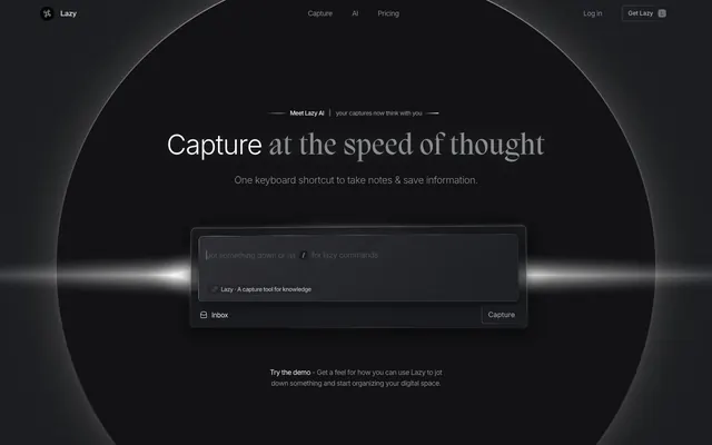
Subdued command center
Color palette
Decorative gradients from near-white to medium gray
Subtle background gradients for panels, header backgrounds
Background gradients for large feature sections
Deepest surface background, text on light elements, subtle shadows
Primary page background, card backgrounds
Elevated card backgrounds, input fields
Subtle elevated surface (e.g., input active state)
Medium-contrast borders, control outlines, and structural separators. Do not promote it to the primary CTA color
Secondary text, link borders, icon strokes
Placeholder text, very subtle body text
Prominent body text, card content text
Hairline borders, dividers, input outlines, and card edges on light surfaces. Do not promote it to the primary CTA color
Typography
- Weights
- 300, 400, 500, 600
- Sizes
- 11px, 12px, 13px, 14px, 16px, 20px, 24px, 28px, 55px
- Line height
- 1.09, 1.1, 1.2, 1.23, 1.25, 1.38, 1.43, 1.5, 1.57, 1.6, 1.83, 2
- Letter spacing
- -0.045em at 55px, -0.042em at 28px, -0.036em at 24px, -0.031em at 20px, -0.025em at 16px, -0.021em at 14px, -0.017em at 13px, -0.005em at 12px, -0.004em at 11px
- Fallback
- system-ui, sans-serif
The primary typeface for all UI elements, body text, and most informational display. Its range of weights and precise letter-spacing contribute to the crisp, compact feel of the interface.
- Weights
- 500
- Sizes
- 21px, 58px
- Line height
- 1.09, 1.25
- Letter spacing
- 0.048em at 58px, 0.026em at 21px
- Fallback
- serif
A decorative serif font used for select hero headlines and impactful statements. Its slightly wider tracking and unique character shapes provide a touch of distinctive elegance against the otherwise geometric UI.
Spacing & shape
Elevation
Components
Background #1a1b1f, border 1px solid #8a8c93, text Pure White. Subtle blur(10px) backdrop effect.
Background #3b3c3, border 1px solid #8a8c93, radius 8px, padding 14px. Shadow: `rgba(0, 0, 0, 0.12) 0px 12px 12px 0px`.
Text Pure White (or #e0e0e0) on transparent background, border 1px solid #8a8c93, radius 4px, padding 12px horizontal. Hover applies a gradient background.
Background transparent, radius 8px, no explicit border on background. Text Callout Text (#e0e0e0) with supporting text in Whisper Gray (#62646a).
Background transparent, text Muted Text (#535355), border 1px solid #535355, radius 22px, padding varies 3px-6px.
Text Whisper Gray (#62646a), interactive on hover/active with Pure White text. No distinct background or explicit padding, relies on elementGap for spacing.
Guidelines
- Use Carbon Gray (#26272c) as the default background for all new sections.
- Apply Ghost Border (#8a8c93) for hairline separation and subtle element distinction.
- Headlines should leverage Migra 500 for high impact, with letter-spacing 0.048em at 58px and 0.026em at 21px.
- All interactive elements like buttons and inputs should have a border-radius of 4px.
- For card backgrounds, use Slate Surface (#1a1b1f) or Ash Gray (#3b3c3e) and apply a 1px solid #8a8c93 border.
- Text hierarchy should progress from Pure White (#ffffff) for primary headers to Callout Text (#e0e0e0) for body, and Whisper Gray (#62646a) or Muted Text (#535355) for secondary/helper text.
- Ensure large headlines and display text receive negative letter-spacing from Inter, e.g., -0.045em at 55px, for visual density.
- Do not introduce highly saturated colors for functional UI elements; reserve them for subtle decorative gradients or brand accents.
- Avoid heavy drop shadows or strong visual separation between elements; prefer thin borders and subtle background shifts.
- Do not use generic system fonts; Inter and Migra are critical for the brand's typographic identity.
- Do not use a default padding or margin of less than 6px for interactive elements; elementGap should be at least 14px.
- Do not use solid backgrounds for primary CTA buttons; they should rely on text, outlined borders, or subtle gradients.
- Avoid large blocks of plain, uncommented text; text should be broken up with clear headings and thoughtful spacing.
- Do not use bright white as a general text color on dark backgrounds without specific contrast considerations; Callout Text (#e0e0e0) is preferred for most body content.
About this system
ShowHide
Lazy operates with a 'stealth dark mode' aesthetic, prioritizing content through deep, muted surfaces and delicate typography. A subtle play of light against dark is achieved through soft, localized gradients and sharp, clean borders. The overall impression is one of quiet efficiency and focused productivity, where UI elements recede until interaction, brought to life by crisp text and carefully applied elevation.
The page primarily employs a max-width 1200px contained layout, centered on a dark background. The hero section is full-bleed, featuring a grand centered headline over an atmospheric radial gradient. Subsequent sections maintain a consistent vertical rhythm with Carbon Gray (#26272c) backgrounds, interspersed with subtle gradients or slightly lighter surface treatments. Content sections often feature centered typographic stacks for headlines and subheadings, followed by a product screenshot or input simulation. Navigation is a minimal top bar, sticky at scroll, with primary links and a subtle login/signup action.
The imagery is sparse, focusing on abstract graphic elements like blurred, light-emitting circles and radial gradients that give a sense of depth and focus, akin to a lens flare or spotlight. Product screenshots, when present, are tightly cropped, presented with a slight perspective, and encased within UI elements, never full-bleed. Icons are minimal, outlined, and monochromatic, maintaining a subtle presence. The visual language emphasizes UI over decorative graphics, with any non-UI visuals serving to enhance atmosphere rather than convey explicit information.
Reminiscent of Superhuman, Linear, Figma, Raycast.
# Lazy — Style Reference
> Subdued command center

**Theme:** dark

**Site:** https://lazy.so

Lazy operates with a 'stealth dark mode' aesthetic, prioritizing content through deep, muted surfaces and delicate typography. A subtle play of light against dark is achieved through soft, localized gradients and sharp, clean borders. The overall impression is one of quiet efficiency and focused productivity, where UI elements recede until interaction, brought to life by crisp text and carefully applied elevation.

## Tokens — Colors

| Name | Value | Token | Role |
|------|------|------|------|
| Cloud Burst Gradient Primary | `#b8b8b8` | `--color-cloud-burst-gradient-primary` | Decorative gradients from near-white to medium gray |
| Deep Space Gradient | `#6c6d77` | `--color-deep-space-gradient` | Subtle background gradients for panels, header backgrounds |
| Graphite Gradient | `#8c8c93` | `--color-graphite-gradient` | Background gradients for large feature sections |
| Midnight Ink | `#0a0a0a` | `--color-midnight-ink` | Deepest surface background, text on light elements, subtle shadows |
| Carbon Gray | `#26272c` | `--color-carbon-gray` | Primary page background, card backgrounds |
| Slate Surface | `#1a1b1f` | `--color-slate-surface` | Elevated card backgrounds, input fields |
| Ash Gray | `#3b3c3e` | `--color-ash-gray` | Subtle elevated surface (e.g., input active state) |
| Ghost Border | `#8a8c93` | `--color-ghost-border` | Medium-contrast borders, control outlines, and structural separators. Do not promote it to the primary CTA color |
| Whisper Gray | `#62646a` | `--color-whisper-gray` | Secondary text, link borders, icon strokes |
| Muted Text | `#535355` | `--color-muted-text` | Placeholder text, very subtle body text |
| Callout Text | `#e0e0e0` | `--color-callout-text` | Prominent body text, card content text |
| Pure White | `#ffffff` | `--color-pure-white` | Hairline borders, dividers, input outlines, and card edges on light surfaces. Do not promote it to the primary CTA color |

## Tokens — Typography

### Inter
- **Substitute:** system-ui, sans-serif
- **Weights:** 300, 400, 500, 600
- **Sizes:** 11px, 12px, 13px, 14px, 16px, 20px, 24px, 28px, 55px
- **Line height:** 1.09, 1.1, 1.2, 1.23, 1.25, 1.38, 1.43, 1.5, 1.57, 1.6, 1.83, 2
- **Letter spacing:** -0.045em at 55px, -0.042em at 28px, -0.036em at 24px, -0.031em at 20px, -0.025em at 16px, -0.021em at 14px, -0.017em at 13px, -0.005em at 12px, -0.004em at 11px
- **Role:** The primary typeface for all UI elements, body text, and most informational display. Its range of weights and precise letter-spacing contribute to the crisp, compact feel of the interface.

### Migra
- **Substitute:** serif
- **Weights:** 500
- **Sizes:** 21px, 58px
- **Line height:** 1.09, 1.25
- **Letter spacing:** 0.048em at 58px, 0.026em at 21px
- **Role:** A decorative serif font used for select hero headlines and impactful statements. Its slightly wider tracking and unique character shapes provide a touch of distinctive elegance against the otherwise geometric UI.

## Tokens — Type Scale

| Role | Size | Line height | Letter spacing |
|------|------|------|------|
| caption | 11px | 1.5 | -0.004em |
| heading | 20px | 1.25 | -0.031em |
| heading-lg | 24px | 1.23 | -0.036em |
| display | 58px | 1.09 | 0.048em |

## Tokens — Spacing

- **Max width:** 1200px
- **Section gap:** 40px
- **Card padding:** 14px
- **Element gap:** 14px

## Tokens — Radius

- **Buttons:** 4px
- **Cards:** 8px
- **badge:** 22px
- **formControl:** 22px
- **input:** 4px
- **pill:** 48px

## Tokens — Elevation

- **Elevated Tool Card:** `rgba(0, 0, 0, 0.12) 0px 12px 12px 0px`
- **Input Field Focus:** `rgba(4, 4, 7, 0.25) 0px 2px 4px 0px, rgba(4, 4, 7, 0.4) 0px 8px 24px 0px`

## Layout

The page primarily employs a max-width 1200px contained layout, centered on a dark background. The hero section is full-bleed, featuring a grand centered headline over an atmospheric radial gradient. Subsequent sections maintain a consistent vertical rhythm with Carbon Gray (#26272c) backgrounds, interspersed with subtle gradients or slightly lighter surface treatments. Content sections often feature centered typographic stacks for headlines and subheadings, followed by a product screenshot or input simulation. Navigation is a minimal top bar, sticky at scroll, with primary links and a subtle login/signup action.

## Imagery

The imagery is sparse, focusing on abstract graphic elements like blurred, light-emitting circles and radial gradients that give a sense of depth and focus, akin to a lens flare or spotlight. Product screenshots, when present, are tightly cropped, presented with a slight perspective, and encased within UI elements, never full-bleed. Icons are minimal, outlined, and monochromatic, maintaining a subtle presence. The visual language emphasizes UI over decorative graphics, with any non-UI visuals serving to enhance atmosphere rather than convey explicit information.

## Components

### Input Field
*Primary interactive input element*

Background #1a1b1f, border 1px solid #8a8c93, text Pure White. Subtle blur(10px) backdrop effect.

### Elevated Tool Card
*Interactive content container with distinction*

Background #3b3c3, border 1px solid #8a8c93, radius 8px, padding 14px. Shadow: `rgba(0, 0, 0, 0.12) 0px 12px 12px 0px`.

### Primary Ghost Button
*Call to action or navigation link*

Text Pure White (or #e0e0e0) on transparent background, border 1px solid #8a8c93, radius 4px, padding 12px horizontal. Hover applies a gradient background.

### Product Feature Card
*Neutral content display card*

Background transparent, radius 8px, no explicit border on background. Text Callout Text (#e0e0e0) with supporting text in Whisper Gray (#62646a).

### Pill Badge
*Categorization or short label*

Background transparent, text Muted Text (#535355), border 1px solid #535355, radius 22px, padding varies 3px-6px.

### Navigation Link
*Header navigation item*

Text Whisper Gray (#62646a), interactive on hover/active with Pure White text. No distinct background or explicit padding, relies on elementGap for spacing.

## Guidelines

### Do

- Use Carbon Gray (#26272c) as the default background for all new sections.
- Apply Ghost Border (#8a8c93) for hairline separation and subtle element distinction.
- Headlines should leverage Migra 500 for high impact, with letter-spacing 0.048em at 58px and 0.026em at 21px.
- All interactive elements like buttons and inputs should have a border-radius of 4px.
- For card backgrounds, use Slate Surface (#1a1b1f) or Ash Gray (#3b3c3e) and apply a 1px solid #8a8c93 border.
- Text hierarchy should progress from Pure White (#ffffff) for primary headers to Callout Text (#e0e0e0) for body, and Whisper Gray (#62646a) or Muted Text (#535355) for secondary/helper text.
- Ensure large headlines and display text receive negative letter-spacing from Inter, e.g., -0.045em at 55px, for visual density.

### Don't

- Do not introduce highly saturated colors for functional UI elements; reserve them for subtle decorative gradients or brand accents.
- Avoid heavy drop shadows or strong visual separation between elements; prefer thin borders and subtle background shifts.
- Do not use generic system fonts; Inter and Migra are critical for the brand's typographic identity.
- Do not use a default padding or margin of less than 6px for interactive elements; elementGap should be at least 14px.
- Do not use solid backgrounds for primary CTA buttons; they should rely on text, outlined borders, or subtle gradients.
- Avoid large blocks of plain, uncommented text; text should be broken up with clear headings and thoughtful spacing.
- Do not use bright white as a general text color on dark backgrounds without specific contrast considerations; Callout Text (#e0e0e0) is preferred for most body content.

## Agent Prompt Guide

Quick Color Reference:text: #ffffff, background: #26272c, border: #8a8c93, accent: #6c6d77, primary action: no distinct CTA color
Example Component Prompts:
Create a hero section: radial gradient background starting from Ghost Border, with a centered headline: Migra 58px, #ffffff, letter-spacing 0.048em, line-height 1.09. Subheading: Inter 24px, #e0e0e0, letter-spacing -0.036em, line-height 1.23.
Create an input field: background #1a1b1f, border 1px solid #8a8c93, radius 4px, padding 14px. Placeholder text #535355. Text #ffffff.
Create an elevated tool card: background #3b3c3e, border 1px solid #8a8c93, radius 8px, padding 14px. Shadow: `rgba(0, 0, 0, 0.12) 0px 12px 12px 0px`. Body text #e0e0e0, caption text #62646a.
Create a ghost navigation link: text #62646a, Inter 14px weight 400, no background or border. On hover, text becomes #ffffff.
Create a pill badge: background transparent, border 1px solid #535355, radius 22px, padding 6px horizontal. Text #535355, Inter 12px weight 400.
More like this




Keep what you find
A free account saves references to boards and can send you a weekly email of picks based on what you save.
To see every result, go Pro.