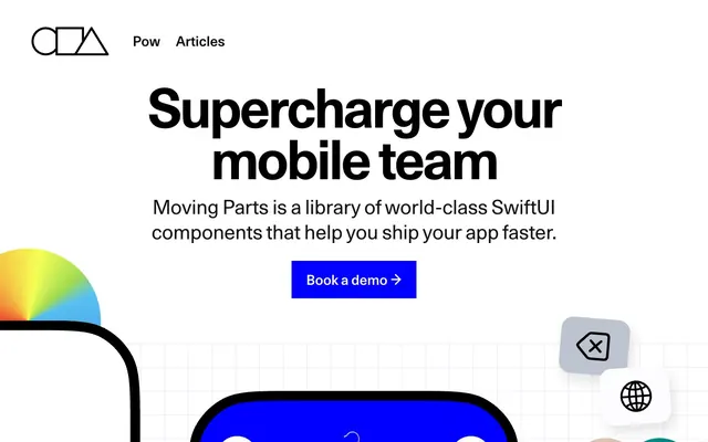
Preview image. Unlock full-res
High-contrast geometric clarity
Color palette
Primary action buttons, interactive elements, highlights, and featured backgrounds. This vivid blue serves as the sole dominant brand accent
Green wash for highlight backgrounds, decorative bands, and soft emphasis behind content
Decorative gradients in abstract visuals or hero sections. Adds a burst of multi-chromatic energy
Primary text, headers, icon strokes, borders, and some background fills on dark sections. High contrast establishes a strong visual hierarchy
Page backgrounds, card surfaces, secondary text on dark backgrounds, and icon fills. Provides a bright, expansive foundation
Secondary text in dark sections, subtle borders, and some elevated dark surfaces. Supports the dark mode appearance with a slightly softer black
Decorative background grids and subtle outlines. Creates texture without distracting from content
Subtle background panels and soft dividers. Adds a touch of warmth to the neutral palette
Less prominent text, borders, and subtle shadow effects. Indicates inactive states or secondary information
Muted helper text and tertiary information. Recedes into the background for less critical content
Typography
- Weights
- 400, 500, 600
- Sizes
- 12px, 17px, 18px, 21px, 25px, 27px, 30px, 34px, 35px
- Line height
- 1.06, 1.15, 1.18, 1.2, 1.36, 1.89, 2.38
- Letter spacing
- -0.0060em at 35px, 0.0100em at 27px, 0.0400em at 12px
- Fallback
- Space Mono
Body text, smaller headings, and supplementary information. Its semi-monospaced nature adds a technical, precise feel.
- Weights
- 400, 500, 600, 700
- Sizes
- 18px, 21px, 22px, 23px, 26px, 27px, 28px, 30px, 31px, 32px, 35px, 38px, 40px, 47px, 51px, 53px, 58px, 62px, 67px, 70px, 100px, 110px
- Line height
- 0.92, 0.93, 0.94, 0.95, 0.96, 1, 1.05, 1.12, 1.19, 1.2, 1.21, 1.22, 1.27, 1.32, 1.37, 1.47, 1.61, 1.71, 1.81
- Letter spacing
- -0.0400em at 110px, -0.0300em at 62px, -0.0050em at 32px, -0.0040em at 22px, 0.0100em at 21px, 0.0300em at 18px, 0.0400em at 18px
- Fallback
- Roboto
Primary headings, navigation, and prominent callouts. Features like 'ss01' for alternate glyphs give it specific brand character.
- Weights
- 400, 500
- Sizes
- 27px, 32px, 60px, 81px, 98px
- Line height
- 0.82, 0.84, 0.85, 0.87, 1.2, 1.21
- Letter spacing
- -0.0300em at 98px, -0.0100em at 60px, 0.0100em at 27px
- Fallback
- Inter
Large, impactful display headlines where tight tracking enhances presence. Used for key section titles.
- Weights
- 400
- Sizes
- 195px, 248px
- Line height
- 1.2
- Letter spacing
- normal
- Fallback
- Oswald Condensed
Massive, compressed display typography for highly visual statements, often paired with graphical elements.
- Weights
- 400, 500, 600
- Sizes
- 25px, 27px, 28px, 35px, 37px, 42px, 52px
- Line height
- 0.98, 1.2, 1.38, 1.48
- Letter spacing
- -0.004, -0.003
Inter — detected in extracted data but not described by AI
- Weights
- 400
- Sizes
- 26px
- Line height
- 1.2
ui-monospace — detected in extracted data but not described by AI
- Weights
- 100, 200
- Sizes
- 27px, 36px, 60px
- Line height
- 1.2, 1.29, 1.35
Fraunces 72pt Soft — detected in extracted data but not described by AI
- Weights
- 400, 500, 600
- Sizes
- 13px
- Line height
- 1.2
Arial — detected in extracted data but not described by AI
- Weights
- 200
- Sizes
- 45px
- Line height
- 1.06
- Letter spacing
- -0.01
Fraunces 72pt SuperSoft — detected in extracted data but not described by AI
- Weights
- 600
- Sizes
- 91px
- Line height
- 1.18
TAN-BUSTER — detected in extracted data but not described by AI
Spacing & shape
Elevation
Components
Filled button with 'Deep Royal Blue' background, 'Canvas White' text, and 0px border radius. Padding set to 25px vertical, 30px horizontal. Uses Unica77 font.
Ghost button with transparent background, 'Midnight Ink' text, and 0px border radius. Padding set to 25px vertical, 30px horizontal. Uses Unica77 font.
Pill-shaped button with 'Cloud Gray' background, 'Midnight Ink' text, and 18px border-radius. Minimal padding.
Card with 'Canvas White' background and 90.3833px border radius. No box shadow evident, assumes a flat presentation.
Card with 'Deep Royal Blue' background and 106.333px 106.333px 0px 0px border-radius, creating a flat bottom edge. No box shadow evident. Large-scale component.
Input field with 'Canvas White' background, 'Midnight Ink' text, and 0px border radius. Padding set to 25px vertical, 30px horizontal. Uses Unica77.
Guidelines
- Use 'Midnight Ink' (#000000) for all primary text and headlines to maintain strong contrast.
- Apply 'Deep Royal Blue' (#0000ff) exclusively for primary calls to action and critical interactive elements.
- Utilize Unica77 for headlines and navigation, leveraging its font feature settings for characteristic glyphs and precise tracking.
- Favor large, confident typography for headlines, with tighter letter-spacing on larger sizes and normal spacing on body text.
- Maintain a clear visual hierarchy by limiting saturated colors to 'Deep Royal Blue' and 'Emerald Green' as deliberate accents.
- Employ the specific large border radii of 90.3833px for content cards and 106.333px for prominent containers to define component shapes.
- Ensure all interactive elements provide a comfortable 25px vertical and 30px horizontal padding, as seen on buttons and inputs.
- Do not introduce new saturated primary colors; adhere to 'Deep Royal Blue' as the sole dominant brand accent.
- Avoid generic small border radii; use the distinct 0px for buttons or the large values (90.3833px, 106.333px) for cards and containers.
- Do not use subtle gray backgrounds or text colors for primary content or calls to action; reserve them for secondary information or decorative grids.
- Do not add additional box-shadows beyond the single defined `rgba(0, 0, 0, 0.3) 15px 20px 30px 0px` for cards, maintaining a predominantly flat aesthetic.
- Do not break the rigid grid-like layout with free-form overlapping elements, maintaining structured geometric compositions.
- Avoid thin, lightweight typefaces for headlines outside of specific decorative uses; default to heavier weights for impact.
- Do not use 'Arial' or 'ui-monospace' for standard UI elements unless explicitly for code snippets, adhering to the brand's custom typefaces.
About this system
ShowHide
Moving Parts employs a bold, high-contrast aesthetic characterized by large, confident typography and a vibrant blue accent on an otherwise monochrome canvas. Geometric shapes and a grid-like structure provide underlying order, while distinct large radii soften component edges. The design feels sharp and modern, with a strong focus on readability for headlines and crisp functional elements.
The page primarily uses a max-width contained layout, likely centered, although a specific max-width is not provided. The hero section is characterized by a full-width visual, often a dark background or distinct product visual, with a large, centered headline and a clear call to action below. Section rhythm is driven by alternating background colors (white, dark, solid brand blue) creating distinct blocks of content. Content within sections is often arranged in prominent single-column stacks for headlines, or two-column text-left/image-right or image-left/text-right patterns for feature explanations. Large components like cards can extend this two-column approach to highlight product visuals. Typography dominates the visual hierarchy, with large headlines guiding the eye. Navigation is a persistent top bar, minimal and un-obtrusive.
Imagery primarily consists of bright product screenshots of mobile UI components, often set against a 'Deep Royal Blue' background, emphasizing the product's native context. Abstract geometric shapes, sometimes with vivid conic gradients, act as decorative elements, adding visual interest and motion. Icons are outlined, with a moderate stroke weight, typically 'Midnight Ink' or inverse 'Canvas White', keeping to a minimalist, functional aesthetic. Photography is minimal, used for social proof or team profiles in a clean, high-contrast style. Visual density is balanced: product showcases are image-heavy, while explanatory sections are text-dominant with functional icons.
Reminiscent of Framer, Linear, Spline, Vercel.
# Moving Parts — Style Reference
> High-contrast geometric clarity

**Theme:** light

**Site:** https://movingparts.io

Moving Parts employs a bold, high-contrast aesthetic characterized by large, confident typography and a vibrant blue accent on an otherwise monochrome canvas. Geometric shapes and a grid-like structure provide underlying order, while distinct large radii soften component edges. The design feels sharp and modern, with a strong focus on readability for headlines and crisp functional elements.

## Tokens — Colors

| Name | Value | Token | Role |
|------|------|------|------|
| Deep Royal Blue | `#0000ff` | `--color-deep-royal-blue` | Primary action buttons, interactive elements, highlights, and featured backgrounds. This vivid blue serves as the sole dominant brand accent |
| Emerald Green | `#00d37c` | `--color-emerald-green` | Green wash for highlight backgrounds, decorative bands, and soft emphasis behind content |
| Conic Spectrum | `#57C0F1` | `--color-conic-spectrum` | Decorative gradients in abstract visuals or hero sections. Adds a burst of multi-chromatic energy |
| Midnight Ink | `#000000` | `--color-midnight-ink` | Primary text, headers, icon strokes, borders, and some background fills on dark sections. High contrast establishes a strong visual hierarchy |
| Canvas White | `#ffffff` | `--color-canvas-white` | Page backgrounds, card surfaces, secondary text on dark backgrounds, and icon fills. Provides a bright, expansive foundation |
| Ghostly Gray | `#121212` | `--color-ghostly-gray` | Secondary text in dark sections, subtle borders, and some elevated dark surfaces. Supports the dark mode appearance with a slightly softer black |
| Fog Grid | `#bcc1c7` | `--color-fog-grid` | Decorative background grids and subtle outlines. Creates texture without distracting from content |
| Warm Mist | `#efefef` | `--color-warm-mist` | Subtle background panels and soft dividers. Adds a touch of warmth to the neutral palette |
| Cloud Gray | `#b3b3b3` | `--color-cloud-gray` | Less prominent text, borders, and subtle shadow effects. Indicates inactive states or secondary information |
| Pale Ash | `#999999` | `--color-pale-ash` | Muted helper text and tertiary information. Recedes into the background for less critical content |

## Tokens — Typography

### Whyte Semi-Mono
- **Substitute:** Space Mono
- **Weights:** 400, 500, 600
- **Sizes:** 12px, 17px, 18px, 21px, 25px, 27px, 30px, 34px, 35px
- **Line height:** 1.06, 1.15, 1.18, 1.2, 1.36, 1.89, 2.38
- **Letter spacing:** -0.0060em at 35px, 0.0100em at 27px, 0.0400em at 12px
- **Role:** Body text, smaller headings, and supplementary information. Its semi-monospaced nature adds a technical, precise feel.

### Unica77
- **Substitute:** Roboto
- **Weights:** 400, 500, 600, 700
- **Sizes:** 18px, 21px, 22px, 23px, 26px, 27px, 28px, 30px, 31px, 32px, 35px, 38px, 40px, 47px, 51px, 53px, 58px, 62px, 67px, 70px, 100px, 110px
- **Line height:** 0.92, 0.93, 0.94, 0.95, 0.96, 1, 1.05, 1.12, 1.19, 1.2, 1.21, 1.22, 1.27, 1.32, 1.37, 1.47, 1.61, 1.71, 1.81
- **Letter spacing:** -0.0400em at 110px, -0.0300em at 62px, -0.0050em at 32px, -0.0040em at 22px, 0.0100em at 21px, 0.0300em at 18px, 0.0400em at 18px
- **Role:** Primary headings, navigation, and prominent callouts. Features like 'ss01' for alternate glyphs give it specific brand character.

### PP Neue Montreal
- **Substitute:** Inter
- **Weights:** 400, 500
- **Sizes:** 27px, 32px, 60px, 81px, 98px
- **Line height:** 0.82, 0.84, 0.85, 0.87, 1.2, 1.21
- **Letter spacing:** -0.0300em at 98px, -0.0100em at 60px, 0.0100em at 27px
- **Role:** Large, impactful display headlines where tight tracking enhances presence. Used for key section titles.

### Druk XXCondensed Super
- **Substitute:** Oswald Condensed
- **Weights:** 400
- **Sizes:** 195px, 248px
- **Line height:** 1.2
- **Letter spacing:** normal
- **Role:** Massive, compressed display typography for highly visual statements, often paired with graphical elements.

### Inter
- **Weights:** 400, 500, 600
- **Sizes:** 25px, 27px, 28px, 35px, 37px, 42px, 52px
- **Line height:** 0.98, 1.2, 1.38, 1.48
- **Letter spacing:** -0.004, -0.003
- **Role:** Inter — detected in extracted data but not described by AI

### ui-monospace
- **Weights:** 400
- **Sizes:** 26px
- **Line height:** 1.2
- **Role:** ui-monospace — detected in extracted data but not described by AI

### Fraunces 72pt Soft
- **Weights:** 100, 200
- **Sizes:** 27px, 36px, 60px
- **Line height:** 1.2, 1.29, 1.35
- **Role:** Fraunces 72pt Soft — detected in extracted data but not described by AI

### Arial
- **Weights:** 400, 500, 600
- **Sizes:** 13px
- **Line height:** 1.2
- **Role:** Arial — detected in extracted data but not described by AI

### Fraunces 72pt SuperSoft
- **Weights:** 200
- **Sizes:** 45px
- **Line height:** 1.06
- **Letter spacing:** -0.01
- **Role:** Fraunces 72pt SuperSoft — detected in extracted data but not described by AI

### TAN-BUSTER
- **Weights:** 600
- **Sizes:** 91px
- **Line height:** 1.18
- **Role:** TAN-BUSTER — detected in extracted data but not described by AI

## Tokens — Type Scale

| Role | Size | Line height | Letter spacing |
|------|------|------|------|
| body | 17px | 1.18 | -0.1px |
| subheading | 21px | 1.2 | 0.21px |
| heading-sm | 27px | 1.2 | 0.27px |
| heading | 60px | 0.85 | -0.6px |
| heading-lg | 98px | 0.82 | -2.94px |
| display | 248px | 1.2 | — |

## Tokens — Spacing

- **Section gap:** 40px
- **Card padding:** 30px
- **Element gap:** 13px

## Tokens — Radius

- **Buttons:** 0px
- **Cards:** 90.3833px
- **Images:** 14px
- **icons:** 18px
- **largeCards:** 106.333px
- **smallElements:** 2.5px

## Tokens — Elevation

- **Card:** `rgba(0, 0, 0, 0.3) 15px 20px 30px 0px`

## Layout

The page primarily uses a max-width contained layout, likely centered, although a specific max-width is not provided. The hero section is characterized by a full-width visual, often a dark background or distinct product visual, with a large, centered headline and a clear call to action below. Section rhythm is driven by alternating background colors (white, dark, solid brand blue) creating distinct blocks of content. Content within sections is often arranged in prominent single-column stacks for headlines, or two-column text-left/image-right or image-left/text-right patterns for feature explanations. Large components like cards can extend this two-column approach to highlight product visuals. Typography dominates the visual hierarchy, with large headlines guiding the eye. Navigation is a persistent top bar, minimal and un-obtrusive.

## Imagery

Imagery primarily consists of bright product screenshots of mobile UI components, often set against a 'Deep Royal Blue' background, emphasizing the product's native context. Abstract geometric shapes, sometimes with vivid conic gradients, act as decorative elements, adding visual interest and motion. Icons are outlined, with a moderate stroke weight, typically 'Midnight Ink' or inverse 'Canvas White', keeping to a minimalist, functional aesthetic. Photography is minimal, used for social proof or team profiles in a clean, high-contrast style. Visual density is balanced: product showcases are image-heavy, while explanatory sections are text-dominant with functional icons.

## Components

### Primary Action Button
*Main call-to-action*

Filled button with 'Deep Royal Blue' background, 'Canvas White' text, and 0px border radius. Padding set to 25px vertical, 30px horizontal. Uses Unica77 font.

### Ghost Button (Primary)
*Secondary action or navigation*

Ghost button with transparent background, 'Midnight Ink' text, and 0px border radius. Padding set to 25px vertical, 30px horizontal. Uses Unica77 font.

### Pill Button (Neutral)
*Status tags or filters*

Pill-shaped button with 'Cloud Gray' background, 'Midnight Ink' text, and 18px border-radius. Minimal padding.

### Rounded Corner Card
*Content container*

Card with 'Canvas White' background and 90.3833px border radius. No box shadow evident, assumes a flat presentation.

### Large Rounded Card (Bottom-Flat)
*Hero or feature container*

Card with 'Deep Royal Blue' background and 106.333px 106.333px 0px 0px border-radius, creating a flat bottom edge. No box shadow evident. Large-scale component.

### Text Input (Base)
*Single-line text entry*

Input field with 'Canvas White' background, 'Midnight Ink' text, and 0px border radius. Padding set to 25px vertical, 30px horizontal. Uses Unica77.

## Guidelines

### Do

- Use 'Midnight Ink' (#000000) for all primary text and headlines to maintain strong contrast.
- Apply 'Deep Royal Blue' (#0000ff) exclusively for primary calls to action and critical interactive elements.
- Utilize Unica77 for headlines and navigation, leveraging its font feature settings for characteristic glyphs and precise tracking.
- Favor large, confident typography for headlines, with tighter letter-spacing on larger sizes and normal spacing on body text.
- Maintain a clear visual hierarchy by limiting saturated colors to 'Deep Royal Blue' and 'Emerald Green' as deliberate accents.
- Employ the specific large border radii of 90.3833px for content cards and 106.333px for prominent containers to define component shapes.
- Ensure all interactive elements provide a comfortable 25px vertical and 30px horizontal padding, as seen on buttons and inputs.

### Don't

- Do not introduce new saturated primary colors; adhere to 'Deep Royal Blue' as the sole dominant brand accent.
- Avoid generic small border radii; use the distinct 0px for buttons or the large values (90.3833px, 106.333px) for cards and containers.
- Do not use subtle gray backgrounds or text colors for primary content or calls to action; reserve them for secondary information or decorative grids.
- Do not add additional box-shadows beyond the single defined `rgba(0, 0, 0, 0.3) 15px 20px 30px 0px` for cards, maintaining a predominantly flat aesthetic.
- Do not break the rigid grid-like layout with free-form overlapping elements, maintaining structured geometric compositions.
- Avoid thin, lightweight typefaces for headlines outside of specific decorative uses; default to heavier weights for impact.
- Do not use 'Arial' or 'ui-monospace' for standard UI elements unless explicitly for code snippets, adhering to the brand's custom typefaces.

## Agent Prompt Guide

primary action: #0000ff (filled action)
Create a Primary Action Button: #0000ff background, #ffffff text, 9999px radius, compact pill padding. Use this filled treatment for the main CTA.

Create a Feature Card: 'Canvas White' (#ffffff) background, 90.3833px border-radius. Headline (Unica77, 32px, weight 700, 'Midnight Ink'). Body text (Whyte Semi-Mono, 17px, weight 400, 'Midnight Ink'). Internal padding of 30px.

Create a Navigation Item: 'Midnight Ink' (#000000) text (Unica77, 21px, weight 500, line-height 1.2) against a 'Canvas White' (#ffffff) background. Normal letter-spacing.

Create an Icon Button: 'Midnight Ink' (#000000) text (Whyte Semi-Mono, 12px, weight 400) or 'Deep Royal Blue' (#0000ff) icon stroke on a 'Canvas White' (#ffffff) background with 18px border radius for the interactive part. Element gap 13px.
More like this





Keep what you find
A free account saves references to boards and can send you a weekly email of picks based on what you save.
To see every result, go Pro.