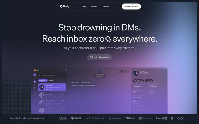
Preview image. Unlock full-res
Deep space command center
Color palette
Hero section background, decorative elements, accent glow
Page background, primary surface for dark mode cards, text on light-mode controls
Primary text color in dark mode, button backgrounds, interactive elements
Secondary card background color, often for featured or distinct content blocks
Muted text, subheadings, and borders for subtle contrast
Placeholder text, secondary body text
Fine borders, helper text
Border color, button text when against light backgrounds
Typography
- Weights
- 400
- Sizes
- 12px
- Line height
- 1.2
sans-serif — detected in extracted data but not described by AI
- Weights
- 400
- Sizes
- 19px
- Line height
- 1
- Letter spacing
- -0.0600em at 64px, -0.0400em at 48px, -0.0200em at 24px and below
- Fallback
- Inter
Primary brand typeface for headings and body text. Its subtle negative tracking across multiple sizes creates a serious yet inviting tone.
- Weights
- 500
- Sizes
- 14px
- Line height
- 1.4
- Fallback
- Inter
Used for specific interactive elements such as navigation links, providing a slightly more structured feel.
- Weights
- 400
- Sizes
- 14px, 16px, 18px, 24px, 26px, 28px, 48px, 64px
- Line height
- 0.9, 1, 1.1, 1.2, 1.4
- Letter spacing
- -0.06, -0.04, -0.02
Test Untitled Sans Regular — detected in extracted data but not described by AI
Spacing & shape
Components
Ghost White (#fefcfb) background with Deep Space Black (#000000) text. Padding of 10px vertical and 16px horizontal. Features a large 100px border radius for a distinctive pill shape.
Midnight Slate (#161e29) background with a 12px border radius. Used for product UI elements and informational blocks within the dark theme.
Off-White Canvas (#eae5dd) background with a 12px border radius. Used for emphasizing key features or content in a lighter context against the dark page background.
Faded Steel (#b8b9bc) text (weight 500 Test Untitled Sans) with 5px vertical padding, becoming Ghost White (#fefcfb) on hover.
Guidelines
- Prioritize Midnight Slate (#161e29) for all primary background surfaces to maintain the deep, dark aesthetic.
- Apply negative letter-spacing from the Test Untitled Sans font to all headlines and display text, specifically -0.0600em for 64px and -0.0400em at 48px, for a sophisticated feel.
- Use a 100px border-radius for all interactive buttons and form fields to create a consistent soft, pill-shaped UI element.
- Employ the Cosmic Gradient (linear-gradient rgb(233, 179, 242) 22%, rgb(152, 104, 204) 74%, rgb(95, 77, 189) 100%) for impactful hero sections and subtle brand highlights.
- Maintain a clear visual hierarchy using Ghost White (#fefcfb) for primary text and Midnight Slate (#161e29) for primary backgrounds in dark mode, ensuring strong contrast (16.4:1 ratio).
- Avoid using bright, saturated colors for large UI elements; color should serve as subtle accent or dynamic interactive effects, not primary surface color.
- Do not deviate from the established large border radii (100px for buttons, 12px for cards); sharp corners conflict with the brand's soft, modern aesthetic.
- Do not use generic, default sans-serif fonts; custom font 'Test Untitled Sans' with its specific tracking is crucial for brand identity.
- Avoid adding heavy shadows or excessive elevation; the design relies on subtle gradients and distinct surface colors for depth.
- Do not use small, dense line heights for body text; ensure adequate line-height for readability, especially with the negative letter-spacing.
About this system
ShowHide
Pally presents a dark-mode interface, creating a contained, focused experience. UI surfaces are predominantly deep charcoal, accented by a subtle, almost ethereal gradient for hero elements and interactive components. Typography is crisp and minimal, embracing negative tracking to maintain sophistication even at larger display sizes. Components are lightweight with large border radii, suggesting a friendly yet refined digital identity.
The page primarily uses a full-bleed layout for the main background (Midnight Slate), which is then overlaid with a contained max-width content area for text and components. The hero section features a centered headline and subtext, often against an atmospheric gradient background. Content sections flow vertically with consistent 80px section gaps. There's a subtle use of a two-panel layout for feature explanations, alternating content left/right. The header is sticky, compact, and centrally aligned, providing essential navigation.
This design system uses abstract, blurred organic shapes for atmosphere, often with gradients (Cosmic Gradient). Product screenshots are integrated directly, appearing as floating UI elements on the dark background, maintaining the dark mode aesthetic within the product visuals themselves. Icons, when present, are subtly glowing or outlined. Imagery is used to set a mood and illustrate product functionality in a non-literal, atmospheric way rather than showing direct product-in-use photography. The density of imagery is balanced, with a few key visuals commanding attention against otherwise minimalist UI.
Reminiscent of Superhuman, Linear, Cron.
# Pally — Style Reference
> Deep space command center

**Theme:** dark

**Site:** https://www.pally.com

Pally presents a dark-mode interface, creating a contained, focused experience. UI surfaces are predominantly deep charcoal, accented by a subtle, almost ethereal gradient for hero elements and interactive components. Typography is crisp and minimal, embracing negative tracking to maintain sophistication even at larger display sizes. Components are lightweight with large border radii, suggesting a friendly yet refined digital identity.

## Tokens — Colors

| Name | Value | Token | Role |
|------|------|------|------|
| Cosmic Gradient | `#e9b3f2` | `--color-cosmic-gradient` | Hero section background, decorative elements, accent glow |
| Midnight Slate | `#161e29` | `--color-midnight-slate` | Page background, primary surface for dark mode cards, text on light-mode controls |
| Ghost White | `#fefcfb` | `--color-ghost-white` | Primary text color in dark mode, button backgrounds, interactive elements |
| Off-White Canvas | `#eae5dd` | `--color-off-white-canvas` | Secondary card background color, often for featured or distinct content blocks |
| Carbon Text | `#1e1d1d` | `--color-carbon-text` | Muted text, subheadings, and borders for subtle contrast |
| Faded Steel | `#b8b9bc` | `--color-faded-steel` | Placeholder text, secondary body text |
| Light Steel | `#d0d0d1` | `--color-light-steel` | Fine borders, helper text |
| Deep Space Black | `#000000` | `--color-deep-space-black` | Border color, button text when against light backgrounds |

## Tokens — Typography

### sans-serif
- **Weights:** 400
- **Sizes:** 12px
- **Line height:** 1.2
- **Role:** sans-serif — detected in extracted data but not described by AI

### Test Untitled Sans
- **Substitute:** Inter
- **Weights:** 400
- **Sizes:** 19px
- **Line height:** 1
- **Letter spacing:** -0.0600em at 64px, -0.0400em at 48px, -0.0200em at 24px and below
- **Role:** Primary brand typeface for headings and body text. Its subtle negative tracking across multiple sizes creates a serious yet inviting tone.

### Inter
- **Substitute:** Inter
- **Weights:** 500
- **Sizes:** 14px
- **Line height:** 1.4
- **Role:** Used for specific interactive elements such as navigation links, providing a slightly more structured feel.

### Test Untitled Sans Regular
- **Weights:** 400
- **Sizes:** 14px, 16px, 18px, 24px, 26px, 28px, 48px, 64px
- **Line height:** 0.9, 1, 1.1, 1.2, 1.4
- **Letter spacing:** -0.06, -0.04, -0.02
- **Role:** Test Untitled Sans Regular — detected in extracted data but not described by AI

## Tokens — Type Scale

Major Third (1.25) from 16px base.

| Role | Size | Line height | Letter spacing |
|------|------|------|------|
| caption | 12px | 1.2 | — |
| body-sm | 14px | 1.4 | — |
| body | 16px | 1.2 | -0.32px |
| subheading | 18px | 1.1 | -0.36px |
| heading-sm | 24px | 1.1 | -0.48px |
| heading | 28px | 1.1 | -0.56px |
| heading-lg | 48px | 1 | -1.92px |
| display | 64px | 0.9 | -3.84px |

## Tokens — Spacing

- **Section gap:** 80px
- **Card padding:** 12px
- **Element gap:** 10px

## Tokens — Radius

- **Buttons:** 100px
- **Cards:** 12px
- **Images:** 12px
- **formFields:** 100px

## Layout

The page primarily uses a full-bleed layout for the main background (Midnight Slate), which is then overlaid with a contained max-width content area for text and components. The hero section features a centered headline and subtext, often against an atmospheric gradient background. Content sections flow vertically with consistent 80px section gaps. There's a subtle use of a two-panel layout for feature explanations, alternating content left/right. The header is sticky, compact, and centrally aligned, providing essential navigation.

## Imagery

This design system uses abstract, blurred organic shapes for atmosphere, often with gradients (Cosmic Gradient). Product screenshots are integrated directly, appearing as floating UI elements on the dark background, maintaining the dark mode aesthetic within the product visuals themselves. Icons, when present, are subtly glowing or outlined. Imagery is used to set a mood and illustrate product functionality in a non-literal, atmospheric way rather than showing direct product-in-use photography. The density of imagery is balanced, with a few key visuals commanding attention against otherwise minimalist UI.

## Components

### Primary Waitlist Button
*Button*

Ghost White (#fefcfb) background with Deep Space Black (#000000) text. Padding of 10px vertical and 16px horizontal. Features a large 100px border radius for a distinctive pill shape.

### Dark Mode Card
*Card*

Midnight Slate (#161e29) background with a 12px border radius. Used for product UI elements and informational blocks within the dark theme.

### Light Mode Feature Card
*Card*

Off-White Canvas (#eae5dd) background with a 12px border radius. Used for emphasizing key features or content in a lighter context against the dark page background.

### Navigation Link
*Link*

Faded Steel (#b8b9bc) text (weight 500 Test Untitled Sans) with 5px vertical padding, becoming Ghost White (#fefcfb) on hover.

## Guidelines

### Do

- Prioritize Midnight Slate (#161e29) for all primary background surfaces to maintain the deep, dark aesthetic.
- Apply negative letter-spacing from the Test Untitled Sans font to all headlines and display text, specifically -0.0600em for 64px and -0.0400em at 48px, for a sophisticated feel.
- Use a 100px border-radius for all interactive buttons and form fields to create a consistent soft, pill-shaped UI element.
- Employ the Cosmic Gradient (linear-gradient rgb(233, 179, 242) 22%, rgb(152, 104, 204) 74%, rgb(95, 77, 189) 100%) for impactful hero sections and subtle brand highlights.
- Maintain a clear visual hierarchy using Ghost White (#fefcfb) for primary text and Midnight Slate (#161e29) for primary backgrounds in dark mode, ensuring strong contrast (16.4:1 ratio).

### Don't

- Avoid using bright, saturated colors for large UI elements; color should serve as subtle accent or dynamic interactive effects, not primary surface color.
- Do not deviate from the established large border radii (100px for buttons, 12px for cards); sharp corners conflict with the brand's soft, modern aesthetic.
- Do not use generic, default sans-serif fonts; custom font 'Test Untitled Sans' with its specific tracking is crucial for brand identity.
- Avoid adding heavy shadows or excessive elevation; the design relies on subtle gradients and distinct surface colors for depth.
- Do not use small, dense line heights for body text; ensure adequate line-height for readability, especially with the negative letter-spacing.

## Agent Prompt Guide

Quick Color Reference:
text: #fefcfb
background: #161e29
border: #000000
accent: #e9b3f2 (start of Cosmic Gradient)
primary action: no distinct CTA color

Example Component Prompts:

1. Create a Hero Section: Use the Cosmic Gradient background (linear-gradient rgb(233, 179, 242) 22%, rgb(152, 104, 204) 74%, rgb(95, 77, 189) 100%). Headline: 'Stop drowning in DMs.' (display, Test Untitled Sans, #fefcfb, weight 400, letter-spacing -3.84px). Subtext: 'All your chats and all your pals from every platform.' (body, Test Untitled Sans, #fefcfb, weight 400, line-height 1.2).

No distinct primary action color was observed; use the extracted neutral button treatments instead of inventing a filled CTA color.

3. Create a Dark Mode Feature Card: Background: Midnight Slate (#161e29). Border radius: 12px. Headline: 'Unified Messaging Inbox' (heading-sm, Test Untitled Sans, #fefcfb, weight 400, letter-spacing -0.48px). Body text: 'All your chats' (body, Test Untitled Sans, #b8b9bc, weight 400).
More like this




Keep what you find
A free account saves references to boards and can send you a weekly email of picks based on what you save.
To see every result, go Pro.