Preview image. Unlock full-res
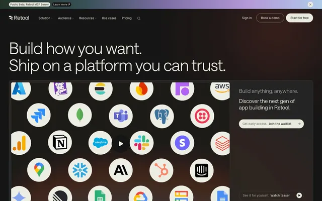
Warm obsidian workshop — a precision tool surface lit by ember glow, where everything is built.
Color palette
Decorative background wash — large-area teal tint used as atmospheric section color
Deeper teal wash, badge and label backgrounds in forest green
Animated text shimmer gradient — parchment transitions through coral and steel blue, used on select highlight phrases
Primary page background, dominant surface across all sections; Hero background gradient — warm amber-rust bleeds from bottom-left into near-black
Deepest surface layer, card backgrounds that recede below canvas
Raised card and panel backgrounds — one step above canvas
Subtle borders and dividers on dark surfaces
Mid-tone icon fills, decorative borders, muted surface accents
Secondary body text, nav subtitles, helper labels
Subheadings, supporting body copy, secondary headings
Tertiary text, eyebrow labels, captions
Primary text, headline color, outlined button borders and text, pill button fill — slightly warm off-white that softens the contrast against near-black ground
Typography
- Weights
- 300, 380, 570
- Sizes
- 14px, 16px, 18px, 24px, 32px, 36px, 48px, 60px, 72px
- Line height
- 1, 1.05, 1.2, 1.5
- Letter spacing
- -0.022em at 72px (~-1.58px), -0.020em at 60px (~-1.2px), -0.010em at 36-48px, +0.010em to +0.020em at 12-14px small caps/labels
- Fallback
- Inter, DM Sans
Primary typeface for all display, heading, body, and UI text. Weight 300 at 60-72px is anti-conventional — most platforms use 600-700 for hero text; the thin weight creates authority through mass (huge scale) rather than stroke weight. Weight 380 handles body and subheadings. Weight 570 for labels and small UI. Custom font unavailable externally.
- Weights
- 400
- Sizes
- 12px, 14px
- Line height
- 1, 1.2
- Letter spacing
- +0.010em at 12-14px (~+0.12-0.14px)
- Fallback
- Space Grotesk, Geist
Monospace-adjacent label font for nav, micro-copy, tags, and icon captions. The slight +0.010em tracking at small sizes distinguishes it from body text — reads like interface chrome rather than content.
- Weights
- 400
- Sizes
- 16px
- Line height
- 1.5
- Fallback
- System UI stack
Fallback system font for utility text, form inputs, and browser-native UI elements. Not a designed choice — appears only as system default context.
Spacing & shape
Components
Background #e9ebdf (Parchment), text #151515 (Obsidian), border 1px solid #151515, border-radius 9999px. Font: saansFont 380 14-16px. Padding approximately 8px 20px. The warm off-white fill on near-black background reads as the brightest element on page — not an aggressive color CTA but a luminance CTA.
Background transparent, text #e9ebdf, border 1px solid #e9ebdf, border-radius 0px. Font: saansFont 380 14px. Zero padding in data — inline with surrounding text flow. Used alongside filled pill for secondary pairing.
Background #242424, text #e9ebdf, border 1px solid rgba(233,235,223,0.12), border-radius 0px, padding 40px 40px 32px 40px. Acts more as a content panel-button hybrid — large padding turns it into a tappable card area.
Background transparent, text #e9ebdf, border 1px solid #433e38 (Charcoal Rim variant), border-radius 0px. Lower border contrast than primary ghost — visually recedes to let content breathe.
Background #242424, border-radius 12px for larger cards / 8px for standard cards, no box-shadow, padding 8px for image-topped cards. Elevation is purely colorimetric — the #242424 surface against #151515 canvas creates ~3% lightness lift with no shadow.
Background #0e0e0, border-radius 0px, no shadow, padding 24px 0 24px 12px. Darker than canvas — creates a recessed inset effect, used for large-area content blocks that should feel embedded rather than floating.
Text #b6b8af (Limestone), font pxGroteskFont 400 12-14px, letter-spacing +0.013em. No background. Positioned above headline in 8-16px gap. Functions as quiet organizational metadata.
Background #0e352c (Midnight Moss), text #e9ebdf, border-radius 4px, padding 2px 6px. Sits in announcement bar at very top of page with a linked CTA alongside.
Background #151515 with teal gradient wash hint (#0e352c), full-width, height ~40px. Contains pxGroteskFont 400 14px text in #e9ebdf with a ghost arrow-linked label. Hairline border-bottom 1px #3f403d separates from nav.
Background #151515 with backdrop-filter blur(3-4px), height 60px. Logo left, nav links center in pxGroteskFont 400 14px at #94958 with #e9ebdf on hover. Right: 'Sign in' ghost text link, 'Book a demo' ghost pill button, 'Start for free' filled pill button. Hairline 1px solid #3f403d bottom border.
Background #151515 or #242424 section. Logos rendered at #e9ebdf fill (desaturated to match Parchment). Horizontal scroll or flex-wrapped row. No borders, no card containers — logos float directly on surface.
Circular container, background #242424 or white (for colorful third-party logos), border-radius 9999px, 56-64px diameter. Icons retain their native brand colors inside the circle. Grid arrangement with 8px gaps. Slight drop into dark background creates constellation-like product connectivity display.
Guidelines
- Use #151515 as the default page background for all new pages and sections — never use pure black (#000000) or white.
- Set all display and large headings (48px+) in saansFont weight 300 with letter-spacing between -0.020em and -0.022em — this compressed, light-weight combination is the signature headline treatment.
- Use 9999px border-radius only for pill CTAs ('Book a demo', 'Start for free') and 0px for all other buttons — the binary radius grammar is intentional.
- Apply #e9ebdf (Parchment) for all primary text, primary borders, and filled CTA backgrounds — this warm off-white is the system's single 'bright' color.
- Elevate cards using background #242424 against canvas #151515 with no shadow — a 1px solid #3f403d border is optional for additional definition.
- Use pxGroteskFont 400 12-14px at +0.013em tracking for all eyebrow labels, nav items, and micro-UI text — distinct from saansFont body text.
- Apply the hero radial gradient (amber-rust from bottom-left fading to transparent over #151515) only on full-viewport hero sections — not on inner content panels.
- Never use saturated chromatic colors (#518dd2 blue, #e8765 coral, #9874d2 purple) as interface chrome — they exist only inside the animated shimmer text and illustration/3D renders.
- Never add box-shadow to cards or panels — shadows break the flat-material surface system; use background lightness shifts instead.
- Never mix square-corner buttons with pill buttons in the same row — choose one context and maintain it (nav uses pill, inline content uses square/ghost).
- Never set heading text above 32px in weight 570 — the bold weight is reserved for small labels; large text must use 300 or 380.
- Never use pure white (#ffffff) as a text or background color — all 'white' in this system is Parchment (#e9ebdf), which carries a warm gray-green tint.
- Never increase section background saturation beyond the muted teal washes (#185849, #0e352c) — the entire page should register as near-achromatic at a glance.
- Never apply border-radius values between 1px and 7px for buttons — the system only uses 0px or 9999px for button shapes.
About this system
ShowHide
Retool operates on a near-black canvas — #151515 as the dominant ground — with off-white text (#e9ebdf) that reads more like parchment than pure white, giving the dark surface a warm, organic quality rather than a cold tech-void. Typography is the primary design tool: the custom 'saansFont' runs from weight 300 at 72px down to 380 at body sizes, with aggressive negative tracking at large scales creating compressed, authoritative headlines that feel proprietary. Surface depth is achieved through a three-step stack (#0e0e0 → #151515 → #242424) with no shadows — cards are literally darker or lighter slabs of the same material, not elevated objects. The only chromatic punctuation is muted teal (#185849, #0e352c) used as subtle background washes, while the hero gradient bleeds warm earthy tones (amber-rust into near-black) from the bottom-left, creating atmospheric depth without visual noise. Buttons are square-cornered or pill-cornered depending on context — no in-between — reinforcing a binary, decisive visual grammar.
Max-width approximately 1200px centered on all content with full-bleed dark backgrounds extending to viewport edges. Hero is full-viewport with centered-left headline text over the dark canvas and ember-glow gradient, with a 2-column split below (integration icon grid left, waitlist card right). Subsequent sections alternate: logo strip full-bleed, then 2-column text-left / 3D-render-right, then full-bleed testimonial/case-study grid. The case study section uses a CSS grid with mixed-size tiles: 2 text cells left paired with 1 large photo tile right. Feature sections use a single centered column with large left-aligned headlines. Navigation is a sticky top bar 60px tall with backdrop blur, full-width. Footer is full-bleed #151515 with a multi-column link grid. Section vertical rhythm uses 80-120px gaps between major content zones with no visible horizontal dividers — sections flow into each other separated only by background color shifts.
Retool's imagery combines two distinct registers: product-integrated 3D renders and real photography. The 3D renders are dimensional, architectural — stacked geometric forms with teal, mauve, and warm neutral finishes, rendered with soft directional lighting and finger/hand interaction to suggest tactility and precision. Photography is moody, tight-cropped portraiture and industrial scenes (worker in hard hat, close-up face) with ambient color preserved but overall tone dark and muted. Both treatments are contained within rounded-rectangle frames (8-12px radius) set against dark card surfaces, never full-bleed. Integration icons appear as a branded grid of circular app bubbles (9999px radius) retaining native brand colors — the only saturated color clusters on the page. The visual density is medium: imagery occupies roughly 40% of content sections as right-side panels, with text taking the left column. Icons throughout the UI are outlined-style, thin stroke, mono-color #e9ebdf or #94958e.
Reminiscent of Vercel, Linear, Raycast, Planetscale, Resend.
# Retool — Style Reference
> Warm obsidian workshop — a precision tool surface lit by ember glow, where everything is built.

**Theme:** dark

**Site:** https://retool.com

Retool operates on a near-black canvas — #151515 as the dominant ground — with off-white text (#e9ebdf) that reads more like parchment than pure white, giving the dark surface a warm, organic quality rather than a cold tech-void. Typography is the primary design tool: the custom 'saansFont' runs from weight 300 at 72px down to 380 at body sizes, with aggressive negative tracking at large scales creating compressed, authoritative headlines that feel proprietary. Surface depth is achieved through a three-step stack (#0e0e0 → #151515 → #242424) with no shadows — cards are literally darker or lighter slabs of the same material, not elevated objects. The only chromatic punctuation is muted teal (#185849, #0e352c) used as subtle background washes, while the hero gradient bleeds warm earthy tones (amber-rust into near-black) from the bottom-left, creating atmospheric depth without visual noise. Buttons are square-cornered or pill-cornered depending on context — no in-between — reinforcing a binary, decisive visual grammar.

## Tokens — Colors

| Name | Value | Token | Role |
|------|------|------|------|
| Forest Deep | `#185849` | `--color-forest-deep` | Decorative background wash — large-area teal tint used as atmospheric section color |
| Midnight Moss | `#0e352c` | `--color-midnight-moss` | Deeper teal wash, badge and label backgrounds in forest green |
| Spectrum Shimmer | `#e87650` | `--color-spectrum-shimmer` | Animated text shimmer gradient — parchment transitions through coral and steel blue, used on select highlight phrases |
| Obsidian Canvas | `#151515` | `--color-obsidian-canvas` | Primary page background, dominant surface across all sections; Hero background gradient — warm amber-rust bleeds from bottom-left into near-black |
| Void Black | `#0e0e0e` | `--color-void-black` | Deepest surface layer, card backgrounds that recede below canvas |
| Ember Surface | `#242424` | `--color-ember-surface` | Raised card and panel backgrounds — one step above canvas |
| Charcoal Rim | `#3f403d` | `--color-charcoal-rim` | Subtle borders and dividers on dark surfaces |
| Copper Wire | `#8b867f` | `--color-copper-wire` | Mid-tone icon fills, decorative borders, muted surface accents |
| Ash Text | `#94958e` | `--color-ash-text` | Secondary body text, nav subtitles, helper labels |
| Fog Text | `#cbccc4` | `--color-fog-text` | Subheadings, supporting body copy, secondary headings |
| Limestone | `#b6b8af` | `--color-limestone` | Tertiary text, eyebrow labels, captions |
| Parchment | `#e9ebdf` | `--color-parchment` | Primary text, headline color, outlined button borders and text, pill button fill — slightly warm off-white that softens the contrast against near-black ground |

## Tokens — Typography

### saansFont
- **Substitute:** Inter, DM Sans
- **Weights:** 300, 380, 570
- **Sizes:** 14px, 16px, 18px, 24px, 32px, 36px, 48px, 60px, 72px
- **Line height:** 1, 1.05, 1.2, 1.5
- **Letter spacing:** -0.022em at 72px (~-1.58px), -0.020em at 60px (~-1.2px), -0.010em at 36-48px, +0.010em to +0.020em at 12-14px small caps/labels
- **Role:** Primary typeface for all display, heading, body, and UI text. Weight 300 at 60-72px is anti-conventional — most platforms use 600-700 for hero text; the thin weight creates authority through mass (huge scale) rather than stroke weight. Weight 380 handles body and subheadings. Weight 570 for labels and small UI. Custom font unavailable externally.

### pxGroteskFont
- **Substitute:** Space Grotesk, Geist
- **Weights:** 400
- **Sizes:** 12px, 14px
- **Line height:** 1, 1.2
- **Letter spacing:** +0.010em at 12-14px (~+0.12-0.14px)
- **Role:** Monospace-adjacent label font for nav, micro-copy, tags, and icon captions. The slight +0.010em tracking at small sizes distinguishes it from body text — reads like interface chrome rather than content.

### ui-sans-serif
- **Substitute:** System UI stack
- **Weights:** 400
- **Sizes:** 16px
- **Line height:** 1.5
- **Role:** Fallback system font for utility text, form inputs, and browser-native UI elements. Not a designed choice — appears only as system default context.

## Tokens — Type Scale

| Role | Size | Line height | Letter spacing |
|------|------|------|------|
| caption | 12px | 1.2 | 0.12px |
| body-sm | 14px | 1.5 | 0.14px |
| body | 16px | 1.5 | — |
| subheading | 18px | 1.2 | -0.18px |
| heading-sm | 24px | 1.2 | -0.24px |
| heading | 36px | 1.05 | -0.36px |
| heading-lg | 48px | 1.05 | -0.48px |
| display | 72px | 1 | -1.58px |

## Tokens — Spacing

- **Max width:** 1200px
- **Section gap:** 80-120px
- **Card padding:** 24px
- **Element gap:** 8-16px

## Tokens — Radius

- **buttons-pill:** 9999px
- **buttons-square:** 0px
- **cards-default:** 8px
- **cards-large:** 12px
- **pills-large:** 36px
- **tags-badges:** 4px

## Layout

Max-width approximately 1200px centered on all content with full-bleed dark backgrounds extending to viewport edges. Hero is full-viewport with centered-left headline text over the dark canvas and ember-glow gradient, with a 2-column split below (integration icon grid left, waitlist card right). Subsequent sections alternate: logo strip full-bleed, then 2-column text-left / 3D-render-right, then full-bleed testimonial/case-study grid. The case study section uses a CSS grid with mixed-size tiles: 2 text cells left paired with 1 large photo tile right. Feature sections use a single centered column with large left-aligned headlines. Navigation is a sticky top bar 60px tall with backdrop blur, full-width. Footer is full-bleed #151515 with a multi-column link grid. Section vertical rhythm uses 80-120px gaps between major content zones with no visible horizontal dividers — sections flow into each other separated only by background color shifts.

## Imagery

Retool's imagery combines two distinct registers: product-integrated 3D renders and real photography. The 3D renders are dimensional, architectural — stacked geometric forms with teal, mauve, and warm neutral finishes, rendered with soft directional lighting and finger/hand interaction to suggest tactility and precision. Photography is moody, tight-cropped portraiture and industrial scenes (worker in hard hat, close-up face) with ambient color preserved but overall tone dark and muted. Both treatments are contained within rounded-rectangle frames (8-12px radius) set against dark card surfaces, never full-bleed. Integration icons appear as a branded grid of circular app bubbles (9999px radius) retaining native brand colors — the only saturated color clusters on the page. The visual density is medium: imagery occupies roughly 40% of content sections as right-side panels, with text taking the left column. Icons throughout the UI are outlined-style, thin stroke, mono-color #e9ebdf or #94958e.

## Components

### Announcement Bar + CTA Button Group

### Stat / Social Proof Cards

### Feature Section Card — AppGen

### Pill Button — Filled
*Primary call-to-action (e.g. 'Book a demo', 'Get early access')*

Background #e9ebdf (Parchment), text #151515 (Obsidian), border 1px solid #151515, border-radius 9999px. Font: saansFont 380 14-16px. Padding approximately 8px 20px. The warm off-white fill on near-black background reads as the brightest element on page — not an aggressive color CTA but a luminance CTA.

### Ghost Button — Square
*Secondary actions, nav-level text links with visible border*

Background transparent, text #e9ebdf, border 1px solid #e9ebdf, border-radius 0px. Font: saansFont 380 14px. Zero padding in data — inline with surrounding text flow. Used alongside filled pill for secondary pairing.

### Dark Surface Button — Square
*Section-level actions embedded in dark content cards*

Background #242424, text #e9ebdf, border 1px solid rgba(233,235,223,0.12), border-radius 0px, padding 40px 40px 32px 40px. Acts more as a content panel-button hybrid — large padding turns it into a tappable card area.

### Muted Ghost Button
*Tertiary actions, low-emphasis interactive text*

Background transparent, text #e9ebdf, border 1px solid #433e38 (Charcoal Rim variant), border-radius 0px. Lower border contrast than primary ghost — visually recedes to let content breathe.

### Raised Card
*Feature cards, integration tiles, content panels*

Background #242424, border-radius 12px for larger cards / 8px for standard cards, no box-shadow, padding 8px for image-topped cards. Elevation is purely colorimetric — the #242424 surface against #151515 canvas creates ~3% lightness lift with no shadow.

### Deep Card
*Full-bleed content sections, testimonial panels*

Background #0e0e0, border-radius 0px, no shadow, padding 24px 0 24px 12px. Darker than canvas — creates a recessed inset effect, used for large-area content blocks that should feel embedded rather than floating.

### Eyebrow Label
*Section category labels above headlines (e.g. 'AppGen for the enterprise')*

Text #b6b8af (Limestone), font pxGroteskFont 400 12-14px, letter-spacing +0.013em. No background. Positioned above headline in 8-16px gap. Functions as quiet organizational metadata.

### Beta Badge
*Status tags, 'Public Beta' announcement strip*

Background #0e352c (Midnight Moss), text #e9ebdf, border-radius 4px, padding 2px 6px. Sits in announcement bar at very top of page with a linked CTA alongside.

### Announcement Bar
*Global top-of-page announcement strip*

Background #151515 with teal gradient wash hint (#0e352c), full-width, height ~40px. Contains pxGroteskFont 400 14px text in #e9ebdf with a ghost arrow-linked label. Hairline border-bottom 1px #3f403d separates from nav.

### Navigation Bar
*Sticky top navigation*

Background #151515 with backdrop-filter blur(3-4px), height 60px. Logo left, nav links center in pxGroteskFont 400 14px at #94958 with #e9ebdf on hover. Right: 'Sign in' ghost text link, 'Book a demo' ghost pill button, 'Start for free' filled pill button. Hairline 1px solid #3f403d bottom border.

### Logo Grid Row
*Social proof customer logo strip*

Background #151515 or #242424 section. Logos rendered at #e9ebdf fill (desaturated to match Parchment). Horizontal scroll or flex-wrapped row. No borders, no card containers — logos float directly on surface.

### Integration Icon Bubble
*Integration/connector showcase icons in hero grid*

Circular container, background #242424 or white (for colorful third-party logos), border-radius 9999px, 56-64px diameter. Icons retain their native brand colors inside the circle. Grid arrangement with 8px gaps. Slight drop into dark background creates constellation-like product connectivity display.

## Guidelines

### Do

- Use #151515 as the default page background for all new pages and sections — never use pure black (#000000) or white.
- Set all display and large headings (48px+) in saansFont weight 300 with letter-spacing between -0.020em and -0.022em — this compressed, light-weight combination is the signature headline treatment.
- Use 9999px border-radius only for pill CTAs ('Book a demo', 'Start for free') and 0px for all other buttons — the binary radius grammar is intentional.
- Apply #e9ebdf (Parchment) for all primary text, primary borders, and filled CTA backgrounds — this warm off-white is the system's single 'bright' color.
- Elevate cards using background #242424 against canvas #151515 with no shadow — a 1px solid #3f403d border is optional for additional definition.
- Use pxGroteskFont 400 12-14px at +0.013em tracking for all eyebrow labels, nav items, and micro-UI text — distinct from saansFont body text.
- Apply the hero radial gradient (amber-rust from bottom-left fading to transparent over #151515) only on full-viewport hero sections — not on inner content panels.

### Don't

- Never use saturated chromatic colors (#518dd2 blue, #e8765 coral, #9874d2 purple) as interface chrome — they exist only inside the animated shimmer text and illustration/3D renders.
- Never add box-shadow to cards or panels — shadows break the flat-material surface system; use background lightness shifts instead.
- Never mix square-corner buttons with pill buttons in the same row — choose one context and maintain it (nav uses pill, inline content uses square/ghost).
- Never set heading text above 32px in weight 570 — the bold weight is reserved for small labels; large text must use 300 or 380.
- Never use pure white (#ffffff) as a text or background color — all 'white' in this system is Parchment (#e9ebdf), which carries a warm gray-green tint.
- Never increase section background saturation beyond the muted teal washes (#185849, #0e352c) — the entire page should register as near-achromatic at a glance.
- Never apply border-radius values between 1px and 7px for buttons — the system only uses 0px or 9999px for button shapes.

## Agent Prompt Guide

**Quick Color Reference**
- text (primary): #e9ebdf
- text (secondary): #cbccc4
- text (tertiary): #94958e
- background (canvas): #151515
- background (card): #242424
- background (deep): #0e0e0e
- border (default): #3f403d
- border (subtle): rgba(233,235,223,0.12)
- brand accent (teal wash): #185849
- primary action: #242424 (filled action)

**Example Component Prompts**

1. **Hero Section**: Full-viewport background #151515 with radial gradient from bottom-left (rgba(74,43,17,0.5) → transparent). Headline 'Build how you want.' at 72px saansFont weight 300, color #e9ebdf, letter-spacing -1.58px, line-height 1.0. Second headline line same treatment. Subtext at 18px saansFont weight 380, color #cbccc4, line-height 1.2.

2. **Navigation Bar**: Background #151515, backdrop-filter blur(4px), height 60px, border-bottom 1px solid #3f403d. Logo left. Nav links center: pxGroteskFont 400 14px #94958e. Right side: 'Sign in' text link #e9ebdf, then 'Book a demo' ghost pill (border 1px solid #e9ebdf, transparent bg, #e9ebdf text, 9999px radius, padding 8px 16px), then 'Start for free' filled pill (#e9ebdf background, #151515 text, 9999px radius, padding 8px 16px).

3. **Feature Card**: Background #242424, border-radius 12px, padding 24px, no box-shadow. Eyebrow label pxGroteskFont 400 12px #b6b8af letter-spacing +0.013em. Heading saansFont 380 24px #e9ebdf letter-spacing -0.24px. Body text saansFont 380 16px #cbccc4 line-height 1.5. Optional 1px border solid #3f403d.

4. **Announcement Bar**: Full-width background #151515 with slight #0e352c teal tint, height 40px, border-bottom 1px solid #3f403d. Text: pxGroteskFont 400 14px #e9ebdf. Badge: background #0e352c, text #e9ebdf, border-radius 4px, padding 2px 6px. Followed by linked text 'Learn more ↗' in #cbccc4.

5. **Logo Strip (Social Proof)**: Section background #151515, full-bleed width. Logos in a horizontal flex row with 40-48px gaps. All logos recolored to #e9ebdf fill (SVG currentColor or CSS filter). No card containers, no borders — logos float directly on canvas surface at roughly 32-40px height.

## Motion & Animation

Retool uses expressive, deliberate motion. Primary easing is cubic-bezier(0.72, 0, 0.12, 1) — a fast-out slow-in curve that feels mechanical and intentional, like a precision instrument snapping into place. Duration hierarchy: 0.6s for major section transitions, 0.4s for component reveals, 0.2-0.3s for hover states. The shimmer text animation (PromptAction shimmer) uses a linear-gradient swept horizontally across headline text, transitioning through coral (#e8765e) and steel blue (#518dd2) — reserved for single high-emphasis phrases only. Commonly transitioned properties: opacity, transform (typically translateY), color, border-color, fill/stroke. Avoid animating background-color on large surfaces — transitions on text, borders, and opacity only.

## Gradient System

Three distinct gradient types serve different purposes:

1. **Hero Atmosphere Gradient** (ambient background): radial-gradient from bottom-left corner — muted amber/rust/navy tones at 50% opacity layered over #151515 canvas. Creates warmth without saturation. Applied only on the primary hero viewport section.

2. **Shimmer Text Gradient** (animated accent): linear-gradient(90deg) sweeping parchment → coral (#e8765e) → steel blue (#518dd2) → parchment. Applied as a background-clip:text animation on select headline words. This is the only place where chromatic color appears as a designed UI element.

3. **Tonal Spectrum Gradient** (decorative): linear-gradient from forest green through violet to lavender-blue — appears in illustration/decorative contexts, never as page background.

All gradients either start or terminate in #151515 or transparent — they emerge from and dissolve back into the canvas rather than creating hard color blocks.
More like this





Keep what you find
A free account saves references to boards and can send you a weekly email of picks based on what you save.
To see every result, go Pro.