Preview image. Unlock full-res
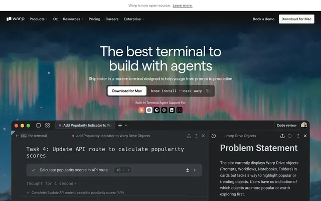
Deep-space command shell — a frosted obsidian cockpit where every pixel earns its place and color is a rare, meaningful signal.
Color palette
Gray outline accent for tags, dividers, and focused UI edges.
Primary page background, dominant surface beneath all content
Deepest layer — nav overlays, announcement bar background
Footer background, slightly elevated surface above canvas
Raised card surfaces, pill button backgrounds, interactive containers
Nav borders, filled dark button backgrounds — the primary interactive fill
Hover-state surfaces, slightly elevated overlays
Secondary body text, muted link text, hairline borders
Tertiary body text, disabled or de-emphasized labels
Announcement bar text, code snippet text, subheadings at reduced emphasis
Highest-contrast text on dark backgrounds, filled light button backgrounds
Nav background on scroll, download button fill, icon fills
Typography
- Weights
- 400
- Sizes
- 12px
- Line height
- 1.2
sans-serif — detected in extracted data but not described by AI
- Weights
- 400, 600
- Sizes
- 12px, 14px, 16px, 18px, 20px, 24px, 32px, 40px, 48px, 56px, 64px
- Line height
- 0.9
- Letter spacing
- -0.04em at 64px, -0.03em at 56px, -0.02em at 32-48px, -0.01em at 20-24px, 0.01em at 12-14px (slight open tracking for small labels)
- Fallback
- General Sans, Manrope, or DM Sans
The system's primary voice — all headings, body copy, buttons, and nav labels. Custom OpenType features give characters precision-cut angles not present in generic alternatives. Negative tracking scales from -0.04em at 64px down to -0.01em at 20px, tightening the display headline into a monolithic slab. Weight 400 handles everything from captions to large headlines — 600 is used sparingly for emphasis.
- Weights
- 400, 500
- Sizes
- 14px, 16px
- Line height
- 1
- Letter spacing
- -0.02em at 16px, -0.014em at 16px, -0.012em at 14px
- Fallback
- Inter (already a Google font)
Secondary UI text — appears in body descriptions and headings within the product UI screenshot. Carries the same OpenType features as Matter to maintain visual harmony. Used when Matter is unavailable in an embedded context.
- Weights
- 400
- Sizes
- 16px
- Line height
- 1
- Fallback
- JetBrains Mono, Fira Code
Terminal commands and code snippets — 'brew install --cask warp' displayed in the hero. Monospaced rendering reinforces the product's terminal identity.
- Weights
- 400
- Sizes
- 16px
- Line height
- 1
- Letter spacing
- -0.012em
Inline code and terminal output text within prose contexts — distinct from Geist Mono by its custom optical tuning matching the Matter family.
- Weights
- 400, 600
- Sizes
- 12px, 14px, 16px, 18px, 20px, 24px, 32px, 40px, 48px, 56px, 64px
- Line height
- 0.9, 1, 1.1, 1.12, 1.15, 1.19, 1.2, 1.35, 1.38, 1.4, 1.5, 1.56
- Letter spacing
- -0.04, -0.03, -0.02, -0.01, 0.01, 0.1, 0.2
Matter Regular — detected in extracted data but not described by AI
- Weights
- 400, 500
- Sizes
- 16px, 20px, 22px
- Line height
- 1, 1.14, 1.2
- Letter spacing
- 0.001
Matter Medium — detected in extracted data but not described by AI
- Weights
- 400
- Sizes
- 16px
- Line height
- 1.4
DM Mono — detected in extracted data but not described by AI
Spacing & shape
Elevation
Components
Background #ffffff, text #121212 (or near-black), border-radius 6px, padding 12px 20px. Matter weight 600 at 16px. Appears in the nav and hero. The white fill on a near-black page makes this the only high-contrast interactive element visible at a glance.
Background #2f2f2f, text #faf9f6, no visible border, border-radius 4px, padding 8px 12px. Matter weight 400 at 14px. Used inside the terminal product UI for sub-actions. Subtle box-shadow: rgba(18,18,18,0.2) 0 0 16px.
Background rgba(255,255,255,0.04), effectively invisible fill, border-radius 4px, padding 8px 12px. Text #faf9f6. Used for low-emphasis actions that need click target area without visual weight.
Background #353534, text/icon #afaeac, border-radius 50px, padding 10px. Circular or tight-aspect buttons for UI chrome controls like view toggles. Monochrome icon at reduced brightness.
Background #353534, text #e3e2e0, font Geist Mono 400 16px, border-radius 10px, padding 12px 16px. Displays 'brew install --cask warp' as a copyable command. Icon button for copy action at trailing edge.
Background #121212, border-radius 16px, no border, no shadow, padding 0 (content inside handles its own padding). Used in 12+ instances. Content bleeds to card edges — imagery is contained by the radius, not inset padding.
Background #353534, border-radius 20px, no shadow, no border. One step above the canvas in the surface stack — used for dropdown/panel containers in the product screenshot.
Background #1e1e1d, border-radius 10px, padding 16px on all sides. Used for structured text blocks like 'Problem Statement' panels within the product screenshot interface.
Background #090909 (near pure black), text #e3e2e0 at 14px Matter weight 400, link in #faf9f6 with underline. Full-width, 40px height. The single horizontal line of text and link creates minimum footprint.
Background #ffffff (scrolled) or transparent, height ~48px. Logo left, nav links center in Matter Medium 16px color #868684, CTA buttons right. Nav links use 'Book a demo' as ghost text and 'Download for Mac' as the white-fill primary. backdrop-filter: blur(20px) on scroll.
Text #799c92, Matter weight 400, 14-16px, letter-spacing 0.1em (wide-tracked). Placed above section headings. The only chromatic color in the system — acts like a terminal prompt cursor bleeding into copy.
Background #121212 (canvas), logos in #868684 to #afaeac (desaturated, low-contrast fills). Full-width horizontal flex, logos centered, no borders or dividers. Density: compact, 12-16px gap between logos.
Guidelines
- Use #121212 as the default page canvas — every section that lacks a specific override inherits this base.
- Apply Terminal Sage (#799c92) only to eyebrow/subheading text above section titles — never as a button color, background, or decoration.
- Set display headings (48px+) in Matter weight 400 with letter-spacing -0.03em to -0.04em — the negative tracking at these sizes is mandatory, not optional.
- Step surfaces upward using background color only: #121212 → #1e1e1d → #353534. Never use borders or shadows to separate co-planar sections.
- Use border-radius 16px for all feature cards, 4px for all rectangular buttons, and 50px for pill/circular controls — these three radii cover 90% of UI components.
- Render all terminal commands and code samples in Geist Mono 400 16px on #353534 backgrounds with #e3e2e0 text.
- Keep the white (#ffffff) download button exclusive to primary navigation CTAs — it is the sole maximum-contrast element and dilutes if reused.
- Never introduce additional chromatic colors beyond Terminal Sage (#799c92) — the system is intentionally near-monochrome and a second hue breaks the terminal-inspired restraint.
- Do not use box shadows or drop shadows on cards or sections — depth is communicated through surface color steps, not elevation effects.
- Avoid font weights above 600 for Matter — the type system lives in the 400-600 range; heavier weights create visual noise against the dark canvas.
- Do not use border-radius above 20px on cards and never apply round corners (50px+) to rectangular content containers — pill radius is reserved for icon-button controls only.
- Never place light (#faf9f6 or #ffffff) backgrounds behind full sections as a design choice — light backgrounds appear only on the nav bar on scroll and the primary download button fill.
- Do not add decorative gradients, glows, or colored backgrounds to content sections — the aurora photography in the hero is the only atmospheric color; UI components stay achromatic.
- Avoid setting body or paragraph text above 18px — Matter at 16px is the comfortable reading size; larger body text breaks the dense, information-forward density of the layout.
About this system
ShowHide
Warp operates in a deep charcoal universe: near-black canvas (#121212) layered with subtly lighter surfaces (#1e1e1d, #353534) and no shadows — elevation is communicated entirely through background-color steps. The primary typeface, Matter, does all the expressive heavy lifting: tight negative tracking at display sizes (-0.04em at 56-64px) whispers confidence rather than shouting, and the custom OpenType features (cv03, cv04, cv09, cv11) give it a precision-engineered feel that generic sans-serifs lack. Color is almost entirely absent — the one chromatic exception, a muted sage-green (#799c92), surfaces exclusively as an accent on section subheadings, making it feel like a terminal prompt color that escaped into the UI. The terminal product screenshot is the hero; the interface reproduces itself as marketing material, blurring the line between product and page.
Max-width ~1200px centered, but hero sections are full-bleed dark. The first screen is a full-viewport dark hero with centered headline stack, a two-button CTA row (white filled + code snippet block side by side), and a product screenshot below the fold edge. Sections alternate between full-bleed #121212 canvas regions and slightly differentiated #1e1e1d footer zones — no alternating light/dark bands. Content arrangement is primarily centered stacks for headline+body+CTA groups, switching to asymmetric text-left / product-right two-column layouts for feature sections (55/45 split). Feature detail sections use a left-side numbered list with a right-side product screenshot panel. Section vertical rhythm uses ~80px gaps. The navigation is a fixed top bar ~48px tall with logo, center nav links, and right-side dual CTA buttons. A full-width announcement bar sits above the nav, adding ~32px to the top chrome.
Warp uses a tight blend of product screenshots and atmospheric photography. The hero features a full-bleed dark background with aurora-borealis-style photography (deep teals, greens, reds against black sky) serving as environmental mood — not literal content. The product terminal window is the true hero object, rendered as a realistic macOS chrome screenshot with traffic-light controls, tab bars, and actual UI state. This blurs the boundary between marketing and product: the interface is the hero. Below the fold, product screenshots are contained within dark rounded-corner cards (16px radius) and shown at slight angles or as cropped panels. Video thumbnails appear with a centered play button overlay on a dark gradient mask. No lifestyle photography, no abstract illustration — either real product UI or atmospheric dark landscapes. Icons are minimal, outlined at ~16-20px, monochrome (#868684), single-weight stroke style. Integration partner logos (Docker, GitHub, Asana, etc.) are desaturated to Ash Text (#868684) tone.
Reminiscent of Vercel, Linear, Railway, Fig / Warp competitors, Raycast.
# Warp — Style Reference
> Deep-space command shell — a frosted obsidian cockpit where every pixel earns its place and color is a rare, meaningful signal.

**Theme:** dark

**Site:** https://warp.dev/terminal

Warp operates in a deep charcoal universe: near-black canvas (#121212) layered with subtly lighter surfaces (#1e1e1d, #353534) and no shadows — elevation is communicated entirely through background-color steps. The primary typeface, Matter, does all the expressive heavy lifting: tight negative tracking at display sizes (-0.04em at 56-64px) whispers confidence rather than shouting, and the custom OpenType features (cv03, cv04, cv09, cv11) give it a precision-engineered feel that generic sans-serifs lack. Color is almost entirely absent — the one chromatic exception, a muted sage-green (#799c92), surfaces exclusively as an accent on section subheadings, making it feel like a terminal prompt color that escaped into the UI. The terminal product screenshot is the hero; the interface reproduces itself as marketing material, blurring the line between product and page.

## Tokens — Colors

| Name | Value | Token | Role |
|------|------|------|------|
| Terminal Sage | `#799c92` | `--color-terminal-sage` | Gray outline accent for tags, dividers, and focused UI edges. |
| Void Canvas | `#121212` | `--color-void-canvas` | Primary page background, dominant surface beneath all content |
| Obsidian Deep | `#090909` | `--color-obsidian-deep` | Deepest layer — nav overlays, announcement bar background |
| Charcoal Surface | `#1e1e1d` | `--color-charcoal-surface` | Footer background, slightly elevated surface above canvas |
| Iron Surface | `#353534` | `--color-iron-surface` | Raised card surfaces, pill button backgrounds, interactive containers |
| Graphite Lift | `#2f2f2f` | `--color-graphite-lift` | Nav borders, filled dark button backgrounds — the primary interactive fill |
| Slate Hover | `#40403f` | `--color-slate-hover` | Hover-state surfaces, slightly elevated overlays |
| Ash Text | `#868684` | `--color-ash-text` | Secondary body text, muted link text, hairline borders |
| Fog Text | `#afaeac` | `--color-fog-text` | Tertiary body text, disabled or de-emphasized labels |
| Smoke Text | `#e3e2e0` | `--color-smoke-text` | Announcement bar text, code snippet text, subheadings at reduced emphasis |
| Warm White | `#faf9f6` | `--color-warm-white` | Highest-contrast text on dark backgrounds, filled light button backgrounds |
| Pure White | `#ffffff` | `--color-pure-white` | Nav background on scroll, download button fill, icon fills |

## Tokens — Typography

### sans-serif
- **Weights:** 400
- **Sizes:** 12px
- **Line height:** 1.2
- **Role:** sans-serif — detected in extracted data but not described by AI

### Matter
- **Substitute:** General Sans, Manrope, or DM Sans
- **Weights:** 400, 600
- **Sizes:** 12px, 14px, 16px, 18px, 20px, 24px, 32px, 40px, 48px, 56px, 64px
- **Line height:** 0.9
- **Letter spacing:** -0.04em at 64px, -0.03em at 56px, -0.02em at 32-48px, -0.01em at 20-24px, 0.01em at 12-14px (slight open tracking for small labels)
- **Role:** The system's primary voice — all headings, body copy, buttons, and nav labels. Custom OpenType features give characters precision-cut angles not present in generic alternatives. Negative tracking scales from -0.04em at 64px down to -0.01em at 20px, tightening the display headline into a monolithic slab. Weight 400 handles everything from captions to large headlines — 600 is used sparingly for emphasis.

### Inter
- **Substitute:** Inter (already a Google font)
- **Weights:** 400, 500
- **Sizes:** 14px, 16px
- **Line height:** 1
- **Letter spacing:** -0.02em at 16px, -0.014em at 16px, -0.012em at 14px
- **Role:** Secondary UI text — appears in body descriptions and headings within the product UI screenshot. Carries the same OpenType features as Matter to maintain visual harmony. Used when Matter is unavailable in an embedded context.

### Geist Mono
- **Substitute:** JetBrains Mono, Fira Code
- **Weights:** 400
- **Sizes:** 16px
- **Line height:** 1
- **Role:** Terminal commands and code snippets — 'brew install --cask warp' displayed in the hero. Monospaced rendering reinforces the product's terminal identity.

### Matter Mono Regular
- **Weights:** 400
- **Sizes:** 16px
- **Line height:** 1
- **Letter spacing:** -0.012em
- **Role:** Inline code and terminal output text within prose contexts — distinct from Geist Mono by its custom optical tuning matching the Matter family.

### Matter Regular
- **Weights:** 400, 600
- **Sizes:** 12px, 14px, 16px, 18px, 20px, 24px, 32px, 40px, 48px, 56px, 64px
- **Line height:** 0.9, 1, 1.1, 1.12, 1.15, 1.19, 1.2, 1.35, 1.38, 1.4, 1.5, 1.56
- **Letter spacing:** -0.04, -0.03, -0.02, -0.01, 0.01, 0.1, 0.2
- **Role:** Matter Regular — detected in extracted data but not described by AI

### Matter Medium
- **Weights:** 400, 500
- **Sizes:** 16px, 20px, 22px
- **Line height:** 1, 1.14, 1.2
- **Letter spacing:** 0.001
- **Role:** Matter Medium — detected in extracted data but not described by AI

### DM Mono
- **Weights:** 400
- **Sizes:** 16px
- **Line height:** 1.4
- **Role:** DM Mono — detected in extracted data but not described by AI

## Tokens — Type Scale

Major Third (1.25) from 16px base.

| Role | Size | Line height | Letter spacing |
|------|------|------|------|
| caption | 12px | 1.2 | 1.2px |
| body-sm | 14px | 1.38 | -0.2px |
| body | 16px | 1.5 | -0.19px |
| subheading | 18px | 1.4 | -0.18px |
| heading-sm | 24px | 1.35 | -0.48px |
| heading | 32px | 1.2 | -0.64px |
| heading-lg | 48px | 1.1 | -0.96px |
| display | 64px | 0.9 | -2.56px |

## Tokens — Spacing

- **Max width:** 1200px
- **Section gap:** 80px
- **Card padding:** 16px
- **Element gap:** 10px

## Tokens — Radius

- **Buttons:** 4px
- **Inputs:** 4px
- **Cards:** 16px
- **Images:** 10px
- **badges:** 200px
- **largeCards:** 20px
- **pillButtons:** 50px

## Tokens — Elevation

- **Button (dark filled):** `rgba(18, 18, 18, 0.2) 0px 0px 16px 0px`

## Layout

Max-width ~1200px centered, but hero sections are full-bleed dark. The first screen is a full-viewport dark hero with centered headline stack, a two-button CTA row (white filled + code snippet block side by side), and a product screenshot below the fold edge. Sections alternate between full-bleed #121212 canvas regions and slightly differentiated #1e1e1d footer zones — no alternating light/dark bands. Content arrangement is primarily centered stacks for headline+body+CTA groups, switching to asymmetric text-left / product-right two-column layouts for feature sections (55/45 split). Feature detail sections use a left-side numbered list with a right-side product screenshot panel. Section vertical rhythm uses ~80px gaps. The navigation is a fixed top bar ~48px tall with logo, center nav links, and right-side dual CTA buttons. A full-width announcement bar sits above the nav, adding ~32px to the top chrome.

## Imagery

Warp uses a tight blend of product screenshots and atmospheric photography. The hero features a full-bleed dark background with aurora-borealis-style photography (deep teals, greens, reds against black sky) serving as environmental mood — not literal content. The product terminal window is the true hero object, rendered as a realistic macOS chrome screenshot with traffic-light controls, tab bars, and actual UI state. This blurs the boundary between marketing and product: the interface is the hero. Below the fold, product screenshots are contained within dark rounded-corner cards (16px radius) and shown at slight angles or as cropped panels. Video thumbnails appear with a centered play button overlay on a dark gradient mask. No lifestyle photography, no abstract illustration — either real product UI or atmospheric dark landscapes. Icons are minimal, outlined at ~16-20px, monochrome (#868684), single-weight stroke style. Integration partner logos (Docker, GitHub, Asana, etc.) are desaturated to Ash Text (#868684) tone.

## Components

### Hero CTA Button Group with Code Snippet

### Feature Section — Numbered List Card

### Trust Logo Bar

### Primary Download Button
*Highest-priority CTA — download action*

Background #ffffff, text #121212 (or near-black), border-radius 6px, padding 12px 20px. Matter weight 600 at 16px. Appears in the nav and hero. The white fill on a near-black page makes this the only high-contrast interactive element visible at a glance.

### Dark Filled Button
*Secondary actions within dark UI panels*

Background #2f2f2f, text #faf9f6, no visible border, border-radius 4px, padding 8px 12px. Matter weight 400 at 14px. Used inside the terminal product UI for sub-actions. Subtle box-shadow: rgba(18,18,18,0.2) 0 0 16px.

### Ghost Surface Button
*Tertiary actions on dark backgrounds*

Background rgba(255,255,255,0.04), effectively invisible fill, border-radius 4px, padding 8px 12px. Text #faf9f6. Used for low-emphasis actions that need click target area without visual weight.

### Pill Icon Button
*Toggle or mode-switch controls*

Background #353534, text/icon #afaeac, border-radius 50px, padding 10px. Circular or tight-aspect buttons for UI chrome controls like view toggles. Monochrome icon at reduced brightness.

### Code Snippet Block
*Inline command display in hero*

Background #353534, text #e3e2e0, font Geist Mono 400 16px, border-radius 10px, padding 12px 16px. Displays 'brew install --cask warp' as a copyable command. Icon button for copy action at trailing edge.

### Primary Feature Card
*Main content cards throughout feature sections*

Background #121212, border-radius 16px, no border, no shadow, padding 0 (content inside handles its own padding). Used in 12+ instances. Content bleeds to card edges — imagery is contained by the radius, not inset padding.

### Elevated Content Card
*Secondary raised container within a section*

Background #353534, border-radius 20px, no shadow, no border. One step above the canvas in the surface stack — used for dropdown/panel containers in the product screenshot.

### Padded Inner Card
*Text-content sub-container*

Background #1e1e1d, border-radius 10px, padding 16px on all sides. Used for structured text blocks like 'Problem Statement' panels within the product screenshot interface.

### Announcement Bar
*Top-of-page notification strip*

Background #090909 (near pure black), text #e3e2e0 at 14px Matter weight 400, link in #faf9f6 with underline. Full-width, 40px height. The single horizontal line of text and link creates minimum footprint.

### Navigation Bar
*Primary site navigation*

Background #ffffff (scrolled) or transparent, height ~48px. Logo left, nav links center in Matter Medium 16px color #868684, CTA buttons right. Nav links use 'Book a demo' as ghost text and 'Download for Mac' as the white-fill primary. backdrop-filter: blur(20px) on scroll.

### Section Eyebrow Label
*Feature section category marker*

Text #799c92, Matter weight 400, 14-16px, letter-spacing 0.1em (wide-tracked). Placed above section headings. The only chromatic color in the system — acts like a terminal prompt cursor bleeding into copy.

### Trust Logo Bar
*Social proof logos row*

Background #121212 (canvas), logos in #868684 to #afaeac (desaturated, low-contrast fills). Full-width horizontal flex, logos centered, no borders or dividers. Density: compact, 12-16px gap between logos.

## Guidelines

### Do

- Use #121212 as the default page canvas — every section that lacks a specific override inherits this base.
- Apply Terminal Sage (#799c92) only to eyebrow/subheading text above section titles — never as a button color, background, or decoration.
- Set display headings (48px+) in Matter weight 400 with letter-spacing -0.03em to -0.04em — the negative tracking at these sizes is mandatory, not optional.
- Step surfaces upward using background color only: #121212 → #1e1e1d → #353534. Never use borders or shadows to separate co-planar sections.
- Use border-radius 16px for all feature cards, 4px for all rectangular buttons, and 50px for pill/circular controls — these three radii cover 90% of UI components.
- Render all terminal commands and code samples in Geist Mono 400 16px on #353534 backgrounds with #e3e2e0 text.
- Keep the white (#ffffff) download button exclusive to primary navigation CTAs — it is the sole maximum-contrast element and dilutes if reused.

### Don't

- Never introduce additional chromatic colors beyond Terminal Sage (#799c92) — the system is intentionally near-monochrome and a second hue breaks the terminal-inspired restraint.
- Do not use box shadows or drop shadows on cards or sections — depth is communicated through surface color steps, not elevation effects.
- Avoid font weights above 600 for Matter — the type system lives in the 400-600 range; heavier weights create visual noise against the dark canvas.
- Do not use border-radius above 20px on cards and never apply round corners (50px+) to rectangular content containers — pill radius is reserved for icon-button controls only.
- Never place light (#faf9f6 or #ffffff) backgrounds behind full sections as a design choice — light backgrounds appear only on the nav bar on scroll and the primary download button fill.
- Do not add decorative gradients, glows, or colored backgrounds to content sections — the aurora photography in the hero is the only atmospheric color; UI components stay achromatic.
- Avoid setting body or paragraph text above 18px — Matter at 16px is the comfortable reading size; larger body text breaks the dense, information-forward density of the layout.

## Agent Prompt Guide

**Quick Color Reference**
- text (primary): #faf9f6
- text (secondary): #868684
- text (muted): #afaeac
- background (canvas): #121212
- border / divider: #2f2f2f
- accent (eyebrow): #799c92
- primary action: #2f2f2f (filled action)

**Example Component Prompts**

1. **Hero Section**: Full-bleed #121212 background. Centered headline 'The best terminal to build with agents' at 56px Matter weight 400 color #faf9f6 letter-spacing -0.03em line-height 1.0. Subtext at 18px Matter weight 400 #868684. Below: white button (#ffffff bg, #121212 text, 6px radius, 12px 20px padding, 'Download for Mac') beside a code block (#353534 bg, #e3e2e0 text, Geist Mono 16px, 10px radius, 12px 16px padding).

2. **Feature Section Opener**: Eyebrow label 'Prompt to shippable feature' in #799c92, Matter 400 14px, letter-spacing 0.1em. Below it, heading 'The editor features you need to work with agents' at 40px Matter weight 400 #faf9f6 letter-spacing -0.02em. Section background #121212.

3. **Feature Card**: Background #121212, border-radius 16px, no shadow, no border. Image fills card to edges (masked by radius). Text content below image: heading 16px Matter weight 600 #faf9f6, body 14px Matter weight 400 #868684, element gap 8px.

4. **Pill Control Button**: Background #353534, icon/text #afaeac, border-radius 50px, padding 10px. No border. Used for view-toggle or mode-switch controls in terminal chrome.

5. **Trust Logo Bar**: Background #121212, full-width flex row, logos rendered in #868684 fill. Text label above: 'Trusted by over 700,000 developers' at 14px Matter 400 #868684, centered. Logo row gap 24px, no borders.

## Motion System

Transitions run at 0.4s for state changes (color, opacity) using cubic-bezier(0.44, 0, 0.56, 1) — a slightly decelerating ease-in-out that feels mechanical rather than bouncy. Quick microinteractions (hover color changes on links) use 0.15s ease. The 0.4s duration is unusually long for hover states, giving interactions a deliberate, weighty quality consistent with a terminal application's cadence. Transition only color, opacity, text-decoration-color, and text-underline-offset — never transform or scale on hover for navigation elements.
More like this





Keep what you find
A free account saves references to boards and can send you a weekly email of picks based on what you save.
To see every result, go Pro.