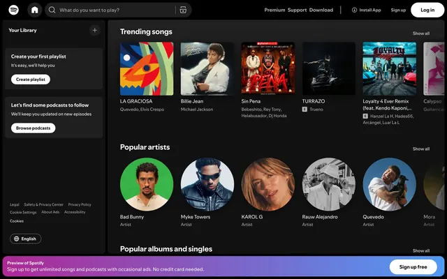
Preview image. Unlock full-res
Ebony Canvas, Spotlight Content
Color palette
Observed in body backgroundColor.
Background for promotional banners, drawing attention with moderate saturation.
Diverse album/artist card backgrounds, providing subtle thematic variation.
Diverse album/artist card backgrounds, providing subtle thematic variation.
Page background, primary canvas, base level surface.
Secondary surface background, card backgrounds, sidebar background — slightly elevated from the canvas.
Content container backgrounds, active navigation indicators. This is the primary filled button background.
Primary body text, neutral icons, subtly present borders.
High-contrast text, prominent headers, interactive element text, button text, and main section titles to ensure legibility against dark backgrounds. Also used for borders on ghost buttons and input fields.
Placeholder text in search inputs, secondary descriptive text, subtle borders.
Typography
- Weights
- 400, 600, 700
- Sizes
- 11px, 12px, 13px, 14px, 16px
- Line height
- 1.2, 1.33, 1.5
- Letter spacing
- normal
- Fallback
- Inter
Primary text font for body content, labels, captions, and interactive elements. Its multiple weights support hierarchical distinctions without changing typefaces.
- Weights
- 700
- Sizes
- 24px
- Line height
- 1.2
- Letter spacing
- normal
- Fallback
- Montserrat
Dedicated font for prominent headings, ensuring clear hierarchy and brand distinction at larger sizes. Its single bold weight delivers impact.
Spacing & shape
Elevation
Components
Background: Charcoal Surface (#1f1f1f), Text: Pure White Text (#ffffff), Padding: 12px vertical, 12px horizontal. Border radius: 9999px. Used for main calls to action.
Background: transparent (rgba(0,0,0,0)), Text: Graphite Text (#b3b3b3), Border: 1px solid Graphite Text (#b3b3b3), Padding: 12px all around. Border radius: 9999px.
Background: transparent (rgba(0,0,0,0)), Text: Pure White Text (#ffffff), Border: 1px solid Pure White Text (#ffffff), Padding: 0px. Used for emphasized secondary actions like 'Install App'.
Background: transparent (rgba(0,0,0,0)), Border radius: 6px, Padding: 12px all around. Used for individual album covers, playlists, or artist profiles.
Background: Iron Accent (#121212), Border radius: 6px, Padding: 0px (internal elements manage their own spacing). Used to group related content, like playlist creation prompts.
Background: Charcoal Surface (#1f1f1f), Text: Pure White Text (#ffffff), Placeholder text: Muted Grey (#767676), Padding: 12px vertical, 48px left, 96px right. Border radius: 500px.
Background: linear-gradient(90deg, rgb(175, 40, 150), rgb(80, 155, 245)), Text: Pure White Text (#ffffff), Padding: 12px vertical, 24px horizontal. Border radius: 0px.
Background: Ebony Canvas (#000000), internal elements often use Iron Accent (#121212) as background, with no overall container padding.
Guidelines
- Prioritize Ebony Canvas (#000000) for large background areas and Iron Accent (#121212) for content surfaces to establish depth.
- Use Pure White Text (#ffffff) for all main headings and prominent interactive text to ensure optimal contrast.
- Apply Iron Accent (#121212) for elevated card backgrounds and Charcoal Surface (#1f1f1f) for interactive fills like button backgrounds or active states.
- Accurately use Spotify Green (#1ed760) only for active indicators and brand highlights, like the Spotify logo or play controls.
- Employ 9999px radius for all interactive buttons and pill-shaped elements to maintain a consistent interactive affordance.
- Adhere to the 6px border radius for content cards and containers to create a soft, contained visual.
- Apply 12px vertical and horizontal padding consistently to interactive buttons and card content areas.
- Do not use saturated colors from media content cards (e.g., #c80808, #508162) for UI elements; they are reserved for mood setting within content.
- Avoid using excessive box-shadows; rely on surface color changes from Ebony Canvas to Iron Accent to Charcoal Surface for visual hierarchy.
- Do not break the 9999px radius for buttons, as it is a core identifier of interactive elements.
- Restrict Pure White Text (#ffffff) usage to prominent text where high contrast is essential, otherwise use Graphite Text (#b3b3b3) for secondary content.
- Do not introduce new color gradients; adhere only to the Signal Purple gradient for specific promotional banners.
- Avoid using a page-level padding; content should align to the defined max-width of 1085px centrally.
- Do not introduce custom font styles or weights outside of SpotifyMixUI and SpotifyMixUITitle. Maintain 'normal' letter spacing for all text.
About this system
ShowHide
This design system conjures a dark, immersive command center for digital media consumption. A deep ebony canvas creates a sense of gravitas, while subtle tonal variations in surfaces define hierarchical layers without relying on heavy shadows. Carefully chosen muted and vivid chromatic accents punctuate content, drawing attention to media rather than interface chrome. Rounded corners for interactive elements provide a soft contrast to the otherwise sharp, precise lines of the content blocks. Typography prioritizing readability and clear information hierarchy completes a focused and understated aesthetic.
The page structure is largely contained within a max-width of 1085px, featuring a persistent left sidebar navigation and a sticky top header. The main content area uses a flexible grid system, alternating between single-column stacks for 'Your Library' prompts and multi-column grids for content like 'Trending songs' and 'Popular artists'. Sections have consistent vertical spacing. The overall density is compact, maximizing content visibility without feeling cramped. The hero section is integrated within the main content area, not a distinct full-bleed element, with primary content appearing immediately within the defined max-width block.
This design primarily uses media album art and artist photography as its visual content. Album covers are presented within contained, square cards with a 6px border-radius, while artist portraits are typically circular. Both styles are rendered as content, not integrated into the UI. Photography of artists tends to be product-focused, showcasing the artist directly. Icons are minimal, monochromatic, and outlined, primarily serving functional navigation and interaction. The system is text-dominant, with imagery acting as visual anchors and content preview rather than decorative elements, creating a focused, content-first experience.
Reminiscent of Netflix, Apple Music, Tidal, Twitch, YouTube (Dark Mode).
# Spotify — Style Reference
> Ebony Canvas, Spotlight Content

**Theme:** dark

**Site:** https://www.spotify.com

This design system conjures a dark, immersive command center for digital media consumption. A deep ebony canvas creates a sense of gravitas, while subtle tonal variations in surfaces define hierarchical layers without relying on heavy shadows. Carefully chosen muted and vivid chromatic accents punctuate content, drawing attention to media rather than interface chrome. Rounded corners for interactive elements provide a soft contrast to the otherwise sharp, precise lines of the content blocks. Typography prioritizing readability and clear information hierarchy completes a focused and understated aesthetic.

## Tokens — Colors

| Name | Value | Token | Role |
|------|------|------|------|
| Spotify Green | `#1ed760` | `--color-spotify-green` | Observed in body backgroundColor. |
| Signal Purple | `#6f74a4` | `--color-signal-purple` | Background for promotional banners, drawing attention with moderate saturation. |
| Deep Space Blue | `#1078a8` | `--color-deep-space-blue` | Diverse album/artist card backgrounds, providing subtle thematic variation. |
| Sunset Red | `#dc392b` | `--color-sunset-red` | Diverse album/artist card backgrounds, providing subtle thematic variation. |
| Ebony Canvas | `#000000` | `--color-ebony-canvas` | Page background, primary canvas, base level surface. |
| Iron Accent | `#121212` | `--color-iron-accent` | Secondary surface background, card backgrounds, sidebar background — slightly elevated from the canvas. |
| Charcoal Surface | `#1f1f1f` | `--color-charcoal-surface` | Content container backgrounds, active navigation indicators. This is the primary filled button background. |
| Graphite Text | `#b3b3b3` | `--color-graphite-text` | Primary body text, neutral icons, subtly present borders. |
| Pure White Text | `#ffffff` | `--color-pure-white-text` | High-contrast text, prominent headers, interactive element text, button text, and main section titles to ensure legibility against dark backgrounds. Also used for borders on ghost buttons and input fields. |
| Muted Grey | `#767676` | `--color-muted-grey` | Placeholder text in search inputs, secondary descriptive text, subtle borders. |

## Tokens — Typography

### SpotifyMixUI
- **Substitute:** Inter
- **Weights:** 400, 600, 700
- **Sizes:** 11px, 12px, 13px, 14px, 16px
- **Line height:** 1.2, 1.33, 1.5
- **Letter spacing:** normal
- **Role:** Primary text font for body content, labels, captions, and interactive elements. Its multiple weights support hierarchical distinctions without changing typefaces.

### SpotifyMixUITitle
- **Substitute:** Montserrat
- **Weights:** 700
- **Sizes:** 24px
- **Line height:** 1.2
- **Letter spacing:** normal
- **Role:** Dedicated font for prominent headings, ensuring clear hierarchy and brand distinction at larger sizes. Its single bold weight delivers impact.

## Tokens — Type Scale

Major Second (1.125) from 13px base.

| Role | Size | Line height | Letter spacing |
|------|------|------|------|
| caption | 11px | 1.33 | — |
| body-sm | 12px | 1.33 | — |
| body | 13px | 1.33 | — |
| body-lg | 14px | 1.33 | — |
| heading-sm | 16px | 1.33 | — |

## Tokens — Spacing

- **Max width:** 1085px
- **Section gap:** 48px
- **Card padding:** 12px
- **Element gap:** 12px

## Tokens — Radius

- **Default:** 6px
- **Buttons:** 9999px
- **circular:** 50%
- **input:** 500px

## Tokens — Elevation

- **Card:** `rgba(0, 0, 0, 0.5) 0px 8px 24px 0px`
- **Header/Sidebar Overlay:** `rgb(18, 18, 18) 0px 1px 0px 0px, rgb(124, 124, 124) 0px 0px 0px 1px inset`

## Layout

The page structure is largely contained within a max-width of 1085px, featuring a persistent left sidebar navigation and a sticky top header. The main content area uses a flexible grid system, alternating between single-column stacks for 'Your Library' prompts and multi-column grids for content like 'Trending songs' and 'Popular artists'. Sections have consistent vertical spacing. The overall density is compact, maximizing content visibility without feeling cramped. The hero section is integrated within the main content area, not a distinct full-bleed element, with primary content appearing immediately within the defined max-width block.

## Imagery

This design primarily uses media album art and artist photography as its visual content. Album covers are presented within contained, square cards with a 6px border-radius, while artist portraits are typically circular. Both styles are rendered as content, not integrated into the UI. Photography of artists tends to be product-focused, showcasing the artist directly. Icons are minimal, monochromatic, and outlined, primarily serving functional navigation and interaction. The system is text-dominant, with imagery acting as visual anchors and content preview rather than decorative elements, creating a focused, content-first experience.

## Components

### Filled Button
*Primary action*

Background: Charcoal Surface (#1f1f1f), Text: Pure White Text (#ffffff), Padding: 12px vertical, 12px horizontal. Border radius: 9999px. Used for main calls to action.

### Ghost Button
*Secondary action*

Background: transparent (rgba(0,0,0,0)), Text: Graphite Text (#b3b3b3), Border: 1px solid Graphite Text (#b3b3b3), Padding: 12px all around. Border radius: 9999px.

### High-Visibility Ghost Button
*Prominent secondary action*

Background: transparent (rgba(0,0,0,0)), Text: Pure White Text (#ffffff), Border: 1px solid Pure White Text (#ffffff), Padding: 0px. Used for emphasized secondary actions like 'Install App'.

### Media Content Card
*Content display*

Background: transparent (rgba(0,0,0,0)), Border radius: 6px, Padding: 12px all around. Used for individual album covers, playlists, or artist profiles.

### Container Card
*Grouped content*

Background: Iron Accent (#121212), Border radius: 6px, Padding: 0px (internal elements manage their own spacing). Used to group related content, like playlist creation prompts.

### Search Input (Header)
*Global input field*

Background: Charcoal Surface (#1f1f1f), Text: Pure White Text (#ffffff), Placeholder text: Muted Grey (#767676), Padding: 12px vertical, 48px left, 96px right. Border radius: 500px.

### Promotional Banner
*System message banner*

Background: linear-gradient(90deg, rgb(175, 40, 150), rgb(80, 155, 245)), Text: Pure White Text (#ffffff), Padding: 12px vertical, 24px horizontal. Border radius: 0px.

### Side Navigation Container
*Persistent navigation*

Background: Ebony Canvas (#000000), internal elements often use Iron Accent (#121212) as background, with no overall container padding.

## Guidelines

### Do

- Prioritize Ebony Canvas (#000000) for large background areas and Iron Accent (#121212) for content surfaces to establish depth.
- Use Pure White Text (#ffffff) for all main headings and prominent interactive text to ensure optimal contrast.
- Apply Iron Accent (#121212) for elevated card backgrounds and Charcoal Surface (#1f1f1f) for interactive fills like button backgrounds or active states.
- Accurately use Spotify Green (#1ed760) only for active indicators and brand highlights, like the Spotify logo or play controls.
- Employ 9999px radius for all interactive buttons and pill-shaped elements to maintain a consistent interactive affordance.
- Adhere to the 6px border radius for content cards and containers to create a soft, contained visual.
- Apply 12px vertical and horizontal padding consistently to interactive buttons and card content areas.

### Don't

- Do not use saturated colors from media content cards (e.g., #c80808, #508162) for UI elements; they are reserved for mood setting within content.
- Avoid using excessive box-shadows; rely on surface color changes from Ebony Canvas to Iron Accent to Charcoal Surface for visual hierarchy.
- Do not break the 9999px radius for buttons, as it is a core identifier of interactive elements.
- Restrict Pure White Text (#ffffff) usage to prominent text where high contrast is essential, otherwise use Graphite Text (#b3b3b3) for secondary content.
- Do not introduce new color gradients; adhere only to the Signal Purple gradient for specific promotional banners.
- Avoid using a page-level padding; content should align to the defined max-width of 1085px centrally.
- Do not introduce custom font styles or weights outside of SpotifyMixUI and SpotifyMixUITitle. Maintain 'normal' letter spacing for all text.

## Agent Prompt Guide

Quick Color Reference:
text: #b3b3b3
background: #000000
border: #b3b3b3
accent: #1ed760
primary action: #1f1f1f (filled action)

Example Component Prompts:
Create a primary action button: Background Charcoal Surface (#1f1f1f), text Pure White Text (#ffffff), 9999px radius, 12px vertical and horizontal padding.
Create a content card a la 'Trending Songs': Background transparent, 6px radius. Text Pure White Text (#ffffff) for titles, Graphite Text (#b3b3b3) for subtitles. Image is full-bleed within the card's 6px radius.
Generate a header search input: Background Charcoal Surface (#1f1f1f), placeholder text Muted Grey (#767676), Pure White Text (#ffffff) for input, 500px radius, 12px vertical, 48px left, 96px right padding.
Create a ghost button for secondary actions: Background transparent, text Graphite Text (#b3b3b3), 1px solid Graphite Text (#b3b3b3) border, 9999px radius, 12px all around padding.
Develop a promotional banner at the bottom of the page: Background Signal Purple gradient, text Pure White Text (#ffffff), 12px vertical, 24px horizontal padding, 0px radius.
More like this






Keep what you find
A free account saves references to boards and can send you a weekly email of picks based on what you save.
To see every result, go Pro.