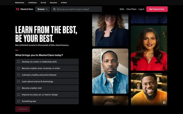
Preview image. Unlock full-res
Midnight Stage Presence
Color palette
Primary action buttons, prominent icons — a vibrant pop against dark backgrounds for conversion
Green action color for filled buttons, selected navigation states, and focused conversion moments. Use as a supporting accent, not as a status color
Accent borders for interactive cards or highlighted content, decorative elements
Primary background for footers and expansive content sections, subtle borders, text for badges
Default page background, card backgrounds
Background for subtle surface differentiation, text buttons, and darker borders
Card backgrounds, button backgrounds for secondary actions
Secondary background color for body sections
Text color for muted elements, borders on certain components
Button backgrounds, inset shadow on interactive elements
Text color for secondary information, muted icons, disabled states
Subtle body text color, borders
Primary text color, active states, badge backgrounds, clear button borders
Hover states for text and icons, borders for ghost buttons, light text
Background for small, less prominent interactive elements
Typography
- Weights
- 400, 600
- Sizes
- 8px, 12px, 14px, 16px, 20px, 22px, 24px, 32px, 48px
- Line height
- 1, 1.25, 1.33, 1.45, 1.5, 1.6, 2.5
- Letter spacing
- 0.0100em at 8px, 0.0120em at 12px, 0.0200em at 14px, 0.0230em at 16px, 0.0270em at 20px, 0.0300em at 22px, 0.0390em at 24px
- Fallback
- Inter
Primary typeface for all body text, links, buttons, and most headings up to 48px. Its slightly condensed yet approachable nature supports information density without feeling cramped.
- Weights
- 500
- Sizes
- 64px, 80px
- Line height
- 0.85, 0.9
- Letter spacing
- -0.0100em at 64px, 0.0100em at 80px
- Fallback
- condensed sans-serif like Oswald or Anton
Used for large, impactful display headlines, where its 'schmal' (narrow) characteristic allows for bold statements in restricted vertical space. The tight letter-spacing adds to its direct, attention-grabbing feel.
- Weights
- 400
- Sizes
- 64px
- Line height
- 1.1
- Letter spacing
- 0.0050em
- Fallback
- Condensed serif like Playfair Display SC or IBM Plex Serif
An alternative serif for display headings, adding a touch of classic authority and gravitas to select feature titles. Its condensed form maintains visual economy typical of the system.
Spacing & shape
Elevation
Components
backgroundColor: rgba(0,0,0,0), color: #f4f4f5, border: #f4f4f5 1px solid, radius: 4px, padding: 16px.
backgroundColor: #596170, color: #ffffff, radius: 4px, padding: 0px.
backgroundColor: #0d0d0, color: #9ea0a9, radius: 8px, padding: 12px 16px.
backgroundColor: rgba(0,0,0,0), color: #ffffff, border: #ffffff 1px solid, radius: 0px, padding: 0px.
backgroundColor: #272c33, color: #ffffff, border: #ffffff 1px solid, radius: 0px, padding: 12px 16px.
backgroundColor: #e32652, color: #ffffff, radius: 8px, padding: 12px 16px.
backgroundColor: #222326, color: #ffffff, radius: 0px, padding: 12px 16px.
backgroundColor: #272c33, radius: 8px, padding: 48px 96px.
backgroundColor: #222326, radius: 12px, padding: 0px.
backgroundColor: #ffffff, color: #000000, radius: 20px, padding: 4px 12px.
Guidelines
- Prioritize Pitch Black (#000000) for large background areas and Charcoal Canvas (#222326) for primary surfaces to maintain the dark theme.
- Use Action Raspberry (#e32652) exclusively for primary calls to action, maintaining its vivid impact.
- All interactive elements will have a minimum border-radius of 4px, with important buttons using 8px.
- Utilize Sohne Schmal at 64px or 80px for monumental headings with tight negative letter-spacing for dramatic effect.
- Employ consistent 4px padding on badges and 16px horizontal padding for most buttons.
- Ensure input fields have a 1px #ffffff border and a 0px radius for a stark, integrated look.
- Use the inset box-shadow `rgb(148, 154, 164) 0px 0px 0px 2px inset` for selected or active body elements to indicate focus.
- Do not introduce light backgrounds for core content sections; the system is strictly dark-mode dominant.
- Avoid using multiple chromatic colors close together; allow Action Raspberry (#e32652) to stand out as the primary accent.
- Do not use generic system fonts; always specify Sohne for body and most headings, Sohne Schmal or Ivar Display Condensed for display.
- Do not deviate from the established spacing scale (multiples of 4px) to maintain consistent density.
- Do not use standard button shadows; rely on inset borders or subtle color shifts for interaction states.
- Avoid large imagery with distracting backgrounds; prioritize portraits or product shots with minimal context.
- Do not use highly rounded corners (e.g., >20px) on main cards or primary buttons, as this clashes with the structured feel.
About this system
ShowHide
MasterClass employs a dark, cinematic UI, reminiscent of a premium streaming platform. Dominant blacks and deep charcoals create a sophisticated environment, allowing vibrant accents to punctuate interactive elements and brand moments. Typography is bold and confident, commanding attention within the high-contrast setting. Component surfaces are subtle, often inset, maintaining a flat aesthetic that emphasizes content and celebrity figures over overt ornamentation.
The page primarily utilizes a max-width contained layout where content is centered, often with dynamic full-bleed hero sections. The hero frequently employs a dark background with a prominent, large headline and supporting text, flanked by high-impact instructor imagery. Sections alternate between full-width black backgrounds and slightly lighter charcoal surfaces, maintaining strong vertical rhythm with generous section gaps (64px). Content is arranged in alternating text-left/image-right patterns, centered stacks for feature declarations, and horizontal scrolling carousels or grids for content browsing. Navigation is a sticky top bar with a stark dark background, featuring minimalist text links and a prominent Action Raspberry call-to-action button.
The visual language is dominated by high-quality, often dramatic portrait photography of celebrity instructors. Images are typically tightly cropped, focusing on the individual's face or upper body, and serve a functional purpose of personalizing content rather than purely decorative. Photography is often full-bleed within sections or contained within cards with large radii (8px or 12px), creating a gallery-like feel. Iconography is minimalist, either outlined or filled, primarily in Pure White or Silver Mist, with occasional pops of Interactive Lime or Action Raspberry for status or interaction. There is a strong emphasis on product showcase – the instructors and their content are the primary visual elements.
Reminiscent of Netflix, Skillshare, Apple TV+, Spotify.
# MasterClass — Style Reference
> Midnight Stage Presence

**Theme:** dark

**Site:** https://www.masterclass.com

MasterClass employs a dark, cinematic UI, reminiscent of a premium streaming platform. Dominant blacks and deep charcoals create a sophisticated environment, allowing vibrant accents to punctuate interactive elements and brand moments. Typography is bold and confident, commanding attention within the high-contrast setting. Component surfaces are subtle, often inset, maintaining a flat aesthetic that emphasizes content and celebrity figures over overt ornamentation.

## Tokens — Colors

| Name | Value | Token | Role |
|------|------|------|------|
| Action Raspberry | `#e32652` | `--color-action-raspberry` | Primary action buttons, prominent icons — a vibrant pop against dark backgrounds for conversion |
| Interactive Lime | `#dcff00` | `--color-interactive-lime` | Green action color for filled buttons, selected navigation states, and focused conversion moments. Use as a supporting accent, not as a status color |
| Highlight Gold | `#eed37f` | `--color-highlight-gold` | Accent borders for interactive cards or highlighted content, decorative elements |
| Pitch Black | `#000000` | `--color-pitch-black` | Primary background for footers and expansive content sections, subtle borders, text for badges |
| Charcoal Canvas | `#222326` | `--color-charcoal-canvas` | Default page background, card backgrounds |
| Graphite Base | `#0d0d0e` | `--color-graphite-base` | Background for subtle surface differentiation, text buttons, and darker borders |
| Deep Slate | `#272c33` | `--color-deep-slate` | Card backgrounds, button backgrounds for secondary actions |
| Subtle Ash | `#191c21` | `--color-subtle-ash` | Secondary background color for body sections |
| Muted Stone | `#211d0d` | `--color-muted-stone` | Text color for muted elements, borders on certain components |
| Iron Gray | `#43454c` | `--color-iron-gray` | Button backgrounds, inset shadow on interactive elements |
| Silver Mist | `#9ea0a9` | `--color-silver-mist` | Text color for secondary information, muted icons, disabled states |
| Light Steel | `#d4d5d9` | `--color-light-steel` | Subtle body text color, borders |
| Pure White | `#ffffff` | `--color-pure-white` | Primary text color, active states, badge backgrounds, clear button borders |
| Ghostly Gray | `#f4f4f5` | `--color-ghostly-gray` | Hover states for text and icons, borders for ghost buttons, light text |
| Subtle Cadet | `#596170` | `--color-subtle-cadet` | Background for small, less prominent interactive elements |

## Tokens — Typography

### Sohne
- **Substitute:** Inter
- **Weights:** 400, 600
- **Sizes:** 8px, 12px, 14px, 16px, 20px, 22px, 24px, 32px, 48px
- **Line height:** 1, 1.25, 1.33, 1.45, 1.5, 1.6, 2.5
- **Letter spacing:** 0.0100em at 8px, 0.0120em at 12px, 0.0200em at 14px, 0.0230em at 16px, 0.0270em at 20px, 0.0300em at 22px, 0.0390em at 24px
- **Role:** Primary typeface for all body text, links, buttons, and most headings up to 48px. Its slightly condensed yet approachable nature supports information density without feeling cramped.

### Sohne Schmal
- **Substitute:** condensed sans-serif like Oswald or Anton
- **Weights:** 500
- **Sizes:** 64px, 80px
- **Line height:** 0.85, 0.9
- **Letter spacing:** -0.0100em at 64px, 0.0100em at 80px
- **Role:** Used for large, impactful display headlines, where its 'schmal' (narrow) characteristic allows for bold statements in restricted vertical space. The tight letter-spacing adds to its direct, attention-grabbing feel.

### Ivar Display Condensed
- **Substitute:** Condensed serif like Playfair Display SC or IBM Plex Serif
- **Weights:** 400
- **Sizes:** 64px
- **Line height:** 1.1
- **Letter spacing:** 0.0050em
- **Role:** An alternative serif for display headings, adding a touch of classic authority and gravitas to select feature titles. Its condensed form maintains visual economy typical of the system.

## Tokens — Type Scale

Minor Third (1.2) from 16px base.

| Role | Size | Line height | Letter spacing |
|------|------|------|------|
| caption | 12px | 1.45 | — |
| body-sm | 14px | 1.45 | — |
| body | 16px | 1.45 | — |
| body-lg | 20px | 1.45 | — |
| heading-sm | 22px | 1.45 | — |
| heading | 24px | 1.3 | — |
| heading-lg | 32px | 1.3 | — |
| display-sm | 48px | 1.3 | — |

## Tokens — Spacing

- **Section gap:** 64px
- **Card padding:** 48px
- **Element gap:** 16px

## Tokens — Radius

- **Buttons:** 8px
- **Inputs:** 0px
- **Cards:** 8px
- **Images:** 4px
- **badges:** 20px
- **links:** 8px

## Tokens — Elevation

- **Input focus:** `inset 0 0 0 2px #949aa4`
- **Hovered button/link:** `inset 0 0 0 2px #43454c`

## Layout

The page primarily utilizes a max-width contained layout where content is centered, often with dynamic full-bleed hero sections. The hero frequently employs a dark background with a prominent, large headline and supporting text, flanked by high-impact instructor imagery. Sections alternate between full-width black backgrounds and slightly lighter charcoal surfaces, maintaining strong vertical rhythm with generous section gaps (64px). Content is arranged in alternating text-left/image-right patterns, centered stacks for feature declarations, and horizontal scrolling carousels or grids for content browsing. Navigation is a sticky top bar with a stark dark background, featuring minimalist text links and a prominent Action Raspberry call-to-action button.

## Imagery

The visual language is dominated by high-quality, often dramatic portrait photography of celebrity instructors. Images are typically tightly cropped, focusing on the individual's face or upper body, and serve a functional purpose of personalizing content rather than purely decorative. Photography is often full-bleed within sections or contained within cards with large radii (8px or 12px), creating a gallery-like feel. Iconography is minimalist, either outlined or filled, primarily in Pure White or Silver Mist, with occasional pops of Interactive Lime or Action Raspberry for status or interaction. There is a strong emphasis on product showcase – the instructors and their content are the primary visual elements.

## Components

### Ghost Navigation Button
*Navigation and secondary actions that need to remain subtle.*

backgroundColor: rgba(0,0,0,0), color: #f4f4f5, border: #f4f4f5 1px solid, radius: 4px, padding: 16px.

### Icon Button (filled)
*Functional icons that require a background.*

backgroundColor: #596170, color: #ffffff, radius: 4px, padding: 0px.

### Navigation Tab Button
*Top-level navigation items or filters.*

backgroundColor: #0d0d0, color: #9ea0a9, radius: 8px, padding: 12px 16px.

### Flat Interactive Input
*Search bars and form fields.*

backgroundColor: rgba(0,0,0,0), color: #ffffff, border: #ffffff 1px solid, radius: 0px, padding: 0px.

### Hero Checkbox/Radio Button
*Choices within hero sections.*

backgroundColor: #272c33, color: #ffffff, border: #ffffff 1px solid, radius: 0px, padding: 12px 16px.

### Primary Action Button
*High-priority calls to action.*

backgroundColor: #e32652, color: #ffffff, radius: 8px, padding: 12px 16px.

### Secondary Action Button
*Prominent actions, but not primary conversion.*

backgroundColor: #222326, color: #ffffff, radius: 0px, padding: 12px 16px.

### Content Feature Card
*Containers for featured content with generous padding.*

backgroundColor: #272c33, radius: 8px, padding: 48px 96px.

### Visual Content Card
*Cards for showcasing visual content (e.g., instructors, classes).*

backgroundColor: #222326, radius: 12px, padding: 0px.

### Informational Badge
*Small, informative labels.*

backgroundColor: #ffffff, color: #000000, radius: 20px, padding: 4px 12px.

## Guidelines

### Do

- Prioritize Pitch Black (#000000) for large background areas and Charcoal Canvas (#222326) for primary surfaces to maintain the dark theme.
- Use Action Raspberry (#e32652) exclusively for primary calls to action, maintaining its vivid impact.
- All interactive elements will have a minimum border-radius of 4px, with important buttons using 8px.
- Utilize Sohne Schmal at 64px or 80px for monumental headings with tight negative letter-spacing for dramatic effect.
- Employ consistent 4px padding on badges and 16px horizontal padding for most buttons.
- Ensure input fields have a 1px #ffffff border and a 0px radius for a stark, integrated look.
- Use the inset box-shadow `rgb(148, 154, 164) 0px 0px 0px 2px inset` for selected or active body elements to indicate focus.

### Don't

- Do not introduce light backgrounds for core content sections; the system is strictly dark-mode dominant.
- Avoid using multiple chromatic colors close together; allow Action Raspberry (#e32652) to stand out as the primary accent.
- Do not use generic system fonts; always specify Sohne for body and most headings, Sohne Schmal or Ivar Display Condensed for display.
- Do not deviate from the established spacing scale (multiples of 4px) to maintain consistent density.
- Do not use standard button shadows; rely on inset borders or subtle color shifts for interaction states.
- Avoid large imagery with distracting backgrounds; prioritize portraits or product shots with minimal context.
- Do not use highly rounded corners (e.g., >20px) on main cards or primary buttons, as this clashes with the structured feel.

## Agent Prompt Guide

Quick Color Reference:
text: #ffffff
background: #222326
border: #ffffff
accent: #e32652
primary action: #e32652 (filled action)

Example Component Prompts:
1. Create a Primary Action Button: #e32652 background, #ffffff text, 9999px radius, compact pill padding. Use this filled treatment for the main CTA.
2. Design a browsing filter button: Graphite Base background, Sohne, 14px, weight 600, #9ea0a9, letter-spacing 0.0200em. Radius 8px, padding 12px 16px. Example text: 'Business & Entrepreneurship'.
3. Construct a content card: Deep Slate background, radius 8px. Inside, for example, an instructor image (radius 12px) followed by a headline 'PHOTOGRAPHY' in Sohne, 24px, weight 600, #ffffff, line-height 1.33. The card should have 48px padding on all sides.
More like this






Keep what you find
A free account saves references to boards and can send you a weekly email of picks based on what you save.
To see every result, go Pro.