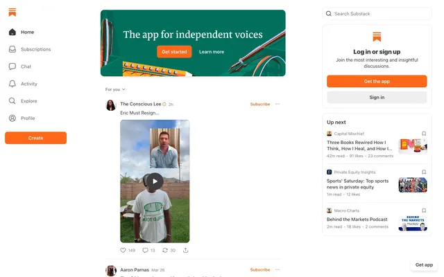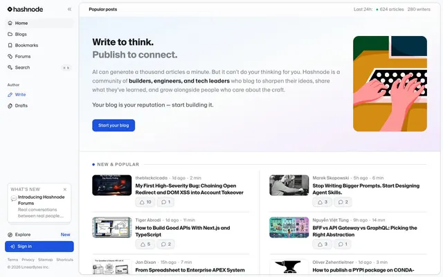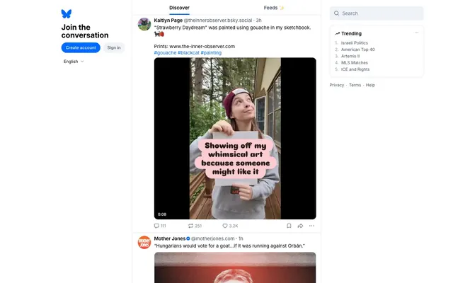
Preview image. Unlock full-res
Minimalist Content Stream
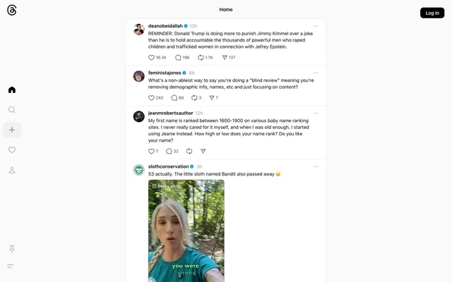
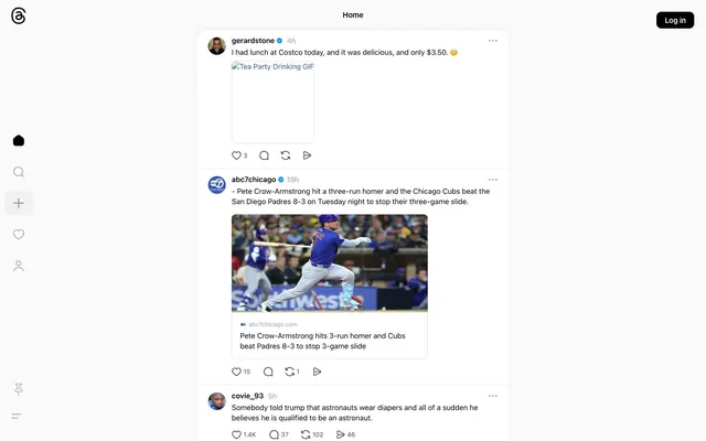
Threads presents a clean, content-focused experience with minimal ornamentation. The visual system prioritizes clarity and directness through a largely achromatic palette, precise typography, and subtle surface differentiation. Interaction is marked by a single, distinct blue accent, deployed sparingly to guide user attention. Components are lightweight with soft, rounded corners, emphasizing an approachable and modern feel.
Prioritize a clean, achromatic base: use Canvas White (#fafafa) for main backgrounds and Midnight Graphite (#000000) for primary text and icons.
Introduce Action Azure (#385898) only for primary interactive elements like links and outlined buttons, and for active navigation states.
Apply soft borders and separation with Silver Mist (#d5d5d5) for hairline dividers and Platinum Gray (#969696) for more substantial outlines.
Maintain high contrast for all text against backgrounds, ensuring AAA accessibility with Midnight Graphite (#000000) on Canvas White (#fafafa).
Use flexible 'system-ui' fonts at specified sizes (12px, 13px, 15px) for consistent readability and platform-native feel.
Ensure all interactive elements have highly rounded corners (1000px) or full circles (50%) to convey approachability and clear affordance.
Differentiate content blocks with subtle elevation using rgba(0,0,0,0.04) 0px 0px 12px 0px shadows rather than heavy backgrounds or strong borders.
Do not introduce new chromatic colors; restrict accents to Action Azure (#385898) and only when signifying interaction or brand.
Avoid strong gradients or overly decorative background textures; surfaces should remain flat and understated.
Do not use sharp 0px corners on interactive elements; all buttons and similar controls require a minimum of 8px radius, preferably 1000px for pill shapes.
Do not use generic box-shadows; adhere to the specified subtle shadow for cards to maintain a lightweight feel.
Avoid large, impactful headlines; all typography should remain compact and direct, primarily relying on 'system-ui' at smaller sizes.
Do not use excessive white space between elements; maintain a compact density with 12px for elementGap for visual efficiency.
Do not use non-system fonts; the UI relies on a native font feel for consistency and performance.