Preview image. Unlock full-res
digital workbench, blueprint sketch
Color palette
Subtle background for UI elements, hinting at a deep and technical digital environment
Primary accent for call-to-action buttons, active navigation items, and interactive highlights, guiding user flow
Accents within illustrations or specific feature highlights, evoking material properties
Illustrative details or secondary accent, adding visual interest
Illustrative details or secondary accent, providing a touch of organic color
Illustrative details or secondary accent, grounding the digital feel with earthy tones
Accent color for illustrative elements, suggesting warmth or creation
Accent color for illustrative elements, contributing to a creative, dreamlike quality
Primary background for pages and main content areas, creating a dramatic, deep canvas for design work
Primary text color and default icon color, providing high contrast against dark backgrounds. Also used for outlined button borders
Secondary text color and backgrounds for some secondary UI elements, offering a softer alternative to Canvas White
Card backgrounds and secondary surface layers, providing depth above the main Ink Black canvas
Darkest background for subtle differentiation, often for deeper nested panels or modals
Fine borders for cards, inputs, and dividers, providing structure without harsh lines
Placeholder text and subtle secondary information, receding into the background
Elevated card backgrounds and tag elements, slightly lighter than Dots Black to indicate hierarchy
Used for inactive or ghost button borders, providing a soft-touch outline
Medium-contrast borders, control outlines, and structural separators. Do not promote it to the primary CTA color
Violet state accent for badges, validation surfaces, and short status labels. Do not promote it to the primary CTA color
Typography
- Weights
- 400, 500
- Sizes
- 12px, 14px, 16px, 18px, 20px, 24px, 56px, 88px, 265px
- Line height
- 1, 1.1, 1.2, 1.3, 1.4, 1.43
- Letter spacing
- -0.0200em at 56px, -0.0100em at 24px and below: A crisp, compact sans-serif that ensures clarity and efficiency even at large headline sizes, maintaining a technical yet approachable feel.
- Fallback
- Inter
Primary UI font for all text elements: headings, body copy, navigation, buttons, and form fields. Its varied weights and tightly-controlled letter-spacing support precise visual hierarchy.
- Weights
- 700
- Sizes
- 56px, 265px
- Line height
- 1.1, 1.2
- Letter spacing
- -0.0200em: A bold, impactful display font used exclusively for hero headlines and graphic elements, conveying a raw, sketched, and unrefined aesthetic.
- Fallback
- Montserrat Alternates
Display font for large, brand-defining headlines and artistic text. Its unique character adds a handcrafted, industrial-sketch aesthetic that contrasts with the Matter typeface.
Spacing & shape
Components
Filled button with 'Ideation Blue' background (#4586da), 'Canvas White' text (#f8f4f1), 8px border-radius, and 12px 18px padding for prominence.
Transparent background with 'Canvas White' text (#f8f4f1) and 'Canvas White' border (#f8f4f1), 0px border-radius and 0px padding. Often used in navigation or as a text link.
'Canvas White' background (#f8f4f1) with a 'Button Outline' border (#b5b2b0), 'Canvas White' text (#f8f4f1), and a large 1440px border-radius to create a pill shape. 0px padding.
'Dots Black' background (#242425) with 12px border-radius and no shadow. 0px padding, allowing inner content to define spacing.
'Dots Black' background (#242425) with 16px border-radius and 16px padding inside. No shadow.
'Dark Card' background (#2f2f31) with 8px border-radius and 8px padding. Used for smaller, more focused UI elements within a panel.
'Paper Grey' background (#e8e3dd) with 'Ink Black' text (#191919), 4px border-radius, and 4px 8px padding. Used for light-themed inputs within a predominantly dark UI.
'Dark Card' background (#2f2f31) with 'Canvas White' text (#f8f4f1), 8px border-radius, and 6px 12px padding.
Guidelines
- Prioritize 'Ink Black' (#191919) as the default background for most content and 'Canvas White' (#f8f4f1) for primary text to maintain high contrast.
- Use 'Ideation Blue' (#4586da) exclusively for primary call-to-action buttons and active interactive states, providing a clear visual cue for engagement.
- Apply 'Matter' for all UI text, varying weights (400, 500) and sizes according to the type scale. Maintain tight letter spacing, especially at larger sizes.
- Reserve 'Tomboy LP' (weight 700) for large, impactful section headlines to inject a raw, sketched aesthetic.
- Use 'Dots Black' (#242425) or 'Dark Card' (#2f2f31) for card backgrounds and secondary surfaces to create subtle layering against the main 'Ink Black' background.
- Implement 8px border-radius as the default for most interactive elements (icons, buttons, inputs, badges), reserving 12px or 16px for larger cards and 1440px for pill-shaped elements.
- Define element spacing using multiples of 8px and 12px for `elementGap` and `cardPadding` respectively, with a `sectionGap` of 90px to ensure comfortable density.
- Do not introduce new chromatic colors outside of the defined accent palette; use the existing vivid blues for UI differentiation.
- Avoid generic large drop shadows; elevation should be subtle and primarily driven by background color changes rather than heavy shadows.
- Do not use 'Tomboy LP' for body text, navigation, or any functional UI text; its expressive nature is intended for display purposes only.
- Avoid using bold or heavily saturated colors for secondary UI text or disabled states; use 'Faded Grey' (#5c5b5a) or 'Paper Grey' (#e8e3dd) for such cases.
- Do not use generic border-radii; adhere strictly to the 8px, 12px, 16px, or 1440px values provided for specific component types.
- Do not deviate from the established spacing hierarchy; maintain the `elementGap` of 8px and `sectionGap` of 90px for consistent visual rhythm.
- Avoid using multiple font families beyond 'Matter' and 'Tomboy LP'; maintain typographic consistency.
About this system
ShowHide
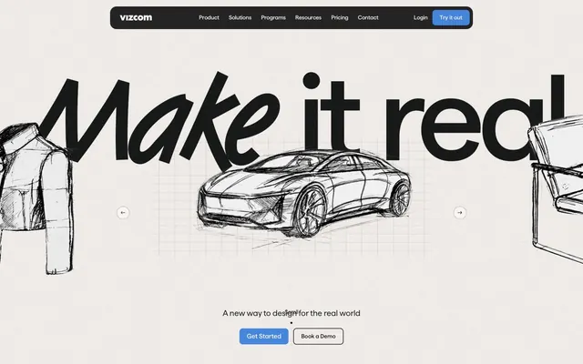
Vizcom presents a dark, high-contrast digital workbench aesthetic, inspired by traditional drawing and industrial design. The layout features stark monochrome surfaces punctuated by a single vivid blue for primary actions and interactive elements. Thin borders and subtle elevation define components, prioritizing functionality and a focused user experience. Textures of paper, charcoal, and engineering blueprints provide an underlying tactile quality to the otherwise digital interface.
The page follows a max-width contained model, ensuring content readability on larger screens, rather than full-bleed. The hero section is distinct: a full-bleed, dark background with a large, central 'Tomboy LP' headline and illustrated elements, drawing immediate attention. Subsequent sections alternate between dark and light backgrounds for visual rhythm, employing a responsive two-column text+image pattern that often reverses direction. Feature grids are organized in compact, card-based layouts. Navigation is a sticky top bar with a left-aligned logo and right-aligned links and calls-to-action.
Imagery primarily features product design sketches and photorealistic 3D renders, emphasizing the core functionality of the AI tool. The treatment is a mix of hand-drawn, often wireframe-like sketches (like the hero car or jacket) and clean, focused 3D product shots (like the copper car). Photography, when present, shows a clean, studio-like environment (e.g., the workspace shot) with minimal lifestyle context, focusing on the tools and output. Icons are minimal, outlined, and monochromatic, with a fine stroke weight, often adopting the 'Canvas White' or 'Faded Grey' color. The density is moderate; imagery serves to illustrate and explain product features rather than purely decorate, with a balance between visual elements and descriptive text.
Reminiscent of Framer, Linear, Supabase, Midjourney.
# Vizcom — Style Reference
> digital workbench, blueprint sketch

**Theme:** dark

**Site:** https://vizcom.com

Vizcom presents a dark, high-contrast digital workbench aesthetic, inspired by traditional drawing and industrial design. The layout features stark monochrome surfaces punctuated by a single vivid blue for primary actions and interactive elements. Thin borders and subtle elevation define components, prioritizing functionality and a focused user experience. Textures of paper, charcoal, and engineering blueprints provide an underlying tactile quality to the otherwise digital interface.

## Tokens — Colors

| Name | Value | Token | Role |
|------|------|------|------|
| Blueprint Navy | `#1145a0` | `--color-blueprint-navy` | Subtle background for UI elements, hinting at a deep and technical digital environment |
| Ideation Blue | `#4586da` | `--color-ideation-blue` | Primary accent for call-to-action buttons, active navigation items, and interactive highlights, guiding user flow |
| Brick Red | `#c94b3c` | `--color-brick-red` | Accents within illustrations or specific feature highlights, evoking material properties |
| Prototype Purple | `#974069` | `--color-prototype-purple` | Illustrative details or secondary accent, adding visual interest |
| Lighter Lime | `#cdea9d` | `--color-lighter-lime` | Illustrative details or secondary accent, providing a touch of organic color |
| Work Olive | `#c2ba43` | `--color-work-olive` | Illustrative details or secondary accent, grounding the digital feel with earthy tones |
| Clay Orange | `#ee855a` | `--color-clay-orange` | Accent color for illustrative elements, suggesting warmth or creation |
| Dream Pink | `#cb83d1` | `--color-dream-pink` | Accent color for illustrative elements, contributing to a creative, dreamlike quality |
| Ink Black | `#191919` | `--color-ink-black` | Primary background for pages and main content areas, creating a dramatic, deep canvas for design work |
| Canvas White | `#f8f4f1` | `--color-canvas-white` | Primary text color and default icon color, providing high contrast against dark backgrounds. Also used for outlined button borders |
| Paper Grey | `#e8e3dd` | `--color-paper-grey` | Secondary text color and backgrounds for some secondary UI elements, offering a softer alternative to Canvas White |
| Dots Black | `#242425` | `--color-dots-black` | Card backgrounds and secondary surface layers, providing depth above the main Ink Black canvas |
| Deep Space | `#131313` | `--color-deep-space` | Darkest background for subtle differentiation, often for deeper nested panels or modals |
| Slate Border | `#3c3c3e` | `--color-slate-border` | Fine borders for cards, inputs, and dividers, providing structure without harsh lines |
| Faded Grey | `#5c5b5a` | `--color-faded-grey` | Placeholder text and subtle secondary information, receding into the background |
| Dark Card | `#2f2f31` | `--color-dark-card` | Elevated card backgrounds and tag elements, slightly lighter than Dots Black to indicate hierarchy |
| Subtle Gray Border | `#8d8a88` | `--color-subtle-gray-border` | Used for inactive or ghost button borders, providing a soft-touch outline |
| Button Outline | `#b5b2b0` | `--color-button-outline` | Medium-contrast borders, control outlines, and structural separators. Do not promote it to the primary CTA color |
| Input Blue | `#4c4cef` | `--color-input-blue` | Violet state accent for badges, validation surfaces, and short status labels. Do not promote it to the primary CTA color |

## Tokens — Typography

### Matter
- **Substitute:** Inter
- **Weights:** 400, 500
- **Sizes:** 12px, 14px, 16px, 18px, 20px, 24px, 56px, 88px, 265px
- **Line height:** 1, 1.1, 1.2, 1.3, 1.4, 1.43
- **Letter spacing:** -0.0200em at 56px, -0.0100em at 24px and below: A crisp, compact sans-serif that ensures clarity and efficiency even at large headline sizes, maintaining a technical yet approachable feel.
- **Role:** Primary UI font for all text elements: headings, body copy, navigation, buttons, and form fields. Its varied weights and tightly-controlled letter-spacing support precise visual hierarchy.

### Tomboy LP
- **Substitute:** Montserrat Alternates
- **Weights:** 700
- **Sizes:** 56px, 265px
- **Line height:** 1.1, 1.2
- **Letter spacing:** -0.0200em: A bold, impactful display font used exclusively for hero headlines and graphic elements, conveying a raw, sketched, and unrefined aesthetic.
- **Role:** Display font for large, brand-defining headlines and artistic text. Its unique character adds a handcrafted, industrial-sketch aesthetic that contrasts with the Matter typeface.

## Tokens — Type Scale

Perfect Fifth (1.5) from 16px base.

| Role | Size | Line height | Letter spacing |
|------|------|------|------|
| caption | 12px | 1.3 | — |
| body-sm | 14px | 1.3 | — |
| body | 16px | 1.3 | — |
| body-lg | 18px | 1.3 | — |
| heading-sm | 20px | 1.3 | — |
| heading | 24px | 1.3 | — |
| heading-lg | 56px | 1.3 | — |
| display-sm | 88px | 1.3 | — |
| display | 265px | 1.3 | — |

## Tokens — Spacing

- **Section gap:** 90px
- **Card padding:** 12px
- **Element gap:** 8px

## Tokens — Radius

- **Default:** 8px
- **Buttons:** 8px
- **Cards:** 12px
- **pill:** 1440px
- **tags:** 8px

## Layout

The page follows a max-width contained model, ensuring content readability on larger screens, rather than full-bleed. The hero section is distinct: a full-bleed, dark background with a large, central 'Tomboy LP' headline and illustrated elements, drawing immediate attention. Subsequent sections alternate between dark and light backgrounds for visual rhythm, employing a responsive two-column text+image pattern that often reverses direction. Feature grids are organized in compact, card-based layouts. Navigation is a sticky top bar with a left-aligned logo and right-aligned links and calls-to-action.

## Imagery

Imagery primarily features product design sketches and photorealistic 3D renders, emphasizing the core functionality of the AI tool. The treatment is a mix of hand-drawn, often wireframe-like sketches (like the hero car or jacket) and clean, focused 3D product shots (like the copper car). Photography, when present, shows a clean, studio-like environment (e.g., the workspace shot) with minimal lifestyle context, focusing on the tools and output. Icons are minimal, outlined, and monochromatic, with a fine stroke weight, often adopting the 'Canvas White' or 'Faded Grey' color. The density is moderate; imagery serves to illustrate and explain product features rather than purely decorate, with a balance between visual elements and descriptive text.

## Components

### Primary Action Button
*Call-to-action*

Filled button with 'Ideation Blue' background (#4586da), 'Canvas White' text (#f8f4f1), 8px border-radius, and 12px 18px padding for prominence.

### Ghost Button
*Secondary action or navigation*

Transparent background with 'Canvas White' text (#f8f4f1) and 'Canvas White' border (#f8f4f1), 0px border-radius and 0px padding. Often used in navigation or as a text link.

### Pill Button
*Tertiary action or filter*

'Canvas White' background (#f8f4f1) with a 'Button Outline' border (#b5b2b0), 'Canvas White' text (#f8f4f1), and a large 1440px border-radius to create a pill shape. 0px padding.

### Standard Card
*Content container*

'Dots Black' background (#242425) with 12px border-radius and no shadow. 0px padding, allowing inner content to define spacing.

### Padded Card
*Content container with integrated spacing*

'Dots Black' background (#242425) with 16px border-radius and 16px padding inside. No shadow.

### Elevated Panel Card
*Prominent content container*

'Dark Card' background (#2f2f31) with 8px border-radius and 8px padding. Used for smaller, more focused UI elements within a panel.

### Text Input (Dark Theme)
*User input field*

'Paper Grey' background (#e8e3dd) with 'Ink Black' text (#191919), 4px border-radius, and 4px 8px padding. Used for light-themed inputs within a predominantly dark UI.

### Status Badge
*Categorization or status indicator*

'Dark Card' background (#2f2f31) with 'Canvas White' text (#f8f4f1), 8px border-radius, and 6px 12px padding.

## Guidelines

### Do

- Prioritize 'Ink Black' (#191919) as the default background for most content and 'Canvas White' (#f8f4f1) for primary text to maintain high contrast.
- Use 'Ideation Blue' (#4586da) exclusively for primary call-to-action buttons and active interactive states, providing a clear visual cue for engagement.
- Apply 'Matter' for all UI text, varying weights (400, 500) and sizes according to the type scale. Maintain tight letter spacing, especially at larger sizes.
- Reserve 'Tomboy LP' (weight 700) for large, impactful section headlines to inject a raw, sketched aesthetic.
- Use 'Dots Black' (#242425) or 'Dark Card' (#2f2f31) for card backgrounds and secondary surfaces to create subtle layering against the main 'Ink Black' background.
- Implement 8px border-radius as the default for most interactive elements (icons, buttons, inputs, badges), reserving 12px or 16px for larger cards and 1440px for pill-shaped elements.
- Define element spacing using multiples of 8px and 12px for `elementGap` and `cardPadding` respectively, with a `sectionGap` of 90px to ensure comfortable density.

### Don't

- Do not introduce new chromatic colors outside of the defined accent palette; use the existing vivid blues for UI differentiation.
- Avoid generic large drop shadows; elevation should be subtle and primarily driven by background color changes rather than heavy shadows.
- Do not use 'Tomboy LP' for body text, navigation, or any functional UI text; its expressive nature is intended for display purposes only.
- Avoid using bold or heavily saturated colors for secondary UI text or disabled states; use 'Faded Grey' (#5c5b5a) or 'Paper Grey' (#e8e3dd) for such cases.
- Do not use generic border-radii; adhere strictly to the 8px, 12px, 16px, or 1440px values provided for specific component types.
- Do not deviate from the established spacing hierarchy; maintain the `elementGap` of 8px and `sectionGap` of 90px for consistent visual rhythm.
- Avoid using multiple font families beyond 'Matter' and 'Tomboy LP'; maintain typographic consistency.

## Agent Prompt Guide

Quick Color Reference:
text: #f8f4f1
background: #191919
border: #e8e3dd
accent: #4586da
primary action: #4586da (filled action)

Example Component Prompts:
1. Create a Primary Action Button: #4586da background, #f8f4f1 text, 9999px radius, compact pill padding. Use this filled treatment for the main CTA.
2. Design a feature card: 'Dots Black' background, 12px border-radius, 12px padding. Headline using Matter weight 500 at 24px, #f8f4f1. Body text using Matter weight 400 at 16px, #f8f4f1. Element gap 8px between elements.
3. Create a dark-themed text input: 'Paper Grey' background, 'Ink Black' text using Matter weight 400 at 16px, 4px border-radius. Placeholder text in 'Faded Grey' (#5c5b5a). Padding 4px 8px inside.
More like this





Keep what you find
A free account saves references to boards and can send you a weekly email of picks based on what you save.
To see every result, go Pro.