Preview image. Unlock full-res
Deep canvas, fuchsia accent
Color palette
Primary action button backgrounds, interactive highlights, and decorative color accents
Decorative strokes in UI elements, subtle hover states, and brand illustration elements
Text on very dark backgrounds, secondary heading color
Orange text accent for links, tags, and emphasized short phrases
Primary page background, structural container backgrounds
Gray text accent for links, tags, and emphasized short phrases. Do not promote it to the primary CTA color
Text for inverted elements, occasionally used for badge backgrounds
Primary text color, icon fills, and accent on light-themed or inverted elements
Muted text, placeholder text, and decorative borders on light elements
Hairline separators, subtle borders for cards, buttons, and input fields
Secondary text for descriptions and helper text
Tertiary text color, icon strokes and fills at lower prominence
Typography
- Weights
- 400, 500, 600
- Sizes
- 14px, 15px, 16px, 18px, 24px, 38px, 50px
- Line height
- 1.1, 1.12, 1.33, 1.43, 1.45, 1.5, 1.56
- Letter spacing
- -0.0500em at 50px, -0.0250em at 38px, 0.0800em at 14px
- Fallback
- system-ui, sans-serif
Headings and prominent display text. The variable font offers nuanced expressiveness, with tighter tracking for larger sizes to maintain visual density.
- Weights
- 400, 500, 600, 700
- Sizes
- 8px, 10px, 11px, 12px, 14px, 15px, 16px, 24px, 28px
- Line height
- 1.2, 1.25, 1.33, 1.43, 1.5, 1.6, 1.63
- Letter spacing
- -0.0400em at 28px, -0.0250em at 24px, -0.0150em at 16px, 0.0500em at 12px
- Fallback
- Inter, sans-serif
Body copy, navigation, and general UI text. It provides clarity and a modern feel, with subtle adjustments in letter-spacing across sizes to optimize readability.
- Weights
- 400
- Sizes
- 10px, 11px, 12px
- Line height
- 1.5, 1.63
- Letter spacing
- 0.0500em
- Fallback
- monospace
Specialized for code blocks, badges, and areas requiring a fixed-width, technical aesthetic. Its mono-spaced nature reinforces the code-centric aspects of the product.
Spacing & shape
Elevation
Components
Solid Call-to-action button with a vibrant Fuchsia Burst background (#d262ff), Bright Snow text (#ffffff), and a soft 8px border-radius. Padding is 12px horizontal.
Transparent background with Bright Snow text (#ffffff) at 70% opacity, bordered by Border Violet (#44374a). Features an infinitely rounded (9999px) border-radius for a pill shape.
Bright Snow text (#ffffff) with no background or border, primarily used in the navigation bar and footer. Features a moderate 8px border-radius when interactive areas are considered.
A card with a transparent background, 14px border-radius, and no box-shadow, typically used for decorative grouping of content without heavy visual separation.
Bright Snow background (#ffffff) with a 14px border-radius. Features a subtle bottom-heavy shadow: `rgba(0, 0, 0, 0) 0px 0px 0px 0px, rgba(0, 0, 0, 0) 0px 0px 0px 0px, rgba(0, 0, 0, 0) 0px 0px 0px 0px, oklab(0 0 0 / 0.08) 0px 0px 0px 1px, rgba(0, 0, 0, 0.1) 0px 20px 25px -5px, rgba(0, 0, 0, 0.1) 0px 8px 10px -6px`.
Semi-transparent background (#ffffff at 8% opacity) with Bright Snow text (#ffffff). Features an infinitely rounded (9999px) border-radius and a subtle border with Border Violet (#44374a). Internal padding of 8px vertical and 12px horizontal.
Small tag with an Off-Black background (#111111), Bright Snow text (#ffffff) and an infinitely rounded (9999px) border-radius. Horizontal padding of 12px.
White background (#ffffff at 90%) with Off-Black text (#333333, `rgb(51,51,51)`) and no border-radius. Padding 6px vertical, 8px horizontal.
Guidelines
- Always use Midnight Plum (#0f0217) as the base background for main page sections to maintain the dark theme.
- Apply Fuchsia Burst (#d262ff) for primary call-to-action buttons and key interactive elements.
- Utilize Bright Snow (#ffffff) for all primary text content against dark backgrounds to ensure high contrast.
- Reinforce interactive elements with a distinct 8px border-radius for buttons and navigation items, or a 9999px (pill-shape) for badges and inputs.
- Employ Border Violet (#44374a) for subtle borders and dividers between UI elements, creating clear but not harsh separation.
- Use Uncut Sans Variable for headlines (50px, weight 400, letter-spacing -0.0500em) to communicate authority with a unique, modern feel.
- Ensure input fields have a semi-transparent background (`rgba(255, 255, 255, 0.08)`) and Border Violet outline for a cohesive dark UI appearance.
- Avoid using highly saturated colors other than Fuchsia Burst (#d262ff) for functional interface elements; reserve other bright colors for imagery or specific, non-interactive highlights.
- Do not introduce sharp, angular cards; all cards should have a consistent 14px border-radius.
- Do not use heavy, opaque drop shadows for elevation; rely on the subtle elevation provided by `oklab(0 0 0 / 0.08) 0px 0px 0px 1px` and similar lightweight shadows.
- Do not deviate from the specified typefaces; Uncut Sans Variable, Inter, and Martian Mono are the only approved font families.
- Avoid full-bleed content sections that break the overall maximum width pattern, except for intentional heroic visual elements.
- Do not use dark text on dark backgrounds; maintain high contrast with Bright Snow (#ffffff) for readability.
- Do not use solid borders on ghost buttons; utilize the Border Violet (#44374a) for a delicate outline effect.
About this system
ShowHide
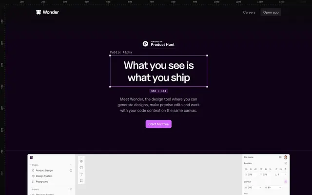
Wonder is a dark-themed design system evoking a 'code editor' aesthetic with deep, muted purple backgrounds and high-contrast white text. It balances stark UI elements – sharp borders, minimal elevation – with a single vivid fuchsia accent that serves as a functional highlight. Typography is precise and utilitarian, hinting at a developer-tool context, while transparent and ghost elements create a sense of depth and interactivity within the dark canvas.
The page uses a maximum-width contained layout, typically centered, suggesting a focus on content within defined boundaries. The hero section is full-bleed with a dark background, featuring a centered headline and a call-to-action. Subsequent sections alternate between dark and light backgrounds, creating a clear vertical rhythm. Content is generally arranged in two-column layouts, often with text on one side and product visuals or abstract graphics on the other. A subtle footer contains sponsor logos, also on a dark background. The navigation is a sticky top bar, providing persistent access.
The site's imagery primarily consists of product screenshots and abstract, ethereal graphics. Product screenshots are contained within card-like UI elements, often with soft transparency or subtle backgrounds, demonstrating the tool's interface directly. Abstract graphics, when present, use gradients of purples and pinks, often appearing as background elements that merge with the dark theme. Icons are typically monolinear, utilizing Bright Snow (#ffffff) for their stroke against dark backgrounds, maintaining a clean yet technical appearance. Imagery serves to explain product functionality and add atmospheric depth rather than decorative flair, and is used sparingly to maintain a text-dominant, information-focused tone.
Reminiscent of Linear, Stripe, Vercel, Raycast.
# Wonder — Style Reference
> Deep canvas, fuchsia accent

**Theme:** dark

**Site:** https://wonder.design

Wonder is a dark-themed design system evoking a 'code editor' aesthetic with deep, muted purple backgrounds and high-contrast white text. It balances stark UI elements – sharp borders, minimal elevation – with a single vivid fuchsia accent that serves as a functional highlight. Typography is precise and utilitarian, hinting at a developer-tool context, while transparent and ghost elements create a sense of depth and interactivity within the dark canvas.

## Tokens — Colors

| Name | Value | Token | Role |
|------|------|------|------|
| Fuchsia Burst | `#d262ff` | `--color-fuchsia-burst` | Primary action button backgrounds, interactive highlights, and decorative color accents |
| Deep Orchid | `#6a1791` | `--color-deep-orchid` | Decorative strokes in UI elements, subtle hover states, and brand illustration elements |
| Dark Magenta | `#2d063a` | `--color-dark-magenta` | Text on very dark backgrounds, secondary heading color |
| Sunset Orange | `#d97757` | `--color-sunset-orange` | Orange text accent for links, tags, and emphasized short phrases |
| Midnight Plum | `#0f0217` | `--color-midnight-plum` | Primary page background, structural container backgrounds |
| Ghost Ink | `#0b0211` | `--color-ghost-ink` | Gray text accent for links, tags, and emphasized short phrases. Do not promote it to the primary CTA color |
| Off-Black | `#111111` | `--color-off-black` | Text for inverted elements, occasionally used for badge backgrounds |
| Bright Snow | `#ffffff` | `--color-bright-snow` | Primary text color, icon fills, and accent on light-themed or inverted elements |
| Silver Mist | `#e1e4e8` | `--color-silver-mist` | Muted text, placeholder text, and decorative borders on light elements |
| Border Violet | `#44374a` | `--color-border-violet` | Hairline separators, subtle borders for cards, buttons, and input fields |
| Muted Ash | `#6f6774` | `--color-muted-ash` | Secondary text for descriptions and helper text |
| Charcoal Grey | `#737373` | `--color-charcoal-grey` | Tertiary text color, icon strokes and fills at lower prominence |

## Tokens — Typography

### Uncut Sans Variable
- **Substitute:** system-ui, sans-serif
- **Weights:** 400, 500, 600
- **Sizes:** 14px, 15px, 16px, 18px, 24px, 38px, 50px
- **Line height:** 1.1, 1.12, 1.33, 1.43, 1.45, 1.5, 1.56
- **Letter spacing:** -0.0500em at 50px, -0.0250em at 38px, 0.0800em at 14px
- **Role:** Headings and prominent display text. The variable font offers nuanced expressiveness, with tighter tracking for larger sizes to maintain visual density.

### Inter
- **Substitute:** Inter, sans-serif
- **Weights:** 400, 500, 600, 700
- **Sizes:** 8px, 10px, 11px, 12px, 14px, 15px, 16px, 24px, 28px
- **Line height:** 1.2, 1.25, 1.33, 1.43, 1.5, 1.6, 1.63
- **Letter spacing:** -0.0400em at 28px, -0.0250em at 24px, -0.0150em at 16px, 0.0500em at 12px
- **Role:** Body copy, navigation, and general UI text. It provides clarity and a modern feel, with subtle adjustments in letter-spacing across sizes to optimize readability.

### Martian Mono
- **Substitute:** monospace
- **Weights:** 400
- **Sizes:** 10px, 11px, 12px
- **Line height:** 1.5, 1.63
- **Letter spacing:** 0.0500em
- **Role:** Specialized for code blocks, badges, and areas requiring a fixed-width, technical aesthetic. Its mono-spaced nature reinforces the code-centric aspects of the product.

## Tokens — Type Scale

Augmented Fourth (1.414) from 14px base.

| Role | Size | Line height | Letter spacing |
|------|------|------|------|
| caption | 10px | 1.5 | 0.5px |
| body | 14px | 1.5 | 0.08em |
| heading-sm | 18px | 1.45 | — |
| heading | 24px | 1.33 | -0.6px |
| heading-lg | 38px | 1.12 | -0.95px |
| display | 50px | 1.1 | -2.5px |

## Tokens — Spacing

- **Section gap:** 40px
- **Card padding:** 12px
- **Element gap:** 12px

## Tokens — Radius

- **Buttons:** 8px
- **Inputs:** 9999px
- **Cards:** 14px
- **badges:** 9999px
- **navItems:** 8px

## Tokens — Elevation

- **Elevated Content Card:** `oklab(0 0 0 / 0.08) 0px 0px 0px 1px, rgba(0, 0, 0, 0.1) 0px 20px 25px -5px, rgba(0, 0, 0, 0.1) 0px 8px 10px -6px`

## Layout

The page uses a maximum-width contained layout, typically centered, suggesting a focus on content within defined boundaries. The hero section is full-bleed with a dark background, featuring a centered headline and a call-to-action. Subsequent sections alternate between dark and light backgrounds, creating a clear vertical rhythm. Content is generally arranged in two-column layouts, often with text on one side and product visuals or abstract graphics on the other. A subtle footer contains sponsor logos, also on a dark background. The navigation is a sticky top bar, providing persistent access.

## Imagery

The site's imagery primarily consists of product screenshots and abstract, ethereal graphics. Product screenshots are contained within card-like UI elements, often with soft transparency or subtle backgrounds, demonstrating the tool's interface directly. Abstract graphics, when present, use gradients of purples and pinks, often appearing as background elements that merge with the dark theme. Icons are typically monolinear, utilizing Bright Snow (#ffffff) for their stroke against dark backgrounds, maintaining a clean yet technical appearance. Imagery serves to explain product functionality and add atmospheric depth rather than decorative flair, and is used sparingly to maintain a text-dominant, information-focused tone.

## Components

### Primary Action Button
*Filled action button*

Solid Call-to-action button with a vibrant Fuchsia Burst background (#d262ff), Bright Snow text (#ffffff), and a soft 8px border-radius. Padding is 12px horizontal.

### Ghost Outline Button
*Secondary action button*

Transparent background with Bright Snow text (#ffffff) at 70% opacity, bordered by Border Violet (#44374a). Features an infinitely rounded (9999px) border-radius for a pill shape.

### Navigation Link
*Navigation links and subtle interactive text*

Bright Snow text (#ffffff) with no background or border, primarily used in the navigation bar and footer. Features a moderate 8px border-radius when interactive areas are considered.

### Transparent Card
*Informational display card*

A card with a transparent background, 14px border-radius, and no box-shadow, typically used for decorative grouping of content without heavy visual separation.

### Elevated Content Card
*Important content display card*

Bright Snow background (#ffffff) with a 14px border-radius. Features a subtle bottom-heavy shadow: `rgba(0, 0, 0, 0) 0px 0px 0px 0px, rgba(0, 0, 0, 0) 0px 0px 0px 0px, rgba(0, 0, 0, 0) 0px 0px 0px 0px, oklab(0 0 0 / 0.08) 0px 0px 0px 1px, rgba(0, 0, 0, 0.1) 0px 20px 25px -5px, rgba(0, 0, 0, 0.1) 0px 8px 10px -6px`.

### Input Field
*Text input areas*

Semi-transparent background (#ffffff at 8% opacity) with Bright Snow text (#ffffff). Features an infinitely rounded (9999px) border-radius and a subtle border with Border Violet (#44374a). Internal padding of 8px vertical and 12px horizontal.

### Round Badge
*Categorization or tag element*

Small tag with an Off-Black background (#111111), Bright Snow text (#ffffff) and an infinitely rounded (9999px) border-radius. Horizontal padding of 12px.

### Product Hunt Badge
*Prominent external link indicator*

White background (#ffffff at 90%) with Off-Black text (#333333, `rgb(51,51,51)`) and no border-radius. Padding 6px vertical, 8px horizontal.

## Guidelines

### Do

- Always use Midnight Plum (#0f0217) as the base background for main page sections to maintain the dark theme.
- Apply Fuchsia Burst (#d262ff) for primary call-to-action buttons and key interactive elements.
- Utilize Bright Snow (#ffffff) for all primary text content against dark backgrounds to ensure high contrast.
- Reinforce interactive elements with a distinct 8px border-radius for buttons and navigation items, or a 9999px (pill-shape) for badges and inputs.
- Employ Border Violet (#44374a) for subtle borders and dividers between UI elements, creating clear but not harsh separation.
- Use Uncut Sans Variable for headlines (50px, weight 400, letter-spacing -0.0500em) to communicate authority with a unique, modern feel.
- Ensure input fields have a semi-transparent background (`rgba(255, 255, 255, 0.08)`) and Border Violet outline for a cohesive dark UI appearance.

### Don't

- Avoid using highly saturated colors other than Fuchsia Burst (#d262ff) for functional interface elements; reserve other bright colors for imagery or specific, non-interactive highlights.
- Do not introduce sharp, angular cards; all cards should have a consistent 14px border-radius.
- Do not use heavy, opaque drop shadows for elevation; rely on the subtle elevation provided by `oklab(0 0 0 / 0.08) 0px 0px 0px 1px` and similar lightweight shadows.
- Do not deviate from the specified typefaces; Uncut Sans Variable, Inter, and Martian Mono are the only approved font families.
- Avoid full-bleed content sections that break the overall maximum width pattern, except for intentional heroic visual elements.
- Do not use dark text on dark backgrounds; maintain high contrast with Bright Snow (#ffffff) for readability.
- Do not use solid borders on ghost buttons; utilize the Border Violet (#44374a) for a delicate outline effect.

## Agent Prompt Guide

### Quick Color Reference
text: #ffffff
background: #0f0217
border: #44374a
accent: #d262ff
primary action: #d262ff (filled action)

### 3-5 Example Component Prompts
1. Create a Primary Action Button: #d262ff background, #040106 text, 9999px radius, compact pill padding. Use this filled treatment for the main CTA.
2. Design a feature card: Transparent background, 14px border-radius, Border Violet 1px solid border. Title text 'Design with an agent.' (Inter, 24px, weight 600, #ffffff). Body text below it (Inter, 16px, weight 400, #e1e4e8).
3. Generate a navigation bar: Midnight Plum background, with 'Careers' and 'Open app' as Navigation Links on the right. Include a small logo (icon) on the left that fills with Bright Snow (#ffffff).
4. Create an input field for email: Semi-transparent background `rgba(255, 255, 255, 0.08)`, Bright Snow text (#ffffff), 9999px border-radius, a 1px solid Border Violet border. Placeholder text should be Muted Ash (#6f6774).
5. Design a small badge: Off-Black background (#111111), Bright Snow text (#ffffff), 9999px border-radius, with 12px horizontal padding. Label it 'Public Alpha' using Martian Mono, 12px, weight 400, letter-spacing 0.5px.
More like this




Keep what you find
A free account saves references to boards and can send you a weekly email of picks based on what you save.
To see every result, go Pro.