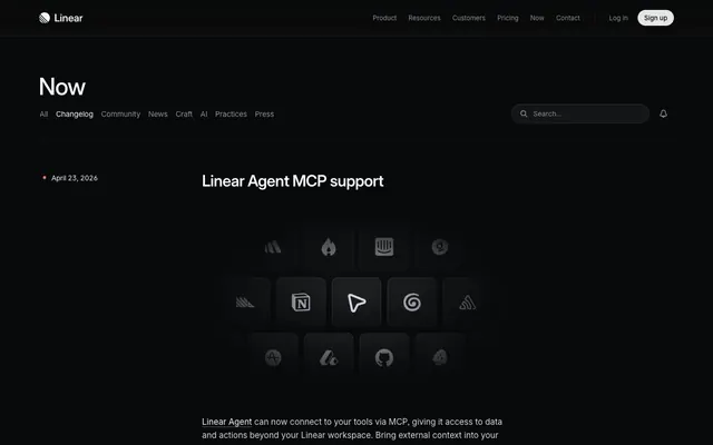
Preview image. Unlock full-res
Midnight command center behind frosted glass.
Color palette
Page backgrounds, base surface for main content areas.
Slightly elevated surfaces, button backgrounds in hover states, subtle distinctions from Canvas Black.
Subtle dividers, borders on interactive elements, visual separation within dark surfaces.
Darker interactive elements, further elevated background layers for specific components.
Input borders, subtle outlines for inactive states, separating elements on dark backgrounds.
Border color for certain interactive components, providing a slightly lighter outline than Carbon.
Primary text, headings, icons, ensuring high contrast against dark backgrounds. Also used as background for ghost buttons.
Secondary text, muted information, subtle accents, less prominent list items. Provides visual relief from primary text.
Placeholder text, tertiary information, disabled states. Signifies lower importance or non-interactivity.
Light background highlight on interactive elements, subtle iconography against dark backgrounds.
Border color for interactive elements and subtle shadow effects. Creates definition without heavy contrast.
Typography
- Weights
- 400, 500, 510, 590
- Sizes
- 12px, 13px, 14px, 15px, 16px, 17px, 24px, 32px, 48px
- Line height
- 1, 1.13, 1.2, 1.33, 1.4, 1.5, 1.6, 2.46, 2.67, 2.86
- Letter spacing
- -0.01em
- Fallback
- Inter
Used for all primary UI text, body copy, headings, and interactive elements. Its variable nature allows fine-grained control over weight, with a specific emphasis on a mid-range weight (500) for headlines to convey modern, understated authority. The tight letter-spacing (-0.01em) maintains a compact, disciplined appearance.
- Weights
- 400, 590
- Sizes
- 15px, 21px
- Line height
- 1.3
- Letter spacing
- -0.014em
- Fallback
- Space Mono
Exclusively for code blocks, timestamps, and technical notations. Its monospaced nature clearly differentiates technical content, and the slightly tighter letter-spacing hints at precision.
Spacing & shape
Elevation
Components
Text Primary #f7f8f8, Inter Variable weight 400. No underline by default; hover state adds underline or changes background.
Background transparent, text #f7f8f8 (Text Primary). Border 1px solid #f7f8f8. Border radius 9999px. Padding 0px top/bottom, 12px left/right for medium, 16px for large.
Background transparent, text #8a8f98 (Text Muted). Border 1px solid #8a8f98. Border radius 9999px. Padding 0px top/bottom, 12px left/right.
Background #141516 (Surface Dark), text #8a8f98 (Text Muted). Border 1px solid #23252a (Border Carbon). Border radius 100px. Padding 0px top/bottom, 16px left/right.
Background transparent. Placeholder text #8a8f98 (Text Muted). Border 1px solid #34343a (Line Graphite). Border radius 100px. Icon fill #8a8f98. Padding 0px vertical, 12px horizontal.
Background transparent. Contents date in Berkeley Mono, title as Heading Small. Border 1px solid #34343a (Line Graphite) on inactive/hover. Border radius 8px. Inner padding around content section 16px.
Text #f7f8f8 (Text Primary) for active, #8a8f98 (Text Muted) for inactive. Background transparent. Border radius 9999px. Padding 0px top/bottom, 12px left/right.
Background #141516 (Surface Dark), text #f7f8f8 (Text Primary). Border radius 9999px. Padding 0px top/bottom, 12px left/right.
Guidelines
- Prioritize Inter Variable font for all UI text, ensuring readability and consistency.
- Use Text Primary #f7f8f8 for all main text elements and headings on dark backgrounds to maintain strong contrast.
- Apply Canvas Black #08090a as the dominant background color across all pages.
- Use 9999px border radius for all actionable buttons and interactive pill components.
- Employ a 1px solid border using Line Graphite #34343a for subtle visual separation of components and containers, especially on hover.
- Leverage Berkeley Mono for all code snippets, timestamps, or technical text, keeping its distinct letter-spacing.
- Apply Surface Dark #141516 for subtle elevation for backgrounds of interactive components or hover states.
- Avoid using multiple vibrant colors; restrict accent colors to functional elements if not present in the palette.
- Do not use heavy shadows for visual depth; rely on background color layering and subtle borders instead.
- Do not introduce new typefaces; the system is built on Inter Variable and Berkeley Mono.
- Avoid large hero imagery; prefer UI-focused elements or subtle graphic overlays.
- Do not use generic square corners; apply 8px radius to cards and containers for a softer, integrated feel.
- Do not use standard, bold font weights for large headlines; leverage Inter Variable weight 500-590 for a refined, modern approach.
- Avoid overly bright or pure white backgrounds; the system is designed for a dark interface.
About this system
ShowHide
This design system evokes a 'midnight command center behind frosted glass,' achieving a focused, high-tech atmosphere through a dark achromatic palette and precise typographic choices. A subtly layered grayscale background creates depth without relying on heavy shadows, while crisp text and restrained accenting maintain readability. Signature anti-conventional headlines use weight 500 at larger sizes, conveying authority through subtle refinement rather than bold weight. The system relies on precise border treatments and a dominant 9999px radius for interactive elements, contrasting with 8px radius for cards, to define interaction points within the otherwise serious interface.
The page maintains a max-width contained layout, with content centered within a defined vertical flow. The hero section is a full-bleed dark canvas with a left-aligned, prominent headline. Sections follow a consistent vertical rhythm, primarily using a text-heavy, single-column stack for changelog entries, occasionally broken by centered visual components like the grid of app icons. Navigation is provided by a sticky top bar with clearly segmented, low-prominence text links and a ghost button for primary action. The layout emphasizes clarity and direct information delivery, with ample vertical rhythm from the 24px section gap and compact element spacing.
The visual language is characterized by functional abstraction and product-focused graphics. It primarily uses icons and stylized, often monochrome, product screenshots or UI elements within dark, contained boxes. Icons are outlined, with a moderate stroke weight, and mostly monochromatic, occasionally using a subtle gradient. Imagery serves an explanatory role for product features or decorative atmosphere within the dark UI, always contained and never full-bleed. There's a high density of text-dominant content, punctuated by these visually precise, often button-like, graphics.
Reminiscent of Stripe, GitHub, Vercel, Figma (dark mode).
# Changelog — Style Reference
> Midnight command center behind frosted glass.

**Theme:** dark

**Site:** https://linear.app/changelog

This design system evokes a 'midnight command center behind frosted glass,' achieving a focused, high-tech atmosphere through a dark achromatic palette and precise typographic choices. A subtly layered grayscale background creates depth without relying on heavy shadows, while crisp text and restrained accenting maintain readability. Signature anti-conventional headlines use weight 500 at larger sizes, conveying authority through subtle refinement rather than bold weight. The system relies on precise border treatments and a dominant 9999px radius for interactive elements, contrasting with 8px radius for cards, to define interaction points within the otherwise serious interface.

## Tokens — Colors

| Name | Value | Token | Role |
|------|------|------|------|
| Canvas Black | `#08090a` | `--color-canvas-black` | Page backgrounds, base surface for main content areas. |
| Surface Dark | `#141516` | `--color-surface-dark` | Slightly elevated surfaces, button backgrounds in hover states, subtle distinctions from Canvas Black. |
| Line Graphite | `#34343a` | `--color-line-graphite` | Subtle dividers, borders on interactive elements, visual separation within dark surfaces. |
| Deep Charcoal | `#1c1c1f` | `--color-deep-charcoal` | Darker interactive elements, further elevated background layers for specific components. |
| Border Carbon | `#23252a` | `--color-border-carbon` | Input borders, subtle outlines for inactive states, separating elements on dark backgrounds. |
| Border Ash | `#2d2e31` | `--color-border-ash` | Border color for certain interactive components, providing a slightly lighter outline than Carbon. |
| Text Primary | `#f7f8f8` | `--color-text-primary` | Primary text, headings, icons, ensuring high contrast against dark backgrounds. Also used as background for ghost buttons. |
| Text Secondary | `#d0d6e0` | `--color-text-secondary` | Secondary text, muted information, subtle accents, less prominent list items. Provides visual relief from primary text. |
| Text Muted | `#8a8f98` | `--color-text-muted` | Placeholder text, tertiary information, disabled states. Signifies lower importance or non-interactivity. |
| Highlight Fog | `#e4e5e9` | `--color-highlight-fog` | Light background highlight on interactive elements, subtle iconography against dark backgrounds. |
| Shadow Tint | `#3e3e44` | `--color-shadow-tint` | Border color for interactive elements and subtle shadow effects. Creates definition without heavy contrast. |

## Tokens — Typography

### Inter Variable
- **Substitute:** Inter
- **Weights:** 400, 500, 510, 590
- **Sizes:** 12px, 13px, 14px, 15px, 16px, 17px, 24px, 32px, 48px
- **Line height:** 1, 1.13, 1.2, 1.33, 1.4, 1.5, 1.6, 2.46, 2.67, 2.86
- **Letter spacing:** -0.01em
- **Role:** Used for all primary UI text, body copy, headings, and interactive elements. Its variable nature allows fine-grained control over weight, with a specific emphasis on a mid-range weight (500) for headlines to convey modern, understated authority. The tight letter-spacing (-0.01em) maintains a compact, disciplined appearance.

### Berkeley Mono
- **Substitute:** Space Mono
- **Weights:** 400, 590
- **Sizes:** 15px, 21px
- **Line height:** 1.3
- **Letter spacing:** -0.014em
- **Role:** Exclusively for code blocks, timestamps, and technical notations. Its monospaced nature clearly differentiates technical content, and the slightly tighter letter-spacing hints at precision.

## Tokens — Type Scale

Golden Ratio (1.618) from 12px base.

| Role | Size | Line height | Letter spacing |
|------|------|------|------|
| caption | 12px | 1.4 | -0.12px |
| heading | 24px | 1.33 | -0.29px |
| heading-lg | 32px | 1.2 | -0.38px |
| display | 48px | 1.13 | -0.58px |

## Tokens — Spacing

- **Section gap:** 24px
- **Card padding:** 16px
- **Element gap:** 8px

## Tokens — Radius

- **Buttons:** 9999px
- **Cards:** 8px
- **interactive:** 4.46px
- **search:** 100px

## Tokens — Elevation

- **Button (filled):** `rgba(255, 255, 255, 0.03) 0px 0px 0px 1px inset, rgba(255, 255, 255, 0.04) 0px 1px 0px 0px inset, rgba(0, 0, 0, 0.6) 0px 0px 0px 1px, rgba(0, 0, 0, 0.1) 0px 4px 4px 0px`
- **Input Focus/Hover:** `rgb(62, 62, 68) 0px 0px 0px 1px`
- **Navigation Bar:** `rgba(0, 0, 0, 0.01) 0px 5px 2px 0px, rgba(0, 0, 0, 0.04) 0px 3px 2px 0px, rgba(0, 0, 0, 0.07) 0px 1px 1px 0px, rgba(0, 0, 0, 0.08) 0px 0px 1px 0px`

## Layout

The page maintains a max-width contained layout, with content centered within a defined vertical flow. The hero section is a full-bleed dark canvas with a left-aligned, prominent headline. Sections follow a consistent vertical rhythm, primarily using a text-heavy, single-column stack for changelog entries, occasionally broken by centered visual components like the grid of app icons. Navigation is provided by a sticky top bar with clearly segmented, low-prominence text links and a ghost button for primary action. The layout emphasizes clarity and direct information delivery, with ample vertical rhythm from the 24px section gap and compact element spacing.

## Imagery

The visual language is characterized by functional abstraction and product-focused graphics. It primarily uses icons and stylized, often monochrome, product screenshots or UI elements within dark, contained boxes. Icons are outlined, with a moderate stroke weight, and mostly monochromatic, occasionally using a subtle gradient. Imagery serves an explanatory role for product features or decorative atmosphere within the dark UI, always contained and never full-bleed. There's a high density of text-dominant content, punctuated by these visually precise, often button-like, graphics.

## Components

### Text Link
*Interactive text, navigation items.*

Text Primary #f7f8f8, Inter Variable weight 400. No underline by default; hover state adds underline or changes background.

### Ghost Button (Primary)
*Primary Call to Action, outlines interactiveness without filling.*

Background transparent, text #f7f8f8 (Text Primary). Border 1px solid #f7f8f8. Border radius 9999px. Padding 0px top/bottom, 12px left/right for medium, 16px for large.

### Ghost Button (Secondary)
*Secondary actions that need less visual emphasis.*

Background transparent, text #8a8f98 (Text Muted). Border 1px solid #8a8f98. Border radius 9999px. Padding 0px top/bottom, 12px left/right.

### Filled Button (Compact)
*Small, contained action buttons.*

Background #141516 (Surface Dark), text #8a8f98 (Text Muted). Border 1px solid #23252a (Border Carbon). Border radius 100px. Padding 0px top/bottom, 16px left/right.

### Search Input
*Input elements for search functionality.*

Background transparent. Placeholder text #8a8f98 (Text Muted). Border 1px solid #34343a (Line Graphite). Border radius 100px. Icon fill #8a8f98. Padding 0px vertical, 12px horizontal.

### Changelog Card
*Container for changelog entries.*

Background transparent. Contents date in Berkeley Mono, title as Heading Small. Border 1px solid #34343a (Line Graphite) on inactive/hover. Border radius 8px. Inner padding around content section 16px.

### Navigation Tab
*Filtering or category navigation.*

Text #f7f8f8 (Text Primary) for active, #8a8f98 (Text Muted) for inactive. Background transparent. Border radius 9999px. Padding 0px top/bottom, 12px left/right.

### Pill Tag
*Categorization or short labels.*

Background #141516 (Surface Dark), text #f7f8f8 (Text Primary). Border radius 9999px. Padding 0px top/bottom, 12px left/right.

## Guidelines

### Do

- Prioritize Inter Variable font for all UI text, ensuring readability and consistency.
- Use Text Primary #f7f8f8 for all main text elements and headings on dark backgrounds to maintain strong contrast.
- Apply Canvas Black #08090a as the dominant background color across all pages.
- Use 9999px border radius for all actionable buttons and interactive pill components.
- Employ a 1px solid border using Line Graphite #34343a for subtle visual separation of components and containers, especially on hover.
- Leverage Berkeley Mono for all code snippets, timestamps, or technical text, keeping its distinct letter-spacing.
- Apply Surface Dark #141516 for subtle elevation for backgrounds of interactive components or hover states.

### Don't

- Avoid using multiple vibrant colors; restrict accent colors to functional elements if not present in the palette.
- Do not use heavy shadows for visual depth; rely on background color layering and subtle borders instead.
- Do not introduce new typefaces; the system is built on Inter Variable and Berkeley Mono.
- Avoid large hero imagery; prefer UI-focused elements or subtle graphic overlays.
- Do not use generic square corners; apply 8px radius to cards and containers for a softer, integrated feel.
- Do not use standard, bold font weights for large headlines; leverage Inter Variable weight 500-590 for a refined, modern approach.
- Avoid overly bright or pure white backgrounds; the system is designed for a dark interface.

## Agent Prompt Guide

### Quick Color Reference
- text: #f7f8f8
- background: #08090a
- border: #34343a
- accent: no distinct accent color
- primary action: no distinct CTA color

### 3-5 Example Component Prompts
1. Create a changelog entry: Date in Berkeley Mono #d0d6e0, background transparent, border bottom 1px solid #34343a. Headline (weight 590, Inter Variable, size 24px, #f7f8f8, letter-spacing -0.29px). Body text (weight 400, Inter Variable, size 15px, #d0d6e0, letter-spacing -0.15px).
2. Create a ghost button: Text 'Log in' in Inter Variable weight 400, size 15px, #f7f8f8. Background transparent. Border 1px solid #f7f8f8. Radius 9999px. Padding 0px vertical, 12px horizontal.
3. Create a search input: Background transparent. Placeholder 'Search…' in Inter Variable weight 400, size 15px, #8a8f98. Icon (magnifying glass) fill #8a8f98. Border 1px solid #34343a. Radius 100px. Padding 0px vertical, 12px horizontal.
4. Create a pill tag: Text 'Fixes' in Inter Variable weight 400, size 13px, #f7f8f8. Background #141516. Radius 9999px. Padding 0px vertical, 12px horizontal.
5. Create a header navigation item: Text 'Customers' in Inter Variable weight 400, size 15px, #f7f8f8. Hover state changes text to #e4e5e9.
More like this






Keep what you find
A free account saves references to boards and can send you a weekly email of picks based on what you save.
To see every result, go Pro.