Preview image. Unlock full-res
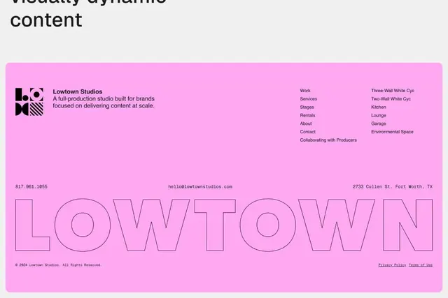
Vibrant hot-pink branding footer for a production studio, combining a geometric wordmark with bold outlined typography and clean navigation.
Summary
Vibrant hot-pink footer for Lowtown Studios (a full-production creative services studio) combining a geometric mark, compact sans-serif navigation, and outsized outline typography.
Visual description
Bright hot-pink (fuchsia/magenta) background fills the entire composition. Top third holds a small geometric wordmark (abstracted ampersand or compound form) in black, followed by the studio name and one-line descriptor in dark sans-serif. Navigation is split into two columns (Work/Services/Stages/Rentals and About/Contact/Collaborating; right column shows facility names: Three-Wall White Cyc, Kitchen, Lounge, Garage, Environmental Space). Footer holds phone, email, address in tiny sans-serif, then a massive outlined sans-serif word "LOWTOWN" in magenta stroke with pink fill (creating interior depth). The layout is rigorously left-aligned and bottom-weighted, using negative space to separate content zones. Dark grey or black text ensures legibility against the vivid pink.
Key takeaway
Using saturated neon or fluorescent color as a primary branding field (not an accent); pairing compact functional navigation with a single outsized typographic statement at the foot for brand recall; bold geometric marks that work well at small size alongside at-scale type; strategic text color contrast (dark copy against neon field).
Reuse notes
Ideal for creative agencies, studios, production companies, or any brand that benefits from high-energy, confident personality. The hot-pink + sans-serif combination reads as modern and accessible. Navigation density works well for multi-service offerings. The outlined typography technique adds visual punch but works best when the word has inherent impact (short, memorable names); test at actual deployment size to confirm outline weight holds legibility.
More like this






Keep what you find
A free account saves references to boards and can send you a weekly email of picks based on what you save.
To see every result, go Pro.