Preview image. Unlock full-res
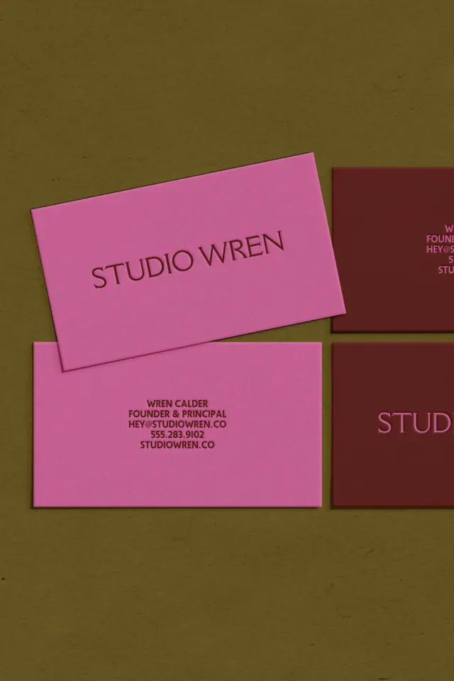
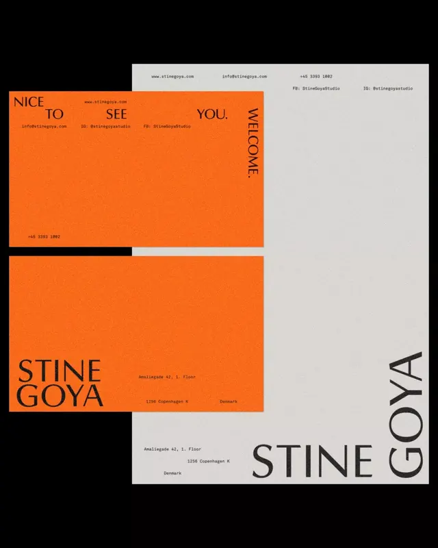
Business card and stationery suite using color-blocked rectangles in warm mauve and deep maroon, arranged in an asymmetric stack to showcase contact details.
Summary
Business card system for Studio Wren, employing warm mauve and deep maroon color blocks in an offset arrangement on neutral background to signal creative sophistication.
Visual description
Four rectangular cards layered in slight offset on an olive or khaki background. Two cards are a warm mauve or dusty pink, two are a deep wine or maroon red. The largest mauve card displays "STUDIO WREN" in a clean, uppercase display sans-serif with medium weight. Smaller cards below and beside show contact information including name, title, phone, email, and website in the same sans-serif font at smaller size. The cards overlap slightly, creating depth without visual confusion. Type sits centered or left-aligned within each colored field. No additional graphics, only the color contrast and typography carry the branding.
Key takeaway
Color blocking as a structural device that organizes information and adds richness without ornament. The warm mauve-and-maroon palette reads sophisticated and creative while remaining professional and legible. The asymmetric stack feels intentional and modern, avoiding the rigid grid. Using type scale and color as the only variables to create hierarchy within a simple format.
Reuse notes
Template for creative agencies, design studios, or independent consultants seeking understated elegance. The offset stack works as both a practical card and a portfolio showcase. The warm earthy palette pairs well with editorial, interior, or branding practices. The minimal type treatment adapts easily to any studio name or contact detail length.
More like this

Keep what you find
A free account saves references to boards and can send you a weekly email of picks based on what you save.
To see every result, go Pro.