Preview image. Unlock full-res
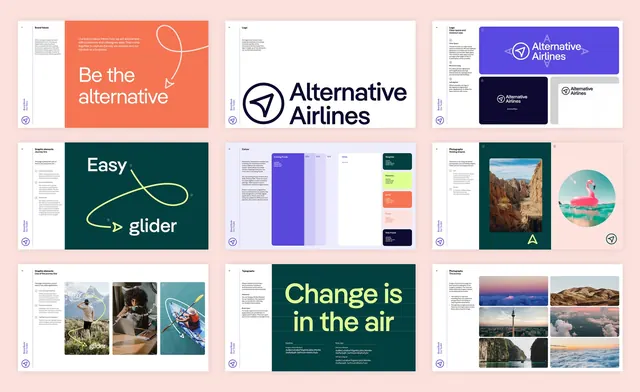
Nine brand book spreads laid out in a grid on pink, covering values, logo, clear space, the journey line, color, typography and photography.
More like this
See all
Summary
Nine landscape guideline spreads arranged three by three on a pale pink ground, showing how the identity is documented rather than how it is applied.
Visual description
Every spread uses the same skeleton: a narrow white left column holding the section title, a paragraph of small body copy and numbered annotations, a vertical running label reading "Brand Book" and the section name, the circular arrow symbol at the bottom left, and a large demonstration area to the right. Top row: "Brand Values" with an orange panel and the line "Be the alternative" beside a loose white looping line ending in an arrow; "Logo" with the full lockup, circular outline symbol plus two-line wordmark, large on white; "Logo, Clear space and minimum size" with the lockup on a purple field surrounded by A-height clear-space markers, plus a navy version tagged 30mm/85px and a left-aligned construction diagram on grey. Middle row: "Graphic elements, Journey line" on dark green, a lime line looping between the words "Easy" and "glider" with callout dots; "Colour", swatch blocks for Evening Purple with 30/20/10 percent tints, White, Seagrass, Pistachio, Spritz, Peach and Web Purple, each carrying hex, CMYK and Pantone values; "Photography, Holding shapes" showing a rounded rectangle crop of a canyon and a circular crop of a flamingo float in turquoise water, with construction marks. Bottom row: "Graphic elements, Use of the journey line" with three portrait photos each threaded by the lime line; "Typography" with a dark green panel setting "Change is in the air" in lime display type over two named type specimens and alphabet strings; "Photography, The journey" with a six-image grid of skies, mountains, a city tower and clouds.
Key takeaway
The fixed left column of copy and annotation against a variable right stage is what holds nine very different pages together, so color and imagery can change every spread without the book losing its grid. Documenting the journey line as a rule set with numbered callouts, rather than a single example, is what makes a hand-drawn device usable by other people.
Reuse notes
A model for structuring a brand book and for presenting one in a case study: nine spreads at once communicate scope better than a page-by-page walkthrough. The pink mount and the white page ground do the separating, so this needs a neutral backdrop distinct from any brand color. Individual spreads are unreadable at this scale, so pair it with detail shots if the copy matters.
More like this

Keep what you find
A free account saves references to boards and can send you a weekly email of picks based on what you save.
To see every result, go Pro.