Preview image. Unlock full-res
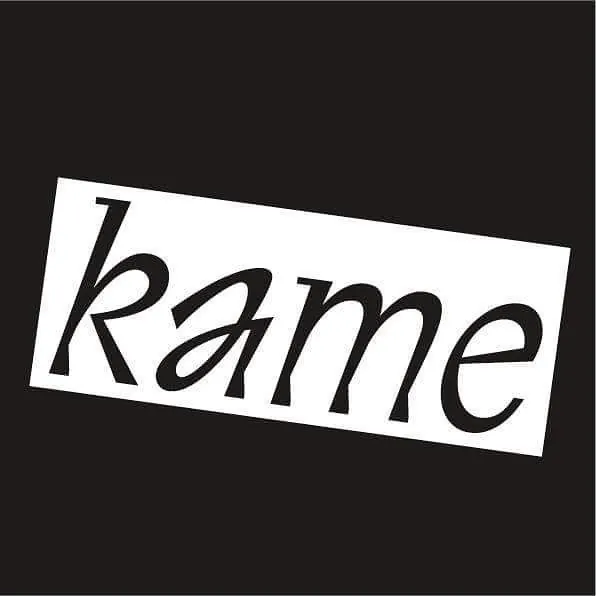
Single word typographic mark in flowing italic display face, printed on a white paper panel angled against a black background.
Summary
Single word typographic mark in flowing italic display face, printed on a white paper panel angled against a black background.
Visual description
A white rectangular panel tilted at an angle dominates the composition, bearing the word "kame" in a flowing italic serif typeface. The letterforms are tall and slender, with elegant serifs and natural proportions. The dark charcoal background creates extreme contrast and makes the white panel pop forward. The panel itself shows subtle paper texture, suggesting a printed or physical specimen. The angle of the white shape creates dynamic tension and visual interest without using color or embellishment.
Key takeaway
The tilted-plane composition is a simple but effective device for creating energy and elegance simultaneously. The serif italic typeface conveys sophistication and movement through its natural slant and flowing proportions. Extreme monochromatic contrast (pure black and white) is restraint that reads as luxury and confidence.
Reuse notes
Use this approach for high-end brand mark concepts, luxury product packaging, editorial mastheads, or gallery identity systems where simplicity signals strength. The serif italic gives a cultured, editorial feel. Works best when the typeface itself is striking enough to carry the entire visual. The angled composition suits type-forward brands and showcases a single glyphic mark or short wordmark effectively.
More like this

Keep what you find
A free account saves references to boards and can send you a weekly email of picks based on what you save.
To see every result, go Pro.