Preview image. Unlock full-res
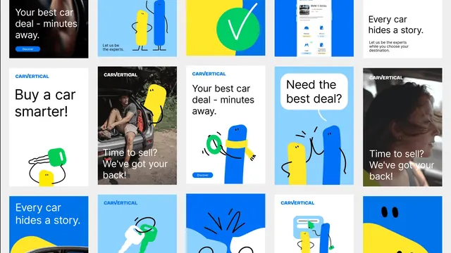
Wall of Carvertical social and advertising creatives laid out in a five-column grid, mixing flat character illustrations, photography, app screens and headline-only panels.
More like this
See all

Summary
A contact-sheet view of the campaign: roughly fifteen social and ad units in five columns, showing how the same four colors, one typeface and two blob characters recombine across illustration, photography and product screens.
Visual description
Units sit on a light grey page in five columns and three visible rows, the top and bottom rows cropped by the frame. Backgrounds cycle through saturated blue, pale blue, white, yellow and photography. Recurring headlines appear in bold black or white sans, flush left: "Your best car deal - minutes away.", "Every car hides a story.", "Buy a car smarter!", "Time to sell? We've got your back!", "Let us be the experts." A small blue pill button labelled "Discover" appears on several units. The wordmark sits top left or top center in white or blue all-caps. Illustration content includes the yellow and blue blob characters standing together with thin black line limbs, a character in a yellow scarf holding a green ring, a pair high-fiving under a white speech bubble reading "Need the best deal?", a green car key held by a small yellow blob, and a green check mark on a yellow and blue split ground. Two photographic units are darkened with white overlay type: a man sitting in an open car boot lacing a boot, with a yellow blob leaning over his shoulder, and a woman looking out of a car window. One unit shows a phone-style vehicle report screen for a BMW 5 Series with four small status tiles for mileage, photos, theft and financial and legal status. Most units are portrait format; the top row is landscape.
Key takeaway
The system is legible as a system because the constraints are visible at a glance: one type style, one button, one wordmark position set, and a fixed rule that photography always gets an overlay while illustration never does. Showing the campaign as a wall rather than as single hero units is itself the argument.
Reuse notes
Use as a reference for presenting a paid-social or performance system, where the proof is consistency across many small units rather than one showpiece. Also a good template for a case-study page section. Note that the individual headlines are not legible at contact-sheet scale, so this needs a companion frame if the copy matters.
More like this





Keep what you find
A free account saves references to boards and can send you a weekly email of picks based on what you save.
To see every result, go Pro.