Preview image. Unlock full-res
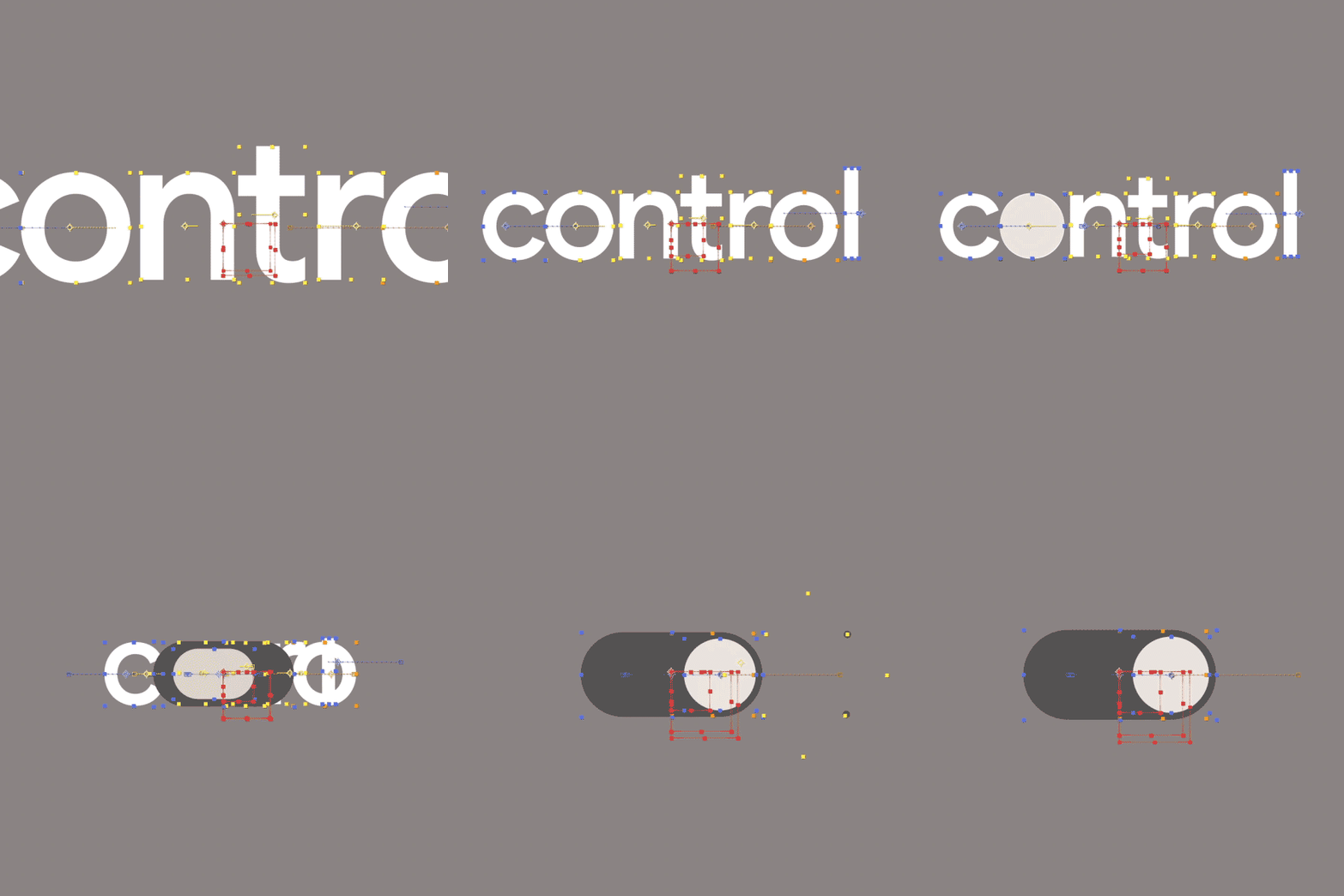
A geometric sans-serif wordmark 'contra' shown with visible construction guides, measurement dots, and control points, demonstrating type system design and dimensional precision.
Summary
A geometric sans-serif wordmark 'contra' displayed with visible design-system construction guides, measurement points, and alignment overlays, showing the technical foundation of type design.
Visual description
The word 'contra' rendered in large, geometric sans-serif capitals centered on a medium grey background. Overlaid are horizontal and vertical guide lines in thin red and dotted tan lines, plus small yellow and blue circular markers positioned at key structural points (cap height, baseline, intersections, proportional divisions). The guides suggest a modular construction system, with precise measurements and proportional relationships. The typeface itself is white or light grey against the neutral background, with clean, straight strokes and minimal serif or decorative detail.
Key takeaway
Showing construction guides alongside type makes the underlying system and proportion visible, which is valuable both as design documentation and as a visual statement of precision and intention. The minimal color palette (grey ground, white type, red and yellow guide marks) focuses attention on the geometric structure. This approach signals technical sophistication and systematic thinking in brand identity.
Reuse notes
Ideal for design-tool brands, software companies, or agencies that want to emphasize process and technical rigor. Works well in pitch decks, case studies, or system documentation to show design thinking. The construction-guide aesthetic has become recognizable shorthand for user-centered, data-driven design; use it when that association serves the brand.
More like this


Keep what you find
A free account saves references to boards and can send you a weekly email of picks based on what you save.
To see every result, go Pro.